 Over the past few weeks I’ve put up posts about Old Style, Modern and Slab Serif typefaces. All three of these font categories cover fonts that are described as Serif typefaces. That is, their letter forms have a serif on the end of the stroke.
If you studied French, you will know that “sans” means “without,” so naturally enough, sans serif fonts are those without serifs at the end of the strokes. The fonts that fall into this category are most commonly known as sans serif but you might also see them referred to as Grotesque, Doric and Gothic (not to be confused with the Blackletter typeface).
The first experiments with printed sans serif typefaces was in the mid 1700s, however their use in print really didn’t become more commonplace until the early 1800s.
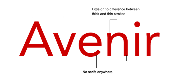
The characteristics which distinguish sans serif typefaces are that they are nearly always “monoweight.” This means that there no thick/thin transition in the strokes, they are the same thickness the whole way around. And of course, there are no serifs anywhere.
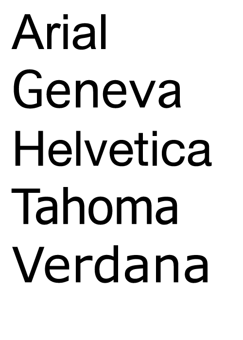
 Sans serif fonts are considered to be easy to read from a screen and so are very suitable for body text on web sites. They are not quite as legible in print, so are used in headings, pull quotes and small tracts of text in magazines, books and brochures. You probably already have several sans serif typefaces on your computer. The following are all web safe.
 The look pretty similar don’t they? Helvetica and Geneva come with Macs, while Arial, Tahoma and Verdana come with Windows.
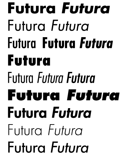
Some of the professional or commercial font families come in a variety of weights and styles. It can worth buying a couple of good sans serif fonts for your library. For example, I’m a big fan of the Futura font. (I’m not going to link here because I’ve seen different prices on various websites and as part of packages, so the advice is shop around for your fonts.) As well as the “regular” or medium font Futura has the following.
 So one typeface with 19 styles makes for a very versatile tool.
Obviously the term sans serif covers a myriad, but what are your favourite sans serif fonts? (Free or commercial)
Related Reading:
Frequently Asked Questions (FAQs) about Sans-Serif Typeface
What is the history of the sans-serif typeface?
The sans-serif typeface, also known as “grotesque” or “gothic”, originated in the early 19th century. It was first used in commercial printings in London, but quickly gained popularity across Europe and North America. The term “sans-serif” comes from the French word “sans”, meaning “without”, and “serif”, referring to the small lines or strokes at the ends of characters in some fonts. The sans-serif typeface is characterized by its lack of these small lines or strokes.
How does the sans-serif typeface impact readability?
The sans-serif typeface is often praised for its clean and modern look, which can enhance readability, especially in digital formats. The lack of serifs can make the text appear less cluttered and easier to read, especially at smaller sizes or on screens with lower resolution. However, some studies suggest that serif fonts may be more readable in long passages of text, as the serifs can guide the eye along the lines of text.
When should I use a sans-serif typeface?
The sans-serif typeface is versatile and can be used in a variety of contexts. It is particularly effective in headlines, captions, and other short pieces of text where clarity and impact are important. It is also commonly used in digital design, such as websites and apps, due to its clean, modern look and readability on screens.
What are some popular sans-serif typefaces?
Some of the most popular sans-serif typefaces include Helvetica, Arial, Futura, and Verdana. These typefaces are widely used in both print and digital media due to their clean, modern look and high readability.
How does the sans-serif typeface influence the tone of my text?
The sans-serif typeface can give your text a modern, clean, and straightforward tone. It is often used in contemporary design and can convey a sense of simplicity and efficiency. However, it may not be suitable for more traditional or formal contexts, where a serif font might be more appropriate.
Can I use sans-serif typeface for my logo design?
Absolutely, many successful companies use sans-serif typefaces in their logos. The clean and modern look of sans-serif fonts can make your logo appear more contemporary and forward-thinking.
What is the difference between a sans-serif and a serif typeface?
The main difference between a sans-serif and a serif typeface is the presence of small lines or strokes at the ends of characters in serif fonts. These are absent in sans-serif fonts, giving them a cleaner and more modern appearance.
Is sans-serif typeface good for print?
While sans-serif typefaces are often praised for their readability on screens, they can also work well in print. They are particularly effective in headlines, captions, and other short pieces of text where clarity and impact are important.
How can I choose the right sans-serif typeface for my project?
When choosing a sans-serif typeface, consider the context and purpose of your project. Think about the tone you want to convey, the medium you are working with (print or digital), and the readability of the font.
Are all sans-serif typefaces the same?
No, there are many different sans-serif typefaces, each with its own unique characteristics. Some sans-serif fonts, like Helvetica, are known for their neutrality and versatility, while others, like Futura, have more distinctive features.
Jennifer Farley is a designer, illustrator and design instructor based in Ireland. She writes about design and illustration on her blog at Laughing Lion Design.

