Spaced Out (Part 2): Kerning In Typography
Last week, we took a look at tracking, which is the amount of space between letters, and how it is an important part of designing with type. Today, we’re looking at a close mate of tracking called Kerning. While tracking is the overall letter spacing, kerning is selective letter spacing between pairs of letters.
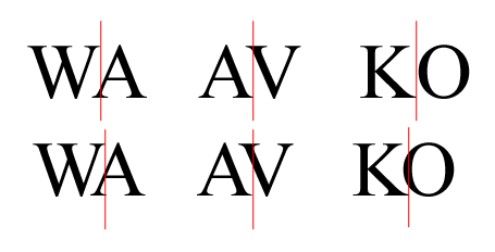
Certain letters, when placed beside each other create an awkward space. We use kerning to increase or reduce that space to make text more readable and more visually appealing. Here’s a few examples of letters which don’t always sit well together.

There are large gaps left between these letters. By kerning the letters in pairs, we can reduce just the space between those letters.
Kerning in Photoshop and Illustrator
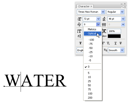
Both Photoshop and Illustrator allow you to kern using Metrics (also known as Auto Kerning) or Optical Kerning. To apply Kerning;
1. Open the Character palette in Photoshop or Illustrator.
2. Select the Type tool and click in between the letters you want to Kern.
3. Choose either Metrics, Optical or a numerical value in the Kerning field on the drop down menu. You can type in your own values in this field if you want to.
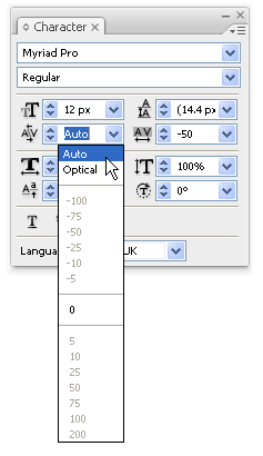
Auto Kerning in the Illustrator Character palette
Optical Kerning adjusts the spacing between adjacent characters based on their shapes.
Metrics Kerning uses kern pairs. Kerning information for many commonly kerned character pairs, such as LA, P., To, Tr, Ta, Tu, Te, Ty, Wa, WA, We, Wo, Ya, and Yo, is built in to quality fonts. Some high quality fonts may define up to 1000 different kerning pairs, and automatic kerning occurs without having to intervene.
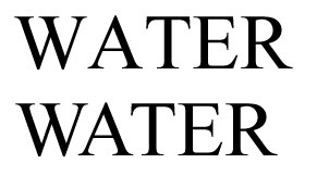
Kerning is most frequently required when text is set in all caps. Take a look at the example below. The text on the top is default text with no kerning. Optical Kerning has been applied on the text underneath, between the letters W and A, and between A and T. The text on the bottom clearly looks better.
Most of the time, you’re trying to even out the appearance of the space between letters, however there are times when extreme kerning or deliberately over-kerning creates special effects with tightly spaced or overlapping characters. Typographic logos depend heavily on good tracking and kerning. Here’s some example of logos using extreme kerning:


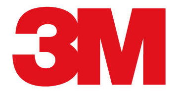
Have you seen any others?
Frequently Asked Questions about Kerning in Typography
What is the historical background of kerning in typography?
Kerning has a rich history that dates back to the era of metal type. In the past, kerning was a manual process where typographers would adjust the space between individual letters to achieve a visually pleasing result. This was done by physically cutting the metal type. With the advent of digital typography, kerning has become a software-controlled process, allowing for more precise and consistent adjustments.
How does kerning differ from tracking and leading?
While all three terms relate to the spacing in typography, they each have distinct meanings. Kerning refers to the adjustment of space between two individual characters, while tracking involves adjusting the spacing uniformly over a range of characters. Leading, on the other hand, refers to the vertical space between lines of text.
Why is kerning important in typography?
Kerning plays a crucial role in enhancing the readability and aesthetic appeal of text. Proper kerning ensures that the space between letters is visually consistent, preventing awkward gaps or tight spaces that can disrupt the reader’s flow.
How can I adjust kerning in digital design software?
Most digital design software, like Adobe Illustrator or Photoshop, have built-in tools for adjusting kerning. Typically, you can find these options in the character panel of the software. Adjustments can be made by selecting the pair of letters and altering the kerning value.
What are some common kerning mistakes to avoid?
Some common kerning mistakes include over-kerning, where too much space is added between letters, and under-kerning, where letters are too close together. Both can disrupt readability. It’s also important to avoid inconsistent kerning, where the spacing between letters varies too much.
Are there any rules or guidelines for kerning?
While there are no hard and fast rules for kerning, there are some general guidelines. For instance, kerning is often needed when a round letter is followed by a straight one (like ‘To’), or when two diagonal letters meet (like ‘Vv’).
How does kerning affect the overall design?
Kerning can significantly impact the overall look and feel of a design. It can influence the readability, mood, and even the perception of a brand or message. Poor kerning can make a design look amateurish, while well-executed kerning can make it look professional and polished.
What is the relationship between kerning and font choice?
Different fonts may require different kerning adjustments. Some fonts may have been designed with optimal kerning in mind, while others may need more manual adjustments. It’s important to consider kerning when choosing a font for your design.
Can kerning be automated?
While some design software offers auto-kerning features, these are not always reliable. Auto-kerning can be a good starting point, but manual adjustments are often needed to achieve the best result.
What is the role of kerning in logo design?
In logo design, kerning is crucial as it can impact the logo’s readability and overall impression. Even minor kerning adjustments can make a significant difference in how a logo is perceived. It’s important to spend time fine-tuning the kerning to ensure the logo communicates the intended message effectively.
Jennifer Farley is a designer, illustrator and design instructor based in Ireland. She writes about design and illustration on her blog at Laughing Lion Design.