Top Minimalist Website Designs: Trends and Examples
When you think of minimalism, you may conjure up images of black and white color schemes, overly-simple layouts, maybe a splash of color here and there. The actual concept in context of web design is about stripping out anything unnecessary. While this can produce boring design, there is a LOT of creative freedom within this framework.
Minimalism seeks to identify the real, functional needs of users and get the clutter out of the way. Want an experiment? Take a screenshot of any modern, monetized blog, throw it into Photoshop, and start erasing sections you do not need to navigate and discover content. You’ll be amazed at how much can go: the header image (usually), the ads along the sidebar, other gadgets you never really need. The end result may be strikingly similar to these designs.
Some of the trends that have emerged are likely a response to the over-the-top monetization of blogs. With banners, ads, and widgets, oh my; well, maybe we’re packing too much on a page. Text-based nav bars, use of grid layouts, minimal colors, large graphics sans text, and hyper-minimalism are just a few of the responses we’re seeing to overly-busy websites.
Text-Based Navigation Bar
The text-based navigation bar has no roll-over graphics. No bells and whistles. Just a simple text-based message that tells you how to get where. This trend goes to show it doesn’t take much to guide your readers around. While the horizontal arrangement is classic, note how a few of these sites mix it up.
Si Scott Studio

Green Light Creative
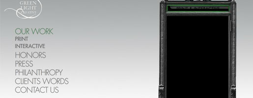
Jan Reichle

Core Division

CDP Architecture

The Grid
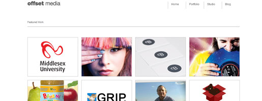
Billboards, books, text-boxes – these are all examples of grid-based organization in an insane world. Grids keep things nice and simple. You know where to expect the next element, whether that’s a graphic or a text-block. These sites use grids to organize a stripped down site and manage to keep things visually interesting as well.
Arias
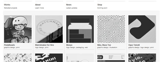
Kyle Tezak
Offset Media
Dic-Syen

Stu Greenham
Minimal Color Treatment
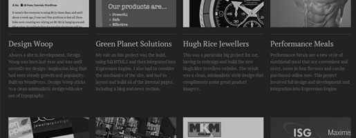
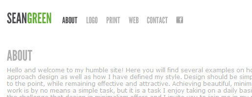
Who says you needs lots of color? In the below examples, the designers did a great job of minimalist design while also stripping the colors down to almost nothing. What this does is create an opportunity to intentionally draw the eye of the reader to specific places on the page. Headers, titles, and other important sections get the color treatment and the copy stays black/gray.
Arty Papers

Sean Green
Stapley Design
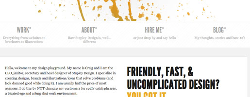
Daniel C. Gold
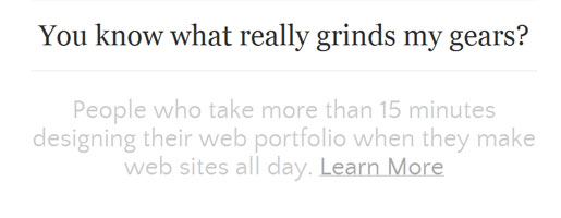
The heading on this site changes to red when visitors hover the mouse over the text.
Daniel Blumenthal

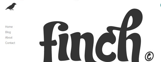
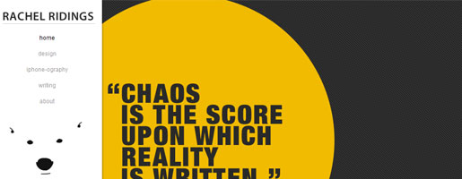
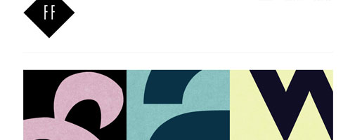
More Graphics, Less Text
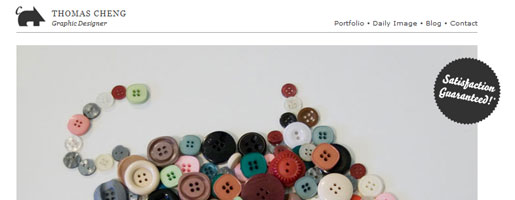
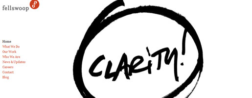
Sometimes a picture says everything that needs to be said. This doesn’t work on every website, of course. Check out how these designers decided to remove pretty much everything BUT the graphics. The effect can be stunning.
Thomas Cheng
Fellswoop
Finch
Rachel Ridings
Woody Romelus

Hyper-Minimalist Designs
Then there are the few who take minimalism to its farthest logical extension. If you can say everything you need in a few short words, maybe that’s all you need. You get the benefit of ultra-fast loading times, easy updating, and a focused message. Did these designers make it work?
Vlourenco

Frank Chimero

Lauren Doucet
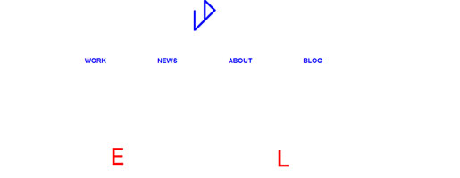
Simon Foster Design
Frequently Asked Questions about Minimalist Website Designs
What are the key elements of a minimalist website design?
Minimalist website design is characterized by simplicity and functionality. The key elements include a limited color palette, often with a monochromatic or achromatic scheme, ample white space, simple and clean typography, and a focus on content over design elements. The use of visuals is restrained, with a preference for high-quality images or illustrations that complement the content. Navigation is also simplified, with a focus on user-friendly interfaces that make it easy for visitors to find what they’re looking for.
How does minimalist design improve user experience?
Minimalist design can significantly enhance user experience by reducing clutter and distractions. This allows users to focus on the most important content and functionality of the site. The use of white space, simple navigation, and clear typography also contributes to a more enjoyable and less frustrating user experience. Furthermore, minimalist websites tend to load faster due to their simplicity, which is another crucial factor in user satisfaction.
Can minimalist design affect SEO?
Yes, minimalist design can positively impact SEO. By focusing on content and reducing unnecessary elements, minimalist websites can be more easily crawled and indexed by search engines. Additionally, the improved user experience and faster load times associated with minimalist design can contribute to higher rankings in search engine results.
What are some common mistakes in minimalist website design?
Some common mistakes in minimalist design include over-simplification, which can lead to a lack of necessary information or functionality, and under-utilization of white space, which can result in a cluttered or confusing layout. Another common mistake is the use of low-contrast color schemes, which can make content difficult to read.
How can I effectively use color in minimalist design?
In minimalist design, color should be used sparingly and strategically. A limited color palette can help to create a cohesive and visually pleasing design. Color can also be used to draw attention to key elements or content. However, it’s important to ensure that the colors used are accessible and provide sufficient contrast for readability.
How can I ensure my minimalist website is accessible?
To ensure your minimalist website is accessible, focus on clear, readable typography, sufficient color contrast, and intuitive navigation. Additionally, make sure all images and non-text elements have appropriate alt text, and that all interactive elements are keyboard-accessible.
Can minimalist design work for e-commerce websites?
Absolutely. In fact, minimalist design can be particularly effective for e-commerce websites. By reducing clutter and distractions, minimalist design can help to focus the user’s attention on the products and make the purchasing process simpler and more enjoyable.
How can I balance minimalism with functionality?
Balancing minimalism with functionality involves careful planning and design. Every element on the page should serve a purpose, whether it’s to provide information, facilitate navigation, or enhance aesthetics. It’s also important to prioritize user experience and ensure that the minimalist design doesn’t compromise usability.
What are some examples of successful minimalist website designs?
There are many examples of successful minimalist website designs across various industries. Some notable examples include Apple, Everlane, and Squarespace, which all utilize minimalist design principles to create clean, user-friendly websites.
How can I get started with minimalist website design?
Getting started with minimalist website design involves a focus on simplicity, functionality, and content. Start by defining the purpose of your website and the key information or functionality it needs to provide. Then, design your website with these priorities in mind, using a limited color palette, ample white space, and simple typography. Remember to prioritize user experience and accessibility, and don’t be afraid to iterate and refine your design based on user feedback.
Tara Hornor has a degree in English and has found her niche writing about marketing, advertising, branding, graphic design, and desktop publishing. She is a Senior Editor for Creative Content Experts, a company that specializes in guest blogging and building backlinks. In addition to her writing career, Tara also enjoys spending time with her husband and two children.
Published in
·Android·App Development·Design·iOS·Mobile·Mobile Web Development·Responsive Web Design·Wearables·September 2, 2014
Published in
·APIs·Community·JavaScript·Mobile·Mobile Web Development·Vanilla JavaScript·December 19, 2013

