

You may have recently landed on SitePoint or SitePoint Premium and paused for a moment, tilted your head slightly and thought “Huh, something is… different.”
You’re right. Something is different, and we’re a bit excited about it. Drumroll, please…
As part of a gradual design refresh we’re conducting here at SitePoint, we’ve refreshed the typeface we’re using across the brand. Welcome, Roboto 🎉🎉🎉
A Subtle Change, for Good Reasons
Even though not everyone can tell the difference (including our Head of Content, Ophélie, who calls herself “font-blind”), we didn’t just change to Roboto because it looks pretty. We had previously been using Helvetica Neue across the board – it’s tried and true, safe and clean. Unfortunately, we ran into problems when staff and contributors around the world, on different machines, didn’t always have access to the font. Helvetica Neue is a beautiful font, but it costs a fair bit — it wasn’t feasible!
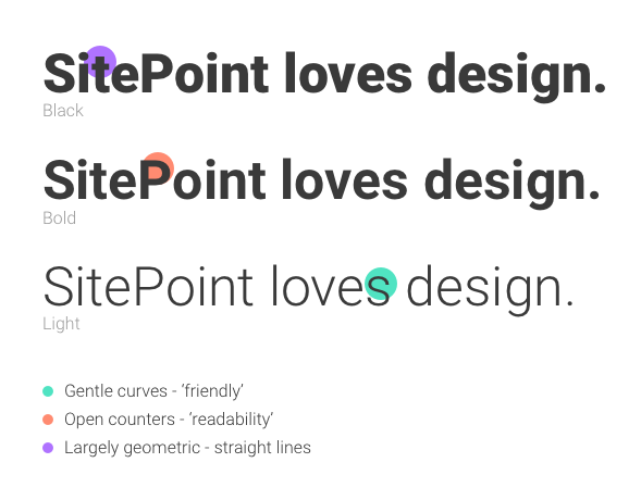
After a flurry of conversations within our team, we landed on Roboto. It’s a largely geometric (falling into what is referred to as the ‘neo-grotesque sans-serif’ family, like Helvetica Neue) but retains gentle curves and open counters which helps with readability, while also providing a friendly personality to the typeface. Of great importance, too, is the fact that Roboto is a Google Font under the Apache 2.0 License. That means that any and all of our staff and contributors, around the world, can find and use it without hassle. Nice!
We’re really loving it so far. What do you think?
Frequently Asked Questions about Roboto Typeface
What makes Roboto Typeface unique compared to other fonts?
Roboto Typeface is a unique font because it combines both geometric and grotesque types. It has a mechanical skeleton and the forms are largely geometric. At the same time, the font features friendly and open curves. This makes it more human and approachable, unlike other fonts that are strictly geometric. The font also adapts to every device, making it versatile and user-friendly.
Why is Roboto Typeface popular among designers?
Roboto Typeface is popular among designers because of its versatility and readability. It is designed to work well on all platforms, including mobile, web, and print. Its open and friendly curves make it easy to read, while its mechanical skeleton gives it a solid structure. This balance makes it a favorite among designers.
How does Roboto Typeface enhance user experience?
Roboto Typeface enhances user experience by providing a clean, modern look that is easy on the eyes. Its geometric structure and open curves make it easy to read, improving the overall user experience. It also adapts to every device, ensuring a consistent look and feel across all platforms.
What are the different styles of Roboto Typeface?
Roboto Typeface comes in 12 styles, ranging from thin to ultra-bold. This variety allows designers to use the font in a wide range of applications, from body text to headlines. Each style has been carefully crafted to ensure readability and visual appeal.
How can I use Roboto Typeface in my designs?
You can use Roboto Typeface in your designs by downloading it from Google Fonts. Once downloaded, you can install it on your computer and use it in your design software. The font is free to use, making it a cost-effective choice for designers.
Is Roboto Typeface suitable for print?
Yes, Roboto Typeface is suitable for print. Its clean lines and open curves make it easy to read, even at small sizes. It also comes in a variety of weights, allowing you to choose the best one for your print project.
Can I use Roboto Typeface for commercial projects?
Yes, you can use Roboto Typeface for commercial projects. The font is licensed under the Apache License, Version 2.0, which allows you to use it for both personal and commercial projects.
What is the history of Roboto Typeface?
Roboto Typeface was designed by Christian Robertson and was first introduced in 2011. It was initially used as the system font for the Android operating system. Since then, it has been adopted by many other platforms and is now one of the most popular fonts on Google Fonts.
How does Roboto Typeface compare to other popular fonts?
Roboto Typeface is often compared to other popular fonts like Helvetica and Arial. While it shares some similarities with these fonts, Roboto has its own unique characteristics. Its combination of geometric and grotesque types sets it apart from other fonts.
What are some best practices for using Roboto Typeface?
When using Roboto Typeface, it’s important to consider the weight and size of the font. The font comes in a variety of weights, so choose the one that best suits your design. Also, ensure that the font size is large enough to be easily readable. Lastly, consider the spacing between letters and lines to ensure optimal readability.

