 This is the last in the series of font categories. We’ve looked at Old Style, Modern, Slab Serif, Sans Serif, Script fonts and their characteristics. We’re going to finish up today with a look at decorative fonts. These are also known as Ornamental or Display fonts.
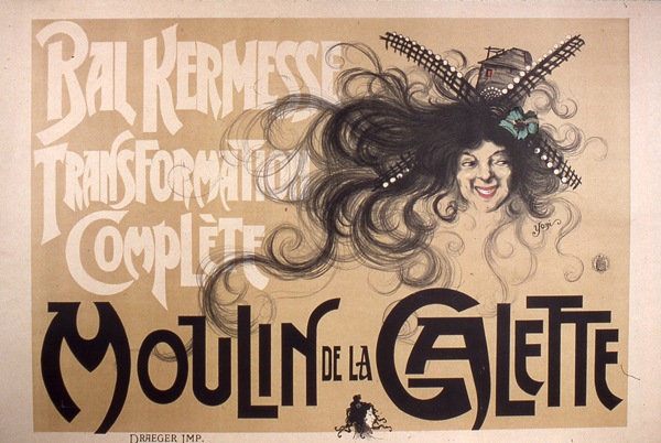
Decorative and display fonts became popular in the 19th century and were used extensively on posters and advertisements. This style of type and lettering could be artistic and eye-catching in a way that wasn’t considered previously. William Morris launched the Arts and Crafts movement and as part of the experimentation and innovation of the time, developed the Troy typeface.
Morris Troy
 Following on from the Arts and Crafts movement, Art Nouveau spread throughout Europe. Decorative lettering was a huge part of this movement and was used in many posters and advertisements.
19th Century Art Deco Poster
 Throughout the 20th and now into the 21st century, decorative fonts continued to be used in advertising and posters. There are hundreds if not thousands of display fonts available for download. The thing to remember about decorative typefaces is that they are only powerful when their use is limited. If you use them everywhere their effect diminishes. With the advent of technologies like Cufon, sIFR and Typekit, there is no reason why you couldn’t use them as headings on your website.
As their name suggests, decorative typefaces should be used for decorative or ornamental purposes. They are not suitable for using in body text. You would have some pretty cross-eyed and sick readers if you forced people to read too much in one of these fonts. They tend to have a very distinct look, for example a wild west style, horror or Christmas.
Outlaw
 Horror Hotel
 Kingthings Christmas
 I hope you’ve found this series on typefaces useful. It’s amazing how much you can change and improve designs by making a conscious effort to choose suitable fonts. The more you know about them, the more confident you’ll feel using them. Give yourself little typeface tests. When you’re looking in magazines see if you can, at a minimum, name the typeface categories. As you become more of a fanatic, you’ll find you can name many individual typefaces. Look at text-only logos and see how the designers use contrasting fonts for good effects, and try mixing and matching fonts yourself to see which ones work well together.
Next week, there will be more about fonts. Friday has inadvertently become font day for me on SitePoint and I’d like to continue on with more posts on typography and typefaces and how to use them effectively.
Related Reading:
- The Sans Serif Typeface
- The Script Typeface
- The Old Style Typeface
- The Modern Typeface
- The Big, Bold Beautiful Slab Serif
Frequently Asked Questions (FAQs) about Decorative Typeface
What is the significance of using decorative typefaces in design?
Decorative typefaces, also known as display or ornamental fonts, play a crucial role in design. They are primarily used to create a specific mood or evoke an emotional response. These typefaces are often unique and creative, making them perfect for logos, headlines, posters, and any design element that needs to stand out. However, due to their distinct and often intricate design, they are not suitable for body text as they can be hard to read in large blocks.
How do I choose the right decorative typeface for my project?
Choosing the right decorative typeface depends on the nature of your project and the message you want to convey. Consider the mood and tone you want to set. For instance, a playful, whimsical font might be perfect for a children’s book cover, while a sleek, modern typeface might be more suitable for a tech company’s logo. Always ensure the font is legible and complements the overall design.
Can I use multiple decorative typefaces in one design?
While it’s possible to use multiple decorative typefaces in one design, it’s generally not recommended. Using too many different fonts can make your design look cluttered and confusing. If you want to use more than one font, consider pairing a decorative typeface with a simpler, more readable font for balance.
Are there any rules for using decorative typefaces?
There are no hard and fast rules for using decorative typefaces, but there are some best practices to follow. These include using them sparingly, ensuring they’re legible, and making sure they align with your brand or project’s overall aesthetic. It’s also important to consider the medium – a font that looks great on a poster might not work as well on a website.
Where can I find decorative typefaces?
There are numerous online resources where you can find decorative typefaces. Websites like FontSpace, Envato Elements, and YouWorkForThem offer a wide range of fonts, including decorative ones. Some are free, while others require a purchase or subscription.
Can I create my own decorative typeface?
Yes, you can create your own decorative typeface. This requires knowledge of typography and design software like Adobe Illustrator or FontLab. Creating your own font allows you to have a unique typeface that perfectly fits your project or brand.
How do I install a decorative typeface on my computer?
Installing a decorative typeface on your computer is relatively straightforward. After downloading the font file, usually in .ttf or .otf format, you can install it by opening the file and clicking the “Install” button. The process may vary slightly depending on your operating system.
Can decorative typefaces be used for body text?
Generally, decorative typefaces are not recommended for body text. Their intricate and unique designs can make them difficult to read in large blocks of text. For body text, it’s best to stick with simpler, more legible fonts.
Are decorative typefaces suitable for all types of design projects?
While decorative typefaces can add a unique touch to a design, they’re not suitable for all types of projects. They work best in designs where text is minimal and the font can stand out, like logos, headlines, or posters. For projects with more text, a simpler font is usually a better choice.
How do decorative typefaces impact the overall design?
Decorative typefaces can significantly impact the overall design. They can set the mood, highlight important information, and make a design stand out. However, they should be used thoughtfully and sparingly to avoid overwhelming the design or making it difficult to read.
Jennifer Farley is a designer, illustrator and design instructor based in Ireland. She writes about design and illustration on her blog at Laughing Lion Design.

