Offline Design Inspiration, Part 3: Food Packaging

Whether it’s a combination of colors, interesting logos or the promise of what lies inside, food packaging is something the vast majority of us look at every day. If we haven’t tried, or seen a product before, the packaging is what’s going to draw us in, make us pick the box up and read more about it.
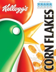
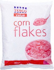
As a simple example, let’s take cornflakes in the supermarket. If I came across either of these for the first time, to me, the Kellogg’s pack looks infinitely superior and more appealing. Although both show similar information — a logo, an image, both have white space – it is the use of strong colors, a larger bolder image and the nutritional information on the pack on the left which conveys a richness. The value corn flakes are cheaper to buy, but they look cheap, too.
How is this related to web design? Well, good design is good design, and many of the concepts will be the same regardless of where the design is used. In general terms, the packaging design should attract attention, it should make the product appealing, and it can impress us with creativity. Just like a website.
So below I’ve picked out some creative, some innovative, and hopefully inspiring food packaging. If you’re hungry, look away now because here are fifteen examples of cool food packaging design.
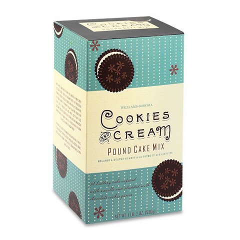
1. There’s a lovely retro feel to this Cookies and Cream cake mix. The retro look is achieved using an old style font with simple flat illustration.
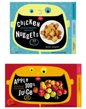
2. The brightly colored and illustrated packaging is obviously aimed at the kid’s market.
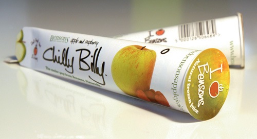
3. Clean and cool, it’s the Chilly Billy.
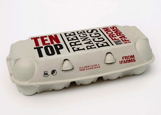
4. A fairly trendy type-based design for these free range eggs.
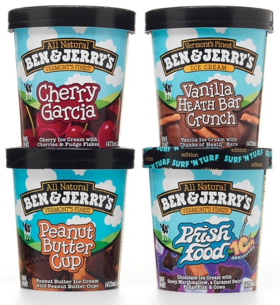
5. The always cool, Ben and Jerry’s packaging is very recognizable with its cartoon style illustration and fonts.
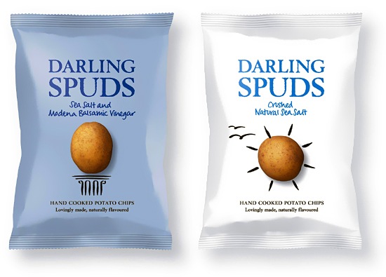
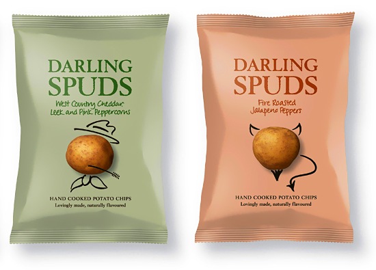
6. Nice use of white space and potato image on these packets of Darling Spuds crisps.
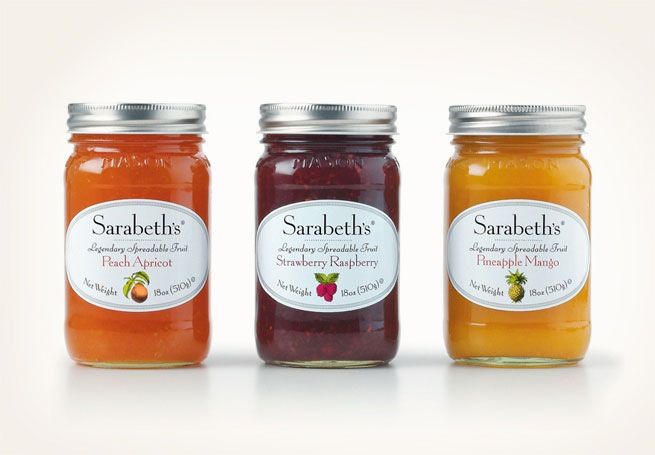
7. Elegant typography and label design on Sarabeth’s jam.
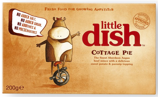
8. The Little Dish company have a range of food aimed at children. Each package has its own beautiful illustrated character.
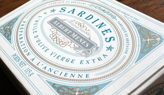
9. If I could actually stomach the thoughts of eating sardines, then I would buy this pack for the design alone.
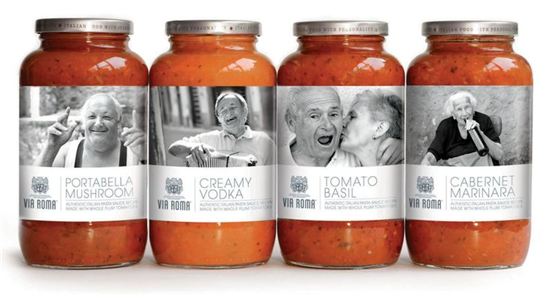
10. The labels on these Via Roma food jars feature humorous black and white photography, combined with an elegant modern typeface.
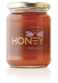
11. Clear honey, clear label with a cute logo from Waitrose.
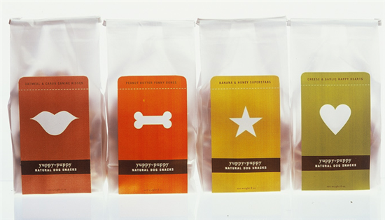
12. Not for human consumption, but it is appealing! Simple icons on a range of colored labels make an attractive design on these puppy snacks.
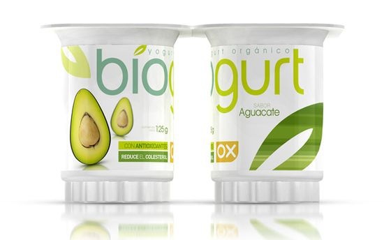
13. A very clean modern design for yoghurt.
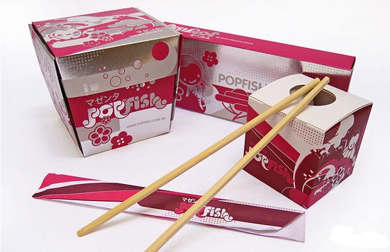
14. Popfish is a Japanese restaurant in Brazil and this is their brightly colored packaging.
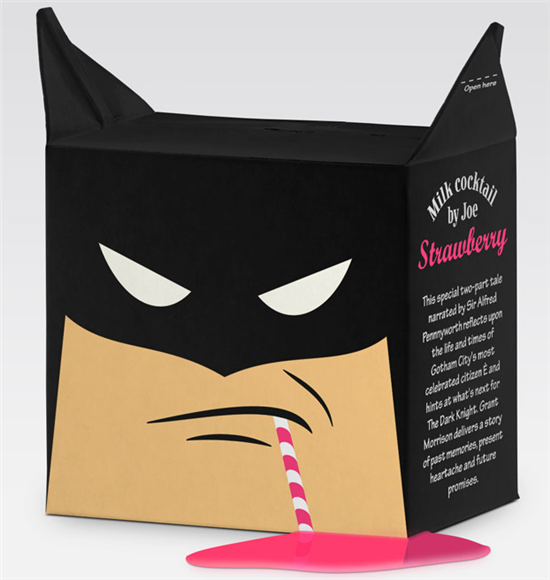
15. And, finally, my own personal favorite. Not quite food, but a very cool strawberry batman milk cocktail.
Where to find more sites about packaging design:
Dzinebites
The Dieline
Graphic Exchange
And of course this is supposed to be about offline inspiration, so keep your eyes peeled in your local shop, restaurant, café! Take pictures of the designs you like and keep them for inspiration further down the line.
What did you think of these designs? Have you seen any other food packaging that made you think “wow” recently?
Related Reading On Sitepoint:
Frequently Asked Questions about Food Packaging Design Inspiration
What are the latest trends in food packaging design?
The food packaging design industry is constantly evolving, with new trends emerging every year. Some of the latest trends include sustainable and eco-friendly packaging, minimalistic designs, bold and vibrant colors, and storytelling through packaging. These trends not only make the product visually appealing but also communicate the brand’s values and story to the consumers.
How does food packaging design impact consumer behavior?
Food packaging design plays a crucial role in influencing consumer behavior. A well-designed package can attract consumers’ attention, communicate the product’s features and benefits, and influence their purchase decision. It can also create a strong brand image and build customer loyalty.
What are some creative food packaging design ideas?
There are countless creative food packaging design ideas out there. Some popular ones include using unique shapes and structures, incorporating interactive elements, using illustrations and graphics, and experimenting with different materials and textures. The key is to create a design that stands out on the shelf and resonates with your target audience.
How can I make my food packaging design more sustainable?
There are several ways to make your food packaging design more sustainable. You can use recyclable or biodegradable materials, minimize the use of plastic, reduce packaging size and weight, and use eco-friendly inks and dyes. It’s also important to communicate your sustainability efforts on the package to educate consumers and encourage them to make eco-friendly choices.
What are some examples of effective food packaging designs?
There are many examples of effective food packaging designs. Some notable ones include Innocent Smoothies with their playful and vibrant designs, Patagonia Provisions with their eco-friendly and minimalistic packaging, and Pringles with their iconic cylindrical can. These brands have successfully used packaging design to create a strong brand identity and connect with their consumers.
How can I incorporate storytelling into my food packaging design?
Storytelling can be incorporated into food packaging design in various ways. You can use visuals, colors, typography, and copy to tell your brand’s story and convey its values. You can also use packaging to share the product’s origin story, the ingredients used, or the process of making it. This can create an emotional connection with consumers and make your product more memorable.
What are the key elements of a successful food packaging design?
The key elements of a successful food packaging design include a clear and readable product name, a compelling visual design, a concise and informative product description, a clear list of ingredients, and a strong brand logo. It’s also important to consider the packaging material and structure, as they can greatly impact the product’s shelf appeal and functionality.
How can I make my food packaging design stand out on the shelf?
To make your food packaging design stand out on the shelf, you need to create a unique and eye-catching design that resonates with your target audience. This can be achieved through the use of bold colors, unique shapes and structures, compelling visuals, and creative typography. It’s also important to clearly communicate your product’s unique selling points and benefits on the package.
What are some common mistakes to avoid in food packaging design?
Some common mistakes to avoid in food packaging design include using too many colors or fonts, overloading the package with information, not considering the product’s shelf placement, and not aligning the design with the brand’s identity and values. It’s also crucial to ensure that the packaging is functional and easy to open, use, and dispose of.
How can I get inspiration for my food packaging design?
There are many ways to get inspiration for your food packaging design. You can look at successful packaging designs in your industry, explore design blogs and websites, attend design exhibitions and events, and use social media platforms like Pinterest and Instagram. It’s also helpful to understand your target audience’s preferences and needs, as they should be at the heart of your design process.
Jennifer Farley is a designer, illustrator and design instructor based in Ireland. She writes about design and illustration on her blog at Laughing Lion Design.