
Magazine covers are a superb source of offline design inspiration. We glance at them and often make very quick decisions about whether we’re interested in the content based purely on the cover. Yes, the hunky man or the beautiful woman are usually the main draw on the glossy mags, but the colours used are part of the overall plan to grab your attention.
This article looks at some of the colour schemes gracing the newsstands at the moment and how we can learn from them and apply them to our web designs.
You can be absolutely 100% assured that the colour schemes on today’s magazines do not happen by accident. The art director spends a lot of time choosing a suitable image, followed by a choice of colour for fonts. Magazines with recognisable logos such as Rolling Stone, Vogue and New Scientist frequently change the colour of the logo to match or complement the images on the cover to make them eye-catching.
The headlines on the cover of a magazine equate somewhat with the call to action on a web site. They are bold, stand out, grab your attention and get you to do something. Buy Me! You may not be selling on your own website, but I’m sure you’d like users to stick around and not close the page before even reading the content. Using effective colour schemes can help you do this.
Studies have shown that web users form an opinion in as little as 1/20th of a second when opening a new web page, so getting your colour scheme right is important. Obviously there are many other factors to consider, including layout and typography, but the colour is the first thing to register in the user’s mind.
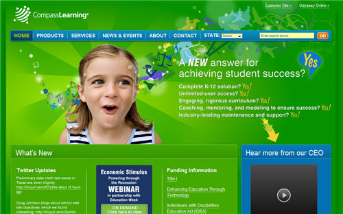
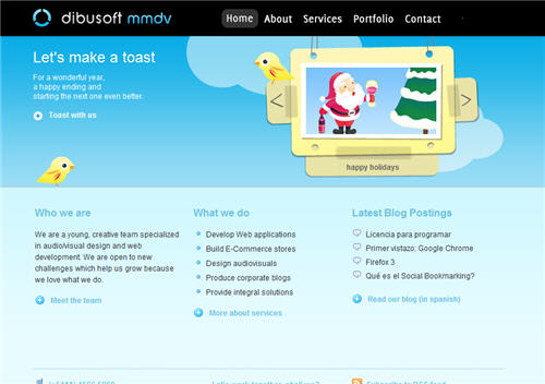
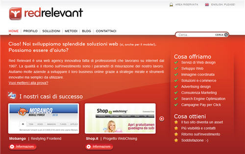
To illustrate the idea of using colour schemes found offline, I’ve chosen a few magazines and highlighted the main colours they’re using. Underneath each magazine is an example of a website using a similar scheme.

In this edition, Food magazine uses a mixture of greens, with a dash of bright blue thrown in on a headline.
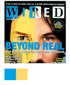
On this illustrated cover for Wired, a bold scheme of bright blue and yellow are combined.
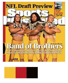
Matching the background with the players uniforms, Sports Illustrated goes mustard!
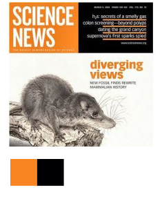
Science news keeps things simple with high contrast orange and black. This is a colour scheme I’ve noticed increasingly on magazine covers.
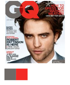
Another colour scheme with good contrast is grey and very bright red, as can be seen on this GQ cover.
If you’re having trouble picking colours for your design, why not take a break from the computer and pick up a magazine for a little while? Other tools that you may find useful to help you pick colours include the wonderful Kuler from Adobe Labs, the ColorBlender website, which I love for it’s simplicity and Cloford.com.
I plan to write future posts about offline sources of inspiration and I’d really love to hear where you guys find design inspiration away from the web. Cinema, books, music, games? Let me know!
Frequently Asked Questions about Magazine Design Inspiration
What are some key elements to consider when designing a magazine cover?
When designing a magazine cover, there are several key elements to consider. First, the cover image should be striking and eye-catching. It should be high-quality and relevant to the magazine’s content. Second, the typography should be clear and readable, even from a distance. The title of the magazine should be the most prominent text on the cover. Third, the color scheme should be consistent and complementary to the cover image. Lastly, the layout should be clean and uncluttered, with a clear hierarchy of information.
How can I make my magazine cover stand out?
To make your magazine cover stand out, you can use bold and contrasting colors, unique typography, and compelling imagery. Experiment with different layouts and design elements until you find a combination that grabs attention. Also, consider your target audience and what would appeal to them. A well-designed cover can make a significant impact on the magazine’s overall appeal.
What software can I use to design a magazine cover?
There are several software options available for designing a magazine cover. Adobe InDesign and Adobe Photoshop are popular choices among professionals due to their advanced features and flexibility. Canva is another great option, especially for beginners, as it offers a wide range of templates and an intuitive interface. Other options include QuarkXPress and Microsoft Publisher.
How can I choose the right images for my magazine cover?
Choosing the right images for your magazine cover is crucial. The images should be high-quality and relevant to the magazine’s content. They should also be visually appealing and able to convey the mood or theme of the magazine. You can source images from stock photo websites, hire a professional photographer, or even create your own illustrations or graphics.
How important is typography in magazine cover design?
Typography is extremely important in magazine cover design. It not only conveys the necessary information but also contributes to the overall aesthetic of the cover. The right font can set the tone for the entire magazine and make it more appealing to potential readers. It’s important to choose a font that is legible, fits the magazine’s style, and complements the other design elements on the cover.
How can I effectively use color in my magazine cover design?
Color plays a significant role in magazine cover design. It can evoke emotions, draw attention, and create a certain mood. When choosing colors, consider the message you want to convey and the emotions you want to evoke. Use a color wheel to find complementary colors and create a balanced and harmonious design. Also, consider the cultural and psychological associations of different colors.
What are some common mistakes to avoid when designing a magazine cover?
Some common mistakes to avoid when designing a magazine cover include cluttering the cover with too much information, using low-quality images, choosing hard-to-read fonts, and not considering the magazine’s target audience. It’s also important to avoid inconsistency in design elements and to ensure that the cover accurately represents the content of the magazine.
How can I create a consistent look and feel across multiple issues of a magazine?
Creating a consistent look and feel across multiple issues of a magazine can be achieved by using a consistent color scheme, typography, layout, and imagery. This not only helps to establish brand identity but also makes the magazine instantly recognizable to readers. However, while consistency is important, it’s also crucial to introduce some variety and freshness in each issue to keep readers engaged.
How can I design a magazine cover that appeals to my target audience?
To design a magazine cover that appeals to your target audience, you need to understand their preferences, interests, and demographics. Use imagery, colors, and typography that resonate with them. Also, consider the kind of content they would find interesting and relevant. A cover that speaks directly to your target audience is more likely to attract their attention and interest.
How can I learn more about magazine cover design?
There are many resources available to learn more about magazine cover design. Online tutorials, design blogs, and books on graphic design can provide valuable insights and tips. You can also study the covers of successful magazines to understand what works and what doesn’t. Additionally, taking a course in graphic design or attending design workshops can be very beneficial.