Offline Design Inspiration, Part 2: Newspapers

Last month, I wrote a post about how we could use magazine covers for colour inspiration. Continuing on this theme, I’m looking again at printed material for ideas and inspiration. This time the source for design ideas is the Newspaper.
The first “newspapers” were handwritten newsletters circulated to merchants. Printed newspapers appeared in Germany around the late 1400’s, while the first American printed newspaper called “Publick Occurrences” appeared in Boston in 1690. These papers were heavily type based, as you can imagine.
Today’s newspapers, however are literally a feast for the eyes, if you choose to look at them that way. Just think about all of the design elements that are involved
• Typography
• Photography
• Illustration
• Info Graphics
• Banners
• Logos
• Branding
• Layout Grids
Don’t forget at the weekend, all of the additional sections, glossy mags and pull-outs that many newspapers supply, loads more eye candy and ideas.
Let’s take a look at a few examples. You’ll see that all of the newspapers use a grid to layout the stories and images. Many web designers are now using grids or frameworks to layout their sites.
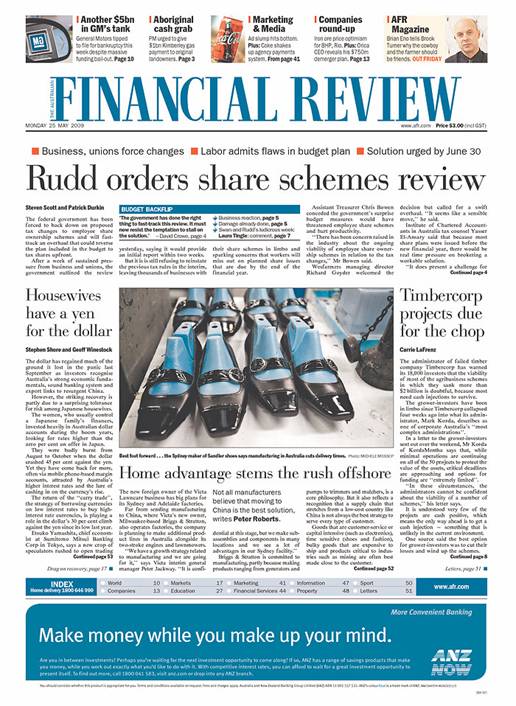
1. The Australian Financial Times is pretty sedate in terms of colour and font choice. They have a very specific audience and the design reflects this. Notice the repetition of the colour blue. It’s in the newspaper title, the index, the large ad at the bottom of the page and even the main image.
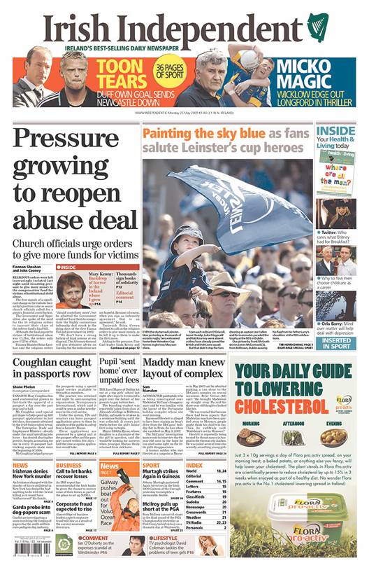
2. The Irish Independent is a little more colourful, but again there is repetition of the colours blue and orange throughout the page in both the text and the images. (On a slightly unrelated note, the main image on this page shows some Irish rugby fans. I’m not boasting, but Irish rugby teams have been doing very well this year!)
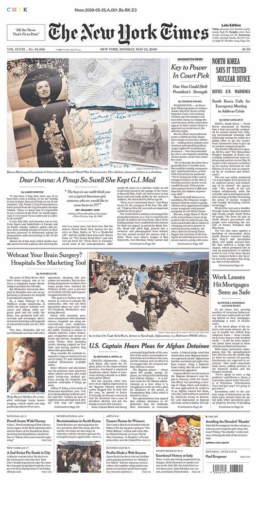
3. The New York Times uses elegant typography in headings, sub-headings and pull-quotes.
4. The Journal, UK has a fairly standard tabloid layout, with a large image and extra large headline. The reversed out type reflects the black and white of the football player’s uniform. This particular football team are known for their black and white uniform.

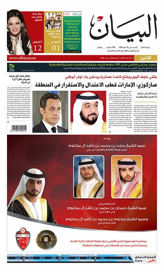
5. The Daily Al Bayan, published in Dubai, United Arab Emirates has a colourful main image, three sections that are clearly demarcated using colour and a logo on the right. This looks just like a blog. I can’t speak Arabic, but I can clearly see the most important information is on the right hand side because the type is larger than on the left hand side.
So even if the news itself is all doom and gloom, ignore the small print, step back a bit and look at the design.
Do you find yourself looking at more than just the stories in a newspaper? Has newspaper layout influenced your designs or ideas?
Related Reading:
Frequently Asked Questions on Offline Design Inspiration: Newspapers
What are some unique ways to use color in newspaper design?
Color plays a crucial role in newspaper design. It can be used to highlight important information, create visual interest, and guide the reader’s eye through the page. One unique way to use color is through color blocking, where different sections of the page are filled with different colors. This can help to separate different stories or sections and make the page more visually appealing. Another way is to use color in headlines or subheadings to draw attention to key information. Lastly, color can be used in images or graphics to add visual interest and enhance the overall design.
How can I make my newspaper design stand out?
There are several ways to make your newspaper design stand out. First, consider your layout. A well-structured layout with clear sections and headlines can make your newspaper easier to read and more visually appealing. Second, use high-quality images and graphics. These can add visual interest and help to convey your message more effectively. Third, consider your color scheme. A well-chosen color scheme can enhance your design and make it more eye-catching. Lastly, don’t be afraid to experiment with different fonts and typography styles. These can add a unique touch to your design and make it more memorable.
What are some common mistakes to avoid in newspaper design?
Some common mistakes to avoid in newspaper design include cluttered layouts, poor use of color, and overuse of fonts. A cluttered layout can make your newspaper difficult to read and unappealing to the eye. Poor use of color can make your design look amateurish and unprofessional. Overuse of fonts can make your design look inconsistent and confusing. It’s important to keep your design clean, simple, and consistent to ensure it’s easy to read and visually appealing.
How can I use images effectively in my newspaper design?
Images can be a powerful tool in newspaper design. They can help to convey your message, add visual interest, and break up large blocks of text. To use images effectively, make sure they are high-quality and relevant to your content. Consider the placement of your images and how they interact with the rest of your design. Use captions to provide context and additional information. Lastly, remember to balance your images with your text to ensure your design is not too image-heavy or text-heavy.
What are some tips for choosing a color scheme for my newspaper design?
When choosing a color scheme for your newspaper design, consider your audience, your content, and your brand. Your color scheme should appeal to your audience and be appropriate for your content. It should also reflect your brand and create a consistent look and feel. Consider using a limited color palette to keep your design cohesive and professional. Use color to highlight important information and guide the reader’s eye through the page. Lastly, consider the psychological effects of color and how they can influence your reader’s perception and response to your content.
How can I create a balanced layout in my newspaper design?
Creating a balanced layout in your newspaper design involves careful planning and consideration. Start by dividing your page into sections or columns. This can help to organize your content and make it easier to read. Use a grid system to ensure your layout is consistent and aligned. Balance your text and images to ensure your design is not too text-heavy or image-heavy. Use white space effectively to create breathing room and prevent your design from looking cluttered. Lastly, consider the flow of your design and how the reader’s eye will move through the page.
What are some creative ways to use typography in newspaper design?
Typography can be a powerful tool in newspaper design. It can be used to create hierarchy, add visual interest, and convey your message more effectively. Some creative ways to use typography include using different fonts for headlines and body text, using typography to create shapes or patterns, and using typography to add texture or depth to your design. Experiment with different font sizes, weights, and styles to create a unique and memorable design.
How can I ensure my newspaper design is easy to read?
Ensuring your newspaper design is easy to read involves careful consideration of your layout, typography, and color scheme. Your layout should be well-structured and organized, with clear sections and headlines. Your typography should be legible and appropriate for your content. Your color scheme should provide sufficient contrast for easy reading. Use white space effectively to create breathing room and prevent your design from looking cluttered. Lastly, consider your audience and their reading habits and preferences.
How can I use graphics effectively in my newspaper design?
Graphics can be a powerful tool in newspaper design. They can help to convey your message, add visual interest, and break up large blocks of text. To use graphics effectively, make sure they are high-quality and relevant to your content. Consider the placement of your graphics and how they interact with the rest of your design. Use captions to provide context and additional information. Lastly, remember to balance your graphics with your text to ensure your design is not too graphic-heavy or text-heavy.
What are some tips for designing a newspaper for print?
Designing a newspaper for print involves careful consideration of your layout, typography, color scheme, and print quality. Your layout should be well-structured and organized, with clear sections and headlines. Your typography should be legible and appropriate for print. Your color scheme should be suitable for print and provide sufficient contrast for easy reading. Ensure your images and graphics are high-resolution for best print quality. Lastly, consider the paper quality and how it will affect your design.
Jennifer Farley is a designer, illustrator and design instructor based in Ireland. She writes about design and illustration on her blog at Laughing Lion Design.