
Material Design, a new design language that gives design guidelines for Android apps and apps on other platforms, was introduced with the release of Android 5.0 Lollipop.
With it came new UI components such as the ‘Floating Action Button’. Implementing these new components while ensuring backward compatibility was typically a tedious process. Third party libraries would usually be needed to streamline the process.
At this year’s Google IO conference, Google introduced the Android Design Support Library which brings a number of important material design components to developers. The components are backwards compatible, with support back to Android 2.1 and implementing them is easier than previously. The library includes a navigation drawer view, floating labels for editing text, a floating action button, snackbar, tabs and a motion and scroll framework to tie them together. In this tutorial we’ll create an app that showcases these components.
Getting Started
You can find the final project code on gitHub.
Before getting started on the components, we’ll set up the project and set some styles. Using Android Studio, create a new Android project. Name it ‘Design Demo’ and leave the other settings as default, ensure the Minimum SDK version is at API level 15.
Add the following dependencies to the build.gradle (Module:app) file.
compile 'com.android.support:design:22.2.1'

compile 'com.android.support:cardview-v7:22.2.1'
The first statement adds the design support library and the second the CardView library, which we’ll use later. Sync the project with the updated Gradle files. This may involve downloading some of the support libraries.
Create a resource file in the res/values folder called colors.xml. Modify it as below:
<?xml version="1.0" encoding="utf-8"?>

<resources>

    <color name="primary">#3F51B5</color>

    <color name="primary_dark">#303F9F</color>

    <color name="accent">#FF4081</color>

</resources>
Modify res/values/strings.xml as below. These are all the Strings we’ll need for the project:
<resources>

    <string name="app_name">Design Demo</string>

    <string name="hello_world">Hello world!</string>

    <string name="action_settings">Settings</string>

    <string name="nav_item_attachment">Attachment</string>

    <string name="nav_item_images">Images</string>

    <string name="nav_item_location">My Location</string>

    <string name="nav_sub_menu">Sub Menu</string>

    <string name="nav_sub_menu_item01">Sub Menu Item 1</string>

    <string name="nav_sub_menu_item02">Sub Menu Item 2</string>

    <string name="drawer_header_text">Drawer Header</string>

    <string name="second_activity_text">Lorem ipsum dolor sit amet, consectetur adipiscing elit. Proin consectetur diam id aliquam scelerisque. Donec ultrices lacus vel dignissim pharetra. Vivamus pharetra augue quis rhoncus placerat. Sed ultricies at risus non cursus. Nam rutrum leo nec placerat consectetur. Vestibulum feugiat eleifend diam, nec interdum augue tincidunt sit amet. Praesent feugiat est auctor lacus consectetur, vitae pellentesque dolor laoreet.</string>

    <string name="title_activity_second">SecondActivity</string>

</resources>
Modify res/values/styles.xml as below:
<resources>
    <!-- Base application theme. -->

    <style name="AppTheme" parent="Theme.AppCompat.Light.NoActionBar">

        <!-- Customize your theme here. -->

        <item name="colorPrimary">@color/primary</item>

        <item name="colorPrimaryDark">@color/primary_dark</item>

        <item name="colorAccent">@color/accent</item>

    </style>
</resources>
In the code above, we customize the app’s Color Palette by setting the primary, primary-dark and accent colors as specified in the material design guide.
Other theme settings that can be customized are shown in the image below.
Notice we do not include the android: prefix before the item name (e.g. android:colorPrimaryDark). This is for backward compatibility. The android: annotation requires the minimum API level set to 21. We use a theme with NoActionBar because we’ll be using a Toolbar as our Action Bar (or AppBar as it is now called).
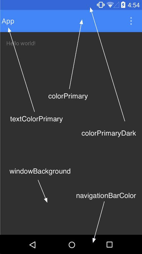
(SOURCE: https://developer.android.com/training/material/theme.html)
To create the Toolbar, modify res/layout/activity_main:
<RelativeLayout xmlns:android="http://schemas.android.com/apk/res/android"

    xmlns:tools="http://schemas.android.com/tools"

    android:layout_width="match_parent"

    android:layout_height="match_parent"

    tools:context=".MainActivity">
    <android.support.v7.widget.Toolbar

        android:id="@+id/toolbar"

        android:layout_width="match_parent"

        android:layout_height="?attr/actionBarSize"

        android:background="?attr/colorPrimary"

        android:theme="@style/ThemeOverlay.AppCompat.Dark" />
</RelativeLayout>
Above, we remove the default padding on the RelativeLayout and add a Toolbar from the support library. If you are supporting devices from API level 21 and above, you would only need to use the default Toolbar component and not one from the support library.
In MainActivity.java modify the onCreate(Bundle) method:
@Override

protected void onCreate(Bundle savedInstanceState) {

    super.onCreate(savedInstanceState);

    setContentView(R.layout.activity_main);
    Toolbar toolbar = (Toolbar) findViewById(R.id.toolbar);

    setSupportActionBar(toolbar);

    ActionBar actionBar = getSupportActionBar();

    actionBar.setHomeAsUpIndicator(R.drawable.ic_menu);

    actionBar.setDisplayHomeAsUpEnabled(true);

}
Download the project resources from gitHub which contains drawable folders that you can paste into the res directory so that the above code doesn’t result in errors.
When prompted by Android Studio, ensure you import the Toolbar from the support library.
In the above code, we get a reference to the Toolbar and set it as the Action Bar. We then get a reference of the Action Bar and set its Home icon to the infamous hamburger menu icon.
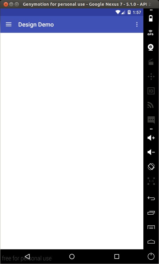
Run the app and you should see the Toolbar set as the app’s AppBar.
NavigationView
The Navigation Drawer is a common component in Android apps. It is one of the ways to build a navigation hierarchy on Android, the others being Tabs and Spinners. Implementing one was never a quick process, but now with the Design Support Library, its implementation is much simpler.
To get started, modify activity_main.xml as shown.
<android.support.v4.widget.DrawerLayout

    xmlns:android="http://schemas.android.com/apk/res/android"

    xmlns:app="http://schemas.android.com/apk/res-auto"

    android:id="@+id/drawer_layout"

    android:layout_width="match_parent"

    android:layout_height="match_parent"

    android:fitsSystemWindows="true">
    <RelativeLayout

        android:layout_width="match_parent"

        android:layout_height="match_parent">
        <android.support.v7.widget.Toolbar

            android:id="@+id/toolbar"

            android:layout_width="match_parent"

            android:layout_height="?attr/actionBarSize"

            android:background="?attr/colorPrimary"

            android:theme="@style/ThemeOverlay.AppCompat.Dark" />
    </RelativeLayout>
    <android.support.design.widget.NavigationView

        android:id="@+id/navigation_view"

        android:layout_width="wrap_content"

        android:layout_height="match_parent"

        android:layout_gravity="start"

        app:headerLayout="@layout/drawer_header"

        app:menu="@menu/drawer"/>

</android.support.v4.widget.DrawerLayout>
In the above code, we add a NavigationView to the layout. A NavigationView is placed within a DrawerLayout. Two important attributes to note are app:headerLayout which controls the (optional) layout used for the header and app:menu which is the menu resource inflated for the navigation items (this can also be updated at runtime).
Create a file labelled drawer_header.xml in the res/layout folder and modify it as shown.
<?xml version="1.0" encoding="utf-8"?>

<LinearLayout xmlns:android="http://schemas.android.com/apk/res/android"

    android:orientation="vertical"

    android:layout_width="match_parent"

    android:layout_height="150dp"

    android:background="?attr/colorPrimaryDark"

    android:padding="16dp"

    android:theme="@style/ThemeOverlay.AppCompat.Dark"

    android:gravity="bottom">
    <TextView

        android:layout_width="match_parent"

        android:layout_height="wrap_content"

        android:text="@string/drawer_header_text"

        android:textAppearance="@style/TextAppearance.AppCompat.Body1"/>
</LinearLayout>
This creates a header for the drawer that will have a background color of the app’s set primary color (in our case blue), with a height of 150dp and some text.
Next create a file named drawer.xml in the res/menu folder and modify it as shown.
<?xml version="1.0" encoding="utf-8"?>

<menu xmlns:android="http://schemas.android.com/apk/res/android">
    <group android:checkableBehavior="single">

        <item

            android:id="@+id/navigation_item_attachment"

            android:checked="true"

            android:icon="@drawable/ic_attachment"

            android:title="@string/nav_item_attachment" />

        <item

            android:id="@+id/navigation_item_images"

            android:icon="@drawable/ic_image"

            android:title="@string/nav_item_images" />

        <item

            android:id="@+id/navigation_item_location"

            android:icon="@drawable/ic_place"

            android:title="@string/nav_item_location" />

    </group>
    <item android:title="@string/nav_sub_menu">

        <menu>

            <item

                android:icon="@drawable/ic_emoticon"

                android:title="@string/nav_sub_menu_item01" />

            <item

                android:icon="@drawable/ic_emoticon"

                android:title="@string/nav_sub_menu_item02" />

        </menu>

    </item>
</menu>
In the above, we create the drawer’s menu items. The first part shows a collection of checkable menu items. The checked item will appear highlighted in the navigation drawer, ensuring the user knows which navigation item is currently selected. In the second part, we use a subheader to separate the second group of items from the first.
In MainActivity.java add the following member variable.
private DrawerLayout mDrawerLayout;
Then add the following to the bottom of onCreate(Bundle).
mDrawerLayout = (DrawerLayout) findViewById(R.id.drawer_layout);
Modify onOptionsItemSelected(MenuItem) as shown:
@Override

public boolean onOptionsItemSelected(MenuItem item) {

    // Handle action bar item clicks here. The action bar will

    // automatically handle clicks on the Home/Up button, so long

    // as you specify a parent activity in AndroidManifest.xml.

    int id = item.getItemId();
    switch (id) {

        case android.R.id.home:

            mDrawerLayout.openDrawer(GravityCompat.START);

            return true;

        case R.id.action_settings:

            return true;

    }
    return super.onOptionsItemSelected(item);

}
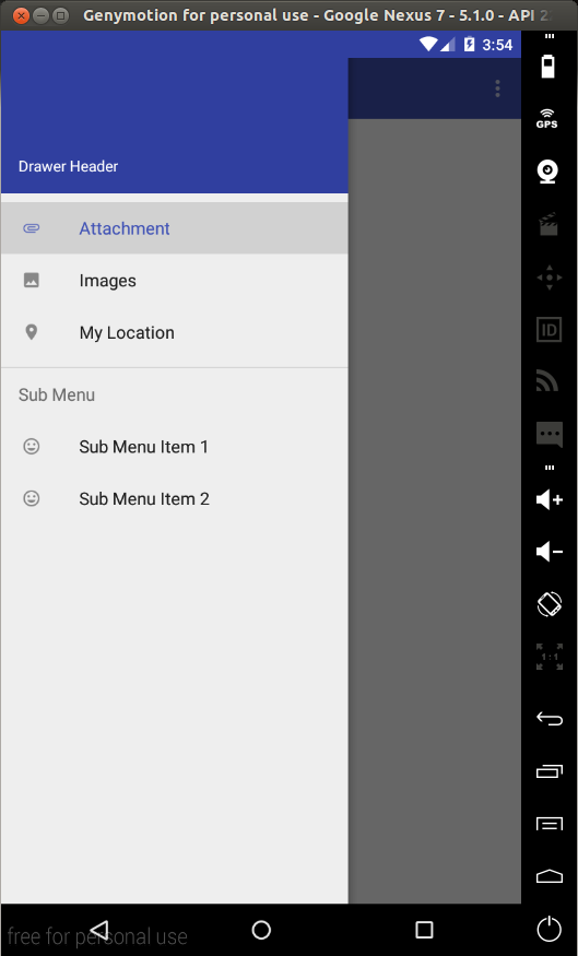
This will bring the drawer onto the screen when the Home button (the one with the hamburger menu icon) is tapped. Run the app and you should see the following.
To capture click events on the menu items we need to set an OnNavigationItemSelectedListener on the NavigationView. Place the following at the bottom of onCreate(Bundle).
NavigationView navigationView = (NavigationView) findViewById(R.id.navigation_view);

navigationView.setNavigationItemSelectedListener(new NavigationView.OnNavigationItemSelectedListener() {

        @Override

        public boolean onNavigationItemSelected(MenuItem menuItem) {

            menuItem.setChecked(true);

            mDrawerLayout.closeDrawers();

            Toast.makeText(MainActivity.this, menuItem.getTitle(), Toast.LENGTH_LONG).show();

            return true;

        }

    });
The above code sets a listener on the navigation view so that when a drawer menu item is selected, the menu item is set to checked (this will only affect the menu items marked as checkable), The drawer is closed and a Toast is shown displaying the title of the selected menu item.
In a real app you would do something like navigate to another Fragment and not just show a Toast. If you open the drawer again, you can confirm that the selected menu item is now checked by its highlight (only for the items marked checkable).
Floating Action Button (FAB)
A floating action button is a round button denoting a primary action on your interface. The Design library’s FloatingActionButton gives a single consistent implementation, by default colored using the colorAccent from your theme.
In addition to the normal size (56dp) floating action button, it supports the mini size (40dp) when visual continuity with other elements is critical.
To add a FAB to the layout, modify res/layout/activity_main.xml as shown.
<android.support.v4.widget.DrawerLayout

    xmlns:android="http://schemas.android.com/apk/res/android"

    xmlns:app="http://schemas.android.com/apk/res-auto"

    android:id="@+id/drawer_layout"

    android:layout_width="match_parent"

    android:layout_height="match_parent"

    android:fitsSystemWindows="true">
    <RelativeLayout

        android:layout_width="match_parent"

        android:layout_height="match_parent">
        <android.support.v7.widget.Toolbar

            android:id="@+id/toolbar"

            android:layout_width="match_parent"

            android:layout_height="?attr/actionBarSize"

            android:background="?attr/colorPrimary"

            android:theme="@style/ThemeOverlay.AppCompat.Dark" />
        <android.support.design.widget.FloatingActionButton

            android:id="@+id/fab"

            android:layout_width="wrap_content"

            android:layout_height="wrap_content"

            android:layout_alignParentBottom="true"

            android:layout_alignParentRight="true"

            android:layout_marginRight="@dimen/activity_horizontal_margin"

            android:layout_marginBottom="@dimen/activity_vertical_margin"

            android:src="@drawable/ic_done" />
    </RelativeLayout>
    <android.support.design.widget.NavigationView

        android:id="@+id/navigation_view"

        android:layout_width="wrap_content"

        android:layout_height="match_parent"

        android:layout_gravity="start"

        app:headerLayout="@layout/drawer_header"

        app:menu="@menu/drawer"/>

</android.support.v4.widget.DrawerLayout>
In the above, we add the FloatingActionButton at the bottom right corner of the layout. android:src sets the icon shown within the button. In code, you can set this with setImageDrawable().
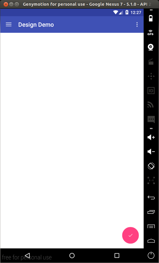
Run the app, and you should see the FAB.
We’ll set an onClickListener on the FAB in the next section.
Snackbar
Traditionally, if you wanted to present quick brief feedback to the user, you would use a Toast. Now there is another option – the Snackbar.
Snackbars are shown at the bottom of the screen and contain text with an optional single action. They automatically time out after the given time by animating off the screen. Users can also swipe them away before the timeout.
By including the ability to interact with the Snackbar through actions and swiping to dismiss, they are considerably more powerful than toasts, and the API is familiar.
In MainActivity.java add the following to the bottom of onCreate(Bundle):
FloatingActionButton fab = (FloatingActionButton)findViewById(R.id.fab);

fab.setOnClickListener(new View.OnClickListener() {

    @Override

    public void onClick(View v) {

        Snackbar.make(findViewById(R.id.drawer_layout), "I'm a Snackbar", Snackbar.LENGTH_LONG).setAction("Action", new View.OnClickListener() {

                @Override

                public void onClick(View v) {

                    Toast.makeText(MainActivity.this, "Snackbar Action", Toast.LENGTH_LONG).show();

                }

            }).show();

        }

    });
In the above, we set an onClickListener on the FAB so that when it is tapped, a Snackbar will be shown. We create an Action on the Snackbar and set an onClickListener that displays a Toast when tapped.
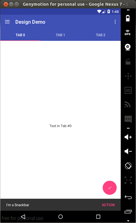
Note the use of a View as the first parameter to make(). Snackbar will attempt to find an appropriate parent of the Snackbar’s view to ensure that it is anchored to the bottom. Run the app to test this.
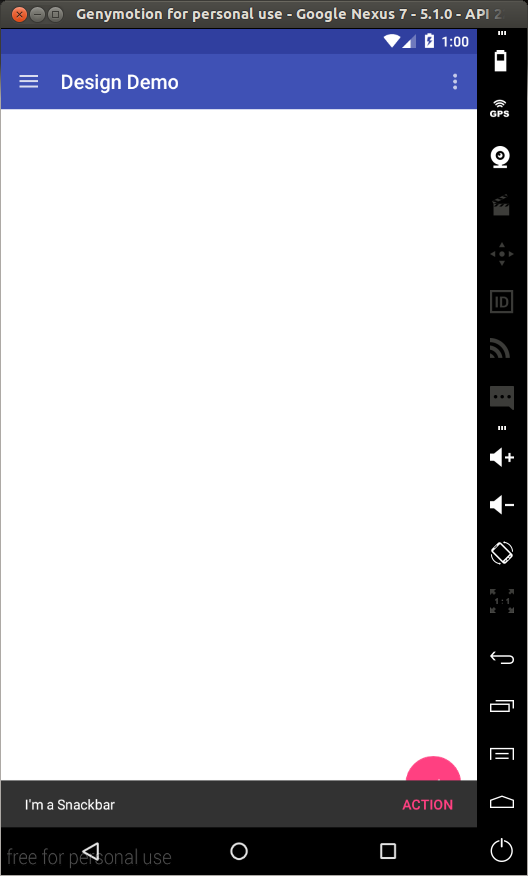
Notice that the Snackbar overlaps the FAB. We’ll fix this in the section on CoordinatorLayout.
TabLayout
Using Tabs to switch between different views is not a new concept on Android. The Design library’s TabLayout simplifies the process of adding tabs to your app. It implements both fixed tabs, where the view’s width is divided equally between all of the tabs, as well as scrollable tabs, where the tabs are not a uniform size and can scroll horizontally.
To add a TabLayout to the app, modify res/layout/activity_main.xml as shown.
<android.support.v4.widget.DrawerLayout

    android:id="@+id/drawer_layout"

    xmlns:android="http://schemas.android.com/apk/res/android"

    xmlns:app="http://schemas.android.com/apk/res-auto"

    android:layout_width="match_parent"

    android:layout_height="match_parent"

    android:fitsSystemWindows="true">
    <RelativeLayout

        android:layout_width="match_parent"

        android:layout_height="match_parent">
        <LinearLayout

            android:layout_width="match_parent"

            android:layout_height="match_parent"

            android:orientation="vertical">
            <android.support.v7.widget.Toolbar

                android:id="@+id/toolbar"

                android:layout_width="match_parent"

                android:layout_height="?attr/actionBarSize"

                android:background="?attr/colorPrimary"

                android:theme="@style/ThemeOverlay.AppCompat.Dark" />
            <android.support.design.widget.TabLayout

                android:id="@+id/tablayout"

                android:layout_width="match_parent"

                android:layout_height="wrap_content"

                android:background="?attr/colorPrimary"

                app:tabGravity="fill"

                android:theme="@style/ThemeOverlay.AppCompat.Dark" />
            <android.support.v4.view.ViewPager

                android:id="@+id/viewpager"

                android:layout_width="match_parent"

                android:layout_height="0dp"

                android:layout_weight="1"/>
        </LinearLayout>
        <android.support.design.widget.FloatingActionButton

            android:id="@+id/fab"

            android:layout_width="wrap_content"

            android:layout_height="wrap_content"

            android:layout_alignParentBottom="true"

            android:layout_alignParentRight="true"

            android:layout_marginBottom="@dimen/activity_vertical_margin"

            android:layout_marginRight="@dimen/activity_horizontal_margin"

            android:src="@drawable/ic_done"/>
    </RelativeLayout>
    <android.support.design.widget.NavigationView

        android:id="@+id/navigation_view"

        android:layout_width="wrap_content"

        android:layout_height="match_parent"

        android:layout_gravity="start"

        app:headerLayout="@layout/drawer_header"

        app:menu="@menu/drawer"/>

</android.support.v4.widget.DrawerLayout>
In the above, we add a TabLayout as well as a ViewPager. The ViewPager will be used to enable horizontal paging between tabs.
In MainActivity.java add the following subclasses.
public static class DesignDemoFragment extends Fragment {

    private static final String TAB_POSITION = "tab_position";
    public DesignDemoFragment() {
    }
    public static DesignDemoFragment newInstance(int tabPosition) {

        DesignDemoFragment fragment = new DesignDemoFragment();

        Bundle args = new Bundle();

        args.putInt(TAB_POSITION, tabPosition);

        fragment.setArguments(args);

        return fragment;

    }
    @Nullable

    @Override

    public View onCreateView(LayoutInflater inflater, ViewGroup container, Bundle savedInstanceState) {

        Bundle args = getArguments();

        int tabPosition = args.getInt(TAB_POSITION);

        TextView tv = new TextView(getActivity());

        tv.setGravity(Gravity.CENTER);

        tv.setText("Text in Tab #" + tabPosition);

        return tv;

    }

}
static class DesignDemoPagerAdapter extends FragmentStatePagerAdapter {
    public DesignDemoPagerAdapter(FragmentManager fm) {

        super(fm);

    }
    @Override

    public Fragment getItem(int position) {

        return DesignDemoFragment.newInstance(position);

    }
    @Override

    public int getCount() {

        return 3;

    }
    @Override

    public CharSequence getPageTitle(int position) {

        return "Tab " + position;

    }

}
Then at the bottom of onCreate(Bundle) add the following.
DesignDemoPagerAdapter adapter = new DesignDemoPagerAdapter(getSupportFragmentManager());

ViewPager viewPager = (ViewPager)findViewById(R.id.viewpager);

viewPager.setAdapter(adapter);

TabLayout tabLayout = (TabLayout)findViewById(R.id.tablayout);

tabLayout.setupWithViewPager(viewPager);
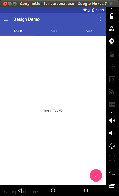
In the above, we create a Fragment class that creates a simple fragment with a single TextView as its content. We then create a FragmentStatePagerAdapter that will be used as the ViewPager’s adapter. The getCount() function of the DesignDemoPagerAdapter class returns the number of pages/tabs. getItem(int) returns the Fragment that will be placed on the view page and getPageTitle(int) returns the title that will appear on a particular tab. For this to work, we use setupWithViewPager() on the TabLayout. This ensures that tab selection events update the ViewPager and page changes update the selected tab.
Run the app and you should see the tabs. You can swipe to change tabs or just tap on a tab to switch to it.
CoordinatorLayout
The Design library introduces the CoordinatorLayout, a layout which provides an additional level of control over touch events between child views, something which many of the components in the Design library take advantage of.
An example of this is when you add a FloatingActionButton as a child of your CoordinatorLayout and then pass that CoordinatorLayout to your Snackbar.make() call.
Instead of the snackbar displaying over the floating action button, as seen previously, the FloatingActionButton takes advantage of additional callbacks provided by CoordinatorLayout to automatically move upward as the snackbar animates in and returns to its position when the snackbar animates out. This is supported on Android 3.0 and higher devices.
To use the CoordinatorLayout in our layout, modify res/layout/activity_main.xml as shown:
<android.support.v4.widget.DrawerLayout

    android:id="@+id/drawer_layout"

    xmlns:android="http://schemas.android.com/apk/res/android"

    xmlns:app="http://schemas.android.com/apk/res-auto"

    android:layout_width="match_parent"

    android:layout_height="match_parent"

    android:fitsSystemWindows="true">
    <android.support.design.widget.CoordinatorLayout

        android:id="@+id/coordinator"

        android:layout_width="match_parent"

        android:layout_height="match_parent">
        <LinearLayout

            android:layout_width="match_parent"

            android:layout_height="match_parent"

            android:orientation="vertical">
            <android.support.v7.widget.Toolbar

                android:id="@+id/toolbar"

                android:layout_width="match_parent"

                android:layout_height="?attr/actionBarSize"

                android:background="?attr/colorPrimary"

                android:theme="@style/ThemeOverlay.AppCompat.Dark" />
            <android.support.design.widget.TabLayout

                android:id="@+id/tablayout"

                android:layout_width="match_parent"

                android:layout_height="wrap_content"

                android:background="?attr/colorPrimary"

                app:tabGravity="fill"

                android:theme="@style/ThemeOverlay.AppCompat.Dark" />
            <android.support.v4.view.ViewPager

                android:id="@+id/viewpager"

                android:layout_width="match_parent"

                android:layout_height="0dp"

                android:layout_weight="1"/>
        </LinearLayout>
        <android.support.design.widget.FloatingActionButton

            android:id="@+id/fab"

            android:layout_width="wrap_content"

            android:layout_height="wrap_content"

            android:layout_alignParentBottom="true"

            android:layout_gravity="bottom|right"

            android:layout_marginBottom="@dimen/activity_vertical_margin"

            android:layout_marginRight="@dimen/activity_horizontal_margin"

            android:src="@drawable/ic_done"/>
    </android.support.design.widget.CoordinatorLayout>
    <android.support.design.widget.NavigationView

        android:id="@+id/navigation_view"

        android:layout_width="wrap_content"

        android:layout_height="match_parent"

        android:layout_gravity="start"

        app:headerLayout="@layout/drawer_header"

        app:menu="@menu/drawer"/>

</android.support.v4.widget.DrawerLayout>
As seen above, the FAB needs to be a child of the CoordinatorLayout, so we replace the previous RelativeLayout with the CoordinatorLayout. Also note that we change the FAB’s position setting to android:layout_gravity="bottom|right".
Next in MainActivity.java when constructing the Snackbar, pass the CoordinatorLayout as the view parameter.
Snackbar.make(findViewById(R.id.coordinator), "I'm a Snackbar", Snackbar.LENGTH_LONG).setAction("Action", new View.OnClickListener() {

                @Override

                public void onClick(View v) {

                    Toast.makeText(MainActivity.this, "Snackbar Action", Toast.LENGTH_LONG).show();

                }

            }).show();
Run the app and now when you tap on the FAB, the Snackbar will slide into view, but this time it won’t overlap the FAB, the FAB will slide up with it and when the Snackbar is dismissed either by timing out or with a swipe, the FAB will fall back into place.
The other main use case for the CoordinatorLayout concerns the app bar and scrolling techniques. The design library provides the AppBarLayout which allows the Toolbar and other views (such as tabs provided by TabLayout) to react to scroll events in a sibling view marked with a ScrollingViewBehavior.
Before looking at this, let’s first create something we can scroll through. We’ll use a RecyclerView to create a list of items we can scroll through.
Note: I spent about an hour trying to make the CoordinatorLayout work with a ListView, but the scrolling behaviour was just not working. A simple search led me to this post, this post and this post. If you check those links, it seems that the CoordinatorLayout doesn’t work well out-of-the-box with ListViews (and apparently GridViews and ScrollViews). The last two links show a workaround to making it work with a ListView, but it doesn’t seem to be backwards compatible. I wanted to let you know incase you get stuck on the same issue. Support for ListViews will probably be added in a future update.
I’ll go through the creation of the RecyclerView without much explanation as this is out of the scope of this tutorial and you can easily find help online regarding RecyclerViews.
Place the following in your build.gradle (Module: app) file and sync the gradle files..
compile 'com.android.support:recyclerview-v7:22.2.1'
Create a file in res/layout named fragment_list_view.xml. Modify it as shown.
<?xml version="1.0" encoding="utf-8"?>

<android.support.v7.widget.RecyclerView

    xmlns:android="http://schemas.android.com/apk/res/android"

    android:id="@+id/recyclerview"

    android:layout_width="match_parent"

    android:layout_height="match_parent"/>
Create another layout file in res/layout and name it list_row.xml. Replace its contents with the content below.
<?xml version="1.0" encoding="utf-8"?>

<LinearLayout xmlns:android="http://schemas.android.com/apk/res/android"

          android:orientation="vertical"

          android:padding="16dp"

          android:layout_width="match_parent"

          android:layout_height="56dp">
    <TextView

        android:id="@+id/list_item"

        android:layout_width="wrap_content"

        android:layout_height="wrap_content"/>
</LinearLayout>
Create a java file called DesignDemoRecyclerAdapter.java and paste the following.
package com.echessa.designdemo; // Rename as Appropriate
import android.support.v7.widget.RecyclerView;

import android.view.LayoutInflater;

import android.view.View;

import android.view.ViewGroup;

import android.widget.TextView;
import java.util.List;
/**

 * Created by echessa on 7/24/15.

 */

public class DesignDemoRecyclerAdapter extends RecyclerView.Adapter<DesignDemoRecyclerAdapter.ViewHolder> {
    private List<String> mItems;
    DesignDemoRecyclerAdapter(List<String> items) {

        mItems = items;

    }
    @Override

    public ViewHolder onCreateViewHolder(ViewGroup viewGroup, int i) {

        View v = LayoutInflater.from(viewGroup.getContext()).inflate(R.layout.list_row, viewGroup, false);
        return new ViewHolder(v);

    }
    @Override

    public void onBindViewHolder(ViewHolder viewHolder, int i) {

        String item = mItems.get(i);

        viewHolder.mTextView.setText(item);

    }
    @Override

    public int getItemCount() {

        return mItems.size();

    }
    public class ViewHolder extends RecyclerView.ViewHolder {
        private final TextView mTextView;
        ViewHolder(View v) {

            super(v);

            mTextView = (TextView)v.findViewById(R.id.list_item);

        }

    }
}
Modify DesignDemoFragment.onCreateView() in MainActivity.java as shown:
@Nullable

    @Override

    public View onCreateView(LayoutInflater inflater, ViewGroup container, Bundle savedInstanceState) {

        Bundle args = getArguments();

        int tabPosition = args.getInt(TAB_POSITION);
        ArrayList<String> items = new ArrayList<String>();

        for (int i = 0; i < 50; i++) {

            items.add("Tab #" + tabPosition + " item #" + i);

        }
        View v =  inflater.inflate(R.layout.fragment_list_view, container, false);

        RecyclerView recyclerView = (RecyclerView)v.findViewById(R.id.recyclerview);

        recyclerView.setLayoutManager(new LinearLayoutManager(getActivity()));

        recyclerView.setAdapter(new DesignDemoRecyclerAdapter(items));
        return v;

    }
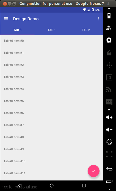
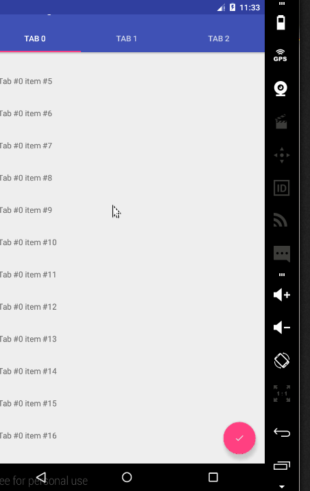
This inflates the previously created layout file. Now the fragment’s view will contain a list of items. Run the app to confirm this.
With that completed, we can look at the scrolling behaviour provided by the CoordinatorLayout.
Modify activity_main.xml as shown.
<android.support.v4.widget.DrawerLayout

    android:id="@+id/drawer_layout"

    xmlns:android="http://schemas.android.com/apk/res/android"

    xmlns:app="http://schemas.android.com/apk/res-auto"

    android:layout_width="match_parent"

    android:layout_height="match_parent"

    android:fitsSystemWindows="true">
    <android.support.design.widget.CoordinatorLayout

        android:id="@+id/coordinator"

        android:layout_width="match_parent"

        android:layout_height="match_parent">
        <android.support.design.widget.AppBarLayout

            android:layout_width="match_parent"

            android:layout_height="wrap_content"

            android:theme="@style/ThemeOverlay.AppCompat.Dark">
            <android.support.v7.widget.Toolbar

                android:id="@+id/toolbar"

                android:layout_width="match_parent"

                android:layout_height="?attr/actionBarSize"

                android:background="?attr/colorPrimary"

                app:layout_scrollFlags="scroll|enterAlways"/>
            <android.support.design.widget.TabLayout

                android:id="@+id/tablayout"

                android:layout_width="match_parent"

                android:layout_height="wrap_content"

                android:background="?attr/colorPrimary"

                app:tabGravity="fill"/>
        </android.support.design.widget.AppBarLayout>
        <android.support.v4.view.ViewPager

            android:id="@+id/viewpager"

            android:layout_width="match_parent"

            android:layout_height="match_parent"

            app:layout_behavior="@string/appbar_scrolling_view_behavior"/>
        <android.support.design.widget.FloatingActionButton

            android:id="@+id/fab"

            android:layout_width="wrap_content"

            android:layout_height="wrap_content"

            android:layout_alignParentBottom="true"

            android:layout_gravity="bottom|right"

            android:layout_marginBottom="@dimen/activity_vertical_margin"

            android:layout_marginRight="@dimen/activity_horizontal_margin"

            android:src="@drawable/ic_done"/>
    </android.support.design.widget.CoordinatorLayout>
    <android.support.design.widget.NavigationView

        android:id="@+id/navigation_view"

        android:layout_width="wrap_content"

        android:layout_height="match_parent"

        android:layout_gravity="start"

        app:headerLayout="@layout/drawer_header"

        app:menu="@menu/drawer"/>

</android.support.v4.widget.DrawerLayout>
In the above, we nest the Toolbar and TabLayout in an AppBarLayout. The AppBarLayout allows the Toolbar and other views (such as tabs provided by TabLayout) to react to scroll events in a sibling view marked with a ScrollingViewBehavior. When the user scrolls through the RecyclerView, the AppBarLayout responds by using its children’s scroll flags to control how they enter (scroll on screen) and exit (scroll off screen).
Flags include:
- scroll: This flag should be set for all views that want to scroll off the screen. For views that do not use this flag, they’ll remain pinned to the top of the screen
- enterAlways: This flag ensures that any downward scroll will cause this view to become visible, enabling the ‘quick return’ pattern
- enterAlwaysCollapsed: When your view has declared a
minHeightand you use this flag, your View will only enter at its minimum height (i.e., ‘collapsed’), only re-expanding to its full height when the scrolling view has reached it’s top. - exitUntilCollapsed: This flag causes the view to scroll off until it is ‘collapsed’ (its
minHeight) before exiting
Note that all views using the scroll flag must be declared before views that do not use the flag. This ensures that all views exit from the top, leaving the fixed elements behind.
In our app we use the scroll and enterAlways flags on the Toolbar which will result in the Toolbar scrolling off screen when scrolling upwards and come back on screen on the downward scroll. Notice the use of app:layout_behavior="@string/appbar_scrolling_view_behavior" on the ViewPager. The support library contains a special string resource @string/appbar_scrolling_view_behavior that maps to AppBarLayout.ScrollingViewBehavior, which is used to notify the AppBarLayout when scroll events occur on a particular view. The behavior must be established on the view that triggers the event.
Run the app to see the effect of scrolling on the AppBar.
CollapsingToolbarLayout
The CollapsingToolbarLayour provides another type of scrolling behaviour to the AppBar. To see it in action, we’ll first create another activity that has a Toolbar, but no TabLayout.
Create a Blank Activity (File -> New -> Activity -> Blank Activity) and name it SecondActivity.
Modify res/layout/activity_second.xml as shown.
<android.support.design.widget.CoordinatorLayout

    xmlns:android="http://schemas.android.com/apk/res/android"

    xmlns:app="http://schemas.android.com/apk/res-auto"

    android:layout_width="match_parent"

    android:layout_height="match_parent">
    <android.support.design.widget.AppBarLayout

        android:layout_width="match_parent"

        android:layout_height="250dp"

        android:theme="@style/ThemeOverlay.AppCompat.Dark.ActionBar">
        <android.support.design.widget.CollapsingToolbarLayout

            android:id="@+id/collapsing_toolbar"

            android:layout_width="match_parent"

            android:layout_height="match_parent"

            app:contentScrim="?attr/colorPrimary"

            app:layout_scrollFlags="scroll|exitUntilCollapsed">
            <ImageView

                android:layout_width="match_parent"

                android:layout_height="match_parent"

                android:scaleType="centerCrop"

                android:src="@drawable/image"

                app:layout_collapseMode="parallax"/>
            <android.support.v7.widget.Toolbar

                android:id="@+id/toolbar"

                android:layout_width="match_parent"

                android:layout_height="?attr/actionBarSize"

                app:layout_collapseMode="pin"/>
        </android.support.design.widget.CollapsingToolbarLayout>
    </android.support.design.widget.AppBarLayout>
    <android.support.v4.widget.NestedScrollView

        android:layout_width="match_parent"

        android:layout_height="match_parent"

        app:layout_behavior="@string/appbar_scrolling_view_behavior">
        <LinearLayout

            android:layout_width="match_parent"

            android:layout_height="match_parent"

            android:orientation="vertical"

            android:paddingTop="24dp">
            <android.support.v7.widget.CardView

                android:layout_width="match_parent"

                android:layout_height="wrap_content"

                android:layout_margin="16dp">
                <LinearLayout

                    android:layout_width="match_parent"

                    android:layout_height="wrap_content"

                    android:orientation="vertical"

                    android:padding="16dp">
                    <TextView

                        android:layout_width="match_parent"

                        android:layout_height="wrap_content"

                        android:text="Lorem ipsum"/>
                    <TextView

                        android:layout_width="match_parent"

                        android:layout_height="wrap_content"

                        android:text="@string/second_activity_text"/>
                </LinearLayout>
            </android.support.v7.widget.CardView>
            <android.support.v7.widget.CardView

                android:layout_width="match_parent"

                android:layout_height="wrap_content"

                android:layout_marginBottom="16dp"

                android:layout_marginLeft="16dp"

                android:layout_marginRight="16dp">
                <LinearLayout

                    android:layout_width="match_parent"

                    android:layout_height="wrap_content"

                    android:orientation="vertical"

                    android:padding="16dp">
                    <TextView

                        android:layout_width="match_parent"

                        android:layout_height="wrap_content"

                        android:text="Sed quam eros"/>
                    <TextView

                        android:layout_width="match_parent"

                        android:layout_height="wrap_content"

                        android:text="@string/second_activity_text"/>
                </LinearLayout>
            </android.support.v7.widget.CardView>
            <android.support.v7.widget.CardView

                android:layout_width="match_parent"

                android:layout_height="wrap_content"

                android:layout_marginBottom="16dp"

                android:layout_marginLeft="16dp"

                android:layout_marginRight="16dp">
                <LinearLayout

                    android:layout_width="match_parent"

                    android:layout_height="wrap_content"

                    android:orientation="vertical"

                    android:padding="16dp">
                    <TextView

                        android:layout_width="match_parent"

                        android:layout_height="wrap_content"

                        android:text="Sed a euismod dui"/>
                    <TextView

                        android:layout_width="match_parent"

                        android:layout_height="wrap_content"

                        android:text="@string/second_activity_text"/>
                </LinearLayout>
            </android.support.v7.widget.CardView>
            <android.support.v7.widget.CardView

                android:layout_width="match_parent"

                android:layout_height="wrap_content"

                android:layout_marginBottom="16dp"

                android:layout_marginLeft="16dp"

                android:layout_marginRight="16dp">
                <LinearLayout

                    android:layout_width="match_parent"

                    android:layout_height="wrap_content"

                    android:orientation="vertical"

                    android:padding="16dp">
                    <TextView

                        android:layout_width="match_parent"

                        android:layout_height="wrap_content"

                        android:text="Fusce nec lacinia mi"/>
                    <TextView

                        android:layout_width="match_parent"

                        android:layout_height="wrap_content"

                        android:text="@string/second_activity_text"/>
                </LinearLayout>
            </android.support.v7.widget.CardView>
            <android.support.v7.widget.CardView

                android:layout_width="match_parent"

                android:layout_height="wrap_content"

                android:layout_marginBottom="16dp"

                android:layout_marginLeft="16dp"

                android:layout_marginRight="16dp">
                <LinearLayout

                    android:layout_width="match_parent"

                    android:layout_height="wrap_content"

                    android:orientation="vertical"

                    android:padding="16dp">
                    <TextView

                        android:layout_width="match_parent"

                        android:layout_height="wrap_content"

                        android:text="Praesent hendrerit"/>
                    <TextView

                        android:layout_width="match_parent"

                        android:layout_height="wrap_content"

                        android:text="@string/second_activity_text"/>
                </LinearLayout>
            </android.support.v7.widget.CardView>
        </LinearLayout>
    </android.support.v4.widget.NestedScrollView>
</android.support.design.widget.CoordinatorLayout>
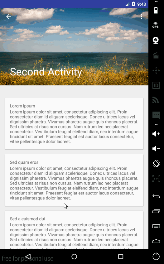
In the above, we use the CollapsingToolbarLayout with the scroll and exitUntilCollapsed flags which will make its subviews scroll off screen. For the Toolbar however, we set app:layout_collapseMode="pin" which will ensure that the Toolbar itself remains pinned to the top of the screen while the view collapses. Another effect we’ll get is that the title in the CollapsingToolbarLayout will appear larger when the layout is fully visible, then transition to its default size as it is collapsed. We’ll set this title in code. The rest of the layout contains a NestedScrollView with several Cards as its children.
In SecondActivity.java modify onCreate(Bundle) as shown.
@Override

protected void onCreate(Bundle savedInstanceState) {

    super.onCreate(savedInstanceState);

    setContentView(R.layout.activity_second);
    Toolbar toolbar = (Toolbar) findViewById(R.id.toolbar);

    setSupportActionBar(toolbar);

    getSupportActionBar().setDisplayHomeAsUpEnabled(true);
    CollapsingToolbarLayout collapsingToolbar = (CollapsingToolbarLayout) findViewById(R.id.collapsing_toolbar);

    collapsingToolbar.setTitle("Second Activity");

}
Here we set up the Up caret on the Toolbar and then set a title for the CollapsingToolbarLayout.
For the Up caret to work, place the following in the manifest file as a child of the SecondActivity’s activity tag.
<meta-data

            android:name="android.support.PARENT_ACTIVITY"

            android:value="com.echessa.designdemo.MainActivity" />
In DesignDemoRecyclerAdapter.java modify `onBindViewHolder() as shown.
@Override

public void onBindViewHolder(ViewHolder viewHolder, int i) {

    String item = mItems.get(i);

    viewHolder.mTextView.setText(item);
    viewHolder.mTextView.setOnClickListener(new View.OnClickListener() {

        @Override

        public void onClick(View view) {

            Context context = view.getContext();

            context.startActivity(new Intent(context, SecondActivity.class));

        }

    });

}
In the above, we set an onClick Listener to the TextView on each row of the RecyclerView. This is not the best way of setting a listener on the RecyclerView items, because if you run the app, the listener’s touch target will only cover the area with the row’s text and not the whole row. I do this here because all I want is a way to start the new activity and so I opted on a way to write the least amount of code.
Run the app and you will see the following scrolling behaviour.
Floating Labels for EditText
The last component of the Design Support Library that we’ll look at is the improved EditText. Normally when typing is started on an EditText, the placeholder hint that was on the field is hidden. Now you can wrap an EditText in a TextInputLayout causing the hint text to become a floating label above the EditText, ensuring that users never lose context in what they are entering.
To see this, place the following inside one of the CardViews in activity_second.xml. You can place it after the second TextView of the Card.
<android.support.design.widget.TextInputLayout

                    android:layout_width="match_parent"

                    android:layout_height="wrap_content">
                    <EditText

                        android:layout_width="match_parent"

                        android:layout_height="wrap_content"

                        android:inputType="textEmailAddress"

                        android:hint="Email" />
                </android.support.design.widget.TextInputLayout>
Run the app and when you start to type into the EditText, the hint text will float above the field.
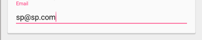
In addition to showing hints, you can display an error message below the EditText by calling setError().
Conclusion
That brings us to the end of this tutorial. The completed project for the tutorial can be downloaded here. For more on the Android Design Support Library, read the Android developers blog.
Frequently Asked Questions (FAQs) about Material Design in Android
What is the Material Design in Android?
Material Design is a design language developed by Google. It was first introduced in 2014 as part of Android’s Lollipop update. The design language aims to create a visual language that synthesizes classic principles of good design with the innovation and possibility of technology and science. It is used in many Google applications and has been adopted by many other developers for their Android applications.
How does Material Design improve the user experience?
Material Design improves the user experience by providing a unified system that combines theory, resources, and tools for crafting digital experiences. It uses grid-based layouts, responsive animations and transitions, padding, and depth effects such as lighting and shadows to create a more intuitive and seamless user experience. This helps users understand the hierarchy and importance of information, making it easier to navigate and interact with the application.
How can I implement Material Design in my Android application?
To implement Material Design in your Android application, you can use the Android Design Support Library. This library provides a set of APIs and design widgets that make it easier to incorporate Material Design into your app. It includes components like navigation drawers, floating action buttons, snack bars, and tabs. You can also use Material Components, a modular and customizable UI component library that implements Material Design.
What are the key principles of Material Design?
The key principles of Material Design are Material is the metaphor, Bold, graphic, intentional, and Motion provides meaning. These principles guide the design and interaction patterns, and they help create a visual language that is understandable and predictable.
How does Material Design differ from other design languages?
Material Design differs from other design languages in its emphasis on motion and depth effects. It uses lighting and shadows to create depth, and responsive animations to create a sense of continuity. This makes the interface feel more tangible and realistic. It also uses bold colors and typography to create hierarchy and focus.
Can I customize Material Design to fit my brand?
Yes, Material Design is highly customizable. You can customize the color, typography, and shape of your components to fit your brand. Material Components, for example, provides a theming system that allows you to customize your app’s appearance and behavior.
What are some examples of Material Design in Android apps?
Some examples of Material Design in Android apps include Google Maps, Gmail, and Google Photos. These apps use Material Design principles to create a consistent and intuitive user experience.
What are the benefits of using Material Design?
The benefits of using Material Design include a more intuitive and seamless user experience, a consistent look and feel across different platforms, and the ability to customize the design to fit your brand. It also provides a set of guidelines and resources that can help you design your app more efficiently.
How can I learn more about Material Design?
You can learn more about Material Design by visiting the official Material Design website. It provides a comprehensive guide to the design language, including its principles, components, and resources. You can also find tutorials and examples to help you get started.
What are some challenges of implementing Material Design?
Some challenges of implementing Material Design include understanding its principles and guidelines, customizing the design to fit your brand, and ensuring compatibility across different devices and screen sizes. However, with the right resources and tools, these challenges can be overcome.