Logo Brief: The London 2012 Education Logo
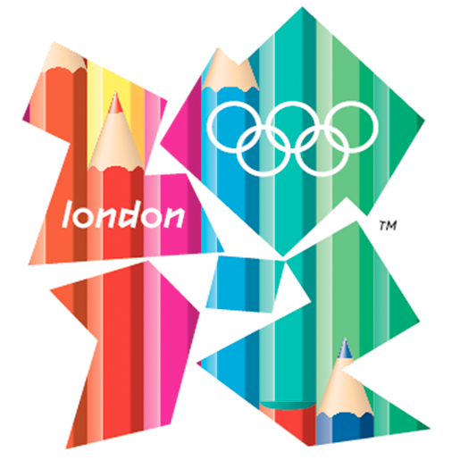
In 2009, London 2012 ran a competition inviting young designers the opportunity to create a special version of the London 2012 logo. Designers aged between 16 and 21 were eligible to enter an “infill” for the existing London Olympics logo which will sit alongside the official and Paralympics logos. The resulting logo will be known as the Education logo.
The winner of the competition was 18-year-old Reiss Evans, whose design was based on the idea of pencils and their use in education.
The idea came from thinking about how everyone uses pencils, right form the earliest age through to adulthood and your whole life. They represent school and education.
As well as seeing his logo used by schools and colleges in the UK, Reiss also got the opportunity to work for two weeks at FutureBrand, London 2012’s creative agency.
Official London Logo
The London 2012 logo was surrounded in controversy when it was first revealed in 2007. Created by Wolf Olins, the logo was hit with a storm of abuse due to its design and the cost nvolved. The brand (not just the logo) cost £400,000. The jagged emblem, made from the numbers 2 0 1 2, comes in pink, green, orange and blue and is loosely inspired by graffiti art.
British newspapers went on the rampage and needless to say comments on the blogs were not favorable. “To me it represents two drunks trying to help each other up off the ground – very British indeed.”
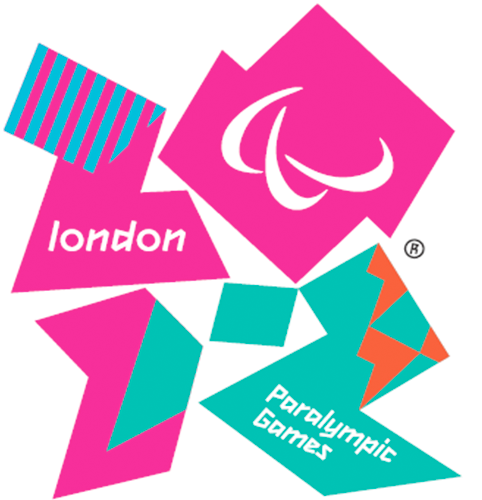
For the first time in Olympic logo history, the same logo will be used for the Olympic and Paralympics games. Plans have also been drawn up to create a different logo for grassroots projects backing the Games, and the new education logo is one example of this.
What do you think of the new 2012 Education logo? And dare I ask, the official logo?
Frequently Asked Questions (FAQs) about Logo Design
What are the key elements to consider when designing a logo for an educational institution?
When designing a logo for an educational institution, it’s important to consider elements that reflect the institution’s values, mission, and identity. This could include symbols related to education, such as books, pens, or graduation caps. The color scheme should be appealing and representative of the institution’s spirit. Typography also plays a crucial role; it should be legible and professional. Lastly, the logo should be versatile, meaning it should look good in different sizes and on different platforms.
How does the London 2012 Education logo reflect its purpose?
The London 2012 Education logo was designed to represent the spirit of the Olympic and Paralympic Games. The logo’s vibrant colors and dynamic shapes reflect the energy, diversity, and unity of the Games. The logo also incorporates the Olympic Rings and the Paralympic Agitos, symbolizing the global nature of the event and its commitment to inclusivity.
What is the significance of color in logo design?
Color plays a significant role in logo design as it can evoke emotions and convey a brand’s personality. For instance, blue often represents trust and reliability, while red can signify passion and energy. It’s important to choose colors that align with the brand’s identity and resonate with the target audience.
How can I make my logo design unique and memorable?
To make your logo design unique and memorable, focus on creating a simple yet distinctive design. Avoid using overly complex elements as they can make the logo difficult to remember. Incorporate elements that are relevant to your brand and resonate with your target audience. Also, consider the use of colors and typography that reflect your brand’s personality.
What is the role of typography in logo design?
Typography is a crucial element in logo design as it can significantly impact the logo’s overall look and feel. The choice of font can convey a brand’s personality and values. For instance, a serif font may give a traditional, respectable feel, while a sans-serif font can give a modern, clean look. It’s important to choose a font that is legible and works well with other elements in the logo.
How does the Paralympic symbol differ from the Olympic symbol?
The Paralympic symbol, known as the Agitos, consists of three swooshes in red, blue, and green, symbolizing the Paralympic motto “Spirit in Motion”. On the other hand, the Olympic symbol consists of five interlocking rings in blue, yellow, black, green, and red, representing the five continents of the world united by Olympism.
What is the importance of versatility in logo design?
Versatility in logo design means that the logo should work well in different sizes and on different platforms. A versatile logo maintains its legibility and impact whether it’s on a business card, a billboard, or a digital platform. This is crucial in today’s digital age where logos need to be adaptable to various mediums.
How can I incorporate my brand’s values into my logo design?
Incorporating your brand’s values into your logo design can be achieved through the use of symbols, colors, and typography. For instance, if your brand values sustainability, you might use green in your logo. If your brand values innovation, you might use a modern, unique design. It’s all about creating a visual representation of what your brand stands for.
What is the process of designing a logo?
The process of designing a logo typically involves research, brainstorming, sketching, prototyping, and refining. It starts with understanding the brand, its values, and its target audience. Then, ideas are brainstormed and sketched out. These sketches are then turned into digital prototypes, which are refined until the final logo is achieved.
How can I ensure my logo design is effective?
To ensure your logo design is effective, it should be simple, memorable, versatile, appropriate, and timeless. It should convey your brand’s personality and resonate with your target audience. It’s also important to test your logo in different contexts and get feedback to ensure it works well in various applications.
Jennifer Farley is a designer, illustrator and design instructor based in Ireland. She writes about design and illustration on her blog at Laughing Lion Design.


