Many developer-business owners and entrepreneurs I speak to have fallen prey to the “this thing I built will sell itself” trap. Then they wonder why no one downloads their new product, or signs up to their new service. Then they call in a copywriter.
What’s the problem here? If you ask me, the strong focus on MVP among startups doesn’t help.
A minimum-viable-product focus sees your team working round the clock to ship something. They get to launch date, and realise they don’t really have any product information—collateral, if you will—to support that launch.
So they whack a signup or download page together, list their app in the App store and Play, and tweet about it. The MO is: build something that works, get it out there, and see if it flies.
But what’s the point of racing to launch an MVP if that’s all you’re going to do? An MVP might make business sense. What doesn’t is to follow it up with an MVW—a minimum viable website.
In this article, we’ll see how you can easily support your next product or service launch with a smart landing page—and without a copywriter if your launch budget won’t allow it.
Let’s take a look at a new, recently released app that’s close to home: SitePoint’s own podling.
An MVW in action
The website that accompanied the recent release of podling is really just a landing page with four words on it.
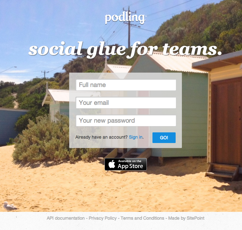
To find out anything about this service, you need to go offsite, to the podling page on the Apple store, where you get a brief description of the app, and a screen capture.
Many Apple app developers will argue that the page on the Apple store is the main game, and that the website doesn’t matter. But if you’re really going to grow your market beyond the first wave of innovators, you’ll need more than an Apple store page.
What’s an innovator? In any audience, there are five types of customers: innovators, early adopters, early majority, late majority and laggards. Only one of these groups—the risk-taking, tech-loving innovators—is going to bother downloading an app to find out what it does and work out how it can help them. And only a small portion will bother to do that. After all, there are plenty of apps out there. Why should they bother downloading yours?
So what’s the solution here? Do you need a full-blown website for your MVP? Well, no—but if you’re going to give your product or service the best chance of getting audience attention and uptake—an MVA (minimum viable audience), you might say—you’re going to need more than an MVW.
Let’s take a look at another example that ups the ante.
Instagram: basic, done well
The Instagram site does a pretty good job of presenting the app. While Instragram is not an MVP, this kind of website is achievable by any startup or small business.
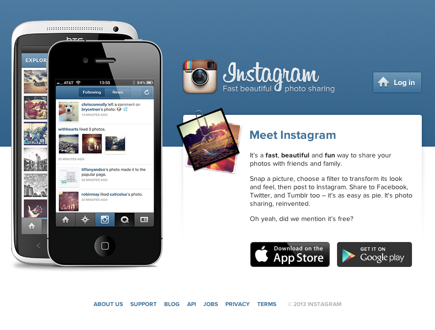
Like podling’s, this landing page contains the brand name and a four-word tagline. It also has links to the Apple store and Play—to download pages that offer a range of screenshots and details about the app.
But Instragam has a couple of extra assets on its website.
The first is a little blurb, containing key words from the brand vocabulary, which is closely aligned with the category (photography) vocabulary: filters, share, post, and photos.
Why not introduce your new product or service with a quick, friendly elevator pitch? Sure, writing a quick, friendly elevator pitch that means something to users is easier said than done. But it is doable.
The other assets Instagram is using to promote downloads? Help content and a blog link.
Few startups have a blog to point users to at the launch of their product. That’s fine. Linking to your blog from your landing page once you have both assets is, I hope, a no-brainer.
But what about FAQs? Instagram calls this “Support” in its IA, but “Help Centre” at the source.
As Instagram has done, you might just link to your FAQs from your landing page footer. This:
- shows you care. The fact that you’ve got FAQs suggests that you care about your users, not just your glorious technology.
- shows that you understand users. You know that not everyone will want to sign up or download to find out about your offering. Your FAQs are free information for those who want it.
- shows that you’re serious. FAQs show you’re committed to your product or service. The fly-by-nighters wouldn’t bother to create FAQs, would they? No. But you have, because you’re building something bigger than an app—you’re building a business, and relationships with real people: your users.
- is not “in your face.” If users want more information, the reasoning goes, they’ll likely look around for it. If they don’t—if they’re happy to download—they won’t even notice you have FAQs. They’re there if you want them, and will probably go largely unnoticed if you don’t.
Note that your FAQs don’t need to be as extensive as these—you could just have a handful of key questions at launch, and build on them over time. No big deal.
Think about it: most of us know what Instagram is and does. Yet the business provides all this information. On the other hand, countless new-to-market apps with no authority or brand presence tell users next to nothing about themselves.
Don’t hope users will bother to download your app to find out what it does. That is no way to build a userbase.
Focus instead on providing them with access to all the content assets—all the information you have about your new product that may interest them. Use what you have to tell your product or service story.
No, users probably won’t need it all. But different users look for different pieces of information, and different types of reassurance. Your landing page needs to address as many of them as it can if your MVP is going to attract an MVA.
Going further
Okay, so to launch your MVP, you want a landing page that has:
- your brand name and tagline
- some information about what the product or service does for the user
- a sign up form or link to download as required
- a link to support or FAQs that provides more information for those who want it.
What if your product or service is a little more involved than Instagram? And what are you going to do with that demo video you stuck on YouTube so you could tweet it? What about that recommendation you got from an influencer in your industry?
Take a leaf out of Evernote’s book: they’ve smartly integrated these elements—along with selected FAQs and blog posts—into their landing page.
Evernote’s even gone so far as to include links to “Product Guides”, which detail the technical features of each release for each platform.
You might not have this level of user-friendly documentation. But let’s say you wrote a whitepaper or ebook that explains your offering to encourage people to sign up for your service. Could you include that as a permanently offered download from your product’s landing page?
Could you embed your YouTube demo? Could you add that great comment the industry pundit said about your brand as a featured quote?
The answers to these questions will depend on the nature of the content assets you have at your fingertips, and your audiences. And, of course, the goal isn’t just to jam a whole lot of stuff on your landing page.
But if you’re launching an MVP, and you have any content assets that could be presented to, or repurposed for, potential customers, take a look at them. See what’s worth including—and where there are information gaps that you need to fill.
“Lighter is better” … or is it?
One objection I hear to this position—in which you provide information on your new product or service, rather than expecting people to learn about it by using it—is that “it’s too much.”
“Too much information is overwhleming,” people say. “It’s a simple product! So simple! It doesn’t need a bunch of words around it. I’d rather let the app speak for itself.”
Newsflash: if your landing page doesn’t convince users to download your product or sign up for your service, it’s not going to get a chance to speak for itself.
Remember the Instagram example. You could hardly say there was too much information on that landing page.
When you’re launching a product or service, less information probably won’t mean more customers. Including, or linking to, carefully chosen, well-pitched supporting content on your landing page is the smarter way to sell your new product or service.
What does your product or service landing page look like? Does it use key words from your brand vocabulary? Does it provide users with enough information to pique their interest—and download or sign up? Let us know in the comments.
 Georgina Laidlaw
Georgina has more than fifteen years' experience writing and editing for web, print and voice. With a background in marketing and a passion for words, the time Georgina spent with companies like Sausage Software and sitepoint.com cemented her lasting interest in the media, persuasion, and communications culture.