

As most of us are probably aware, Bootstrap and Foundation are the current leaders among front-end development frameworks. But history has shown us that eventually something better will come along and in this case that might not be so far away.
This article will introduce you to a new candidate on the framework landscape called Semantic UI.
Semantic UI is a modern front-end development framework, powered by LESS and jQuery. It has a sleek, subtle, and flat design look that provides a lightweight user experience.
According to the Semantic UI website, the goal of the framework is to empower designers and developers “by creating a language for sharing UI”. They do this by leveraging a semantic, descriptive language for its classes and naming conventions. Instead of using abbreviations, as other frameworks do, it utilizes real words in a manner closer to plain English.
Key Takeaways
- Semantic UI is a modern front-end development framework that emphasizes human-friendly HTML, using natural language for class names which enhances readability and ease of use compared to other frameworks like Bootstrap and Foundation.
- The framework is structured around five descriptive categories: UI Elements, UI Collections, UI Views, UI Modules, and UI Behaviors, which aid in building diverse and interactive web interfaces.
- Semantic UI offers unique features and components not available in other frameworks, such as real-time debug outputs and exclusive UI components like Feed and Comment, enhancing development diagnostics and user interface options.
- It supports extensive customization with minimal and neutral default styling, making it adaptable for various design preferences and ensuring components are portable and self-contained for flexible use across projects.
- Semantic UI is well-documented and includes a style guide, making it accessible for beginners and efficient for experienced developers to learn and implement effectively.
Features
Semantic UI is unique in two ways. First is the way the framework is structured. It uses five descriptive categories to define re-usable UI components.
- A UI Element is a basic building block. It can appear alone or in uniform groups. For example, a button can be independent or put in a button group.
- A UI Collection is a group of different kinds of elements that are interdependent. For example, a web form can have buttons, inputs, checkboxes, icons, and so forth.
- A UI View represents a common piece of website content. For example, a feed or comments section.
- A UI Module is a component with interactive JavaScript-based functionality. Examples include an accordion, dimmer, modal, and so on.
- A UI Behavior is a component that can’t exist independently, but instead is used to inject functionality into other components. For example, the Form Validation behavior provide validation functionality for the Form component.
Almost every component has types, states and variations. For example, some of the button component’s types include: standard button, button with icon, animated button and a button can be in the active, disabled, or loading state. Finally, a button can vary in size and color, and can be formatted as basic, social, fluid, toggle, and more. This scheme gives you a great amount of flexibility in a component’s appearance.
As you can see, Semantic UI is not only meaningful and well structured in terms of naming its classes but also in naming, defining, and describing its components. This structure is much more semantic compared to that found in Bootstrap or Foundation.
The second unique thing about Semantic UI is that it provides some exclusive features and components not present in other frameworks. For example, Feed and Comment in the UI Views components or Sidebar and Shape from the UI Modules. Also, when interacting with Semantic UI components you get real-time debug output. Just open up your web console and you’ll see your components communicating exactly what they’re doing.
Another strength of Semantic UI is that it uses minimal and neutral styling, leaving customization open to you. It includes important and useful things while leaving out additional features that you’ll probably never use. Plus, the framework’s components are portable and self-contained so you can grab and use only those you need.
The framework uses em and rem units for its elements, making it fully responsive and adaptive to any size. You need only to change the base font and all other elements will adjust accordingly.
Finally, Semantic UI is very well documented and the website provides many examples for the different components. In addition, it has a style guide with techniques and directions on how to write your code. All this makes learning the framework a pain-free experience.
To find how Semantic UI integrates with others projects and tools check out the integration page.
To see how a website built with Semantic UI looks you can visit Quirky.
OK. So far, so good. But I think this overview of Semantic UI won’t be fully complete without getting our hands a little dirty. So let’s taste the sweetness of Semantic UI right now. I’ll show you how to create an awesome Sign In/Sign Up form using a variety of Semantic UI components.
How to Create a Sign In/Sign Up Form with Semantic UI
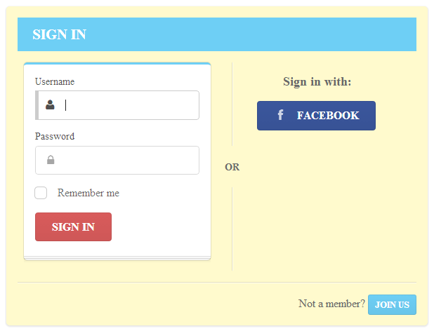
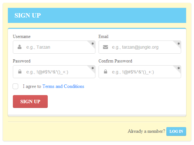
We’re going to create a form that switches views depending on whether the user want to “Sign In” or “Sign Up”. Here is how the views will look:
First download Semantic UI, open the zipped file and extract the folder called “packaged”. Rename the to Semantic UI Form Example (or something else that you can use to identify it easily).
To see a working demo of our form example just download the complete form.html file and put it into the Semantic UI Form Example folder. Open the form.html file in your browser and play with the form to get the sense of it. Now I’m going to show you how to recreate the form by displaying and explaining the code involved.
To start, rename the file to complete_form.html and create an empty file called form.html. Open it and add the following HTML:
<!DOCTYPE HTML>

<html>

<head>

  <meta charset="utf-8" />

  <title>Semantic UI Sign In/Sign Up Form</title>
  <link href="css/semantic.css" rel="stylesheet" type="text/css" />
  <style type="text/css">
  </style>
</head>

<body>
  <!-- content will go here -->
  <script src="https://code.jquery.com/jquery-1.10.2.min.js"></script>

  <script src="javascript/semantic.js" type="text/javascript"></script>
  <script type="text/javascript">
  </script>

</body>

</html>
This is our starting template. It links to the semantic.css and semantic.js files, and adds reference to the jQuery library. It also has script and style tags for the JavaScript and CSS that we’re going to add. I’m including the JavaScript and CSS internally only for learning purpose, because it’s easier and you don’t need to jump between multiple files. But in real-world projects it’s always better to use external files.
Before we get started, let’s consider how Semantic UI works. All component definitions begin with a class of ui followed by the name of the component. For example, to add a Button element you just give it a class of ui button. To add states and/or variations just insert the needed classes. For example, to create a button that changes its color to blue on hover, add the hover state class and blue variation class: ui hover blue button.
Let’s get back to our form. I’m not going to explain what each class does, because the classes are more or less self-descriptive and you can see more on their meanings in the documentation.
The first thing we need to do is to add a Segment element which will contain our form. We do this by adding a div tag with a class of ui raised segment signin. For the form’s title, we use an h3 tag with a class of ui inverted blue block header. Next we create a two-column grid with a vertical divider between the columns. In the first column we add a div with a class of ui blue stacked segment, which will hold our form elements. At the bottom we put another Divider element, and a div with a class of footer.
<div class="ui raised segment signin">

  <h3 class="ui inverted blue block header"> SIGN IN </h3>

  <div class="ui two column grid basic segment">

    <div class="column">

      <div class="ui blue stacked segment">

           <!-- form here -->

      </div>

    </div>

    <div class="ui vertical divider"> OR </div>

    <div class="center aligned column">

      <!-- Facebook button here -->

    </div>

  </div>

  <div class="ui divider"></div>

  <div class="footer">

    <!-- text plus button here -->

  </div>

</div>
Now we need to add some styling. Put the code below inside your currently empty style tags.
body, .ui.vertical.divider {

  color: #696969;

}
.ui.vertical.divider {

  margin: 0 4px;

}
.ui.raised.segment {

  background-color: #fffacd;

  width: 600px;

  margin-top: 0;

  position: fixed;

  left: 10px;

  top: 10px;

}
Next, in the first column (where the HTML comment says “form here”) we add the code for the form. To create the form we add a div tag with a class of ui form. Then we put two more div tags each with a class of field, another one with a class of inline field, and finally one with a class of ui red submit button. The first two fields are for Username and Password. In the third div, which is formatted to be inline, we put a checkbox.
<div class="ui form">

  <div class="field">

    <label> Username </label>

    <div class="ui left labeled icon input">

      <input type="text">

      <i class="user icon"></i>

    </div>

  </div>

  <div class="field">

    <label> Password </label>

    <div class="ui left labeled icon input">

      <input type="password">

      <i class="lock icon"></i>

    </div>

  </div>

  <div class="inline field">

    <div class="ui checkbox">

      <input id="remember" type="checkbox">

      <label for="remember"> Remember me </label>

    </div>

  </div>

  <div class="ui red submit button"> Sign In </div>

</div>
In the second column with class center aligned column (where the HTML comment says “Facebook button here”) we use an h4 heading and add Semantic UI’s Facebook social button:
<h4 class="ui header"> Sign in with: </h4>

<div class="ui facebook button">

  <i class="facebook icon"></i>

  Facebook

</div>
We complete the footer by adding some text and an animated button that will switch our form from Sign In to Sign Up. The following HTML gets added where the HTML comment says “text plus button here”:
<div class="text"> Not a member? </div>

<div class="ui vertical animated blue mini button signup">

  <div class="visible content"> Join Us </div>

  <div class="hidden content">

    <i class="users icon"></i>

  </div>

</div>
We’ll also need to add some styling to render our footer properly. Add the following CSS below the existing CSS inside our style tags:
.footer {

  text-align: right;

}
.text {

  display: inline;

}
Now the first side (“Sign Up”) is ready. Let’s create the second. We start with the following code which is similar to that which we’ve already covered. This HTML gets added below all of our existing HTML:
<div class="ui raised segment signup inactive">

  <h3 class="ui inverted blue block header"> SIGN UP </h3>

  <div class="ui blue stacked segment">

       <!-- form here -->

  </div>

  <div class="ui divider"></div>

  <div class="footer">

    <div class="text"> Already a member? </div>

    <div class="ui vertical animated blue mini button signin">

      <div class="visible content"> Log In </div>

      <div class="hidden content">

        <i class="sign in icon"></i>

      </div>

    </div>

  </div>

</div>
Next we add the code for the form inside the segment element, in the HTML we just added (where the HTML comment says “form here”). The div with class ui error message is put at the end of the form because the Form Validation behavior that we’ll add later on requires it to show errors to the user.
<div class="ui form">

  <div class="two fields">

    <div class="field">

      <!-- Username here -->

    </div>

    <div class="field">

      <!-- Email here -->

    </div>

  </div>

  <div class="two fields">

    <div class="field">

      <!-- Password here -->

    </div>

    <div class="field">

      <!-- Confirm Password here -->

    </div>

  </div>

  <div class="inline field">

    <!-- checkbox here -->

  </div>

  <div class="ui red submit button"> Sign Up </div>

  <div class="ui error message"></div>

</div>
Notice each of the field elements in the above HTML has a comment indicating which part of the form we’ll add in each one. Let’s do that now.
Here is the code for the Username field:
<label> Username </label>

<div class="ui left labeled icon input">

  <input id="username" placeholder="e.g., Tarzan" type="text">

  <i class="user icon"></i>

  <div class="ui corner label">

    <i class="asterisk icon"></i>

  </div>

</div>
Here is the code for the Email field:
<label> Email </label>

<div class="ui left labeled icon input">

  <input id="email" placeholder="e.g., tarzan@jungle.org" type="text">

  <i class="mail icon"></i>

  <div class="ui corner label">

    <i class="asterisk icon"></i>

  </div>

</div>
Here is the code for the Password field:
<label> Password </label>

<div class="ui left labeled icon input">

  <input id="password" placeholder="e.g., !@#$%^&*()_+:)" type="password">

  <i class="lock icon"></i>

  <div class="ui corner label">

    <i class="asterisk icon"></i>

  </div>

</div>
Here is the code for the Confirm Password field:
<label> Confirm Password </label>

<div class="ui left labeled icon input">

  <input id="confirm-password" placeholder="e.g., !@#$%^&*()_+:)" type="password">

  <i class="lock icon"></i>

  <div class="ui corner label">

    <i class="asterisk icon"></i>

  </div>

</div>
And the code for the checkbox:
<div class="ui checkbox">

  <input id="terms" type="checkbox">

  <label for="terms"> I agree to the <a href="#"> Terms and Conditions </a></label>

</div>
We also add styling for the links:
a {

  text-decoration: none;

  color: #1E90FF;

}
Now that the two parts of our form are ready, we need to add the code for switching from one side of the form to the other. Put the following code into the empty script tag.
$( document ).ready(function() {
  // Hide Sign Up side on initialization

  $( '.inactive' ).hide();
  $( '.mini.button.signup' ).click(function() {
    // Hide Sign In and show Sign Up side with slide down effect

    $( '.ui.segment.signin' )

      .hide()

      .end()

    .find( '.ui.segment.signup' )

      .slideDown();
  });
  $( '.mini.button.signin' ).click(function() {
    // Hide Sign Up and show Sign In side with slide down effect

    $( '.ui.segment.signup' )

      .hide()

      .end()

    .find( '.ui.segment.signin' )

      .slideDown();
  });

});
Our form looks nice — but what if a user types invalid values? We need to add validation. We do this by adding the following code inside our script tag, after the code we just added above:
$( '.ui.form' )

  .form({

    username: {

      identifier : 'username',

      rules: [

        {

          type   : 'empty',

          prompt : 'Please enter a username'

        }

      ]

    },

    email: {

      identifier : 'email',

      rules: [

        {

          type   : 'email',

          prompt : 'Please enter a valid email addres'

        }

      ]

    },

    password: {

      identifier : 'password',

      rules: [

        {

          type   : 'empty',

          prompt : 'Please enter a password'

        },

        {

          type   : 'length[6]',

          prompt : 'Your password must be at least 6 characters'

        }

      ]

    },

    passwordConfirm: {

      identifier : 'confirm-password',

      rules: [

        {

          type   : 'empty',

          prompt : 'Please confirm your password'

        },

        {

          type   : 'match[password]',

          prompt : 'Password doesn\'t match'

        }

      ]

    },

    terms: {

      identifier : 'terms',

      rules: [

        {

          type   : 'checked',

          prompt : 'You must agree to the terms and conditions'

        }

      ]

    }

});
You can read more about how the above code works in the documentation.
Well done! This is a fairly simple example and with it we’ve only scratched the surface of the capabilities of Semantic UI.
Conclusion
As you can see, Semantic UI is a new, fresh and, in some aspects, unique addition to the landscape of front-end development frameworks. From what we’ve considered here, although it’s, as of this writing, only a few months old, you can see that it’s quite promising and deserves to be on many developers’ watch lists for this year.
Once again, you can download the complete tutorial file here and remember to add it inside the “packaged” folder when you unzip the full Semantic UI library.
Frequently Asked Questions (FAQs) about Semantic UI Component Library
What Makes Semantic UI Different from Other UI Libraries?
Semantic UI stands out from other UI libraries due to its human-friendly HTML. It allows for faster and more intuitive development. The classes in Semantic UI use syntax from natural languages like noun/modifier relationships, word order, and plurality to link concepts intuitively. This makes the code more readable and easier to understand, even for beginners.
How Can I Get Started with Semantic UI?
To get started with Semantic UI, you need to first install it. You can do this by using the npm command: npm install semantic-ui. After installation, you can import the Semantic UI CSS and JavaScript into your project. Then, you can start using the Semantic UI components in your HTML.
Can I Use Semantic UI with React?
Yes, Semantic UI can be used with React. There is a specific library called Semantic UI React that is the official React integration for Semantic UI. It allows you to use Semantic UI components and themes directly in your React application.
How Can I Customize Themes in Semantic UI?
Semantic UI allows you to customize themes by modifying the theme.config file. This file acts as a central setting for all your theme’s variables. You can change the values of variables to customize the appearance of your theme.
What Are Some Common Components in Semantic UI?
Semantic UI offers a wide range of components. Some of the common ones include Buttons, Icons, Headers, Dividers, Labels, Lists, and Cards. Each component comes with its own set of variations and options for customization.
How Can I Use Semantic UI for Responsive Design?
Semantic UI supports responsive design through its grid system. The grid system allows you to specify different column widths for different screen sizes, ensuring your design looks good on all devices.
How Can I Contribute to Semantic UI?
You can contribute to Semantic UI by submitting pull requests on its GitHub repository. Before submitting a pull request, make sure to read the contributing guidelines provided by the Semantic UI team.
How Can I Use Semantic UI with Angular?
While there is no official Angular integration for Semantic UI, you can still use it with Angular by manually including the Semantic UI CSS and JavaScript files in your project.
How Can I Update Semantic UI?
You can update Semantic UI by running the npm update semantic-ui command. This will update Semantic UI to the latest version.
What Are Some Alternatives to Semantic UI?
Some alternatives to Semantic UI include Bootstrap, Foundation, Material-UI, and Bulma. Each of these libraries has its own strengths and weaknesses, so the best choice depends on your specific needs and preferences.