In the first article of this brand new series, I have introduced the main objectives of the series and given a short but complete introduction on the critical components of media queries and responsive breakpoints. Now, it’s time to begin doing some practical work. As I have mentioned before, I’ll start with the planning and creation of a mockup for each of the three main device types on which our responsive website will be designed, tested, and displayed: PC desktops, tablets, and mobile phones.
3…2…1… Let’s Start!
Before continuing, I want to give you a little advice: remember that the more mockups you do, the more arduous and confusing your job will become. Responsive mockups are not the same as static mockups; you don’t really know where your content will be placed, because it depends on the screen size.
Obviously, as we’ve seen in the previous series, designing mockups for every screen size is nearly impossible, because there are potentially hundreds of screens, layouts, and orientations that you have to accommodate. This is why I suggest that you select your target screens/layouts and build the project mockups only for your top three main devices’ categories.
For obvious reasons, I won’t show you how to design and build the entire website, but I’ll focus on the homepage, although I’m sure that once you have understood the logic and basis of responsive web design, you’ll be able to proceed with building the entire portal and everything will fall into place. I should reiterate that creating mockups doesn’t usually require that you lay out every single view to perfection, and that they are effective as soon as they’re enough of an abstraction of the final product (website or app) that they give you sufficient information to begin building.
I have chosen to build my project mockup using Balsamiq Mockups. As I have explained in detail in the linked article, Balsamiq Mockups is a tool that helps developers to create wireframes and communicate with clients and coworkers with visual representations of their design plans. Balsamiq is offline desktop software, and you can work with it using the operating system of your choice, since it runs on Mac, Windows, and Linux.
Let’s start planning the mockup of our website working on the PC desktop version.
First and foremost, let me introduce the kind of website we’re going to desogm and all of the elements that we’ll find within it. In fact, when building a web app or website, it’s a good practice to identify your content ahead of time and designate respective content areas within the website template. For our purposes, we’ll build a website with main content topics like graphics, web design and mobile development, a place where the design-addicted can read articles about their favourite fields, discuss, learn new techniques, and stay informed.
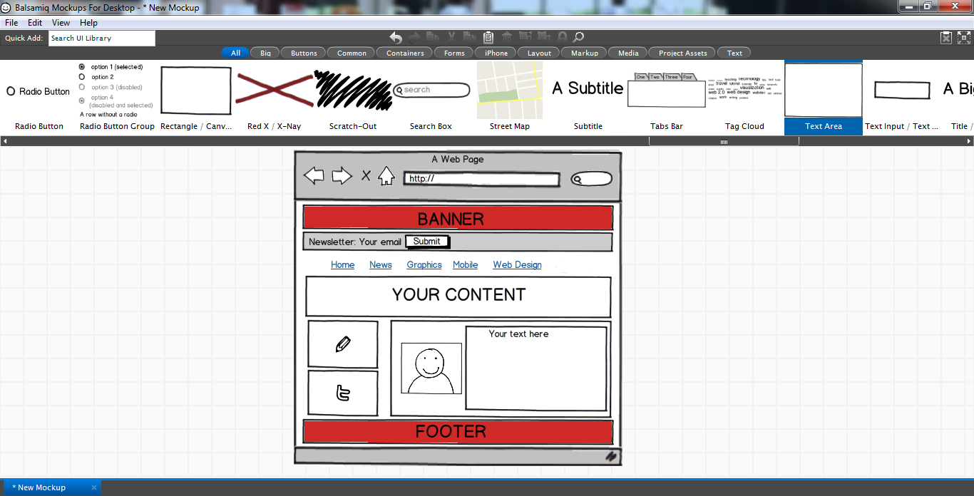
Let’s see how can we proceed using the elements of Balsamiq Mockups and focus on one target layout first. We have to work on the placement of blocks on the layouts, and as a first step, I place the browser window shape to represent the profile of any browser page and set its size using slight adjustments with the mouse.
As for the style of the main page, the first thing to determine is which elements we want to show on our brand new homepage. Generally, we might find a header, a newsletter bar, a menu-list, some sidebars (based on the extra-content you want to enter), a text box for the most important information, an image, or some links, for example.
Thanks to its simple, intuitive drag-and-drop system, we can easily add everything we want with a few clicks. For the first components of our page, we have to open the category called “Big.” Here, we’ll find the following elements elements: title/headline, the text area, and the image box. So, drag and drop each of these into your mockup. Then, open the category “Common” to find rectangles, text areas, text input boxes, image and icons’ indicators, and link pointers. Let’s place the two sidebars to the left of the author information box (where it could be nice adding a photo) under the main content box, which occupies the full window width.
At this point, our design concept should look something like this:
Once you’ve dragged and dropped the elements, you’ll see that each element has extensive editing options. When you click on the title/headline or within the text box, you’ll see a typical text editor, where you’ll be able to specify the characteristics or content. You can modify texts selecting size, text alignment, format, and color. You can also set the background color, set the border color, add a scrollbar, and play with opacity and focus.
For images, we can show or hide a border, crop the image, and hyperlink the chosen image to lead to a new URL or screen. Since this is a mockup project intended mainly to keep in mind all the page elements and their arrangement, is not necessary in my opinion to make ultra-precise stylistic changes. What is important is to have a sort of “skeleton,” or a point of departure to fix attention on what is necessary to build into the structure with the help of the HTML code and the CSS3 styling rules.
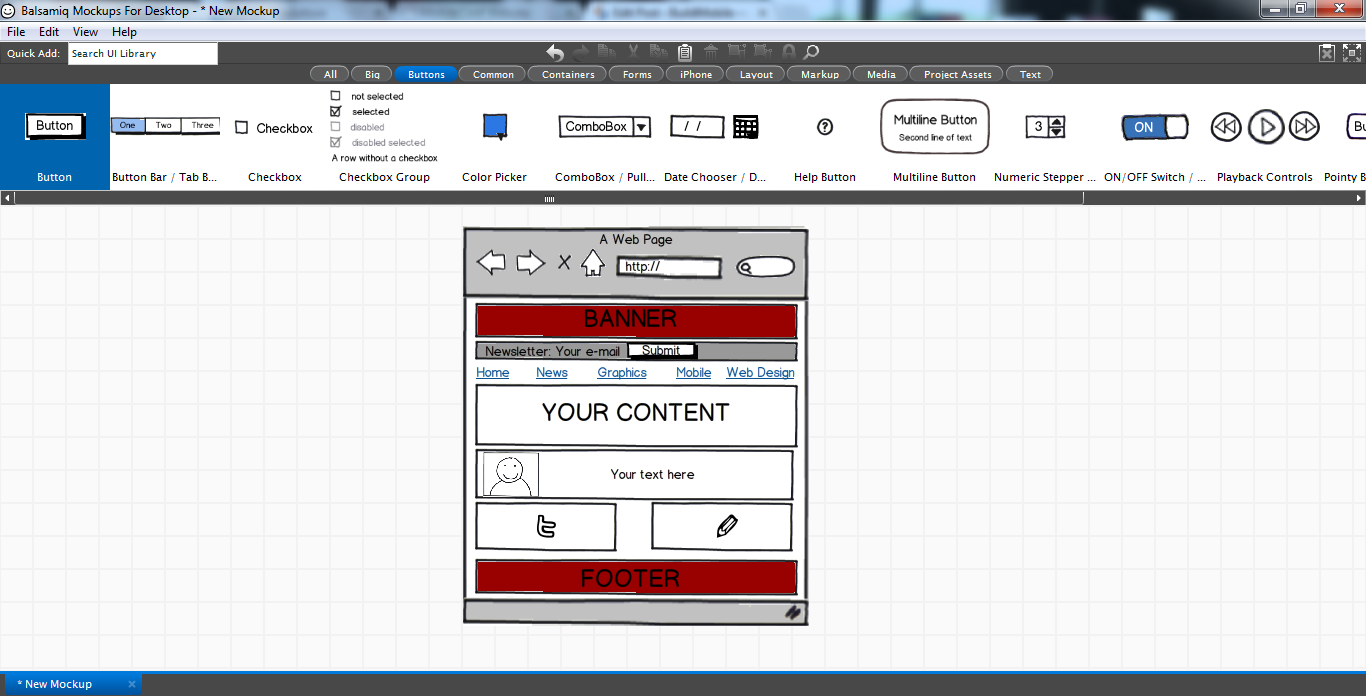
Once we’re done with this first passage, let’s continue planning our tablet version.
As you can see in the image above, all the elements used in this second mockup are the same; the only thing that has changed is their arrangement. In the top part of the page, almost everything has the same style: the banner and the newsletter bar occupy all the window width on the PC desktop as well as the tablet version.
What has changed is the alignment of the menu-list items. In order to make the reading of menu items clear and easy even on a screen with a reduced size, I have planned to increase the space between all the present items. Additionally, the bottom part of the mockup introduces some slight changes: the sidebars that were placed on the left side of the author box have been moved under this and positioned next to each other in order to give them a larger width. Look below for clarity.
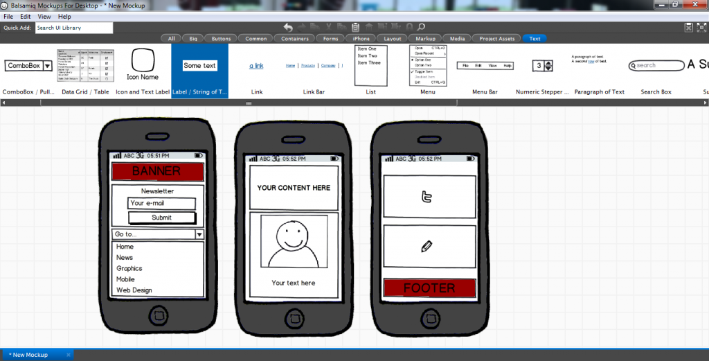
As our last step in the mockup process, let’s tackle the smartphone version. I have placed the iPhone shape (as said before, it’s the only one available to represent the profile of all modern smartphones) and duplicated it twice to allow you to view what the user would see by scrolling through the site from the top to the bottom.
As you can see, for the top part of the portal, the arrangement of the newsletter elements has changed, andthe menu-item list is also different compared to the PC desktop and tablet mockups. The input box and the submit button are presented vertically in order to make the process of writing and sending data faster and simpler. As for the menu, the best solution to adopt in this case (since the menu is composed of only five items) is to create a drop-down menu that the user can easily touch to load the page he desires to visit.
All the other components of the page are set to their max width to make the content intuitive and accessible. Even if at this stage you cannot see it, for the text view, you can think about a simple trick to make your users satisfied. Remember that, if your content is too long, they would have to scroll down the page many times to reach the end, and this could easily cause disorientation and boredom. So you could solve this “too much content” problem by placing a “Read more” link that takes the user directly to the information he demands and makes the homepage more streamlined, easier to load, and pleasant to visit, even on a narrow smartphone screen.
Conclusion
In this article, we’ve seen how to build a project mockup thinking responsively and—consequently—how a responsive design can adapt to three target layouts: Default (PC desktop), Portrait Tablet, and Smartphone. We’ve seen how to arrange the elements of a typical website in the three main devices’ categories by creating a template that represents the common content elements. In the third part of this series, we’ll start to write the HTML code and work on the structure of the homepage and set the first CSS styling rules to build an initial design.
I have a Bachelor's degree in European languages, cultures, and literature from the University of Naples. I'm passionate about graphics and web design, and for several years I've been working on projects and designs for many companies. I'm a writer for the Audero User Group; my specialties are HTML, CSS, Web Design, and Adobe Photoshop.


