

When you are working with print design work, you run into unique problems and considerations that don’t apply when working with web design. You have to take things into consideration such as the type of paper, the cost of paper, the cost of different types of inks, and special finishes such as varnishes. Printing costs are important, especially when your client needs tens of thousands of copies made. Money saving techniques like as 2-color printing can make or break a print project’s budget, and versatile designers must know how to accommodate these constraints and still come up with a great design.
Color limitations are where duotones and gradient maps save the day. A duotone is made when the light and dark areas of an image are created using only two colors. The luminosity, highlights, shadows, and overall tonal ranges are preserved; only the colors are changes. A gradient map is the same concept with a slightly different process and application.
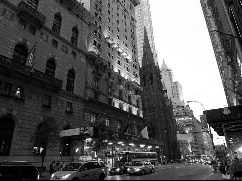
Duotones take a little extra work to create, but you get different results and have different options compared to gradient maps. The sample image below can be found here. Let’s say that our client is sending out 10,000 direct mailers, but they have a low budget, so you decide to go with two total colors in the entire design. The client still wants an image in the design, so now you have to use a duotone in order to limit the output to two colors.

This image is available in RGB mode, but in order for the duotone option to be available, you have to convert the image to grayscale. This discards the color information, which is obviously destructive, so it is best to keep a spare copy of this image in case things go awry, and you need to go back to a fresh start. To convert your image to grayscale, go to “Image” > “Mode” > “Grayscale.”

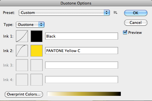
Next, choose “Mode” > “Duotone.” A dialog box will come up with “monotone” — which is the default setting — giving you a black and white image.

The Duotone Menu is packed full of presets, ranging from blues to oranges, browns, and greens. You have many options under presets, but if you want a custom look, once you decide on the pantone color of your choice, switch the type to duotone, and click the second color box. The Color Picker will pop up, giving you the option to choose from any color value that is normally available via the color picker. You also have the option to choose from the pantone color libraries available.


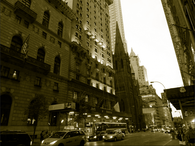
You can see below that after choosing “Pantone Yellow C,” the image looks similar to a sepia-toned image. The shadows and dark areas are made up of the black default, and the highlights are made up of the pantone yellow. The midtones are created by mixing the two.
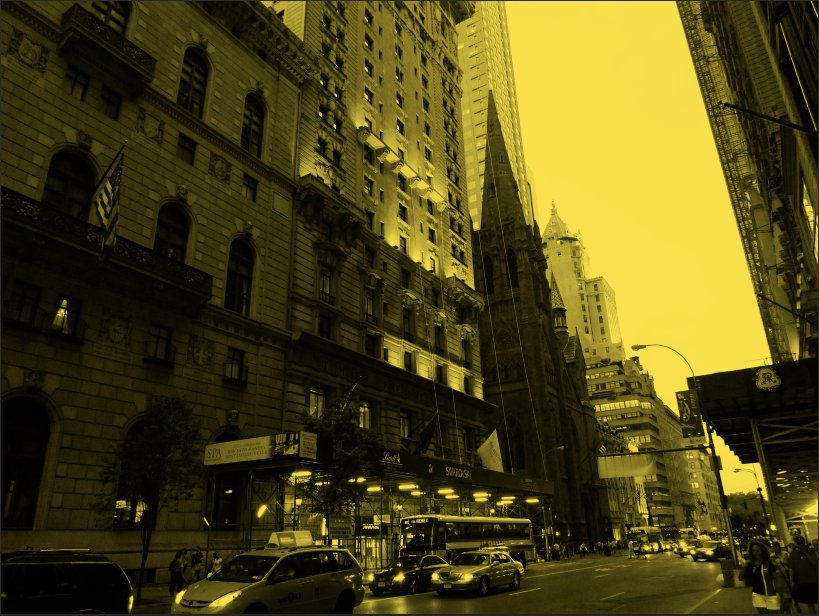
The most useful feature within the duotone menu is the tonal curve that you can adjust for each color featured in the duotone. This will allow you to lighten shadow areas or darken highlight areas that have become blown out. Bending the curve upward increases the amount of that color that is featured in the image. Bending it downward decreases the amount of that color that is in the image. In the image below, I decreased the impact of black and increased the impact of yellow.


The problem with duotones is that once you create them and commit to them, you cannot go back and edit them. However, with gradient maps, you have the ability to keep your images editable, giving you the flexibility to make future changes. Go back to the original RGB version of your image.
Click on the adjustment layer icon in the Layers panel. In the adjustments panel, you can control the gradient, as well as the colors that make up the gradient.

Adjusting the grey diamond in the middle determines the mix between the two colors. The difference is that it doesn’t effect the tonal range, as the duotone option does. The color shown below is much more flat and harsh.
You can change the blend mode to overlay, but the results are not exactly the same as the duotone menu is. Adjusting the mix between the two colors in the gradient map adjustment layer yields different results.

Between the image layer and the gradient map adjustment layer, place a Hue/Saturation adjustment layer, lowering the saturation to zero.


Lowering the fill of the gradient map adjustment layer creates a sepia tone to the image, similar to the effect that we created with the duotone options. Lower the opacity of the fill to roughly 45%. Also, if you need more contrast, move the black portion of the slider of the gradient to the right to increase the shadow areas and add contrast to the image.


When choosing between the two techniques, the two color mix tends to be better with the duotone option. The trade off is deciding between flexibility and consistency.
Conclusion
Designers don’t always have a million colors and an unlimited canvas at their disposal. Solving real industry issues for your clients can be a real challenge, but it can also be an opportunity to prove your worth and demonstrate your versatility. Solving these types of problems for your client isn’t only our job, but saving our clients money and coming in under budget are two of our main goals. Two-color printing with duotones can save clients a lot of money on printing expenses. Knowing how to create two-color images that still have impact while saving our clients money is an essential tool in our arsenal of design knowledge.
Have you had to make design compromises in order to fit within a budget? How to you handle these constraints?
Frequently Asked Questions (FAQs) about Duotones and Gradient Maps
What are the benefits of using duotones and gradient maps in design?
Duotones and gradient maps offer a unique way to enhance the visual appeal of your design work. They allow you to manipulate the color scheme of your images, giving them a fresh and modern look. Duotones, which involve the use of two contrasting colors, can create a striking effect that draws the viewer’s attention. Gradient maps, on the other hand, can be used to apply a wide range of colors to your images, allowing for more complex and nuanced color effects. Both techniques can be used to create a distinctive style that sets your design work apart from the competition.
How can I fit great design work within my print budget using duotones and gradient maps?
Duotones and gradient maps can be a cost-effective solution for creating high-quality design work within a tight budget. By limiting the number of colors used in your design, you can significantly reduce printing costs. Duotones, in particular, are a great way to achieve this, as they only require two ink colors. Gradient maps can also be used to create visually appealing designs with a limited color palette. By experimenting with different color combinations, you can create a wide range of effects without having to invest in expensive printing techniques.
Are there any free resources available for gradient maps?
Yes, there are several free resources available online for gradient maps. Websites like Adobe Creative Cloud offer free gradient map presets that you can download and use in your design work. These presets can be a great starting point if you’re new to gradient maps and want to experiment with different color combinations. There are also numerous tutorials and guides available online that can help you learn how to create your own gradient maps.
What is the difference between duotones and gradient maps?
While both duotones and gradient maps are used to manipulate the color scheme of images, they do so in different ways. Duotones involve the use of two contrasting colors to create a striking visual effect. Gradient maps, on the other hand, apply a range of colors to an image based on its grayscale values. This allows for more complex color effects and can be used to create a wider variety of visual styles.
Can I use duotones and gradient maps in Photoshop?
Yes, both duotones and gradient maps can be created in Photoshop. The software offers a range of tools and features that make it easy to apply these techniques to your images. For duotones, you can use the Duotone Mode feature, which allows you to choose two colors and apply them to your image. For gradient maps, you can use the Gradient Map adjustment layer, which allows you to apply a color gradient to your image based on its grayscale values.
How can I create a duotone effect in Photoshop?
Creating a duotone effect in Photoshop is a relatively straightforward process. First, you’ll need to convert your image to grayscale. Then, you can use the Duotone Mode feature to apply two colors to your image. You can choose any two colors you like, but contrasting colors often produce the most striking effects.
How can I create a gradient map in Photoshop?
To create a gradient map in Photoshop, you’ll first need to add a Gradient Map adjustment layer to your image. Then, you can choose a gradient preset or create your own custom gradient. The colors in the gradient will be applied to your image based on its grayscale values, with the left end of the gradient representing the shadows and the right end representing the highlights.
Can duotones and gradient maps be used in print design?
Yes, both duotones and gradient maps can be used in print design. They can be a cost-effective way to add color and visual interest to your designs without increasing printing costs. However, it’s important to note that the colors may appear differently in print than they do on screen, so it’s always a good idea to do a test print before finalizing your design.
Can I use duotones and gradient maps in web design?
Yes, duotones and gradient maps can be used in web design to create visually striking images and backgrounds. They can be particularly effective for creating a distinctive visual style that sets your website apart from the competition. However, it’s important to ensure that your images are optimized for web use to ensure that they load quickly and display correctly on all devices.
What are some common mistakes to avoid when using duotones and gradient maps?
One common mistake is using colors that are too similar, which can result in a lack of contrast and a flat, uninteresting image. It’s also important to ensure that your colors are well-balanced and harmonious. Overusing these techniques can also be a mistake, as it can make your design look overdone and unprofessional. As with any design technique, it’s important to use duotones and gradient maps judiciously and in a way that enhances the overall design rather than detracting from it.

