Finding a Date Picker Input Solution for Bootstrap

Key Takeaways
- No browser currently supports the datetime input type, and all browsers appear to ignore the lang attribute, making it impossible to display an input widget in a language other than the native one. This necessitates handling not only date or datetime support but also the date format and UTC/local issues.
- While there are many JavaScript solutions to improve support for date inputs in all browsers, none of the scripts examined in this piece manage the two different date formats for displaying and saving data, which poses a significant problem.
- jQuery UI’s Datepicker is a well-tested and supported library that offers a solution to the format issue through its altField option. It can be integrated with Bootstrap, though this requires creating a new theme file to ensure visual consistency.
- The jQuery UI Datepicker does not manage datetime fields. A solution to this issue is Trent Richardson’s Timepicker Add-on, which behaves just like the standard Datepicker Widget and uses the datepicker.less file without any additional work.
My work often requires adding date inputs to forms. Since they are not yet supported by all browsers, I’m always looking for the best way to integrate them in my pages.
You can see the latest data on browser support for date inputs on Can I Use.
In addition to the basic date-input field, there are other time-related field types:
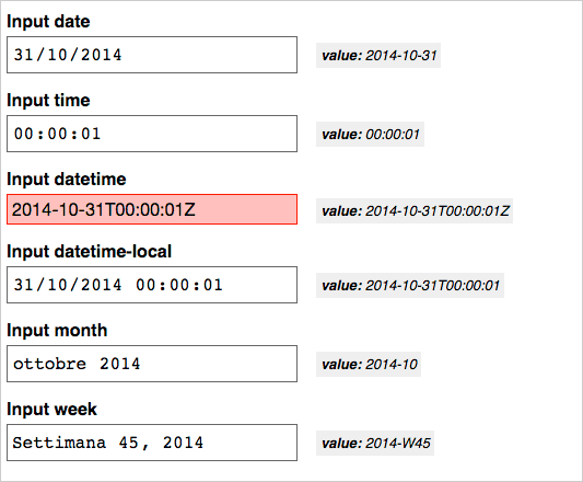
datetimefields allow entering dates and times based on the UTC format.datetime-localrepresents date and time with no time zonetimemonthrepresents the month and yearweekrepresents a week number and year
I’ve built a test page for all the above listed date input types, with some help from Modernizr, and I’ve tested it with many recent mobile and desktop browsers using Browserstack. For example, this is the result page as viewed in Chrome (red fields are unsupported ones):
You can test it directly in the demo here:
See the Pen Testing date picker display and values. by SitePoint (@SitePoint) on CodePen.
This test brings us the following information:
- No browser supports the
datetimeinput type. - Browsers that support
datetime-localalso supporttimeandmonthtoo, while theweektype is not as well supported. - All browsers seem to ignore the
langattribute. That is, browser input widgets always use system settings for date and time format, so it’s impossible to display an input widget with a language other than the native one.
Now we know that we have to handle not only date or datetime support but also the date format (if we need it to be different from the system settings of the user) and UTC / local issues. Moreover, we need to take into account the difference between the displayed format and the returned one on form submit.
Choosing a fallback script
There are many JavaScript solutions to improve support for date inputs in all browsers, and of course all of them have their pros and cons. My most recent project was a Bootstrap-based project, so I looked first for scripts based on that framework. I’ve found some interesting solutions:
But these projects (and others I have not listed), have two major problems:
- I’m not sure that they are still being maintained (some of them were last updated more than a year ago)
- None of them helps me manage the two different date formats for displaying and saving data.
Since I have to display the date in the Italian format (it will be the same for most localizations), this presents an additional problem: Browsers that support date inputs return date values in standard ISO 8601 / RFC 3339 format (yyyy-mm-dd) while every script I checked uses the same format both for display and saving.
So I had values saved from Chrome, Opera, and most mobile browsers in yyyy-mm-dd format, and values from browsers that use the fallback script as dd/mm/yyyy – a big mess!
What about jQuery UI?
Before proceeding towards a custom solution (I have deliberately discarded the possibility of managing the two formats in the back end), I began to consider the jQuery UI Datepicker as a possible solution.
I hadn’t initially considered jQuery UI because it comes with some predefined themes that are not integrated with Bootstrap (but that wasn’t a big issue). On the other hand, jQuery UI’s Datepicker is a well-tested and supported library and its altField option represents exactly what I was looking for. Also, Bootstrap scripts require jQuery, just like jQuery UI.
jQuery UI can be downloaded from the project page, but since I’m going to mix jQuery UI files with Bootstrap ones, I think the best way is to download it (or clone it, etc.) from the GitHub repository.
Using development files will let me combine css files with Bootstrap in a simpler way. Needed files (from the master jQuery UI folder) are:
- JS:
ui/core.jsui/datepicker.js- a localization file from the
ui/i18nfolder
- CSS:
themes/base/core.cssthemes/base/datepicker.cssthemes/base/theme.css.
Conditional loading
Before loading the callback script, we need to verify browser support. A simple way to do this is to feature detect with Modernizr, like in my previous test, using its resource loader to load fallback scripts only if needed:
Modernizr.load({
    test: Modernizr.inputtypes.date,
    nope: [
        'jquery-ui-master/ui/core.js',
        'jquery-ui-master/ui/datepicker.js',
        'jquery-ui-master/ui/i18n/datepicker-it.js',
        'jquery-ui-master/themes/base/core.css',
        'jquery-ui-master/themes/base/datepicker.css',
        'jquery-ui-master/themes/base/theme.css'
   ],
    callback: function () {
        // do something if test fails
    }
});
We first test the inputtypes.date support, loading the datepicker JavaScript and CSS files if necessary.
I intentionally kept all the files separate for clarity, but it is a good idea to concatenate them in your build process for production.
Note: Be aware that yepnope.js (the load component of Modernizr) has been deprecated, and future versions of Modernizr will not include it.
After the nope scripts and css are loaded, we have to tell our browsers (the ones that failed the Modernizr.inputtypes.date test) to do something, so we have to add a callback function:
callback:function (url) {
    if (url === 'jquery-ui-master/ui/i18n/datepicker-it.js') {
        var idx = 0;
        $('input[type="date"]').each( function() {
            var _this = $(this),
                prefix = 'alt' + String(idx++) + '_',
                _val = _this.val();
            _this
            .attr('placeholder', 'gg/mm/aaaa')
            .attr('autocomplete', 'off')
            .prop('readonly', true)
            .after('<input type="hidden" id="' + prefix +
                   _this.attr('id')  + '" name="' +
                   _this.attr('name') + '" value="' + _val + '">')
            .removeAttr('name')
            .val('')
            .datepicker({
                altField: '#'+ prefix + _this.attr('id'),
                dateFormat: 'dd/mm/yy',
                altFormat: 'yy-mm-dd'
            });
            // managing existing date values
            if (_val) {
                _this.datepicker('setDate', $.datepicker.parseDate('yy-mm-dd', _val) );
            }
        });
    }
}
How the code works:
- Using the
urlargument, we first ensure that all scripts have been loaded, checking for the last of them. - For each
input[type="date"]field, aunique-idhidden field is created. - The
nameattribute of the date field is removed and added to the hidden field. - The widget is instructed to use the hidden field as
altFieldto store the ISO-format date, regardless of the localization we are using. - Date and hidden field date formats are set.
- Any existing ISO value is removed and reassigned in the datepicker format.
- A placeholder with the pattern of the date to be inserted (according to our local date format) is added.
autocompleteis set to off, since, in some cases, this can bring confusion using the widget.- the
readonlyattribute is added to the fields. This is certainly not the best from the perspective of UX, but it solves a big problem: if date field content is manually erased (without triggering the widget), the alt field is not updated, andreadonlyprevents this behavior.
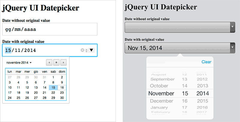
You can see the result displayed in the screenshot below (I’ve changed the altField from hidden to a grey-boxed text to let you see the changes).
Here’s the result page viewed with Firefox…
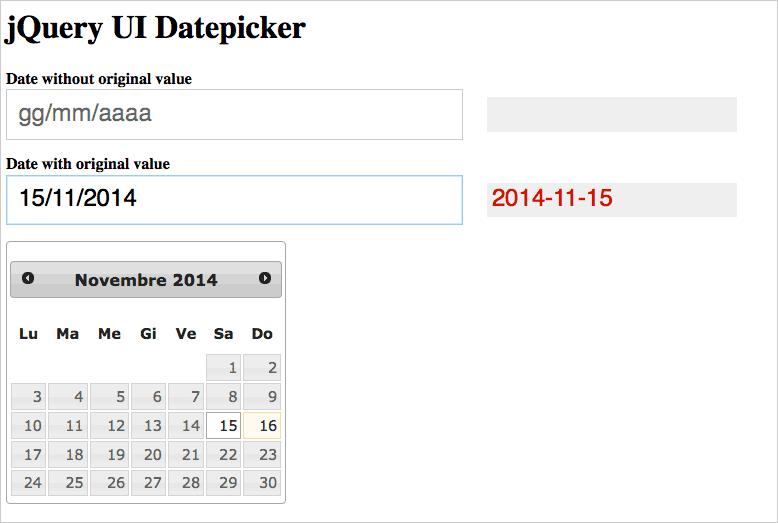
…and with Chrome and IOS (which use their native widget):
And here is a demo to try it yourself:
See the Pen VYexoy by SitePoint (@SitePoint) on CodePen.
Note that in this demo I’ve loaded scripts from CDNs, so there are some differences from the code shown earlier.
To complete the callback, I’ve added some code to manage any min or max attributes (which you can see under the “JS” tab of the CodePen demo).
Bootstrap integration
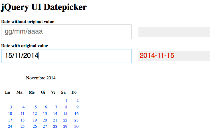
This previous step doesn’t solve the problem of Bootstrap integration. You can see how all examples show the basic jQuery UI theme loaded through the theme.css file. If you remove it, the widget appears without any formatting:
So we have to replace that file with a Bootstrap-integrated one.
I think there are two good ways to do this:
- Create a new
theme.less(or.scss) file. This is the best way if you need to use more jQuery UI widgets, since thetheme.cssis shared between all them (in this case, take a look at the jQuery UI CSS Framework documentation) - Create a datepicker-only theme, ignoring the other widgets. You should consider this if you only need the Datepicker widget. Even if this way is more empiric, it is really faster then the other one (and it is the solution we’ll cover now).
These are our goals:
- Write a new
datepicker.lessfile making use of Bootstrap project variables for color, sizes, etc. This will bind your Datepicker to the framework setting, allowing us to build a more coordinated design. - Use an icon font (in this case, the Bootstrap default Glyphicons) instead of the original jQuery UI images.
To build the file, we first have to import some settings from Bootstrap. Once you’ve downloaded it (and jQuery UI, of course), create a new less file and import the variables and glyphicons:
@import (reference) 'path/to/bootstrap/variables.less';
@import (reference) 'path/to/bootstrap/glyphicons.less';
The reference option allows us to “import external files, without adding the imported styles to the compiled output unless referenced” (see Less import options).
Then you have to build the file using Bootstrap variables, just like in the sample below:
.ui-datepicker .ui-datepicker-header {
    background-color: @panel-default-heading-bg;
    border-radius: @border-radius-base;
    font-family: @font-family-sans-serif;
    color: @panel-default-text;
    font-weight: bold;
}
In the same way, replacing the icon images with Glyphicons is really easy:
.ui-datepicker .ui-icon {
    .glyphicon();
    visibility: hidden;
    text-indent: 0;
    &:before {
       visibility: visible;
    }
}
.ui-datepicker .ui-icon.ui-icon-circle-triangle-w {
    .glyphicon-chevron-left();
}
.ui-datepicker .ui-icon.ui-icon-circle-triangle-e {
    .glyphicon-chevron-right();
}
You can find the complete less file in my GitHub repository for this solution.
Note that this preserves completely the original jQuery UI files, and you can update them anytime without worrying about losing your customization.
You can use any other icon font or image sprite in the same way, and customize the Bootstrap variables as you like.
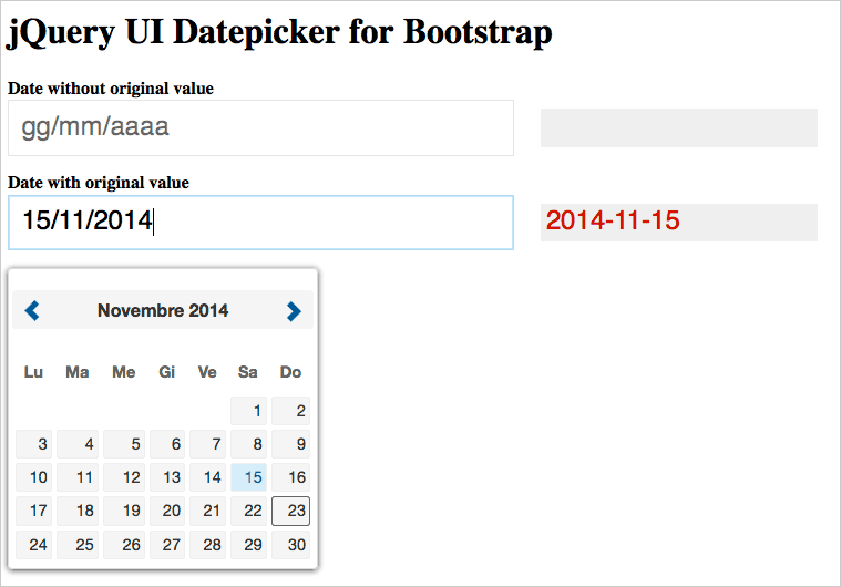
Here is a screenshot of the result:
About time
Unfortunately, jQuery UI Datepicker doesn’t manage datetime fields. But I’ve found a very easy solution in Trent Richardson’s Timepicker Add-on. It behaves just like the standard Datepicker Widget and uses our datepicker.less file without any additional work.
What’s next?
There are quite a few things you need to consider when implementing a cross-browser date/time input field, and it’s impossible to cover all the issues here. The progressive increase of browser support for input types will eventually make the tricks discussed here (I hope) obsolete, and this will become much easier.
If you have any suggestions or thoughts on how you’ve approached these problems, let me know in the comments.
Frequently Asked Questions (FAQs) about Bootstrap Date Picker Input Solution
How Can I Customize the Bootstrap Date Picker to Match My Website’s Theme?
Customizing the Bootstrap Date Picker to match your website’s theme can be done by overriding the default CSS styles. You can change the color, size, border, and other properties of the date picker by writing your own CSS rules. For instance, to change the background color, you can use the following code:.datepicker {
background-color: #your-color;}
Remember to replace ‘#your-color’ with the actual color code you want to use. Always ensure your custom CSS is loaded after the Bootstrap CSS to override the default styles.
How Can I Disable Specific Dates in the Bootstrap Date Picker?
Disabling specific dates in the Bootstrap Date Picker can be achieved by using the ‘datesDisabled’ option. This option accepts an array of dates that you want to disable. Here’s an example:$('.datepicker').datepicker({
datesDisabled: ['01/01/2022', '02/02/2022', '03/03/2022'],});
In this example, the dates ’01/01/2022′, ’02/02/2022′, and ’03/03/2022′ are disabled and cannot be selected by the user.
Can I Use the Bootstrap Date Picker Without jQuery?
The Bootstrap Date Picker is built to work with jQuery, and it requires jQuery to function properly. However, if you prefer not to use jQuery, there are other date picker libraries available that do not require jQuery, such as flatpickr or pickadate.js. These libraries have their own APIs and options, so you’ll need to refer to their documentation for usage instructions.
How Can I Set a Default Date in the Bootstrap Date Picker?
Setting a default date in the Bootstrap Date Picker can be done using the ‘defaultViewDate’ option. This option accepts a date object representing the default date. Here’s an example:$('.datepicker').datepicker({
defaultViewDate: { year: 2022, month: 0, day: 1 },});
In this example, the default date is set to ’01/01/2022′.
How Can I Change the Date Format in the Bootstrap Date Picker?
Changing the date format in the Bootstrap Date Picker can be done using the ‘format’ option. This option accepts a string representing the date format. Here’s an example:$('.datepicker').datepicker({
format: 'mm/dd/yyyy',});
In this example, the date format is set to ‘mm/dd/yyyy’. You can change this to any format you prefer, such as ‘dd/mm/yyyy’ or ‘yyyy-mm-dd’.
Massimo is a web and graphic designer and front-end developer based in Roma, Italy.