Key Takeaways
- The ‘viewport’ is the available space used to design a site, it varies from browser to browser and operating system to operating system. Many designers use a width from 950 to 999 pixels to design.
- The 960 grid system is a strong de-facto standard for web design. It aids in layout and enables us to create a website layout more quickly. There are also other valid grid systems to choose from.
- Using a template speeds up the process of designing a website. It also gives more freedom to your creative mind. The templates provided in this discussion are only a guide for designing your own.
- The main reason for having a specific layout for desktop, tablet and phone is to effectively communicate the site’s content to the viewer in each situation. The correct layout should be displayed on the correct device type.

Continuing on from the previous article in this series, Designing for the Web: Resolution and Size, we cover some helpful and important factors while creating a template for designing a website.
In this article, we will cover some important issues and introduce some tools for you to use when designing a website. Just keep in mind that as in the print sphere, the web sphere contains a multitude of choices for design as well as development. This is only one method and we are attempting to come from more of a designer angle rather than a developer one.
From the previous article, we chose to design for a desktop screen resolution of 1024 x 768. We will use the desktop as our main example and will cover tablets and phones later in the article.
However, we need to look at the available space we can use to design a site. This available space is called the ‘viewport’. The definition of the viewport is a bit varied – depending on the source, but in basic terms, it is the area in the browser where the website is displayed.
We will need to work out a standardised size to design our website so we can ensure that we can account for the viewport of most all browsers as the size of this space may vary from browser to browser and operating system to operating system.
Many designers have been using a width from 950 to 999 pixels to design to. However, as graphic designers, we like to work with standards as it simplifies design and production.
960 Grid System
As we do in print publications such as newspapers and magazines, we can use a grid system to aid us in layout – in particular, there is ‘the 960 grid system’. This will enable us to create a website layout a little more quickly. There are various other grid systems to choose from and all are valid and have varying reasons for existence. While it may seem like they are in competition, it should not be viewed as such. The objective is to ensure that your design is engaging, effective and legible for the given project.
We have chosen to use the 960 grid system for the fact that it has become a strong de-facto standard.
Note: For more information on the various grid systems out there, visit 960.gs and 978.gs. The latter link covers many other grid systems of various resolutions. There is also www.thegridsystem.org.
The Template: An Overview
Using a template is a good way to speed up any process including designing a website. Creating a template that accounts for the above factors will speed up the process of design and give a little more freedom to your creative mind. I have provided a template for you as an example – feel free to use it or take ideas that you like from it.
This is a template that I have built to use as a design base for projects. The reason for the use of Illustrator is that it is a great layout tool for print and is transferable for web. However, many designers do prefer Photoshop to create their web designs – something to look into if you work in Photoshop a lot.
The Artboard
In the example template, the artboard is 1920px x 2160px. The height of the artboard is about three scrolls of the screen height – which is about the number of scrolls that the average user with an average amount of interest will scroll.
The width of the artboard is quite wide and gives plenty of room to design a more lush background if desired – if you find the width of the artboard way too wide, you can always resize it.
Fixed Layout
If you are just starting out on designing a website, you will learn about fixed width layouts and fluid or liquid layouts. A fixed layout will cause no movement in size or shape of a website if a browser window is resized. A liquid layout is one that may ‘grow’ or ‘shrink’ if a browser window is being resized.
While the templates are made for fixed layouts, it is possible to use them to create liquid layouts as those particular issues can be solved in the coding. The important element for a designer is to explain how a site shrinks or grows and the minimum and maximum widths and heights needed.
In order to maintain some design control, it might be better to create a fixed layout first.
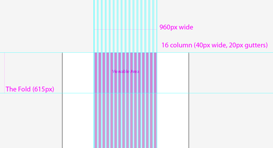
The Viewable Area (or Viewport)

View the template in Illustrator or view the images in this article to follow along.
The pink square is an area that most browsers in most operating systems display and is generally the starting point for designing a website and this area can be considered the Viewport of a maximised browser with a screen resolution of 1024 x 768 pixels. This average viewable area also represents the part of the website that is initially seen by the user or the content above ‘the fold‘.
The Fold

The Fold is a term that is borrowed from print and represents the line of the fold of the newspaper. The space above the fold is seen on the newsstand.This term has been adopted for web design and represents the line where you would need to start scrolling to view more of the page (generally the home page). So, the top 615 pixels, or so, of your site would be above the fold. The idea is that you would put the most relevant information above the fold. The relevance of the fold is debatable and there are plenty of articles on the subject. However, it is relevant for tablet and phone designs as you may want to create a layout that avoids scrolling as much as possible unless displaying a written work.
Grid systems for web design

Within the layers, you will find 3 layers for the 960 grid system. Each vary in columns and therefore column width and a designer might use these singularly, or together to work out the grid of a page. Using the 12 column grid seems to offer a more simple design process and going up to 24 columns offers the designer more scope for more complex grids. You may want to choose a happy medium of 16 columns, the choice is up to you – suffice to say, you may use the three in tandem or one over the other for different applications.
Tablet and Phone Templates
Tablet Template | Phone Template
The templates are very similar to the desktop one – with some differences and these differences are specifically for the design challenges of each of the device types.
The tablet template
In the tablet template, we have done away with the background all together. As the actual screen is much smaller than a monitor and involves using touch, we will need to ensure better visibility and usability for this design. While the template still includes the 960 grid, elements might need to be a little more ‘chunky’.
The phone template
The phone template is in a portrait orientation and is 320 pixels wide and a 300 grid is included in this template. As with the tablet layout, we need to ensure that our design is easily viewable as this layout will be used on phones and other small handheld devices.
Why are we creating three site designs?
The main reason for having a specific layout for desktop, tablet and phone is so that the content of the site is effectively communicated to the viewer in each situation. The end result is that the correct layout should be displayed on the correct device type. There are different ways to approach this for a developer and is beyond the scope of this particular article.
Making your own Templates
Comfort and intuitiveness in your tools is very important while designing. The templates that I have provided are only a guide for designing your own – ensure they work the way you want them to. For example, the desktop template might be too wide for most designers. Spending a bit of time on backgrounds (as 86% of desktop users can see some background) adds a richness or depth to a site design – but that is designer preference.
In the next article, we are going to talk general site elements in a site design and blocks!
Frequently Asked Questions about Designing for the Web: Templates and Grid Systems
What are the benefits of using grid systems in web design?
Grid systems offer a structured and organized layout that can significantly enhance the user experience. They provide a framework that makes it easier to place elements in a way that is both visually appealing and intuitive for users. Grids can also improve consistency across different pages of a website, creating a cohesive look and feel. Moreover, they can make the design process more efficient, as they provide a clear guide for where to place elements.
How do I choose the right grid system for my website?
Choosing the right grid system depends on the content and purpose of your website. Consider the type of content you will be displaying and how you want users to interact with it. For instance, a photography website might benefit from a grid that showcases large images, while a news website might require a grid that can accommodate a lot of text. It’s also important to consider the responsiveness of the grid system, especially as more users are accessing websites from mobile devices.
What are some popular grid systems for web design?
There are many popular grid systems available for web design, each with its own strengths and weaknesses. Some of the most popular include Bootstrap, Foundation, and Gridset. Bootstrap is known for its responsive, mobile-first approach. Foundation is a versatile and flexible grid system that can be customized to fit any project. Gridset is a tool that allows designers to create any kind of grid they want, including complex and asymmetrical grids.
How can I customize a web template to fit my brand?
Customizing a web template involves changing elements such as colors, fonts, images, and layout to align with your brand identity. This can be done through CSS and HTML. It’s important to keep in mind the user experience when customizing a template. Make sure that the design is not only visually appealing but also intuitive and user-friendly.
What are the advantages of using web templates?
Web templates can save a lot of time and effort in the web design process. They provide a pre-designed structure that you can customize to fit your needs. This can be particularly beneficial for those who are new to web design or who need to create a website quickly. Additionally, many templates are designed with best practices in mind, ensuring a high-quality, professional-looking end result.
Are there any limitations to using web templates?
While web templates offer many advantages, they also have some limitations. One of the main limitations is that they can lack originality. Since templates are used by many different websites, it can be challenging to create a unique design. Additionally, templates may not always perfectly fit your specific needs, requiring additional customization.
How can I make my website responsive?
Making a website responsive involves designing it to automatically adjust to different screen sizes and orientations. This can be achieved through flexible layouts, flexible images, and CSS media queries. A responsive design ensures that your website looks and functions well on all devices, from desktop computers to smartphones.
What is the role of CSS in web design?
CSS, or Cascading Style Sheets, plays a crucial role in web design. It is used to control the look and feel of a website, including layout, colors, fonts, and animations. CSS allows designers to create visually appealing websites and enhances the user experience by enabling interactive elements.
How can I learn more about web design?
There are many resources available for learning about web design. Online tutorials, courses, and blogs can provide valuable information and tips. Additionally, practicing web design through hands-on projects is one of the best ways to improve your skills and understanding.
What are some trends in web design?
Web design trends are constantly evolving. Some current trends include minimalist design, dark mode, immersive 3D elements, and micro-interactions. Staying up-to-date with the latest trends can help you create a modern, engaging website.
Felix Mak, a graphic designer for 20 or so years, has been working quietly in the suburbs of Melbourne - and has more recently been delving into the art of web design and development and the wonders of shivs and javascript libraries. A strong proponent of simple design and simple communication, he has a love of the lushness of art nouveau design.