
As a graphic designer working in print, it is important to understand and work to a set of fixed standards. This ensures that what the designer produces will actually be usable as a print item and also printable! For example in print, designing a simple business card has its own factors to watch for – this is also dependant on who you use to print your jobs.
Some common issues to watch for would be if the job is of a standard size (and if the printer offers its own set of guidelines and sizes), if you decide to print in laser (which affects price as well as color), or offset, if you are using solid or process, how much bleed should you leave and if they have affordable metallics – the list could go on and on! Even with so many varied print issues, we feel comfortable ensconsed in our guidelines and the familiar set of difficulties.
Switching to the web world, the issues of design are just as complex and varied. To a graphic designer who hasn’t ventured into web design, it can be a freaky place where suddenly our long used guidebook of print design goes out the window!
Over the following weeks, I will cover basic as well as complex aspects of web design, but will not cross the threshold of coding. The aim is to arm the graphic designer with the knowledge and skills to design a solid website. There are many ways to design a website and this guide is one way.
Designing for the web gives you a freedom that you wouldn’t believe. However, there are certain factors that you need to keep in mind – depending on the job at hand of course! When putting pen to paper for your first design, or opening Photoshop or Illustrator, it is important to know what size the site is!
An important factor of website design is resolution as well as the physical size of the screen. It is important to know what sizes to design for as well as what affect the given sizes we choose for our client will have on the visitor’s screen.
The prevailing wisdom in web has been to design for the most common screen resolution that most people use and at the time of writing, it has been 1024 x 768 for quite a few years now. However, there is a relatively new and important factor that designers need to account for and that is the rise and prevelance of hand held devices. The popularity of the Android device as well as iOS (Apple’s operating system for most all things they manufacture – starting with the letter ‘i’) and the slow rise of Windows 7 devices, cannot be ignored and must be accounted for. These devices can be phone sized or tablet sized devices and their design size needs to be included in our new ‘guidebook’.
Resolution, Available Space and Physical Screen Size
| Type | Desktop (avg) | Tablet Size (avg) | Phone Size (avg) |
| Resolution | 1024 x 768 px | iPad: 1024×768 px | iPhone 4+ 640 x 960 px |
| Available Space | 999 x 700 px (approx) | iPad:1024×664 px (approx) L | iphone: 640 x 707 px (approx) P |
| Screen size | 230mm x 170mm* | iPad: 200mm x 148mm | iPhone: 50mm x 76mm |
| P = PortraitL = Landscape | *a quick measurement made on my laptop |
In the above table, I have included the average resolution for desktop computers that is still in use by 14% of Internet users, and Apple’s tablets and phones (unfortunately, I do not have access to any other manufacturer’s goods at the time of writing). However, these resolutions are full screen sizes and the browser does take up part of the screen in the form of status bars, button bars, address bars, scrolling bars and the like. The “Available space” row in the above table is a good guide to design a site for. This helps us avoid scrolling – especially when we are designing for a space that is not intended to scroll.
*If you would like to read more on the usability side of the web, look for books by Jakob Nielsen. Some in the industry might see him as extreme, but he makes strong arguments and incorporating some of his ideals into your web design philosophy would not hurt!
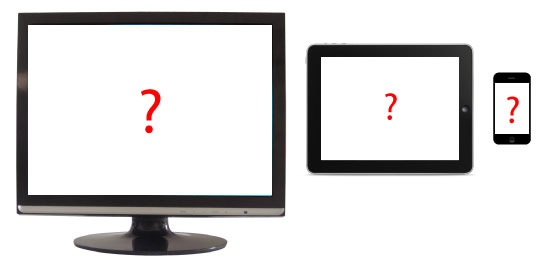
However, we may have a problem if we design by pixel size.
The above figure illustrates the approximate size of all three screen sizes in pixels and shows the used space by button bars, status bars and the like. However, you might notice something a little odd – yes, the iPhone resolution seems out of proportion! I am sure that last time you looked, your phone was not taller than your monitor!
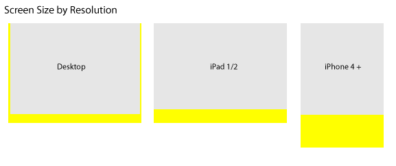
Referring back to the table, the “Screen Size” row shows you an issue with the actual size of a screen versus the resolution of the screen. Although, a graphic representation might be a bit better.

The above figure gives us a far better understanding and will help us design a far better website interface for phones such as the iPhone. While resolution is a very important aspect of design, it is not usable as a standardized measurement for site size, as it has been for desktop computers.
Important Points to Remember
- Using resolution as a website size is fine for the desktop version of a design
- Using physical size as a website size is better for hand held devices
- It is likely that you will design three variations on the website design you use to account for the varying sizes.
In part two of this series we will be producing a website template in Illustrator where we will account for the issues above.
Frequently Asked Questions on Web Design Resolution and Size
What is the ideal resolution for a website design?
The ideal resolution for a website design depends on the target audience’s most commonly used devices. However, considering the current trends, a resolution of 1366×768 pixels is widely accepted as a standard for desktops. For mobile devices, 360×640 pixels is a common resolution. It’s important to note that these are not fixed standards, but rather the most commonly used resolutions. A responsive design approach is recommended to ensure your website looks good on all devices, regardless of screen resolution.
How does screen size affect web design?
Screen size significantly impacts web design. It determines how much content can be displayed at once and influences the layout, typography, images, and other design elements. Larger screens allow for more complex designs and layouts, while smaller screens require a more minimalist approach. Designers must ensure that the website is responsive, meaning it adjusts to fit different screen sizes.
What is the difference between fixed and fluid layouts in web design?
Fixed layouts have a set width in pixels. This means the layout doesn’t change size regardless of the screen size or resolution. On the other hand, fluid layouts use percentages for widths, allowing the layout to adjust to the screen size. Fluid layouts are more adaptable and provide a better user experience on different devices.
How does resolution impact the quality of images on a website?
Resolution directly impacts the quality of images on a website. Higher resolution images have more pixels, providing more detail and clarity. However, they also require more storage space and can slow down the website’s loading time. It’s crucial to find a balance between image quality and website performance.
What is a viewport in web design?
A viewport is the user’s visible area of a web page. It varies with the device being used to access the website. On a desktop computer, the viewport is the size of the browser window. On mobile devices, the viewport is the size of the screen. Understanding the viewport is essential for creating a responsive design.
What is the significance of aspect ratio in web design?
Aspect ratio is the relationship between the width and height of an image or screen. It’s crucial in web design because it affects how images and elements are displayed. A mismatched aspect ratio can result in distorted images or design elements.
How can I design a website for multiple screen sizes?
Designing a website for multiple screen sizes involves using a responsive design approach. This means using flexible layouts, images, and CSS media queries to adjust the design to different screen sizes. It ensures that your website provides a good user experience on all devices.
What is the role of pixels in web design?
Pixels are the smallest units of digital images and screens. They play a crucial role in defining the clarity and quality of digital content. In web design, understanding pixels is essential for creating sharp, clear images and crisp text.
How does screen resolution affect user experience?
Screen resolution can significantly impact user experience. A high-resolution screen can display more detail, making images sharper and text easier to read. However, if a website isn’t designed to adapt to different resolutions, users may experience issues like distorted images or text, which can negatively impact their experience.
What is the importance of responsive design in today’s digital landscape?
Responsive design is crucial in today’s digital landscape because users access websites from a variety of devices with different screen sizes and resolutions. A responsive design ensures that your website looks good and functions well on all devices, providing a consistent user experience. It also improves SEO, as search engines favor websites that are mobile-friendly.