
Key Takeaways
- The CSS3 border-image property allows developers to use an image as a border, which is divided into nine sections (four corners, four edges, and a middle) using the border-image-slice property.
- The border-image property requires the border (or border-width) to be set with four values corresponding to the values given in the shorthand notation. This ensures that image slices aren’t stretched to fill the border width.
- The border-image property is versatile and can accommodate any sized box, provided the settings are declared correctly in the CSS. However, creating the images necessary for border images can be a bit tedious at first.
- While CSS3 border images are supported by most modern web browsers, it’s important to remember to provide fallback options for non-supporting browsers. This ensures the look and size of the border are maintained across all platforms.
The CSS3 buzz is in full swing, and many of CSS3’s most useful properties are receiving a fair bit of attention. Properties like border-radius, text-shadow, custom gradients, and even CSS3 transitions have been shown to be quite practical, resolving real-world design issues with minimal markup and maintainable code.
One CSS3 property that’s been overlooked in this area, however, is the border-image property. The irony here is that what makes this property so useful, is exactly what makes it extremely confusing.
In this article, I’m going to attempt to demystify this very practical property. I’ll demonstrate how it can be implemented using some more attractive examples than what’s been attempted so far by well-meaning blogs and websites.
Currently, the only browser support for CSS3’s border images is by means of the border-image shorthand notation. Here’s what the syntax looks like, with the necessary proprietary syntax included:
.border-image-example { -webkit-border-image: url(border-image.jpg) 45 20 45 30 repeat; -moz-border-image: url(border-image.jpg) 45 20 45 30 repeat; border-image: url(border-image.jpg) 45 20 45 30 repeat;}
The notation is broken up into three sections. The first is the URL that points to the image. This should be familiar to most CSS developers, since it’s the same syntax that’s used for the CSS background property.
The next section (the four numeric values) represents the border-image-slice property. The spec explains:
The four
border-image-slicevalues represent inward offsets from the top, right, bottom, and left edges of the image respectively, dividing it into nine regions: four corners, four edges, and a middle.
So, the single image you provide will be sliced into nine pieces, which will then be used to construct the border. The way the slices are made is illustrated in Figure 1, “The border-image-slice model”.
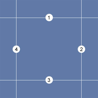
You’ll notice that the lines that create the regions are individually numbered. As these imaginary lines intersect, they create the nine areas into which the image will be sliced.
So how do the four numeric values correlate to the image shown above?
- The first value is the distance (in pixels or as a percentage) between the topmost edge of the image and line #1.
- The second value is the distance between the rightmost edge and line #2.
- The third value is the distance between the bottommost edge and line #3.
- And finally, the fourth value is the distance between the leftmost edge and line #4.
It should be noted that the syntax requires the % symbol to be included when using percent values, but the px should be omitted when using pixel values.
The corner slices of your image are handled in a straightforward way, with each used in the respective corner of the element to which you’ve applied the border-image. The middle sections, however, are trickier; after all, the sizes could potentially be any length. That’s where the last value in the border-image shorthand notation comes into play. It will determine how the non-corner parts of the image should be handled. The four possible values are stretch, repeat, round, and space.
The first two are fairly self-explanatory: stretch will stretch the slice to fill the space required, and repeat will tile it. The last two (round and space) are variants of repeat; they specify the behavior to adopt in the event that the space available doesn’t allow for a whole number of tiled slices. With repeat, the last tile will simply be cut off once all the space has been filled. By contrast, if you use space, the extra space will be distributed around each tile; and if you use round, the image will be stretched a little so that a whole number or slices suffice to fill the space.
You can also specify two values for this property, with the first applying to the top and bottom sides, and the second to the left and right sides:
border-image: url(border-image.jpg) 45 20 45 30 repeat stretch;
For an in-depth explanation of how these values are used to construct the border, check out the specification.
In order for border-image to work correctly, the element to which it’s applied must have the border (or border-width) property set with four values corresponding to the values given in the shorthand notation. (Otherwise your image slices will be stretched to fill the border width, which is rarely what you want).
The four values behave similarly to margin and padding values; it’s unnecessary to declare all four values explicitly. You could declare a single value, and that will represent all four. Or you could include just the first two values, and the two omitted values will match the ones declared. Thus, the following two examples would have the exact same results:
.border-image-example {border-image: url(bg-border.jpg) 45 20 45 20 repeat;}.border-image-example {border-image: url(bg-border.jpg) 45 20 repeat;}
As mentioned, many of the examples of border-image shown on various blogs are downright ugly. For this article, I decided to create a few cleaner and more practical examples that demonstrate how valuable this property will become when it’s fully supported by all in-use browsers. Have a look, and be sure to view the source to get a view of what exactly goes into these demos.
Three different images are used to create the border images shown on the demo page. Figure 2, “The three images used in the demo” shows all three images, so you can see how flexible this property really is.
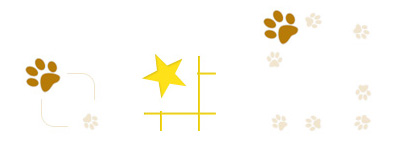
The three images above are all quite small, but because of the flexibility of the border-image property, they can suit any sized box, as long as the settings are declared correctly in the CSS.
Admittedly, creating the images necessary for border images can be a bit tedious at first. But once you understand how the property works, it’s fairly easy to create the mockup of your bordered box, then condense the image down to a bare minimum for insertion into the page.
To understand exactly how the images are constructed, here’s the first image blown up and divided into sections:
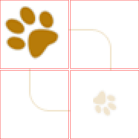
The red boxes indicate the four corner sections, while the areas between the boxes (in this case just a single pixel) represent the parts of the border that will either repeat or stretch to accommodate the size of the box.
In this example, a single pixel between the corner images is enough, because the repeating border is, well, a single pixel.
On the demo page, you’ll notice a variation on the third example, which has paw prints surrounding the entire image and with whitespace separating the paw prints. In such a case, it’s more challenging to get the border image to work correctly for different sized boxes unless you use the round or space values in your CSS notation. In fact, if you view the examples in Chrome or Safari (which lack support for the round value), you’ll notice that some of the paw prints in the third example are cut off near the corners; conversely, Firefox 3.5+ and Opera 10.5+ (both of which support the value round) are without this flaw.
Because of the lack of support across all modern browsers, it’s unlikely that image borders will be used extensively at this point. If you do decide to use them, don’t forget to test in nonsupporting browsers, and provide respectable fallback options for the look and size of the border.
For a more detailed discussion of the border-image property, be sure to check out the resources below:
- The W3C Specification for border-image
- Understanding Border Image, at CSS-Tricks
Do you know of any examples of border-images in use on live sites? Please let us know in the comments.
Frequently Asked Questions about CSS3 Border Images
What are the different properties of CSS3 border images?
CSS3 border images have five main properties. These are border-image-source, border-image-slice, border-image-width, border-image-outset, and border-image-repeat. The border-image-source property is used to specify the image to be used as the border. The border-image-slice property is used to divide the image into a grid, with the four values representing the top, right, bottom, and left parts of the image. The border-image-width property is used to specify the width of the border. The border-image-outset property is used to specify the amount by which the border image area extends beyond the border box. Lastly, the border-image-repeat property is used to specify whether and how the border image is repeated.
How can I use CSS3 border images to create a responsive design?
CSS3 border images can be used to create a responsive design by using the border-image-width and border-image-outset properties. These properties allow you to specify the width and outset of the border image in relation to the size of the border box, which can be set to change dynamically with the size of the viewport. This means that the border image will scale and reposition itself as the viewport size changes, allowing for a responsive design.
Can I use different images for different sides of the border?
Yes, you can use different images for different sides of the border by using the border-image-source property. This property allows you to specify an image for each side of the border. However, keep in mind that this can make your CSS more complex and may not be supported by all browsers.
How can I control the repetition of the border image?
The repetition of the border image can be controlled using the border-image-repeat property. This property allows you to specify whether the border image should be repeated, rounded, stretched, or spaced. The repeat value will repeat the image to fill the border area. The round value will repeat the image as many times as will fit within the border area without being cut off. The stretch value will stretch the image to fill the border area. The space value will repeat the image as many times as will fit within the border area with a certain amount of space between each repetition.
What types of images can be used as border images?
Any image that can be displayed by a web browser can be used as a border image. This includes JPEG, PNG, GIF, SVG, and other image formats. However, keep in mind that the image will be sliced into a grid and used to fill the border area, so the image should be designed with this in mind.
How can I make the border image responsive to different screen sizes?
To make the border image responsive to different screen sizes, you can use media queries in combination with the border-image-width and border-image-outset properties. Media queries allow you to apply different CSS rules depending on the size of the viewport. By changing the values of the border-image-width and border-image-outset properties in response to different viewport sizes, you can make the border image scale and reposition itself for different screen sizes.
Can I use CSS3 border images with other CSS border properties?
Yes, you can use CSS3 border images in combination with other CSS border properties. However, keep in mind that the border-image properties will override the corresponding border properties. For example, if you specify a border-image-width, it will override any border-width that you have specified.
How can I control the slicing of the border image?
The slicing of the border image can be controlled using the border-image-slice property. This property allows you to specify the top, right, bottom, and left insets for the slicing grid. The values can be specified as percentages of the image size or as absolute pixel values.
Can I use CSS3 border images with rounded corners?
Yes, you can use CSS3 border images with rounded corners by using the border-radius property in combination with the border-image properties. However, keep in mind that the border image will be applied to the border area as defined by the border-radius, which may result in the image being distorted or cut off.
Are CSS3 border images supported by all browsers?
CSS3 border images are supported by most modern web browsers, including Chrome, Firefox, Safari, and Edge. However, they may not be supported by older browsers or certain mobile browsers. It’s always a good idea to test your CSS in multiple browsers to ensure compatibility.