
In this article, we’ll explore all the possibilities of the CSS Grid repeat() function, which allows us to efficiently create patterns of Grid columns and rows, and even to create responsive layouts without media queries.
Key Takeaways
- The `repeat()` function simplifies the creation of grid patterns, allowing for the specification of the number of columns or rows and their sizes in a concise manner, enhancing code readability and efficiency.
- It supports various sizing options like fixed lengths (`px`, `em`, `%`, `fr`), content-based keywords (`min-content`, `max-content`), and the flexible `auto` keyword, providing versatility in responsive design.
- The function can integrate with `auto-fit` and `auto-fill` keywords to automatically adjust the number of grid tracks based on the container’s width, which is crucial for creating fluid, responsive layouts without media queries.
- Utilizing `minmax()` within `repeat()` offers a powerful way to define a range for track sizes, ensuring content adapts smoothly across different viewport sizes.
- Named lines can be defined within `repeat()`, aiding in the precise placement of grid items and enhancing the maintainability of the grid structure.
- `repeat()` cannot be nested within itself, but it can be used alongside other values and functions to create complex and responsive grid layouts efficiently.
Don’t repeat() Yourself
The grid-template-columns and grid-template-rows properties allow us to explicitly set the number of rows and columns we want in a grid, and to specify how they should be sized. This can become repetitive if we want multiple rows and/or columns to be sized the same way.
The repeat() function can save us from having to repeat ourselves. For example, we might find ourselves writing this:
grid-template-columns: 1fr 1fr 1fr 1fr 1fr;
Instead, we can write this:
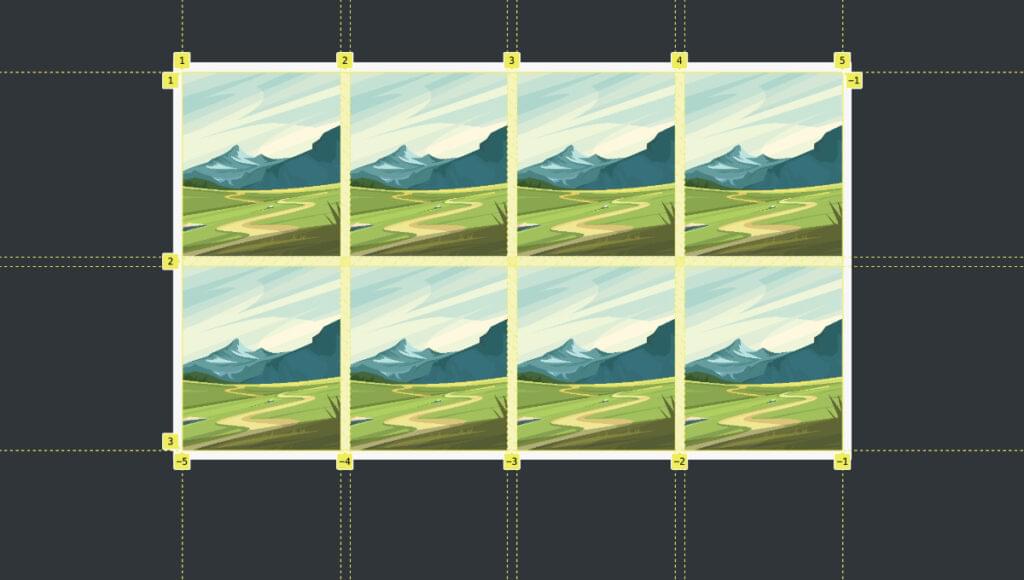
grid-template-columns: repeat(5, 1fr);
In the example above, the repeat() function lets us specify how many columns we want (5), and what size they should all be (1fr — or one fraction of the available space).
This makes our code more efficient and easier to read. And this is just a simple example. As we’ll see below, there’s a lot more we can do with the repeat() function.
The following Pen shows a simple demo of the code above. An article containing ten divs is organized into five columns.
See the Pen
CSS Grid repeat(): 5 simple columns by SitePoint (@SitePoint)
on CodePen.
The demo above uses the CSS gap property. To learn more about grid layout, check out our beginner’s guide to CSS Grid.
Options for the repeat() Function
We can actually do quite a lot inside the parentheses of repeat(). It takes two arguments, separated by a comma. The first represents the “count”, and the second represents the “tracks”: repeat(<count>, <tracks>). (The word “track” is a generic name for a column or a row.)
The count argument can be one of three things:
Clearly, a number value sets a specific number of tracks. But auto-fit and auto-fill allow for varying numbers of tracks depending on the available space. This makes them very handy for responsive layouts without media queries. We’ll explore them in detail below.
The tracks argument specifies the tracks that will be repeated. These are the options for this argument:
- a length value, using units such as fr, px, em, % and ch
- the min-content keyword
- the max-content keyword
- the auto keyword
- the minmax() function, which can itself have a nested min() or max() function
- the fit-content() function
- named lines
As you can see, there are lots of possible options for this argument, and they can start to look a bit confusing, especially when several of them are combined. We’ll try to keep things fairly simple here so that we don’t get lost in the weeds. In most circumstances, the tracks argument is fairly simple and intuitive.
Setting Groups of Columns with repeat()
Before we explore the various arguments that can be used with repeat(), it’s worth noting that repeat() can be used to create patterns of columns.
For example, consider this “longhand” code for a six-column grid:
article {
  grid-template-columns: 1fr 2fr 1fr 2fr 1fr 2fr;
}
We can rewrite this like so, using repeat():
article {
  grid-template-columns: repeat(3, 1fr 2fr);
}
This tells the browser to repeat a pattern three times — of a column 1fr wide, followed by a column 2fr wide. The demo below shows this in action.
See the Pen
CSS Grid repeat(): column patterns by SitePoint (@SitePoint)
on CodePen.
Using Length Values with repeat()
We’ve already seen a length value of 1fr used with repeat(). The advantage of the fr unit is that it sizes tracks according to the available space without us having to worry about how much space is available. But we can also use other length units where we need them.
For example, let’s set three column tracks and give them a width of 120 pixels:
article {
  grid-template-columns: repeat(3, 120px);
}
The following CodePen demo shows the result.
See the Pen
CSS Grid repeat(): length values by SitePoint (@SitePoint)
on CodePen.
The columns now have a fixed width, which won’t change even if the container is too narrow. Try playing around with the browser width in the Pen above. Also try swapping pixels for other length units, such as 5em, 10ch, 15%, and so on, to see their effect.
Using the min-content Keyword with repeat()
The min-content keyword sets a track to be only as wide or tall as its minimum content. In the demo below, we have three columns, each of which is set to min-content, so each column is as wide as the longest word it contains:
article {
  grid-template-columns: repeat(3, min-content);
}
See the Pen
CSS Grid repeat(): min-content by SitePoint (@SitePoint)
on CodePen.
Using the max-content Keyword with repeat()
The max-content keyword basically does the opposite of min-content: it bases the track size on the largest amount of content in a grid cell. In the demo below, the column widths are based on the cell with the largest amount of content:
article {
  grid-template-columns: repeat(3, max-content);
}
See the Pen
CSS Grid repeat(): max-content by SitePoint (@SitePoint)
on CodePen.
Using the auto Keyword with repeat()
When used with repeat(), the auto keyword maxes out at max-content and mins out at min-content.
Consider the following pattern of columns:
article {
  grid-template-columns: repeat(3, auto 1fr);
}
Here, we’ll have six columns, each odd-numbered one set to a width of auto. In the CodePen demo below, we can see that, where there’s enough space, the divs with “auto” text max out at max-content, and the 1fr divs share the remaining space. As the browser narrows, the auto columns continue to get narrower until they reach the min-content threshold.
See the Pen
CSS Grid repeat(): auto by SitePoint (@SitePoint)
on CodePen.
In the demo above, the divs only start to overflow the container once each column has reached its min-content threshold. (That is, the text can’t wrap any further.)
Note: auto only seems to behave as described above when mixed with other values. On its own — such as repeat(3, auto) — it behaves just like we’re setting repeat(3, 1fr).
Using the minmax() Function with repeat()
The minmax() function takes two arguments of its own — a minimum and maximum value, separated by a comma. So with minmax(), we can set a range of possible sizes for tracks in a flexible environment.
For example, we could set a column to minmax(40px, 100px), which means its minimum possible width is 40px and its maximum possible width is 100px.
Both arguments of minmax() can take length values like fr, px, em, % and ch, as well as min-content, max-content and auto. However, it’s best to use a length value for at least one argument, as the keywords aren’t supposed to work as both arguments (although I find this sometimes does work — such as minmax(min-content, max-content)).
The following code sets five columns, each with a minimum width of 60px and a maximum width of 1fr:
article {
  grid-template-columns: repeat(5, minmax(60px, 1fr));
}
See the Pen
CSS Grid repeat(): minmax() by SitePoint (@SitePoint)
on CodePen.
This works well until the minimum width of 60px is reached. After that point, the content starts to hang out of its container. We’ll see how to get a better result soon.
Using the minmax() function with min() or max()
The minmax() function can also have either the min() or max() function as an argument. These both take two values. The min() function applies whichever is the smaller of its two values, and the max() function applies whichever is the larger value. This is useful in responsive environments.
For example:
article {
  grid-template-columns: repeat(5, minmax(min(60px, 8vw), 1fr));
}
See the Pen
CSS Grid repeat(): minmax() function with min() by SitePoint (@SitePoint)
on CodePen.
The code above sets five columns. On wide browsers, the five columns will all be equally spaced at 1fr. On narrower devices, the columns will get narrower and narrower. They’ll stop shrinking once they hit whichever is the lower of 60px and 8vw. So we still can find ourselves with content hanging out of the container on narrow screens; there’s still further to go to be fully responsive.
If you’re finding the combination of minmax(), min() and max() a bit underwhelming at this stage, hang in there, as their real power will be seen below when we meet auto-fit and auto-fill.
Using the fit-content() function with repeat()
The fit-content() function takes a single argument, which represents the maximum size a track can grow to. So the track can be flexible up to that point. fit-content() can take any length value, such as fr, px, em, % and ch.
For example, if we set three columns and fit-content(120px), the column widths will be responsive up until a width of 120px:
article {
  grid-template-columns: repeat(3, fit-content(120px));
}
See the Pen
CSS Grid repeat(): fit-content() by SitePoint (@SitePoint)
on CodePen.
Using Named Lines with repeat()
In Grid layout, the vertical and horizontal lines around tracks are numbered by default. When setting grid-template-columns and grid-template-rows, we can give names to those lines. This makes it easier to target those lines when placing content on the grid (as we don’t have to go in and count the grid lines).
Here’s a simple example. The named lines are the bits in square brackets ([]):
article {
  grid-template-columns: [sidebar] 300px [content-start] 1fr [content-end];
}
The code above gives us two columns. The left-most vertical grid line (number 1) is called “sidebar”, the middle grid line (number 2) is called “content-start”, and the final grid line (number 3) is called “content-end”.
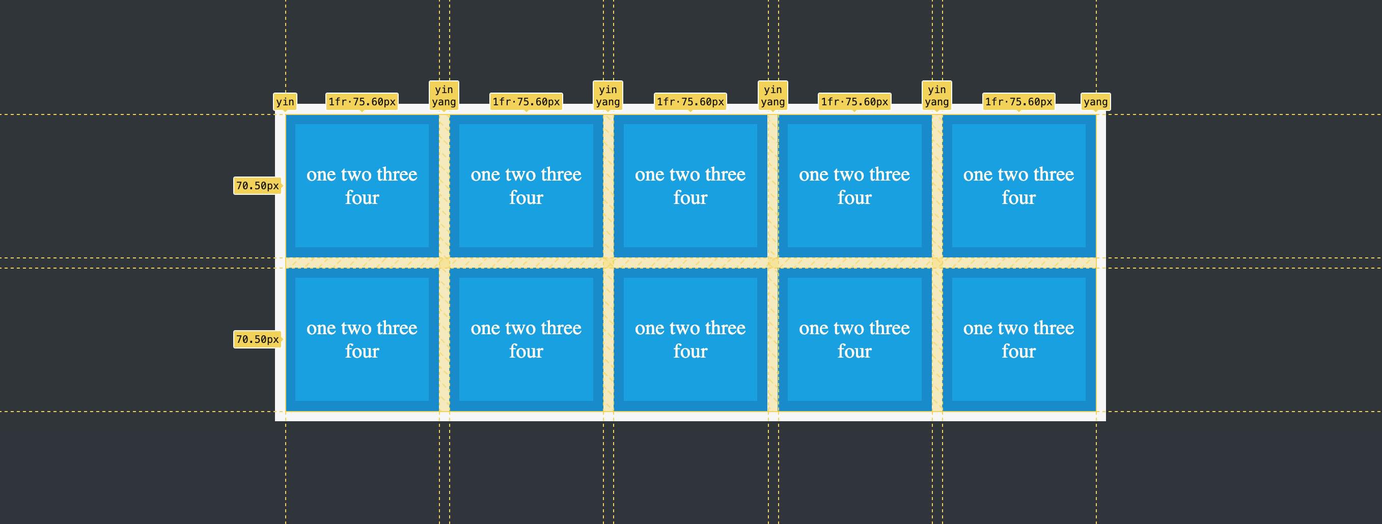
We can also used named lines within our repeat() function:
article {
  grid-template-columns: repeat(5, [yin] 1fr [yang]);
}
This means that each of our columns now has a line to the left called yin and a line to the right called yang.
It might seem to make life more difficult if each line has the same name, but we can still target them individually. For example:
- we can target the first
yinline withgrid-column: yin - we can target the second
yinline withgrid-column: yin 2 - we can set a column to span three rows from the second
yinline:grid-column: yin 2 / span 3 - we can set a column to span from the second
yinto the end withgrid-column: yin 2 / yang -1
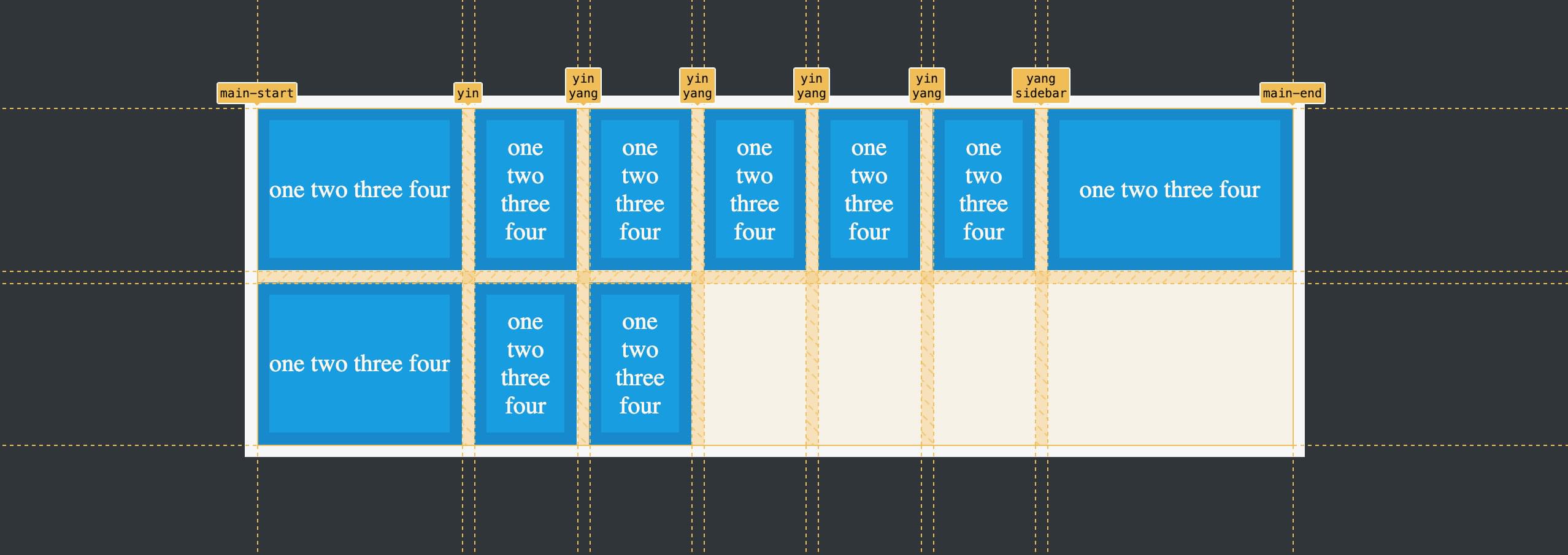
Naming lines within repeat() is probably most useful where repeat() is mixed with other values, like so:
article {
  grid-template-columns: [main-start] auto repeat(5, [yin] 1fr [yang]) [sidebar] 300px [main-end];
}
I won’t delve further into named lines and how to use them here, as it’s a separate topic, but you can read more about named grid lines on MDN.
Using repeat() with auto-fit and auto-fill
The auto-fit and auto-fill keywords are alternatives to setting a fixed number of tracks. They tell the browser to fit as many tracks into a given space as possible. For example:
article {
  grid-template-columns: repeat(auto-fit, 150px);
}
See the Pen
CSS Grid repeat(): auto-fit and auto-fill by SitePoint (@SitePoint)
on CodePen.
In the demo above, divs are set to a width of 150px, and those that can’t fit on one line drop to the next. If we change auto-fit to auto-fill, we won’t see a difference, because under these conditions, they both do the same thing. The differences between them only become obvious under special circumstances.
At this point, auto-fit to auto-fill are okay, but nothing especially flash. It’s when they’re combined with minmax() and min() that the real magic starts to happen, so let’s look at that next.
Using repeat() with auto-fit/auto-fill, minmax() and min()
If you aren’t in love with repeat() yet, the combination of repeat() with auto-fit, minmax() and min() will surely see Cupid’s arrow pierce your stubborn heart. Their combination lets us create truly responsive layouts without the use of media queries.
Using auto-fit and minmax() with repeat()
Consider the following CSS:
article {
  grid-template-columns: repeat(auto-fit, minmax(200px, 1fr));
}
In this example, minmax() sets a minimum column width of 200px and a maximum of 1fr. The demo below shows this in action.
See the Pen
CSS Grid repeat(): auto-fit and minmax() by SitePoint (@SitePoint)
on CodePen.
Each div must be at least 200px wide. If there’s extra space to the right (less that 200 pixels), the divs expand to fill the space. If we widen the browser, another div is added to the row once another 200 pixels of space is available. The same happens in reverse: as we narrow the browser, the last div in the row will drop once there isn’t at least 200px of space for it to fit into. And once it has dropped, the remaining divs expand to fill up the row.
Again, if we swap auto-fit for auto-fill, we’ll see the same behavior.
There’s one limitation with this example, though. If we make the browser window narrow enough, we’ll end up with a single column. As that column gets narrower than 200px, the divs will start to overflow their container.

We can prevent this overflow from happening by bringing min() into the mix, so let’s look at that next.
Using auto-fit, minmax() and min() with repeat()
We can control what happens at small widths by introducing min(). Let’s update our code to look like this:
article {
  grid-template-columns: repeat(auto-fit, minmax(min(200px, 100%), 1fr));
}
Now there are two options for the minimum column width. The browser will choose whichever is smallest. Once the column is narrower than 200px, 100% is the smaller value, so it prevails. And this means that the single remaining column is now set to width: 100%, so it will continue to fit nicely into its container at ever decreasing widths. (Squeeze the browser window down as far as you can to see this in practice.)
See the Pen
CSS Grid repeat(): minmax() and min() by SitePoint (@SitePoint)
on CodePen.
For a more real-world demo of using repeat() with auto-fit, minmax() and min(), check out the following CodePen demo of a responsive image gallery. This demo also makes use of the aspect-ratio property, which we covered in How to Use CSS aspect-ratio.
See the Pen
Responsive Image Gallery using aspect-ratio by SitePoint (@SitePoint)
on CodePen.
Understanding the Difference between auto-fit and auto-fill
In the examples we’ve seen so far, there appears to be no difference whatsoever between auto-fit and auto-fill. The difference only appears in certain situations, which we’ll briefly cover now.
We’ll strip our demo HTML down so that there are only four divs, and set the following CSS:
article {
  grid-template-columns: repeat(auto-fill, minmax(min(100px, 100%), 1fr));
}
The image below shows what we get with auto-fill.
The browser is calculating how many divs could fit in the container and is leaving space for them. Each of the existing divs is 110px wide, as are the spaces left to the right.
Let’s switch to auto-fit:
article {
  grid-template-columns: repeat(auto-fit, minmax(min(100px, 100%), 1fr));
}
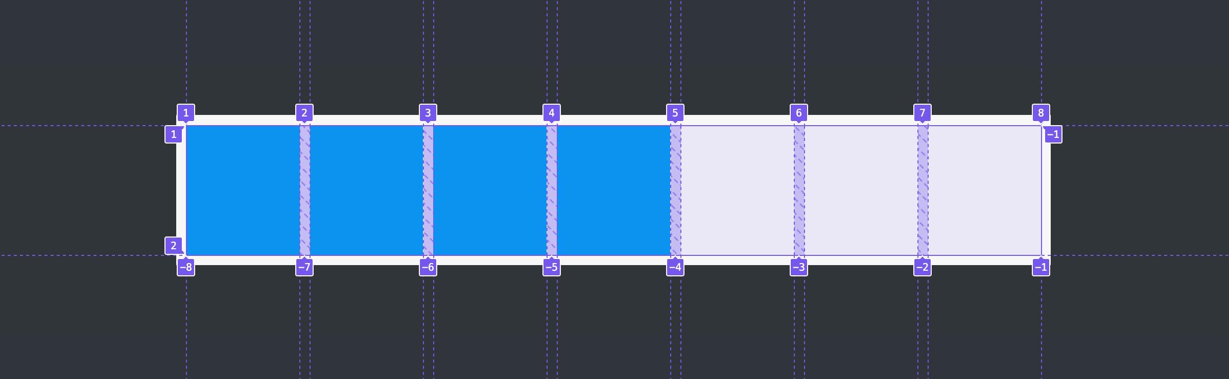
The image below shows what we get with auto-fit.
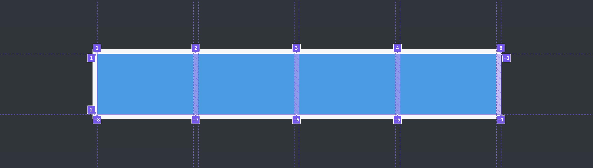
With auto-fit, the browser also calculates space for more divs, but then collapses that space down to zero width and lets the existing divs expand to take up all the space. In the image above, you can see that the end column line is still numbered 8. The 8 is stacked above grid lines 7, 6 and 5.
So what are we to make of all this? Realistically, in most if not all circumstances we’re going to want to use auto-fit, because we won’t often want space to remain empty when we could be using it for our content.
You can play around with auto-fit and auto-fill in this CodePen demo. Try changing auto-fit to auto-fill, and widen and contract the browser to see how they both behave.
Useful Things to Know about repeat()
As noted above, the repeat() function can be used as part of a longer declaration with grid-template-columns and grid-template-rows. Most of the friends we’ve met here — length units, min-content, max-content, auto, minmax(), fit-content(), and named lines — work alongside repeat() as well as inside it. (You can see examples of them working with grid-template-columns and grid-template-rows on MDN.)
Some combinations are not allowed for the track argument. For example, we can’t use something like repeat(auto-fill, 1fr). auto-fit and flexible units can’t play together, because we need a fixed measure in there somewhere, such as minmax(100px, 1fr).
As we’ve seen, the minmax() function can have either a nested min() or max() function. It can also contain one of auto, min-content, max-content, but not two. For example, we could use minmax(50px, max-content), but not minmax(min-content, max-content) (although, to be honest, I’ve found that some of these combinations do seem to work anyway).
The repeat() notation can’t be nested. So we can’t have a repeat() within a repeat(). But we certainly can have repeat() functions side by side — such as repeat(5, 1fr) 100px repeat(2, 50px).
Wrapping Up
The repeat() function is an incredibly useful tool for efficiently laying out repeating patterns of grid columns and rows. It can be used to create fully responsive layouts without media queries in just a single line of code.
In most cases, you won’t need to get too far down in the weeds with repeat(). Its most impressive feature is summed up in a basic example like this:
repeat(auto-fit, minmax(min(50px, 100%), 1fr))
Make sure to keep that line of code in your back pocket, as it will come in very handy.
You can learn more about the repeat() function here:
For a more general introduction to CSS Grid layout, see An Introduction to CSS Grid Layouts.
Frequently Asked Questions (FAQs) about CSS Grid Repeat Function
What is the difference between using the repeat function and manually specifying the grid tracks in CSS Grid?
The repeat function in CSS Grid is a shorthand method for defining multiple grid tracks of the same size. Instead of manually specifying each track, you can use the repeat function to define the number of tracks and their size in one go. This makes your code cleaner and easier to read. For example, instead of writing “grid-template-columns: 100px 100px 100px 100px;”, you can simply write “grid-template-columns: repeat(4, 100px);”. Both codes will create a grid with four columns each of 100px width.
Can I use the repeat function with different track sizes?
Yes, you can use the repeat function with different track sizes. The repeat function accepts two arguments: the number of repetitions and the track size. If you want to create a grid with tracks of different sizes, you can use the repeat function multiple times in the same property. For example, “grid-template-columns: repeat(2, 100px) repeat(3, 200px);” will create a grid with two columns of 100px and three columns of 200px.
How does the auto-fill keyword work with the repeat function?
The auto-fill keyword is used with the repeat function to automatically fill the grid container with as many tracks as it can fit. The size of the tracks is specified as the second argument of the repeat function. If the container’s size exceeds the total size of the tracks, the remaining space will be distributed equally among the tracks. For example, “grid-template-columns: repeat(auto-fill, 100px);” will create as many 100px columns as can fit in the container.
Can I use the repeat function with fractional units (fr)?
Yes, the repeat function can be used with fractional units (fr). The fr unit represents a fraction of the available space in the grid container. For example, “grid-template-columns: repeat(3, 1fr);” will create a grid with three columns that each take up one third of the container’s width.
How does the auto-fit keyword work with the repeat function?
The auto-fit keyword is used with the repeat function to create a responsive grid layout. It works similarly to auto-fill, but it collapses any empty tracks. This means that if there’s not enough content to fill all the tracks, the remaining tracks will expand to take up the available space. For example, “grid-template-columns: repeat(auto-fit, minmax(100px, 1fr));” will create as many 100px columns as can fit in the container, and any remaining space will be distributed among the columns.
Can I use the repeat function with the minmax function?
Yes, the repeat function can be used with the minmax function. The minmax function defines a size range greater than or equal to the minimum and less than or equal to the maximum. For example, “grid-template-columns: repeat(3, minmax(100px, 1fr));” will create a grid with three columns that each have a minimum width of 100px and a maximum width of 1fr.
What happens if I use the repeat function with a negative number?
If you use the repeat function with a negative number, the browser will ignore the rule and the grid will not be created. The repeat function only accepts positive integers as the number of repetitions.
Can I use the repeat function with percentage values?
Yes, you can use the repeat function with percentage values. The percentage is calculated with respect to the size of the grid container. For example, “grid-template-columns: repeat(2, 50%);” will create a grid with two columns that each take up half of the container’s width.
Can I use the repeat function with the grid-template-rows property?
Yes, the repeat function can be used with the grid-template-rows property to define the size of the grid rows. The syntax is the same as with grid-template-columns. For example, “grid-template-rows: repeat(3, 100px);” will create a grid with three rows each of 100px height.
Can I use the repeat function with media queries?
Yes, the repeat function can be used with media queries to create responsive grid layouts. You can define different grid layouts for different screen sizes using the repeat function inside a media query. For example, you might want to display two columns on small screens and four columns on large screens. This can be achieved with the following code:
@media (max-width: 600px) {
.grid {
grid-template-columns: repeat(2, 1fr);
}
}
@media (min-width: 601px) {
.grid {
grid-template-columns: repeat(4, 1fr);
}
}