
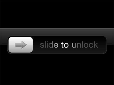
Even if you’re never touched an iPhone before, you’re probably familiar with the infamous “slide to unlock” button, and maybe have always wanted a swipe button for Android apps.
The original purpose behind this button was to prevent a device from getting accidentally unlocked while in a pocket. In the mobile apps you create, there may be a similar use case where you want to give the user the option to confirm a definitive action. The Uber app for drivers has such a button which the driver swipes from left to right to confirm that they want to start a journey.
Usually the solution is to prompt the user with a popup to confirm the action, but this is not an inspired solution. Let’s try creating our own swipe button for Android.

The final code for the project is on GitHub.
Key Takeaways
- Implement an iOS-style swipe button in Android to enhance user interaction by following a detailed guide on creating a custom SwipeButton class.
- Customize the SwipeButton’s appearance and behavior using the SwipeButtonCustomItems class, which allows modification of gradient colors, swipe distance, and callback functions.
- Handle user interactions such as pressing, moving, and releasing the button with onTouchEvent to manage swipe effects and confirm actions.
- Enable dynamic visual feedback during the swipe action using LinearGradient and ShapeDrawable to visually represent the swipe progress.
- Integrate the custom SwipeButton into your Android app’s layout and activity, with options to customize text, colors, and actions through provided setter methods.
Getting Started
Create a new project in Android Studio with a Blank Activity.
Add a class called SwipeButton that extends the Button class and add the following to it:
import android.content.Context;
import android.util.AttributeSet;
import android.widget.Button;

public class SwipeButton extends Button {
    public SwipeButton(Context context) {
        super(context);
    }

    public SwipeButton(Context context, AttributeSet attrs) {
        super(context, attrs);
    }

    public SwipeButton(Context context, AttributeSet attrs, int defStyleAttr) {
        super(context, attrs, defStyleAttr);
    }

}
For the functionality required, you’ll have to play with the onTouchEvent listener of the Button. In the listener you capture when the user presses, swipes across or releases the button. Override the onTouchEvent by adding the following to the SwipeButton class:
@Override
public boolean onTouchEvent(MotionEvent event) {

  switch (event.getAction()) {
      // when user first touches the screen we get x and y coordinate
      case MotionEvent.ACTION_DOWN: {
          //when user first touches the screen change the button text to desired value
          break;
      }
      case MotionEvent.ACTION_UP: {
          //when the user releases touch then revert back the text
          break;
      }
      case MotionEvent.ACTION_MOVE: {
          //here we'll capture when the user swipes from left to right and write the logic to create the swiping effect
          break;
      }
  }

  return super.onTouchEvent(event);
}
The code above handles three cases which I will cover in more detail:
- When the user first touches the button
- When the user is swiping the button.
- When the user releases the button after either completing the swipe or somewhere in the middle.
1. When user first touches the button
You need to do the following:
- Get the x and y coordinates of where the user touched the button from the
MotionEventobject in theonTouchEventcallback. - Change the text or color of the button.
Here’s the code:
public class SwipeButton extends Button {
  private float x1;
  //x coordinate of where user first touches the button
  private float y1;
  //y coordinate of where user first touches the button
  private String originalButtonText;
  //the text on the button
  private boolean confirmThresholdCrossed;
  //whether the threshold distance beyond which action is considered confirmed is crossed or not
  private boolean swipeTextShown;
  //whether the text currently on the button is the text shown while swiping or the original text

  ...

  @Override
  public boolean onTouchEvent(MotionEvent event) {

      switch (event.getAction()) {
          case MotionEvent.ACTION_DOWN: {
              x1 = event.getX();
              y1 = event.getY();
              // when user first touches the screen we get x and y coordinate

              this.originalButtonText = this.getText().toString();
              //save the original text on the button

              confirmThresholdCrossed = false;
              //action hasn't been confirmed yet

              if (!swipeTextShown) {
                  this.setText(">> SWIPE TO CONFIRM >>");
                  //change the text on the button to indicate that the user is supposed to swipe the button to confirm
                  swipeTextShown = true;
              }
              break;
          }
          ...
      }

      return super.onTouchEvent(event);
  }
  }
2. When user is swiping the button
The following needs to happen when a user is swiping the button:
- Change the text if desired.
- Display a swiping effect by manipulating the gradient as the user swipes the button.
LinearGradient is used for displaying the swiping effect with a gradient effect of three colors. As the user swipes, this gradient moves from left to right creating the desired effect.
public class SwipeButton extends Button {

  ...
  private boolean swiping = false;
  private float x2Start;
  //whether the text currently on the button is the text shown while swiping or the original text


  @Override
  public boolean onTouchEvent(MotionEvent event) {
    switch (event.getAction()) {
      ...
      case MotionEvent.ACTION_MOVE: {
          //here we'll capture when the user swipes from left to right and write the logic to create the swiping effect

          float x2 = event.getX();
          float y2 = event.getY();

          if(!swiping){
              x2Start = event.getX();
              //this is to capture at what x swiping started
              swiping = true;
          }

          //if left to right sweep event on screen
          if (x1 < x2 && !confirmThresholdCrossed) {
              this.setBackgroundDrawable(null);

              ShapeDrawable mDrawable = new ShapeDrawable(new RectShape());

              int gradientColor1 = 0xFF333333;
              int gradientColor2 = 0xFF666666;
              int gradientColor2Width = 50;
              int gradientColor3 = 0xFF888888;
              double actionConfirmDistanceFraction = 0.6;
              //We'll get to how to be able to customize these values for each instance of the button


              Shader shader = new LinearGradient(x2, 0, x2 - gradientColor2Width, 0,
                      new int[]{gradientColor3, gradientColor2, gradientColor1},
                      new float[]{0, 0.5f, 1},
                      Shader.TileMode.CLAMP);

              mDrawable.getPaint().setShader(shader);
              this.setBackgroundDrawable(mDrawable);


              if (swipeTextShown == false) {
                  this.setText(">> SWIPE TO CONFIRM >> ");
                  //change text while swiping
                  swipeTextShown = true;
              }

              if ((x2-x2Start) > (this.getWidth() * actionConfirmDistanceFraction)) {
                  Log.d("CONFIRMATION", "Action Confirmed! Read on to find how to get your desired callback here");
                  //confirm action when swiped upto the desired distance
                  confirmThresholdCrossed = true;
              }
          }
      }
      ...
3. When user releases the button
Now when user releases the button, there will be two possibilities:
- The user releases before confirming the action. Meaning before crossing the threshold distance the user needs to swipe for confirming the action.
- The user releases after confirming the action, meaning after crossing the threshold distance.
These are both covered in the following snippet:
...
case MotionEvent.ACTION_UP: {
  //when the user releases touch then revert back the text
  swiping = false;
  float x2 = event.getX();
  int buttonColor = swipeButtonCustomItems.getPostConfirmationColor();
  String actionConfirmText = swipeButtonCustomItems.getActionConfirmText() == null ? this.originalButtonText : swipeButtonCustomItems.getActionConfirmText();
  //if you choose to not set the confirmation text, it will set to the original button text;

  this.setBackgroundDrawable(null);
  this.setBackgroundColor(buttonColor);
  swipeTextShown =  false;


  if ((x2-x2Start) <= (this.getWidth() * swipeButtonCustomItems.getActionConfirmDistanceFraction())) {
      Log.d("CONFIRMATION", "Action not confirmed");
      this.setText(originalButtonText);
      swipeButtonCustomItems.onSwipeCancel();
      confirmThresholdCrossed = false;

  } else {
      Log.d("CONFIRMATION", "Action confirmed");
      this.setText(actionConfirmText);
  }

  break;
}
...
Several attributes, such as gradient colors, have been hard-coded for now. These will be set for each instance of the button, and to be able to set callback functions for when a user performs certain actions with the button.
Set attributes
The attributes that you can customize for each instance of SwipeButton are:
- The three gradient colors.
- The width covered by the second gradient color.
- Fraction of distance of the width of the
Buttonthat the user needs to swipe to confirm the action. - The text that appears when the user presses, or is swiping the button.
You can also provide the option to assign callbacks for cases when the user:
- Presses the button.
- Swipes the button up to the required distance for confirmation.
- Releases the button without confirming.
To accept these attributes and callbacks, make another class, and make it abstract.
public abstract class SwipeButtonCustomItems {
    //These are the default values if we don't choose to set them later:
    public int gradientColor1 = 0xFF333333;
    public int gradientColor2 = 0xFF666666;
    public int gradientColor2Width = 50;
    public int gradientColor3 = 0xFF888888;
    public int postConfirmationColor = 0xFF888888;
    public double actionConfirmDistanceFraction = 0.7;
    public String buttonPressText = ">>   SWIPE TO CONFIRM   >> ";

    public String actionConfirmText = null;

    public int getGradientColor1() {
        return gradientColor1;
    }

    public SwipeButtonCustomItems setGradientColor1(int gradientColor1) {
        this.gradientColor1 = gradientColor1;
        return this;
    }

    public int getGradientColor2() {
        return gradientColor2;
    }

    public SwipeButtonCustomItems setGradientColor2(int gradientColor2) {
        this.gradientColor2 = gradientColor2;
        return this;
    }

    public int getGradientColor2Width() {
        return gradientColor2Width;
    }

    public SwipeButtonCustomItems setGradientColor2Width(int gradientColor2Width) {
        this.gradientColor2Width = gradientColor2Width;
        return this;
    }

    public int getGradientColor3() {
        return gradientColor3;
    }

    public SwipeButtonCustomItems setGradientColor3(int gradientColor3) {
        this.gradientColor3 = gradientColor3;
        return this;
    }

    public double getActionConfirmDistanceFraction() {
        return actionConfirmDistanceFraction;
    }

    public SwipeButtonCustomItems setActionConfirmDistanceFraction(double actionConfirmDistanceFraction) {
        this.actionConfirmDistanceFraction = actionConfirmDistanceFraction;
        return this;
    }

    public String getButtonPressText() {
        return buttonPressText;
    }

    public SwipeButtonCustomItems setButtonPressText(String buttonPressText) {
        this.buttonPressText = buttonPressText;
        return this;
    }

    public String getActionConfirmText() {
        return actionConfirmText;
    }

    public SwipeButtonCustomItems setActionConfirmText(String actionConfirmText) {
        this.actionConfirmText = actionConfirmText;
        return this;
    }

    public int getPostConfirmationColor() {
        return postConfirmationColor;
    }

    public SwipeButtonCustomItems setPostConfirmationColor(int postConfirmationColor) {
        this.postConfirmationColor = postConfirmationColor;
        return this;
    }

    //These methods listed below can be overridden in the instance of SwipeButton
    public void onButtonPress(){

    }

    public void onSwipeCancel(){

    }

    abstract public void onSwipeConfirm();
}
Now you need a setter in the main SwipeButton class which introduces an instance of this abstract class. Using the setter you can set the desired attributes and callbacks. With all cases covered and attributes and callbacks taken from the abstract class’ instance, here’s how the SwipeButton class now looks:
public class SwipeButton extends Button {

    private float x1;
    //x coordinate of where user first touches the button
    private float y1;
    //y coordinate of where user first touches the button
    private String originalButtonText;
    //the text on the button
    private boolean confirmThresholdCrossed;
    //whether the threshold distance beyond which action is considered confirmed is crossed or not
    private boolean swipeTextShown;
    private boolean swiping = false;
    private float x2Start;
    //whether the text currently on the button is the text shown while swiping or the original text

    private SwipeButtonCustomItems swipeButtonCustomItems;
    //in this instance of the class SwipeButtonCustomItems we can accept callbacks and other params like colors

    public SwipeButton(Context context) {
        super(context);
    }

    public SwipeButton(Context context, AttributeSet attrs) {
        super(context, attrs);
    }

    public SwipeButton(Context context, AttributeSet attrs, int defStyleAttr) {
        super(context, attrs, defStyleAttr);
    }

    public void setSwipeButtonCustomItems(SwipeButtonCustomItems swipeButtonCustomItems) {
        //setter for swipeButtonCustomItems
        this.swipeButtonCustomItems = swipeButtonCustomItems;
    }

    @Override
    public boolean onTouchEvent(MotionEvent event) {

        switch (event.getAction()) {
            case MotionEvent.ACTION_DOWN: {
                // when user first touches the screen we get x and y coordinate
                x1 = event.getX();
                y1 = event.getY();

                this.originalButtonText = this.getText().toString();

                confirmThresholdCrossed = false;

                if (!swipeTextShown) {
                    this.setText(swipeButtonCustomItems.getButtonPressText());
                    swipeTextShown = true;
                }

                swipeButtonCustomItems.onButtonPress();
                break;
            }
            case MotionEvent.ACTION_MOVE: {
                //here we'll capture when the user swipes from left to right and write the logic to create the swiping effect

                float x2 = event.getX();
                float y2 = event.getY();

                if(!swiping){
                    x2Start = event.getX();
                    //this is to capture at what x swiping started
                    swiping = true;
                }

                //if left to right sweep event on screen
                if (x1 < x2 && !confirmThresholdCrossed) {
                    this.setBackgroundDrawable(null);

                    ShapeDrawable mDrawable = new ShapeDrawable(new RectShape());

                    int gradientColor1 = swipeButtonCustomItems.getGradientColor1();
                    int gradientColor2 = swipeButtonCustomItems.getGradientColor2();
                    int gradientColor2Width = swipeButtonCustomItems.getGradientColor2Width();
                    int gradientColor3 = swipeButtonCustomItems.getGradientColor3();
                    double actionConfirmDistanceFraction = swipeButtonCustomItems.getActionConfirmDistanceFraction();
                    //Note that above we replaced the hard coded values by those from the SwipeButtonCustomItems instance.


                    Shader shader = new LinearGradient(x2, 0, x2 - gradientColor2Width, 0,
                            new int[]{gradientColor3, gradientColor2, gradientColor1},
                            new float[]{0, 0.5f, 1},
                            Shader.TileMode.CLAMP);

                    mDrawable.getPaint().setShader(shader);
                    this.setBackgroundDrawable(mDrawable);


                    if (swipeTextShown == false) {
                        this.setText(swipeButtonCustomItems.getButtonPressText());
                        //change text while swiping
                        swipeTextShown = true;
                    }

                    if ((x2-x2Start) > (this.getWidth() * actionConfirmDistanceFraction)) {
                        Log.d("CONFIRMATION", "Action Confirmed!");
                        //Note that below we inserted the desired callback from the SwipeButtonCustomItem instance.
                        swipeButtonCustomItems.onSwipeConfirm();
                        //confirm action when swiped upto the desired distance
                        confirmThresholdCrossed = true;
                    }

                }

                break;
            }
            case MotionEvent.ACTION_UP: {
                //when the user releases touch then revert back the text
                swiping = false;
                float x2 = event.getX();
                int buttonColor = swipeButtonCustomItems.getPostConfirmationColor();
                String actionConfirmText = swipeButtonCustomItems.getActionConfirmText() == null ? this.originalButtonText : swipeButtonCustomItems.getActionConfirmText();
                //if you choose to not set the confirmation text, it will set to the original button text;

                this.setBackgroundDrawable(null);
                this.setBackgroundColor(buttonColor);
                swipeTextShown =  false;


                if ((x2-x2Start) <= (this.getWidth() * swipeButtonCustomItems.getActionConfirmDistanceFraction())) {
                    Log.d("CONFIRMATION", "Action not confirmed");
                    this.setText(originalButtonText);
                    swipeButtonCustomItems.onSwipeCancel();
                    confirmThresholdCrossed = false;

                } else {
                    Log.d("CONFIRMATION", "Action confirmed");
                    this.setText(actionConfirmText);
                }

                break;
            }
        }


        return super.onTouchEvent(event);
    }
}
To use the SwipeButton in your activity or fragment, add the corresponding xml element to the layout xml:
<com.package.path.SwipeButton
    android:id="@+id/my_swipe_button"
    android:layout_width="400dp"
    android:layout_height="50dp"
    android:text="Button"
    android:layout_below="@id/hello_world"
    android:background="#888888"
    android:textColor="#ffffff"
    />
To assign callbacks and customize attributes like colors, add the following to your MainActivity:
public class MainActivity extends AppCompatActivity {

  @Override
  protected void onCreate(Bundle savedInstanceState) {
      super.onCreate(savedInstanceState);
      setContentView(R.layout.activity_main);
      SwipeButton mSwipeButton = (SwipeButton) findViewById(R.id.my_swipe_button);

      SwipeButtonCustomItems swipeButtonSettings = new SwipeButtonCustomItems() {
          @Override
          public void onSwipeConfirm() {
              Log.d("NEW_STUFF", "New swipe confirm callback");
          }
      };

      swipeButtonSettings
              .setButtonPressText(">> NEW TEXT! >>")
              .setGradientColor1(0xFF888888)
              .setGradientColor2(0xFF666666)
              .setGradientColor2Width(60)
              .setGradientColor3(0xFF333333)
              .setPostConfirmationColor(0xFF888888)
              .setActionConfirmDistanceFraction(0.7)
              .setActionConfirmText("Action Confirmed");

      if (mSwipeButton != null) {
          mSwipeButton.setSwipeButtonCustomItems(swipeButtonSettings);
      }
  }
}
Use Cases
Using this type of button interaction could be an interesting alternative to the annoying confirmation alert. I would be interested to know what use cases you would have, please add your thoughts in the comments below.
Frequently Asked Questions (FAQs) about Creating an iOS-Style Swipe Button for Android
How can I customize the appearance of the swipe button?
Customizing the appearance of the swipe button involves changing its properties in the XML layout file. You can modify the button’s color, size, and text among other things. For instance, to change the button’s color, you can use the ‘setButtonBackground’ method and pass in the color you want. Similarly, to change the text, you can use the ‘setText’ method and pass in the string you want to display. Remember, customization is key in enhancing the user experience and making your app stand out.
Can I use an image instead of text for the swipe button?
Yes, you can use an image instead of text for the swipe button. This can be achieved by setting the button’s background to the desired image. You can use the ‘setBackgroundResource’ method and pass in the resource ID of the image. However, ensure the image is appropriately sized to fit within the button for the best visual result.
How can I change the swipe direction of the button?
Changing the swipe direction of the button can be achieved programmatically. By default, the swipe direction is set to right. However, you can change this by using the ‘setSwipeDirection’ method and passing in the desired direction. For instance, to set the swipe direction to left, you can pass ‘SwipeButton.LEFT’ as the argument.
How can I add a confirmation dialog to the swipe button?
Adding a confirmation dialog to the swipe button can be done in the ‘onStateChange’ method. This method is called when the button’s state changes, i.e., when it is swiped. In this method, you can create and display a dialog asking the user for confirmation. If the user confirms, you can proceed with the action; otherwise, you can reset the button’s state.
How can I make the swipe button responsive to different screen sizes?
Making the swipe button responsive to different screen sizes involves using ‘match_parent’ or ‘wrap_content’ for the button’s width and height in the XML layout file. This ensures that the button scales appropriately depending on the screen size. Additionally, you can use different layout files for different screen sizes to further customize the button’s appearance.
How can I disable the swipe button?
Disabling the swipe button can be done programmatically using the ‘setEnabled’ method. By passing ‘false’ as the argument, the button becomes unresponsive to user input. This can be useful in situations where you want to prevent the user from interacting with the button.
Can I use the swipe button in a RecyclerView?
Yes, you can use the swipe button in a RecyclerView. However, you need to handle the button’s state changes appropriately to prevent issues due to view recycling. This can be done in the ‘onBindViewHolder’ method of the RecyclerView’s adapter.
How can I add a ripple effect to the swipe button?
Adding a ripple effect to the swipe button can enhance its visual appeal. This can be achieved by setting the button’s background to a ripple drawable. The ripple drawable defines the appearance of the ripple effect, including its color and radius.
How can I change the speed of the swipe animation?
Changing the speed of the swipe animation can be done programmatically using the ‘setSwipeAnimationDuration’ method. By passing the desired duration (in milliseconds) as the argument, you can control how fast or slow the swipe animation is.
Can I use the swipe button with Kotlin?
Yes, you can use the swipe button with Kotlin. The process is similar to using it with Java. However, you need to ensure that you have the appropriate Kotlin plugin and dependencies installed in your Android Studio project.