We’re all getting ready to welcome the new year, and there’s no better way to prepare than by designing a calendar UI precisely for the purpose of planning out the year’s milestones and achievements. Following these techniques, you will be able to design your very own calendar just the way you like it.
In this tutorial, I’ll walk you through the process of designing a minimalist calendar user interface in Photoshop. Along the way, we’ll use few shape tools, filters, and various blending options to achieve the final outcome. So, let’s get started!
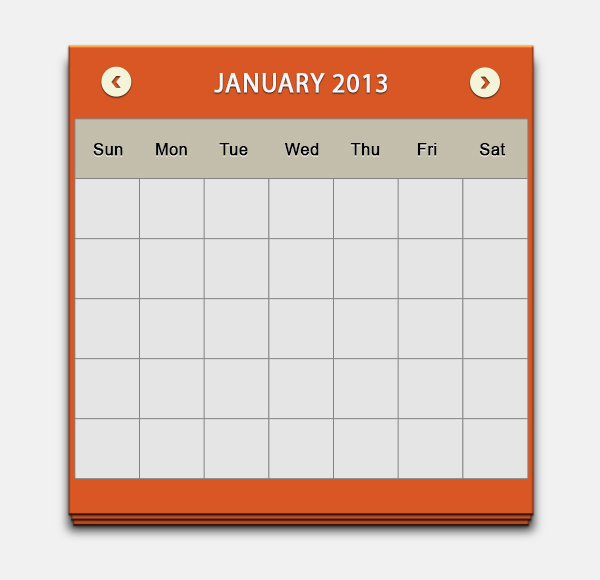
Final result: (To download the completed, layered file, click here.)

Step 1
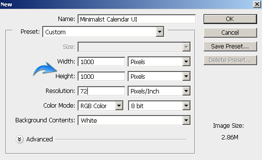
Create a new document in Photoshop with a 1000px width and a 1000px height.
Step 2
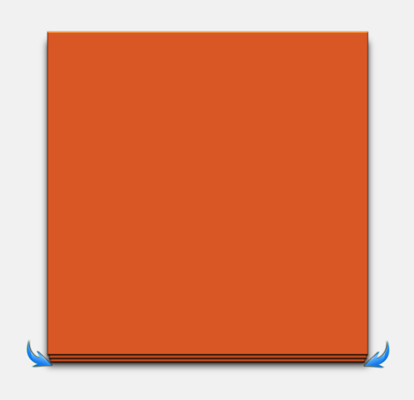
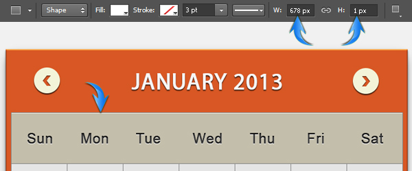
First of all, we’ll create the base for the calendar. Set #d85724 as your foreground color and draw a rectangle using the rectangle tool. Use the following dimensions.

Step 3
Double-click on the rectangle layer to open the layer style window and apply the following settings for “Bevel and Emboss” and “Drop Shadow”.


Step 4
Now, duplicate the rectangle layer and decrease its size a bit using the free transform tool (Ctrl + “T”). Place this layer below the original rectangle layer and drag it a bit downward to get the effect shown below.

Duplicate this layer to make the third base, decrease its size further, position it just above the background layer, and drag it a bit downward.

Step 5
Next, we’ll make base shadow. Press Ctrl+ <click on the first rectangle layer> to make selection around it. Now, create a new layer just above the background and fill the selection with pure black using the paint bucket tool. After that, go to “Filter” > “Blur” > “Gaussian Blur”. Apply a 4px Gaussian blur filter to the new layer. Then, drag the shadow downward so it becomes visible below the 3rd base layer. Lastly, reduce its opacity to 75-80%.
Step 6
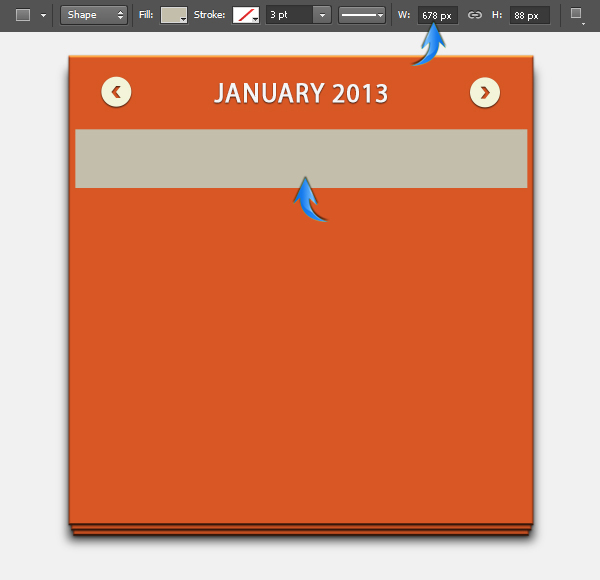
We’ll create the header for the calendar now. To start, we’ll make the navigation arrows. Draw a small ellipse near the top corners using color #f3f4d9.

Apply the following settings to create a drop shadow on this ellipse.


Step 7
Select the pen tool (Tool mode: Shape) to draw the arrow shape shown below using color #d85724.

Apply the settings below for inner shadow on the arrow.

Collect the ellipse and arrow layers into a group, duplicate this group, and flip it horizontally by going to “Edit” > “Transform” > “Flip Horizontal”. Position it near the right corner to form the opposite arrow.

Step 8
Next, we’ll add the title text. Set #f6f6f6 as the foreground color and add your desired text using the type tool. I am using the “Myriad Pro” font here.
Apply the same drop shadow settings that we used for the ellipse in step 6.


Step 9
The header is ready. Next, we’ll make the weekdays section. Draw a rectangle with the following dimensions using color #c3beab.
Step 10
Apply the following settings for stroke on this newly-drawn rectangle.


Step 11
Set #3b3b3b as your foreground color and type in the abbreviated weekdays using “Arial” font on a single layer. Adjust spacing between different days.

Step 12
Apply the following layer style settings on the weekdays layer.


Step 13
Next, we’ll make our first row of seven boxes. Draw a rectangle using color #e5e5e5. Use the following dimensions for your rectangles.

Apply the same settings for stroke on this new rectangle that we applied for the weekdays rectangle in step 10. Now, duplicate this rectangle six times and arrange each copy side by side, as shown below. Collect these seven boxes into a group and name that group “1st row”.

Step 14
Now, duplicate the “1st row” group, drag it downward, and position it just below the original “1st row”. Label this group as “2nd row”. Keep on duplicating this group and complete five rows using the same process.
Step 15
Draw a very thin rectangle in pure white color with the following dimensions, and position it below the top stroke of the weekdays rectangle, as shown below. Reduce its opacity to 80%.
Duplicate this white line layer six times and position these copies below the stroke line of gray boxes rows.

Step 16
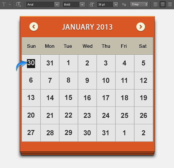
Add the digits on separate layers (so that you can easily edit them later on), and position these in the center of their respective gray boxes. Apply the same settings for inner shadow and drop shadow on these digits layers that we used in step 12.
Step 17
To differentiate the previous and next month’s days on the first row of the calendar, we’ll change their Inner Shadow and Color Overlay settings.


Step 18
Draw rectangles exactly above the previous and next month’s days using color #9c9887, and reduce their opacity to 15%.

Step 19
Next, we’ll highlight today’s date. To do this, make a rectangle over the desired date box. I am going to use color #a0cdcc here. Make sure to draw this rectangle below the digits and above the gray box layers.

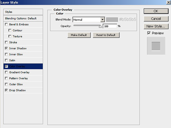
Apply the following settings for inner shadow on this colored rectangle.

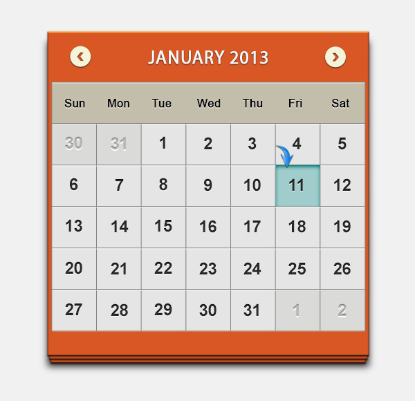
You can highlight important dates over your calendar by making different colored rectangles over the dates. See below.

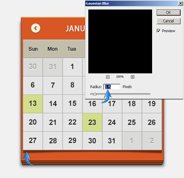
Step 20
We’ll complete this calendar by making a shadow. Make the selection as shown below using the rectangular marquee tool, and fill it with pure black color on a new layer.
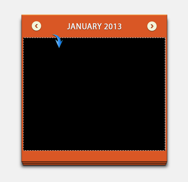
Position this layer just above the base layers and drag it a bit downward. After that go to “Edit” > “Transform” > “Warp”. Use this Warp tool to make the curved shadow shown below.

Now, apply 1.5px Gaussian blur filter to the shadow, and reduce its opacity to 50%.

That’s it. I hope you enjoyed the tutorial and learned something useful. Do share your thoughts!
Frequently Asked Questions about Designing a Clean Calendar UI in Photoshop
How can I add custom images to my calendar design in Photoshop?
Adding custom images to your calendar design in Photoshop can make it more personalized and appealing. To do this, first, open the image you want to add in Photoshop. Then, use the Rectangular Marquee Tool to select the part of the image you want to use. Copy the selected area (Ctrl+C) and paste it into your calendar design (Ctrl+V). You can then resize and position the image as needed using the Free Transform Tool (Ctrl+T).
Can I use different fonts for my calendar design in Photoshop?
Yes, you can use different fonts to make your calendar design more unique. To change the font, select the Text Tool from the toolbar, click on the text you want to change, and choose your desired font from the options at the top of the screen. You can also adjust the font size, color, and other settings from this menu.
How can I save my calendar design in Photoshop for printing?
To save your calendar design for printing, go to File > Save As, and choose Photoshop PDF as the file format. In the Save Adobe PDF dialog box, choose [Press Quality] from the Adobe PDF Preset menu. This will ensure your design is saved at a high resolution suitable for printing.
Can I create a calendar in Photoshop with different languages?
Yes, you can create a calendar in any language in Photoshop. Just select the Text Tool, click on the date or month you want to change, and type in the new text in your desired language.
How can I add holidays or special events to my calendar design in Photoshop?
To add holidays or special events to your calendar, select the Text Tool and click on the date you want to mark. Type in the name of the holiday or event, and adjust the font size, color, and style as needed.
Can I change the color scheme of my calendar design in Photoshop?
Yes, you can easily change the color scheme of your calendar design. To do this, select the layer you want to change, go to Image > Adjustments > Hue/Saturation, and adjust the sliders until you achieve your desired colors.
How can I create a calendar for a different year in Photoshop?
To create a calendar for a different year, you just need to change the dates and months. Select the Text Tool, click on the date or month you want to change, and type in the new information.
Can I add notes or reminders to my calendar design in Photoshop?
Yes, you can add notes or reminders to your calendar design. Select the Text Tool, click on the date you want to add a note to, and type in your note. You can adjust the font size, color, and style as needed to make the note stand out.
How can I create a digital version of my calendar design in Photoshop?
To create a digital version of your calendar design, save it as a JPEG or PNG file. Go to File > Save As, and choose JPEG or PNG from the Format menu. This will create a digital image of your design that can be shared online or used as a desktop wallpaper.
Can I create a calendar in Photoshop with different sizes?
Yes, you can create a calendar of any size in Photoshop. When creating a new document (File > New), you can specify the width and height of your design. You can also adjust the size of an existing design by going to Image > Image Size and changing the dimensions.
Anum is Web and Graphic designer. Addicted to Photoshop and crazy for pixel perfection. She is also an active blogger, sharing her passions, skills and creative details on her blog Websoulz. She loves to connect with the community, sharing the latest design gossips and rolling her eyes on boring trends.