

A stylish portfolio is critical for any designer. Other professions have the luxury of describing their skills and accolades in words, but designers can’t just describe their work; they have to show it. Designers are most often compared, chosen, and hired based on the impression that their portfolio makes. Even if your work samples are stellar, the portfolio itself is arguably your most important design work, and it should be just as impressive as the work within it. Below, we’ll use some straightforward techniques to help you create a stylish, professional portfolio layout.
Image Resources:
Microbot, Suharrhyme
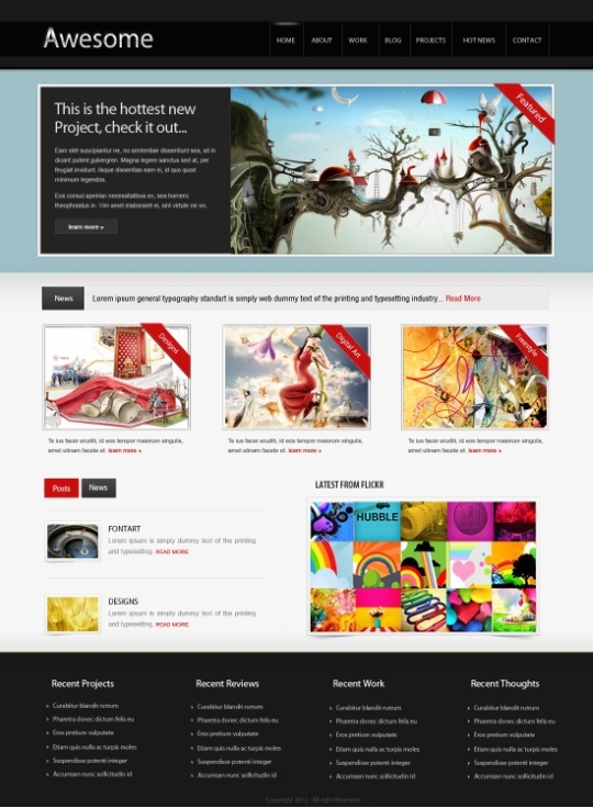
Now that we’ve got what we need to create this layout, let’s have a look ahead at our final result:
Step 1: Create Your Photoshop Document
Open Photoshop and create a new file with a width of 1100 pixels and a 1500 pixel height.

Step 2: Fill the Background
Now, select the Paint Bucket tool and fill the background with color #f6f6f6.

Step 3: Establish the Navigation
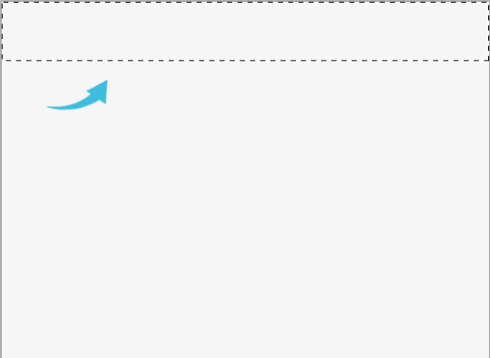
We will start with the top navigation. Use the Rectangular Marquee tool to select a small area on the top.
Step 4: Darken the Navigation Background
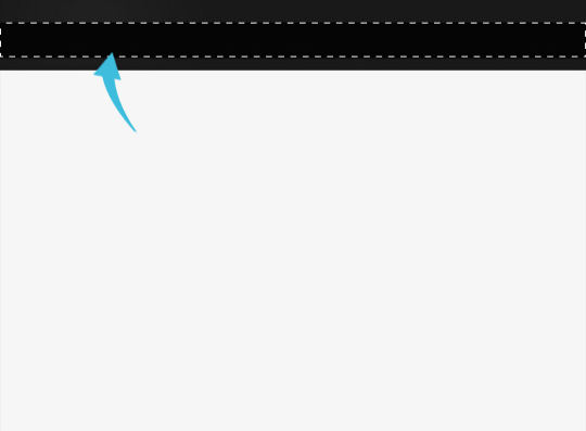
Select the paint bucket tool and fill the area with color #191919.

Step 5: Build the Navigation Button Area
Click on the marquee tool and select a rectangular bar within the darkened navigation area. Then, fill it with #050505.
Step 6: Add Dividers
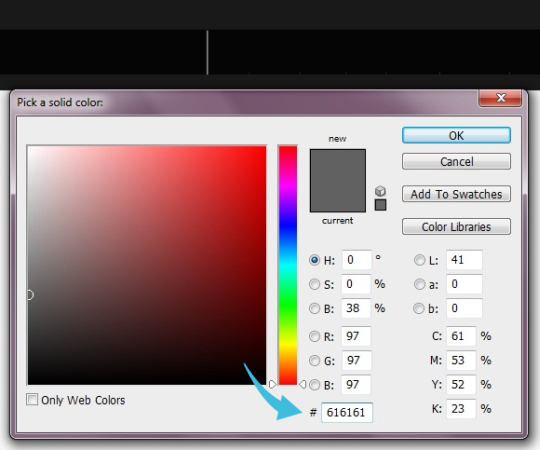
We’ll add some lines that will separate your navigation items. Select the line tool with a 1 pixel weight. Also, make sure that our foreground color is #616161.
Step 7: Add Your Navigation Text
Now let’s add the text for our pages. Simply select the text tool and type in the desired text.

Step 8: Build a Hover Effect
For a hover effect, we will create a white line using the brush tool with a 3 pixel size. Then, select the eraser tool and remove the edges using a soft round brush. Now, reduce the opacity to 40%.

Step 9: Add Your Brand
Add your logo to the left of your navigation menu.

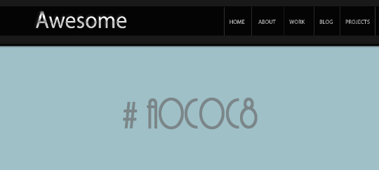
Step 10: Build a Background
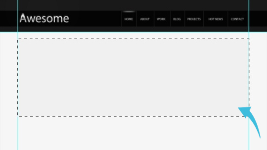
Now, we’ll move on to our featured content area. First, create a new layer, and with marquee tool select the area under the navigation. Fill it with color #a0c0c8.
Now, switch off the background layer, select the marquee tool again, and create a rectangle. Fill the selected area with #f0f0f0.
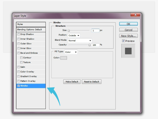
We need some stroke on this, so click on “Layer” > “Layer style” > “Stroke.”
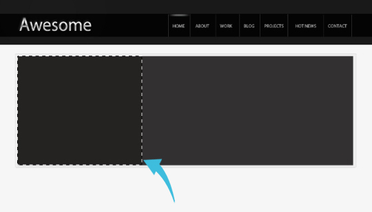
Step 11: Divide Your Content Area into Columns
Create another rectangle and fill it with #323030. And, for the adjacent text area, fill it with #242322.
Step 12: Add a “Read More” Button
Now select the text tool and add our text about the featured image. Under the text, we will add a “read more” button. To accomplish this, simply select “the rectangle tool and create a small rectangle with color #323030. Then, add your text inside the new rectangle.

Step 13: Add Featured Imagery
Now, add the image on the right, and add our featured ribbon to the top right corner of the image. I’ve created the ribbon with the pen tool, and I added text using the text tool.
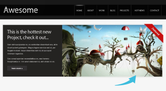
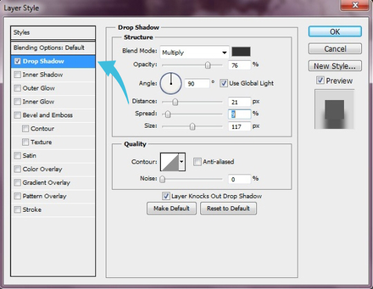
Step 14: Add a Drop Shadow
Select the line tool and use it under the feature box with 1px weight and color #dedede. Now, click on “Layer” > “Layer style” > “Drop Shadow.”
Step 15: Create a “News” Element
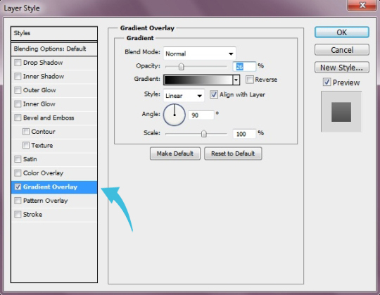
Now, we’ll create a “News” element. So, click on the rectangle tool and create a rectangle strip with color #ebebeb. Again, select the rectangle tool and create a very small rectangle on the left with color #000000. Select this black rectangle and click on “Layer” > “Layer Style” > “Gradient Overlay.”
Step 16: Add the “News” Text
Add the “news” text using the text tool.

Step 17: Build a Portfolio Item
Create a small rectangle using rectangle tool with color #f0f0f0. Then, add the same stroke that we used with the feature area.

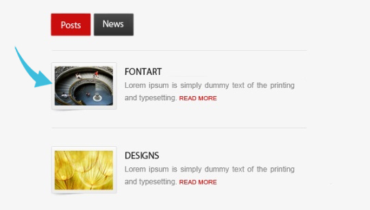
Step 18: Add Portfolio Imagery and Text
Now, add the image and add the banner on the side. Select the text tool and add the text under the image.

Step 19: Add Additional Portfolio Items
Repeat the same process to create two more portfolio items.

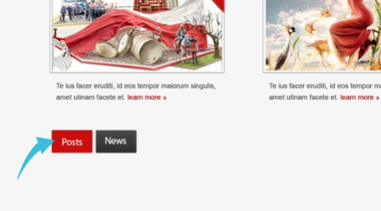
Step 20: Create Buttons Below
Select rectangle tool and create two buttons with colors #ca0e0e and #3c3c3c. Then add text using the text tool.
Step 21: Add Dividing Lines
Now select the line tool and create two lines with a 1 pixel weight and the color #dcdcdc. After that, add the images and text in the same style as the post that we did before.
Step 22: Add Flickr Updates
For the Flickr updates, select the text tool and add the heading. Once again create the gray frame using the rectangle tool, and add a stroke. Now, create a new layer and place it under the frame layer. Then select a soft round brush, and use it on the sides to give a shadow effect.
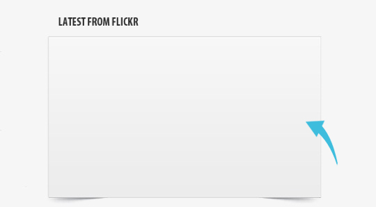
Now, paste the images in the frame.

Step 23: Building the Footer
Let’s start with our footer. First, select the area with the rectangular marquee tool and fill it with color #191919.

Step 24: Adding Footer Text
Select the text tool and add the desired footer text.

Our awesome layout is all done.
Frequently Asked Questions (FAQs) about Creating an Awesome Portfolio Layout in Photoshop
What are the key elements to consider when designing a portfolio layout in Photoshop?
When designing a portfolio layout in Photoshop, there are several key elements to consider. First, you need to think about the overall structure and layout of your portfolio. This includes deciding on the number of pages, the arrangement of your work, and the navigation system. Second, you need to consider the visual design elements such as color scheme, typography, and imagery. These elements should reflect your personal brand and style. Lastly, you need to consider the content of your portfolio. This includes your work samples, descriptions, and any additional information like your resume or contact information.
How can I make my portfolio layout stand out?
To make your portfolio layout stand out, you need to showcase your unique style and creativity. This can be achieved through the use of unique design elements, bold color schemes, and innovative layouts. Additionally, high-quality images and well-written descriptions can also help to make your portfolio more engaging and memorable. Remember, your portfolio is a reflection of your skills and abilities, so it’s important to put your best foot forward.
What size should I make my portfolio layout in Photoshop?
The size of your portfolio layout in Photoshop will depend on your specific needs and the platform you plan to use to showcase your portfolio. However, a common size for web-based portfolios is 1024 x 768 pixels. This size is large enough to display your work clearly, but small enough to load quickly on most internet connections. If you plan to print your portfolio, you’ll need to consider the size of the paper you’ll be printing on and ensure your layout fits within those dimensions.
How can I organize my work in my portfolio layout?
Organizing your work in your portfolio layout is crucial for creating a cohesive and easy-to-navigate portfolio. You can organize your work by project, by type of work (such as logos, websites, or illustrations), or chronologically. It’s important to include a variety of work that showcases your skills and abilities, but remember to only include your best work.
Can I use templates for my portfolio layout in Photoshop?
Yes, you can use templates for your portfolio layout in Photoshop. Templates can be a great starting point, especially if you’re new to Photoshop or design in general. They can provide a professional-looking structure and layout, which you can then customize to fit your personal style and needs. However, remember that your portfolio should be a reflection of your unique skills and creativity, so don’t rely too heavily on templates.
How can I add interactivity to my portfolio layout in Photoshop?
While Photoshop is primarily a tool for creating static images, you can design elements of interactivity that can be implemented in the coding phase. This could include designing buttons, links, or hover effects. However, to actually make these elements interactive, you’ll need to use a web development tool or work with a web developer.
How can I optimize my portfolio layout for mobile devices?
To optimize your portfolio layout for mobile devices, you’ll need to consider responsive design. This means designing your layout in a way that it can adapt to different screen sizes and orientations. In Photoshop, you can use artboards to design multiple layouts for different screen sizes. Additionally, you should consider touch-friendly design, such as larger buttons and links, and ensure your text is large enough to read on smaller screens.
How can I showcase my personality in my portfolio layout?
Showcasing your personality in your portfolio layout can be achieved through your choice of color, typography, imagery, and the overall style of your layout. You can also include personal elements such as a photo of yourself, a bio, or a personal logo. Remember, your portfolio is a reflection of you as a designer, so don’t be afraid to let your personality shine through.
How can I use color effectively in my portfolio layout?
Color can be a powerful tool in your portfolio layout. It can help to set the mood, draw attention to key elements, and create a cohesive look and feel. When choosing colors, consider your personal brand and the message you want to convey. You can use color theory to choose a harmonious color scheme, and tools like the color wheel or color palettes can be helpful.
How can I get feedback on my portfolio layout?
Getting feedback on your portfolio layout can be invaluable for improving your design. You can ask for feedback from peers, mentors, or online design communities. Additionally, you can conduct usability testing to see how users interact with your portfolio and identify any potential issues. Remember, feedback is a tool for growth, so be open to constructive criticism.

