Key Takeaways
- Recreating Google’s image search layout involves creating a basic HTML structure for images, styling them with CSS, and adding functionality with JavaScript.
- The key CSS properties used in this process include display, grid-template-columns, grid-gap, and object-fit. These properties help create a grid layout, specify the number and size of columns, set the gap between grid cells, and dictate how an image should be resized to fit its container.
- The layout can be customized to fit individual needs. This includes changing the number and size of columns in the grid, the gap between grid cells, and the size of the images. Additional CSS properties can also be added for further customization.
- Functionality can be added to the images using JavaScript. Examples of this include adding an event listener to the images that opens a larger version of the image when clicked, and adding features such as image filtering or sorting.
- The layout can be made responsive by using media queries in CSS. These allow for different styles to be applied depending on the size of the user’s screen, ensuring that images are displayed properly on all devices.
In a project I was recently involved in, I was asked to recreate Google’s image search expansion functionality, similar to the screenshot shown below, but in a rigid grid format.
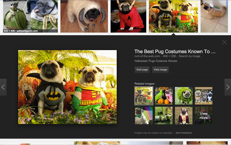
My immediate reaction was that I would need to use JavaScript to set some layout and box model properties which I’m always reluctant to do and will only ever do as a last resort. As there was an already perfectly working example, I decided to open up developer tools to see how Google does it (why reinvent the wheel, right?)
Turns out that Google breaks down the structure into two divs, one div contains all of the image cells and the other div is for the expanding area. Once an image is clicked (and expanded), JavaScript inserts a spacer div after the last image cell in the row of the clicked div. JavaScript sets its height to the same as the expanded div, and positions the expanded div absolutely into the position that the spacer div occupies. This is clever, but not ideal due to it’s heavy reliance on JavaScript.
I had a basic idea that I’ve managed to develop into a working demo using CSS for all layout and box model properties. The only JavaScript necessary is to change class names based on the expansion toggle.
The Basic Markup
First of all, we need to construct the .image-grid container along with each .image__cell. Here’s the HTML:
<section class="image-grid">
  <div class="image__cell is-collapsed">
    <div class="image--basic">
      <a href="#expand-jump-1">
        <img id="expand-jump-1"
                 class="basic__img"
                 src="https://lorempixel.com/250/250/fashion/1" alt="Fashion 1">
      </a>
      <div class="arrow--up"></div>
    </div>
    <div class="image--expand">
      <a href="#close-jump-1" class="expand__close"></a>
      <img class="image--large"
           src="https://lorempixel.com/400/400/fashion/1" alt="Fashion 1">
    </div>
  </div>
  ...
</section>
The markup above contains one example .image cell element which will need to be duplicated for each image in the grid. Please note the identifiers for #close-jump-1 and #expand-jump-1, and the subsequent href attributes will need to be unique to the .image__cell. Hash links such as: href="#expand-jump-1" enable the browser to jump to the active image cell when pressed.
The CSS
First we apply box-sizing: border-box; to all elements including :before and :after pseudo-elements using the universal selector. This will allow easy handling of elements that mix percentage widths with fixed padding values, as it combines them.
/* apply a natural box layout model to all elements,
   but allowing components to change */

html {
  box-sizing: border-box;
}

*, *:before, *:after {
  box-sizing: inherit;
}
The .image-grid element is given a clearfix overflow: hidden; to maintain layout based on the image cell floats.
.image-grid {
  width: 100%;
  max-width: 1310px;
  margin: 0 auto;
  overflow: hidden;
  padding: 10px 5px 0;
}

.image__cell {
  float: left;
  position: relative;
  width: 20%;
}

.image--basic {
  padding: 0 5px;
}

.basic__img {
  display: block;
  max-width: 100%;
  height: auto;
  margin: 0 auto;
}

.image__cell.is-collapsed .arrow--up {
  display: block;
  height: 10px;
  width: 100%;
}

.image--large {
  max-width: 100%;
  height: auto;
  display: block;
  padding: 40px;
  margin: 0 auto;
  box-sizing: border-box;
}
The width given to the image cell is equivalent to 100 divided by the number of items per row, expressed as a percentage. In this example, there are 5 items per row which means that each .image__cell is 20% wide.
Note that padding: 10px 5px 0; applied to .image-grid combined with padding: 0 5px; on .image--basic, and height: 10px; on .image__cell.is-collapsed .arrow--up give the equal window frame effect around the tiled images. We could increase the gap between the images, by changing these values.
Lastly, the .basic__img image element is given display: block; to prevent any spacing issues. Themax-width: 100%; and height: auto; declarations enable the image to scale to the width of its container while not exceeding its own width.
The below CSS provides the layout for the expandable area.
.image__cell.is-collapsed .image--basic {
  cursor: pointer;
}

.image__cell.is-expanded .image--expand {
  max-height: 500px;
  margin-bottom: 10px;
}

.image--expand {
  position: relative;
  left: -5px;
  padding: 0 5px;
  box-sizing: content-box;
  overflow: hidden;
  background: #222;
  max-height: 0;
  transition: max-height .3s ease-in-out,
              margin-bottom .1s .2s;
  width: 500%;
}
Here are some notes to take away from the above code:
- The cursor changes to a pointer when hovering over
.image--basicwhen it is only in a collapsed state. This gives a visual indicator to the user that clicking on the image will do something. - The
max-heightof the.image-expandelement is set to 0 in its initial state. Themax-heightis given a value of 500px when the.image-cellelement has the.is-expandedclass. Note that if the expanding area was to increase, the maximum height value would need to be increased as well in order for the entire area to display. - Transitions applied to
max-heightandmargin-bottomallow a sliding effect when the expanded area is toggled. Visually, we want the expanding area to align with the
.image-grid. To do this, we need to negate the horizontal padding set in the.image-gridelement.- Firstly,
.image--expandis givenbox-sizing: content-box;to exclude the padding value from its width. - The
.image--expandelement has a width 5 times its parent element500%. This allows the expanded area to occupy the entire width of the.image-grid, minus the padding. - To occupy the remaining space, the
.image--expandelement is given 5px padding left and right. - The
position: relative;andleft: -5pxdeclarations shift the expanded area over to the left slightly to negate the.image-gridpadding-left value.
- Firstly,
The Clever Bit
We want to shift all .image--expand elements to the far left in alignment with the left side of the .image-grid. To do this we set a negative margin depending on its position in the row.
This is where nth-of-type comes in:
.image__cell:nth-of-type(5n+2) .image--expand {
  margin-left: -100%;
}

.image__cell:nth-of-type(5n+3) .image--expand {
  margin-left: -200%;
}

.image__cell:nth-of-type(5n+4) .image--expand {
  margin-left: -300%;
}

.image__cell:nth-of-type(5n+5) .image--expand {
  margin-left: -400%;
}
Initially, I used nth-child to achieve the same effect, but on other projects I have found iOS8 Safari to be quite buggy with this so I try to avoid using it. Instead, I use nth-of-type as it largely serves the same purpose. If you’re interested, you can find a brief explanation of nth-of-type here< .
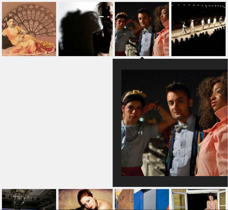
In the above CSS, we are targeting the second, third, and fourth .image__cell expandable areas on each row. The margin-left value depends on the element’s position in the row as well. Note that the first element in each row doesn’t need a margin-left value set as it is already in the desired position. The further the element is from the left, the further we need to push the expandable area back over to the left side (in increments of -100%). Without doing this the expandable area would be aligned to its parent, as shown below:
We also need to insert the CSS shown below to ensure that the first .image__cell on every row, apart from the first row, sticks to its position when earlier .image__cell elements are expanded.
.image__cell:nth-of-type(5n+6) {
  clear: left;
}
Now that the basic layout is in place, we can add a few styles to improve the user experience.
First, an up-pointing arrow to indicate which image the expanded block belongs to:
.image__cell.is-expanded .arrow--up {
  display: block;
  border-bottom: 8px solid #222;
  border-left: 8px solid transparent;
  border-right: 8px solid transparent;
  height: 0;
  width: 0;
  margin: 2px auto 0;
}
Note that the arrow style is achieved by creating a CSS triangle, thus saving an HTTP request. This effect is easily achieved by clever use of borders and setting the height and width to 0.
We also want the arrow to appear only when the .image__cell element is expanded. This is done by the addition of the .is-expanded class. Finally, we want the arrow to remain in the horizontal center of the .image__cell element so margin: 0 auto; is applied.
Now we are ready to style the “close” button that will allow the user to close the expanded area.
.expand__close {
  position: absolute;
  top: 10px;
  right: 20px;
  color: #454545;
  font-size: 50px;
  line-height: 50px;
  text-decoration: none;
}

.expand__close:before {
  content: '×';
}

.expand__close:hover {
  color: #fff;
}
Note that by using a :before pseudo-element, we are able to insert an ‘×’ character onto the page without it appearing in the DOM, again saving at least one HTTP request. The inserted special character is the multiplication character which Boostrap also uses.
The jQuery
Finally, the below jQuery simply toggles between the .is-expanded and .is-collapsed class on click of each image cell and close button.
var $cell = $('.image__cell');

$cell.find('.image--basic').click(function() {
  var $thisCell = $(this).closest('.image__cell');

  if ($thisCell.hasClass('is-collapsed')) {
    $cell.not($thisCell).removeClass('is-expanded').addClass('is-collapsed');
    $thisCell.removeClass('is-collapsed').addClass('is-expanded');
  } else {
    $thisCell.removeClass('is-expanded').addClass('is-collapsed');
  }
});

$cell.find('.expand__close').click(function() {
  var $thisCell = $(this).closest('.image__cell');
  $thisCell.removeClass('is-expanded').addClass('is-collapsed');
});Making the Grid Responsive
Having 5 image cells on each row on smaller devices isn’t ideal, so we are able to change the number of items per row using media queries. For example, the below CSS reduces it to 2 images per row.
@media only screen and (max-width: 530px) {

    .image__cell {
      width: 50%;
    }

    .image__cell:nth-of-type(2n+2) .image--expand {
      margin-left: -100%;
    }

    .image__cell:nth-of-type(2n+3) {
      clear: left;
    }

    .image--expand {
      width: 200%;
    }

}
To prevent CSS applied earlier relating to 5 items per row, we will need to either reset these values or extract the properties and place them in their own media query, which is done in the below CodePen, along with the previous code.
See the Pen Google Images search in CSS by SitePoint (@SitePoint) on CodePen.
Note the inclusion of the cells function that spits out 50 image cells to save me the bother.
For Sass lovers
I didn’t want to exclude readers who do not use Sass when writing this article, but I didn’t want to discount them either. This project lends itself as a great use case for Sass in development, because the number of items per row is related to so many different properties.
Please see the following alternate CodePen demo. Note that in that demo I’m using Sass variables at the top of the CSS, which allows me to specify the gap between the images, the maximum image width, and the minimum and maximum images per row. Using various calculations, the Sass will compile into CSS based on the options provided. It will automatically calculate the optimal media queries based on the maximum number of items per row, which will keep the images within their maximum dimensions.
This Sass version is experimental, but please let me know if you notice any bugs or potential code improvements in either the regular version or the Sass version.
Frequently Asked Questions (FAQs) about Recreating Google Images Search Layout with CSS
How can I recreate the Google Images search layout using CSS?
Recreating the Google Images search layout using CSS involves a few steps. First, you need to create a basic HTML structure for your images. This includes creating a div for each image and assigning it a class. Next, you need to style these divs using CSS to mimic the layout of Google Images. This involves setting the width and height of the divs, as well as their position on the page. You can also add hover effects to the images using CSS. Finally, you can use JavaScript to add functionality to the images, such as opening a larger version of the image when it is clicked.
What are the key CSS properties used in recreating the Google Images layout?
The key CSS properties used in recreating the Google Images layout include display, grid-template-columns, grid-gap, and object-fit. The display property is set to grid to create a grid layout. The grid-template-columns property is used to specify the number and size of columns in the grid. The grid-gap property is used to set the gap between the grid cells. The object-fit property is used to specify how an image should be resized to fit its container.
Can I customize the layout to fit my own needs?
Yes, you can customize the layout to fit your own needs. You can change the number and size of the columns in the grid, the gap between the grid cells, and the size of the images. You can also add additional CSS properties to further customize the layout, such as adding borders or shadows to the images.
How can I add functionality to the images?
You can add functionality to the images using JavaScript. For example, you can add an event listener to the images that opens a larger version of the image when it is clicked. You can also add functionality such as filtering or sorting the images.
Why is my layout not looking like Google Images layout?
If your layout is not looking like the Google Images layout, there could be several reasons. First, make sure you have correctly implemented the CSS properties. Second, check if your images are of the same aspect ratio. Google Images uses images of the same aspect ratio to create a uniform layout. If your images are of different aspect ratios, the layout may not look the same.
How can I make my layout responsive?
You can make your layout responsive by using media queries in your CSS. Media queries allow you to apply different styles depending on the size of the user’s screen. For example, you can change the number of columns in the grid on smaller screens to ensure the images are still displayed properly.
Can I use this layout for other types of content, not just images?
Yes, you can use this layout for other types of content, not just images. You can use it to display text, videos, or any other type of content. Just make sure to adjust the CSS properties accordingly to fit the type of content you are displaying.
How can I add hover effects to the images?
You can add hover effects to the images using the :hover pseudo-class in your CSS. For example, you can change the border color of the image when the user hovers over it, or you can display additional information about the image.
Why are my images not fitting properly in the grid cells?
If your images are not fitting properly in the grid cells, it could be because the aspect ratio of the images is not the same as the aspect ratio of the grid cells. You can fix this by using the object-fit property in your CSS to specify how the images should be resized to fit their container.
Can I use this layout with a CMS like WordPress?
Yes, you can use this layout with a CMS like WordPress. You would need to add the CSS to your theme’s style.css file and the HTML to the appropriate template file. You may also need to add some PHP code to dynamically generate the HTML for the images, depending on how your WordPress site is set up.
Dan Rose is a Front End Web Developer from Birmingham UK, with a creative mind. He's obsessed with his workflow and constantly improving it. When he's not playing with CSS and JavaScript he's watching cat videos and drinking tea with muffins.


Published in
·automation·Debugging & Deployment·Development Environment·Meta·Miscellaneous·Patterns & Practices·PHP·December 6, 2014