
Key Takeaways
- The Social Login design pattern allows users to sign up for your app using their existing social media accounts, simplifying the registration process and potentially providing you with basic user data to better tailor your app to users’ needs.
- Notifications, Popups, and the pull-to-refresh feature are essential design patterns for a successful app, as they keep users informed about recent activities and updates, and can be implemented in a variety of ways depending on the nature of your app and your users’ preferences.
- Swipe and tap interactions are common gestures on smartphones, and should be incorporated into your app design to enhance user experience. Plan these interactions early in the wireframing process and adjust based on user feedback during testing.
In this short series of articles about Mobile Design patterns I introduced some of the most common patterns used to fix problems during development. During articles you’ve learned what a design pattern is, its basic components and the best solutions to solve problems with them. Problems such as organization of forms, galleries, search functions and interaction suggestions. You should also have learned why and when to avoid mobile design anti-patterns.
For the conclusion of this series, I’ll outline 5 interface design patterns you should recognize from popular mobile apps and can use in your own projects. They’ll help you in making your design useful and intuitive for users. In particular, I’ll focus on patterns that will help you managing:
- Social sharing
- Notifications
- Popups
- Content updates
- User interaction (swipe, tap, etc.)
Social login
In the article “3 Tips to Make Your Apps Less Annoying”, we discussed how annoying events or occurrences that we don’t expect are. We looked at the example of a game that asks if you want to login with Facebook every time you run it with no way to avoid the question. The use of Facebook made me think about another situation that could be annoying when needing to register for a service, filling in a form.
In an age dominated by social networks, do we need to submit our personal data in such an old fashioned way? The Social login design pattern is an awesome alternative, providing users with a quick and easy way of logging in.
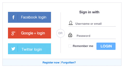
Users don’t have to set up yet another account that they may not need in the future. Instead they can sign up with their existing social accounts (Facebook, Twitter, or Google etc.) and speed up the registration process. There are several other good reasons why you should incorporate this pattern in your mobile app:
- Signing up through an existing social network means the user doesn’t have another username/password combination to worry about.
- Users aren’t forced to type their details into an unfamiliar app they have just downloaded, making the sign up process much easier.
- By allowing users to sign up through an existing social network account, you may have access to some basic data about your users. This can then be used to more effectively adapt your mobile application to users’ needs.
Notifications
Notifications highlight recent activity and actions. We consume lots of information every day but at the same time we are busy and can’t (or don’t want) to spend hours on our mobile phones. We like to do things in the shortest time possible and know immediately if there have been new activities or actions requiring our interest. A good understanding and implementation of design patterns for notifications is crucial.
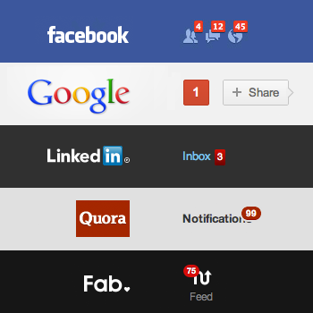
Mobile applications from many famous companies have implemented this pattern in different ways:
- LinkedIn places a numbered badge on labels with new updates.
- Twitter indicates new activity by placing a small dot at the top of the timeline icon.
- Facebook displays notifications regarding new items in the newsfeed with a popup banner that drops down within the app.
Imitate the solution you like the most and test if it suits your purposes and users.
Popups and Overlays
Popups (also known as overlays) are a programming trick generally used for Internet advertising. They cover the main content without creating a new window. They cannot be blocked by ad blocking software, so the user is forced to see them. Typically this is an annoying situation for users, however there are some cases when information interrupting using the app may help users. For example, users might want to view information without losing their current place in the user interface.
Here the popup design pattern comes to rescue and can solve the problem in several ways:
- The popup occurs when the user performs certain actions or reaches a specific point in the app. It then shows the relevant information/controls associated with that particular action or place.
- The original content or place in the app is still visible in the background, but the popup gives users the option of learning about what comes next.
- The popup gets the users’ attention and provides important notifications where needed. When finished, they can dismiss the popup and return to their previous activity by tapping or swiping the screen.
Content Updates: pull-to-refresh
As regular users of social networks such as Facebook, Twitter, or Google, a gesture we all find natural now is to pull down from the top of a feed to reveal new content. The first company to use this design pattern was Apple and since then it has been widely used.
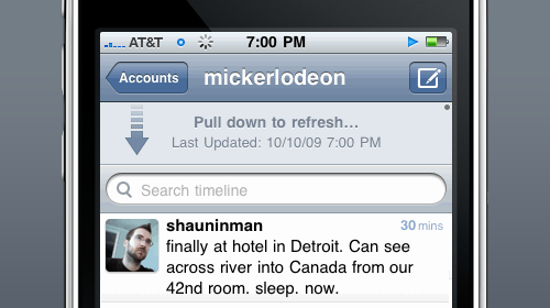
The pull-to-refresh pattern can be applied when you need to show a list of items that is not static but dynamic and you don’t automatically refresh this content. It is a natural consequence of scrolling to the top and once the refresh is completed, the new items are shown at the top. It is a useful pattern because it saves space (you don’t need a button) and it’s easy to discover. Adopting this pattern to update content is not the only way it can be used, it can also be utilized to load earlier items in a list of messages, photos or profile updates.
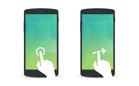
User interaction (swipe, tap, etc.)
After the pull-to-refresh gesture, swiping is another common gesture on smartphones. Some apps allow you to swipe left or right on a tweet/post to get more details or perform other actions. It’s a creative solution contrasted with typical web applications that rely on mouse clicks.
There are a plethora of mobile applications for Android and iOS which handle swipes, taps and other specific user interactions and you should try to take advantage of these in your projects. Every application has a different purpose and value to its users. Plan your ideas early in the wireframing process before taking the app into design or development. Take time to consider users’ feedback, suggestions and criticisms during the testing process.
Conclusions
In this article we have looked at 5 design patterns for Mobile Interfaces to give you inspiration. If you want to learn more about other major design patterns, I suggest you download the free ebook by UXPin “Mobile UI Design Patterns 2014: A Deeper Look at the Hottest Apps Today”, a simple and clear guide to begin an in-depth analysis of the broad world of Mobile Design Patterns.
Frequently Asked Questions on Mobile Design Patterns
What are the key elements to consider when designing a mobile app?
When designing a mobile app, it’s crucial to consider the user interface (UI), user experience (UX), functionality, and the overall design pattern. The UI should be intuitive and easy to navigate, while the UX should provide a seamless and enjoyable experience for the user. Functionality refers to the app’s features and how well they perform. The design pattern, on the other hand, is the overall layout and structure of the app, which should be consistent and user-friendly.
How do mobile design patterns contribute to the success of an app?
Mobile design patterns play a significant role in the success of an app. They provide a familiar and consistent user experience, which can increase user engagement and retention. They also help in reducing the learning curve for new users, as they can easily understand and navigate the app. Moreover, design patterns can simplify the development process, as they provide a tested and proven solution to common design problems.
What are some popular mobile design patterns?
Some popular mobile design patterns include the Hamburger Menu, which is often used for navigation; the Card Layout, which is used to display information in a compact and organized manner; the Infinite Scroll, which allows users to scroll through content continuously; and the Skeleton Screen, which is used to improve perceived loading times.
How can I choose the right design pattern for my mobile app?
Choosing the right design pattern for your mobile app depends on several factors, including the type of app, the target audience, the platform (iOS or Android), and the specific user needs and expectations. It’s important to research and understand these factors before deciding on a design pattern. User testing and feedback can also be valuable in making the right choice.
What are the differences between mobile and desktop design patterns?
Mobile and desktop design patterns differ in several ways due to the differences in screen size, interaction methods (touch vs mouse), and user behavior. Mobile design patterns often prioritize simplicity, ease of use, and speed, while desktop design patterns can accommodate more complex features and interactions. Also, mobile design patterns often focus on single-tasking, while desktop patterns can support multitasking.
How can I implement a mobile design pattern in my app?
Implementing a mobile design pattern in your app involves several steps, including defining the user needs and goals, choosing the appropriate design pattern, creating wireframes and prototypes, conducting user testing, and refining the design based on feedback. It’s also important to follow the guidelines and standards for the specific platform (iOS or Android).
Can I use multiple design patterns in a single app?
Yes, it’s possible to use multiple design patterns in a single app, as long as they complement each other and provide a consistent and seamless user experience. However, it’s important to avoid overcomplicating the design, as this can confuse users and make the app difficult to navigate.
What are some common mistakes to avoid when using mobile design patterns?
Some common mistakes to avoid when using mobile design patterns include overcomplicating the design, not considering the user needs and expectations, not following the platform guidelines, and not conducting user testing. It’s also important to avoid using a design pattern just because it’s trendy; instead, the choice of pattern should be based on its suitability for the specific app and user needs.
How do mobile design patterns evolve over time?
Mobile design patterns evolve over time due to changes in technology, user behavior, and design trends. For example, the rise of larger screen sizes and gesture-based navigation has led to the development of new design patterns. It’s important for designers to stay updated on these changes and adapt their designs accordingly.
How can I learn more about mobile design patterns?
There are many resources available to learn more about mobile design patterns, including online tutorials, courses, books, and blogs. Participating in design communities and attending design conferences can also provide valuable insights and learning opportunities.