
Key Takeaways
- The Transform Effect in Adobe Illustrator is a dynamic tool that allows users to create patterns of paths or text blocks that can be easily manipulated with a single command, making adjustments to the original object straightforward and efficient.
- The Transform Effect can be used to create a simple beveled stroke effect by building up new fill and stroke attributes, allowing for a professional result in less time.
- The Transform Effect can also be combined with the Pucker & Bloat tool in Adobe Illustrator to develop simple text into a high-impact graphic design, adding depth and complexity to the design.
- The Transform Effect is not only useful for creating complex patterns, but it also allows for the creation of mirror reflections, the illusion of 3D objects, and the application of multiple Transform Effects to a single object, making it a versatile and powerful tool in Adobe Illustrator.
The Transform Effect in Adobe Illustrator lets you move, scale, flip, rotate and clone the appearance of one of more selected objects (all from a central dialog box).
Using it you can create patterns with paths and text blocks, and handle the whole pattern by making adjustments to the native project.
In this tutorial, I’ll explain you how to create a simple bevelled stroke effect and I’ll show you some curiosities regarding the Transform Effect.
You’ll be surprised by the power of this indispensable tool.
The Transform Effect: what is it?
As I mentioned in the introduction of the article, the Transform Effect is a dynamic effect whose main result is to create patterns of paths or text blocks that can be simply manipulated in a single command, allowing you to make adjustments to the original object.
In this practical example, I’ll guide you step-by-step in the creation of a simple beveled stroke effect. Secondly, we’ll have a look at how to use one of the most important and curious Illustrator’s path wigglers, — the Pucker & Bloat.
Well, that’s the premise, let’s get started.
Step 1: Setting up the text
Open a simple line drawing with a square background which will be our starting point. The first task of this exercise will be using the offset strokes to create a depth effect. We’ll achieve this practical effect dynamically, which is a smarter and better way to work.
It’s very common, indeed – especially among beginner users of Adobe Illustrator – that a good way to create rich multi-layered text with more than one stroke, is the following:
- create the text
- assign a stroke
- make a copy
- paste it in front of the original
- change its color
- reduce the stroke
- repeat the same operations over and over until you’ve reached the desired effect.
This is not the ideal (or recommended) way of creating this effect for a number of reasons. Not only is it slow, repetitive and error-prone but, above all, any adjustments you make to the kerning or case, you’ll need to manually repeat to each copy individually.
With this new approach, you have one reference text object, so that any change affects each set of offset strokes. I believe this is a smarter way to work.
The trick is to build up new fill and stroke attributes; so, let’s see how to go on with the creation of this very simple and basic application of stroke effects combined with a text in order to achieve a good result in less time and in a very professional way.
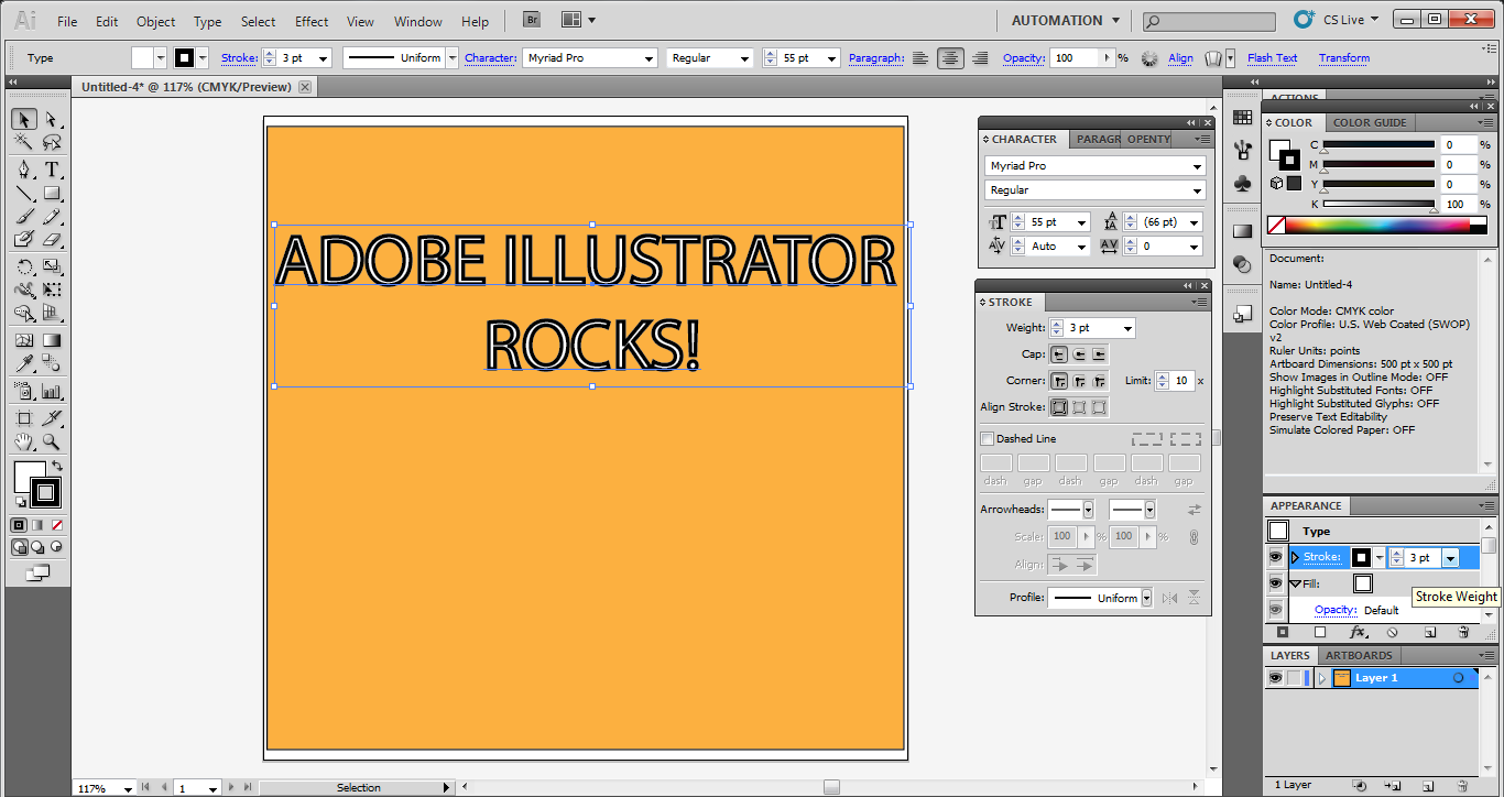
If you don’t have them set, the first thing to do is to get back to default colors. At this point, select font and size, type your message and compose it within your document (I couldn’t propose any other message!). I’ve chosen a very classic font called Myriad Pro (you can find it here: http://www.cufonfonts.com/it/font/492/myriad-pro) and I’ve filled the type with a color of my choice (I think white could be good). I’ve also given it a 1 point stroke.

If you examine the stroke carefully, you’ll see this goes into the type and out of the type, that means into the letters and out of the letters. Why? Simply because the stroke is by default centered on the path outlines for every letter forms.
Step 2: Stroke it
As your second step, open the Stroke panel and change the weight value from 1 to 3 points.
As you can see, the given result is awful because the stroke is leaking into the letters. The Appearance panel is the simplest way to correct this. All you have to do is to grab the fill and move it on top of the stroke.
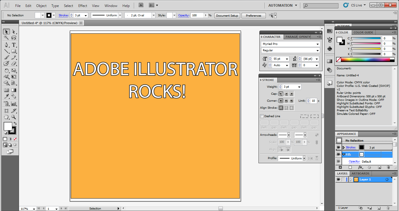
Can you seen the change? Now the effect is surely better. Remember that even for very simple text aligning effect you have to work inside the appearance panel.
Step 3: Time to Transform!
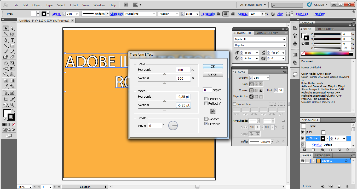
Put the Fill on top because by default the stroke is always on top and, after having the stroke selected, go to Effect > Distort & Transform > Transform.
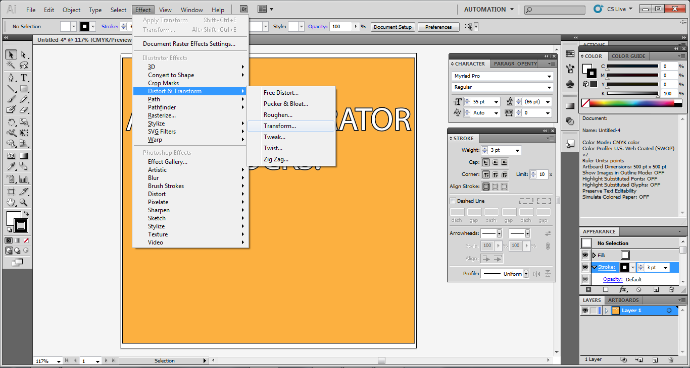
The Transform effect is very useful for a great number of purposes. Let’s see how it works changing in the dialog box the values for Horizontal and Vertical, entering for both of them 0.35 points. Moreover, change the value to negative and see what happens: the strokes moved down and to the left. Press Ok in order to apply the effect.
Step 4: Layering your strokes
Let’s add another stroke. With the stroke active inside the Appearance panel, click on the Duplicate Selected Item icon (the second from the right) and next select the brand new stroke item you’ve just created. In order to make the difference more visible, you should change the color (I’ve chosen the color #69D2E7 ) and the line weight (which has been doubled and set at 6 points).
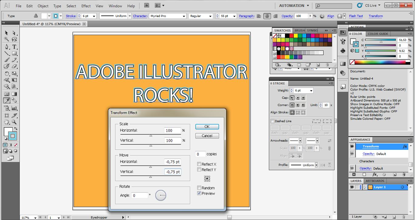
What happened? There’s a thicker stroke. What now? Double click on Transform and raise the values (I’ve set the value -0.75 both in Horizontal and Vertical) and click Ok to apply the change.
Step 5: Rinse and repeat
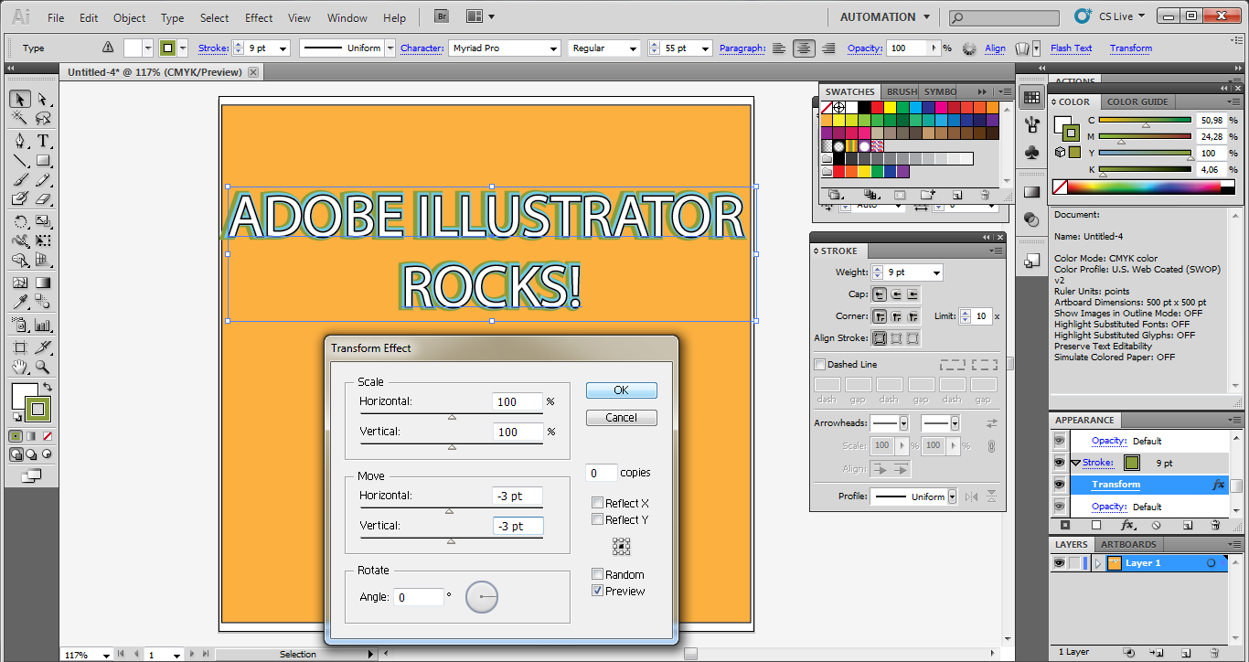
Now, repeat the same operation for our third stroke: with this stroke item selected, click on the new icon at the bottom of the Appearance panel. Click on stroke and put the line weight value on 9 points and change the color (after light blue, it’s the turn of green #8A9B0F).
Finally, put on stroke, double click on Transform, and change the value to 3 points.
Finished! Do you like this beveled effect to our letters?
I hope so. But this is not the end because it’s time to start the second task of this exercise. With the help of Transform and Pucker & Bloat we’ll see how to develop this simple text into a high-impact graphic design.
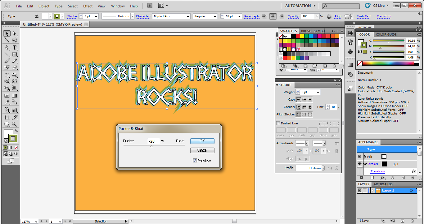
Step 5: Pucker up
In the Appearance panel, click the top item Type to make the entire text object active.
Select Effect > Distort & Transform > Pucker & Bloat.
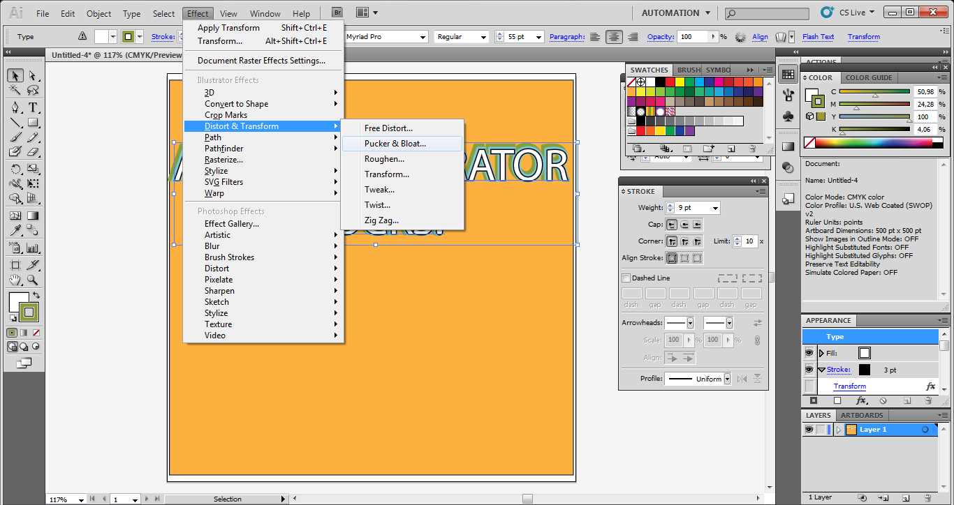
In dialog box enter a value of -20% and click OK.
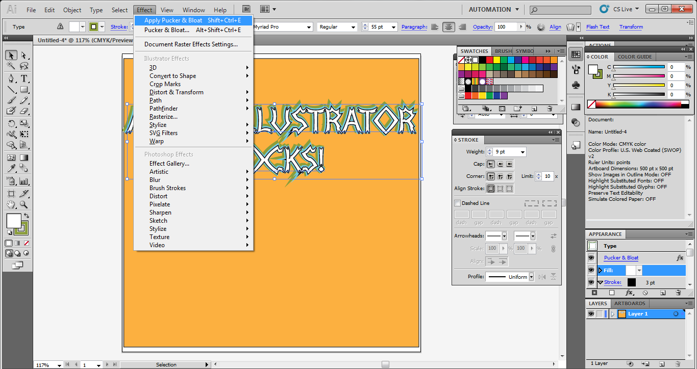
It is amazing, isn’t it?
And you can apply the effect as many times as you like. But remember that firstly you have to click the Fill item to make it active and then choose the first command in the Effect menu called Apply Pucker & Bloat in order to reapply the last-used effect.
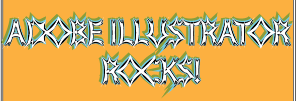
What you see below is the final result of the tutorial.
Conclusion
In this article you have seen how simple and powerful is the Transform Effect in Adobe Illustrator and how a correct use can improve the appearance of the every personal and professional project. Give it a try and enjoy yourself by combining this with other effects you already know.
Frequently Asked Questions about Adobe Illustrator’s Transform Effect
How can I use the Transform Effect to create complex patterns in Adobe Illustrator?
The Transform Effect in Adobe Illustrator is a powerful tool that allows you to create complex patterns with ease. To do this, first, create a basic shape or design that you want to replicate. Then, go to the ‘Effect’ menu, select ‘Distort & Transform’, and then ‘Transform’. A dialog box will appear where you can specify the number of copies you want, and how you want them to be transformed (scale, move, rotate, etc.). Click ‘OK’ and Illustrator will create the pattern for you. You can then further edit the pattern by double-clicking on the ‘Transform’ effect in the Appearance panel.
What is the difference between using the Transform Effect and the Transform Panel in Adobe Illustrator?
The Transform Effect and the Transform Panel in Adobe Illustrator serve similar purposes but work in slightly different ways. The Transform Panel is used to transform selected objects directly, changing their size, position, or rotation. On the other hand, the Transform Effect applies transformations as an effect to the object, which means the original object remains unchanged and you can edit or remove the effect later. This makes the Transform Effect more flexible and non-destructive.
Can I apply multiple Transform Effects to a single object in Adobe Illustrator?
Yes, you can apply multiple Transform Effects to a single object in Adobe Illustrator. Each effect will be listed separately in the Appearance Panel, and you can edit or remove them individually. This allows you to create complex transformations by combining multiple effects. However, keep in mind that the order of the effects in the Appearance Panel matters, as each effect is applied on top of the previous ones.
How can I convert the result of a Transform Effect into actual paths in Adobe Illustrator?
To convert the result of a Transform Effect into actual paths in Adobe Illustrator, you need to use the ‘Expand Appearance’ command. First, select the object with the Transform Effect. Then, go to the ‘Object’ menu and select ‘Expand Appearance’. Illustrator will create new paths that match the appearance of the transformed object. Note that this is a destructive operation and you won’t be able to edit the Transform Effect afterwards.
Why can’t I see the Transform Effect in the Appearance Panel in Adobe Illustrator?
If you can’t see the Transform Effect in the Appearance Panel in Adobe Illustrator, it’s likely because the object you’ve selected doesn’t have any effects applied. Make sure you’ve correctly applied the Transform Effect to the object. If the effect is applied but still not visible, try resetting your Illustrator preferences as it could be a software glitch.
Can I use the Transform Effect to create 3D objects in Adobe Illustrator?
While the Transform Effect in Adobe Illustrator doesn’t directly support 3D transformations, you can use it to create the illusion of 3D objects. By carefully adjusting the scale and perspective of copies, you can create shapes that appear to have depth. However, for more complex 3D objects, you might want to use Illustrator’s dedicated 3D effects.
How can I animate the Transform Effect in Adobe Illustrator?
Adobe Illustrator itself doesn’t support animation. However, you can create a sequence of frames with different Transform Effects and then export them to a program that supports animation, like Adobe After Effects. There, you can create a smooth animation by interpolating between the frames.
Can I save a Transform Effect as a preset in Adobe Illustrator?
Unfortunately, Adobe Illustrator doesn’t support saving Transform Effects as presets. However, you can save the entire object with the effect applied as a symbol, which you can then reuse in your designs. To do this, simply drag the object into the Symbols Panel.
How can I apply a Transform Effect to a text object in Adobe Illustrator?
You can apply a Transform Effect to a text object in Adobe Illustrator just like any other object. However, keep in mind that the effect will distort the text, which might make it harder to read. If you want to keep the text editable, make sure to apply the effect to a copy of the text object, not the original.
Can I use the Transform Effect to create mirror reflections in Adobe Illustrator?
Yes, you can use the Transform Effect to create mirror reflections in Adobe Illustrator. To do this, apply a Transform Effect to the object you want to reflect, set the number of copies to 1, and set the vertical scale to -100%. This will create a mirrored copy of the object. You can then adjust the position and opacity to create the illusion of a reflection.