How to Simulate Mobile Devices with Device Mode in Chrome


Website testing has become increasingly complex. The days of checking functionality in a couple of browsers are long gone. Your latest masterpiece must be rigorously evaluated on a range of mobile, tablet and desktop devices with differing OSs, screen resolutions, and capabilities. In extreme cases, it could take as long as the original development.
The process is complicated further by touch screens, hybrid devices, and high-density displays. If you’re coding on a regular PC with a mouse and keyboard, it’s difficult to appreciate how your interface will operate. Features such as mouse hover won’t necessarily work and your application could be inoperable. But how can you test your code on a range of operating systems during development and avoid the pain of managing and switching between multiple devices?
Fortunately, all modern browsers offer mobile emulation tools, and one of the best can be found in the Chrome browser. It can help identify early problems without leaving the comfort of your PC and development environment.
Key Takeaways
- Chrome’s mobile emulator tool allows developers to simulate mobile devices on their PC, helping to identify potential issues early. The tool is accessible through Chrome’s Developer Tools, and offers touch-enabled emulation, CSS media query bars, and a variety of emulated device options.
- The tool allows developers to emulate various aspects of mobile browsing including screen dimensions, touch-based JavaScript events, network speeds, device sensors such as GPS, and even the ability to simulate slow network speeds.
- Despite its capabilities, Chrome’s mobile emulator is not a complete substitute for testing on actual devices. It cannot perfectly replicate hardware capabilities, varying operating systems, and device-specific behaviors. Therefore, testing on real devices remains crucial for a comprehensive evaluation of the user experience.
- Chrome’s mobile emulator also allows for remote real device debugging. Developers can connect a real Android device via USB for remote debugging, and set up port forwarding to navigate to a web address on their local server on the device. This feature allows developers to interact either using the device or Chrome itself.
Developer Tools
Start Chrome, navigate to the web page you want to test and open the Developer Tools (Menu > Tools > Developer Tools, Cmd + Opt + I on macOS or F12 / Ctrl + Shift + I on Windows and Linux).
You can now enable the browser emulator by clicking the Toggle device toolbar icon in the top left:

A device simulation will now appear:
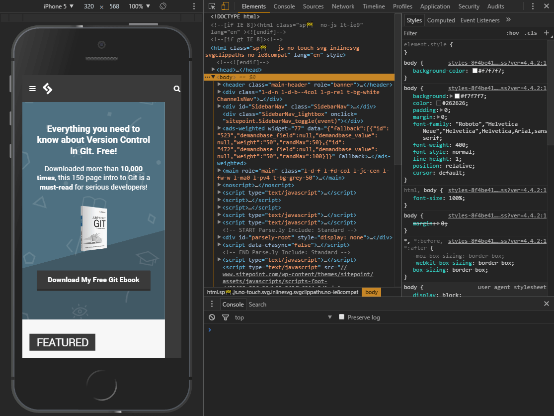
While not quite an iOS or Android emulator, a number of mobile devices running both platforms can be selected as presets. The dimensions of the emulated screen can be changed when Responsive is selected as the device type.
Touch-Enabled Emulation
Move your mouse over the device to see a circular “touch” cursor. This will react to touch-based JavaScript events such as touchstart, touchmove and touchend. Mouse-specific events and CSS effects should not occur.
Hold down Shift then click and move your mouse to emulate pinch zooming.
The Mobile Emulator Device Toolbar
It’s worth spending a little time familiarizing yourself with the toolbar and menu above the Chrome emulator:
The default controls are:
- the device type (or Responsive)
- the current resolution
- the scale (the screen can be zoomed in or out to fit better in the emulator pane)
- the network speed
- a portrait/landscape toggle button
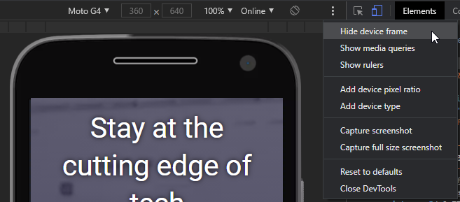
The three-dot menu allows you to show or hide additional controls:
- the device frame (if available, a graphic of the phone or tablet)
- CSS media query bars (see below)
- a pixel ruler
- add device pixel ratios
- add device types
- capture a screenshot (including the device frame if shown)
- capture a full-page screen shot
CSS Media Query Bars
Select Show media queries from the three-dot menu to view a graphical color-coded representation of all media queries set in the CSS.
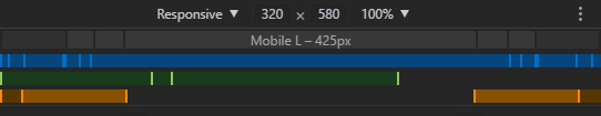
- BLUE: queries which target a maximum width
- GREEN: queries which target widths within a range
- ORANGE: queries which target a minimum width
Any bar can be clicked to set the emulator screen to that width.
Emulated Device Options
The drop-down menu on the left allows you to select a device. Several dozen presets are provided for popular smart phones and tablets, including iPhones, iPads, Kindles, Nexus tablets, Samsung Galaxy, and so on.
Not all devices are presented at once. Click Edit… at the bottom of the device drop-down or click the DevTools Settings cog icon and choose the Devices tab:
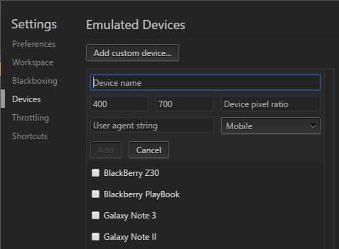
You can enable or disable devices or enter your own by defining:
- a name
- a classification such as “Mobile” or “Tablet”
- a browser user agent string
- the device resolution
- and pixel ratio (such as 2 for iPhone Retina screens where the pixel density is twice as high as the reported viewport resolution)
All browsers identify themselves with a user agent string sent on every HTTP header. This can be examined on the client or server-side and, during the dark days of web development, would be used to modify or provide a different user experience. In extreme cases, the viewer would be directed to a different site. The technique was always flawed but has become largely redundant owing to Responsive Web Design techniques, and it was unsustainable given the number of devices available on the market.
Bandwidth Throttling Simulation
The throttling drop-down allows you to emulate slow network speeds typically experienced on mobile connections or dodgy hotel and airport Wi-Fi! You can use this to ensure your site or application loads quickly and remains responsive in all environments.
The throttling drop-down is available in the Network tab and Chrome’s device toolbar. You can set your own bandwidth configuration by clicking the DevTools Settings cog icon and choosing the Throttling tab:
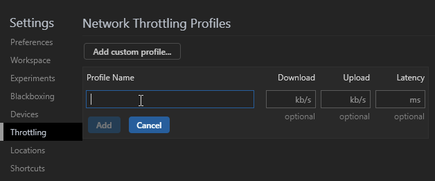
Click Add custom profile then enter:
- the profile name
- the download speed in kilobits per second
- the upload speed in kilobits per second
- the latency in milliseconds (the typical delay when making a network request)
Emulated Mobile Sensors
Smartphones and tablets often have sensors such as GPS, gyroscopes, and accelerometers, which aren’t normally present in desktop devices. These can be emulated in Chrome by choosing More tools, then Sensors from the Developer Tools main three-dot menu:
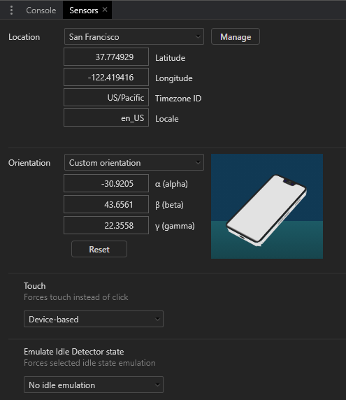
A new pane appears which allows you to define:
- The current latitude and longitude or select a major city from the drop-down. You can also select Location unavailable to emulate how your application reacts when the device cannot obtain a reliable GPS signal.
- The orientation. Several presets are available or you can move the device image by clicking and dragging.
- The touch response.
- An idle state to examine how an app reacts to a lock screen.
Remote Real Device Debugging
Finally, Google Chrome allows you to connect a real Android device via USB for remote device debugging. Enter in the address bar, ensure Discover USB devices is checked, then attach your phone or tablet and follow the instructions.
Chrome allows you to set up port forwarding so you can navigate to a web address on your local server on the device. Chrome’s preview pane shows a synchronized view of the device screen and you can interact either using the device or Chrome itself.
The full range of developer tools can be used including the Application tab to test Progressive Web Apps in offline mode. Note that, unlike a real application which requires HTTPS, Chrome permits PWAs to run from localhost over an HTTP connection.
Great! I Don’t Need Any Devices Now!
Chrome’s mobile browser emulator is useful and powerful, but it’s no substitute for interacting with your website or app on a real device to evaluate the full user experience.
You should also be aware that no device emulator is perfect. For example, Chrome shows a representation of the page on an iPhone or iPad but will not attempt to simulate the standards support or Safari quirks.
That said, for quick and dirty mobile testing, Chrome’s device emulation is excellent. It’s far easier than switching between real smart phones, and you’ll have all the developer tools at your disposal. It saves hours of effort.
FAQs About Chrome Mobile Emulator
What is Chrome Mobile Emulator?
Chrome Mobile Emulator is a feature provided by the Google Chrome web browser that allows users to simulate the experience of browsing the web on a mobile device directly from their desktop or laptop computer. This emulator is a part of the Chrome Developer Tools, a set of built-in tools designed to assist web developers in testing and optimizing their websites and web applications.
With the Chrome Mobile Emulator, developers can select from a range of predefined mobile device profiles, such as various Android and iOS devices, and view their websites as they would appear on those specific devices. It allows developers to test responsiveness, ensuring that their websites or web apps adapt and display correctly on a variety of mobile devices.
Chrome Mobile Emulator serves as a valuable tool for web developers, helping them ensure that their websites and web applications are mobile-friendly and provide a seamless user experience across a wide range of mobile devices. It accomplishes this by offering a comprehensive set of emulation features within the Chrome Developer Tools, making it easier to develop and optimize mobile web content without the need for physical access to multiple devices.
How to simulate a mobile device on Chrome?
To simulate a mobile device on the Google Chrome web browser, you can use the built-in developer tools. Here’s how to do it:
Open Developer Tools: There are several ways to open Chrome’s Developer Tools. You can press F12 or Ctrl+Shift+I (Cmd+Option+I on Mac) on your keyboard. Alternatively, right-click on a web page element and select “Inspect” from the context menu. You can also go to the Chrome menu (three dots in the top-right corner) > More Tools > Developer Tools.
Toggle Device Toolbar: In the Developer Tools panel, you’ll find various tabs at the top. Look for the “Toggle Device Toolbar” icon, which is usually represented by a small device icon. It’s commonly located in the top-left corner of the Developer Tools panel. You can also activate it by pressing Ctrl+Shift+M (Cmd+Option+M on Mac) on your keyboard.
Choose a Device: Click on the “Toggle Device Toolbar” icon, and you’ll see a toolbar appear at the top of the web page. This toolbar allows you to select a specific device or device type from the dropdown menu. You can choose from various Android or iOS devices. Additionally, you can toggle the device orientation between portrait and landscape and adjust the viewport dimensions by clicking on the dimensions display. You can select from available presets or enter custom dimensions.
Reload the Page: After selecting the desired device and orientation, you can simply refresh the web page you’re viewing. Chrome will then render the page as if it were displayed on the selected mobile device. You can interact with the page and test its responsiveness just as you would on a real mobile device.
Access Additional Features: Within the Device Toolbar, you can use the “Network Conditions” tab to simulate different network speeds and conditions. This helps you evaluate how your website or web application performs under various network conditions. Additionally, the “Sensors” tab allows you to simulate various sensor inputs, such as geolocation.
Why is Chrome Mobile Emulator not accurate?
Chrome Mobile Emulator may not provide perfect accuracy in simulating the user experience on real mobile devices for several reasons. It primarily emulates the behavior of the Chrome browser, which may differ from other browsers used on mobile devices. Additionally, emulators cannot fully replicate hardware capabilities, varying operating systems, network complexities, and device-specific behaviors. Interaction methods, such as touch events, might not precisely mimic real devices. Moreover, emulators may not always keep up with the latest updates and changes in browsers and devices. While valuable for initial testing, using actual mobile devices for testing remains crucial to ensure a more accurate assessment of website or app performance across diverse platforms.
Can Chrome emulate Android?
Yes, Chrome Mobile Emulator is a feature provided by Chrome that allows users to simulate the experience of browsing the web on a mobile device directly from their desktop or laptop computer.
Craig is a freelance UK web consultant who built his first page for IE2.0 in 1995. Since that time he's been advocating standards, accessibility, and best-practice HTML5 techniques. He's created enterprise specifications, websites and online applications for companies and organisations including the UK Parliament, the European Parliament, the Department of Energy & Climate Change, Microsoft, and more. He's written more than 1,000 articles for SitePoint and you can find him @craigbuckler.

Published in
·Android·App Development·Design·iOS·Mobile·Mobile Web Development·Responsive Web Design·Wearables·September 2, 2014