
It has been commonly admitted that using fonts for icons is a bad practice. It’s bad for rendering (sizing, positioning, etc.), it has weird failures (proxy browsers, CORS, etc.), it conveys poor semantics, can hurt accessibility, and the list goes on. CSS-Tricks has an insightful piece on the matter.
That being said, I always find it a bit complex to deal with SVG. Let’s be honest, I’m no Sara Soueidan. SVG is not really my thing. All these paths, weird tags, and attributes, ugh. I don’t really know how to use them. Still, I have to. And still, I like to do things properly.
So I came up with an SVG workflow for icons that is both simple and automated. Hopefully, it will be useful to some of you.
Key Takeaways
- Utilize SVG files instead of icon fonts to avoid common issues such as poor semantics and accessibility problems, as highlighted by CSS-Tricks.
- Gather individual SVG icon files into a dedicated folder and use a tool like Icomoon for easy selection and export, ensuring a streamlined start to the workflow.
- Generate an SVG sprite using a script like spritesh to efficiently manage multiple icons, allowing for easier maintenance and updates within the project.
- Implement an icon component using the `
- Enhance accessibility by adding `
` and `<desc>` tags to the SVGs, providing context-sensitive descriptions which improve the experience for screen reader users.</desc>
What’s the Gist?
CSS-Tricks has a very nice article by Chris Coyier about how to build an icon system with SVG sprites. Given that this article is a direct application of Chris’s article, I suggest you read it if you haven’t already.
Here is roughly how it works.
- Source icons are gathered in individual SVG files in a dedicated folder.
- A sprite is generated with spritesh.
- The sprite is included in the main layout for future reference.
- Icons are displayed through a small component.
- ???
- Profit.
The setup depends a bit on the type of project you are working on (Jekyll, React, Rails…) but the gist of it stays the same. In this article, I’ll walk you through the steps so you can start using it today.
Gathering Icon Files
If you ask me, this is somewhat of a hard part, because having correct SVG files is not an easy topic. Depending on which tool is used to export the icon, the markup looks different, can be bloated, and so on. And don’t get me started on viewBox issues…
If you can avoid designing your own icons, I’d recommend you do that. Icomoon has a very decent collection of lovely icons that are free to use and exportable as SVG. You could not wish for more. Which is why we will go this way in this article.
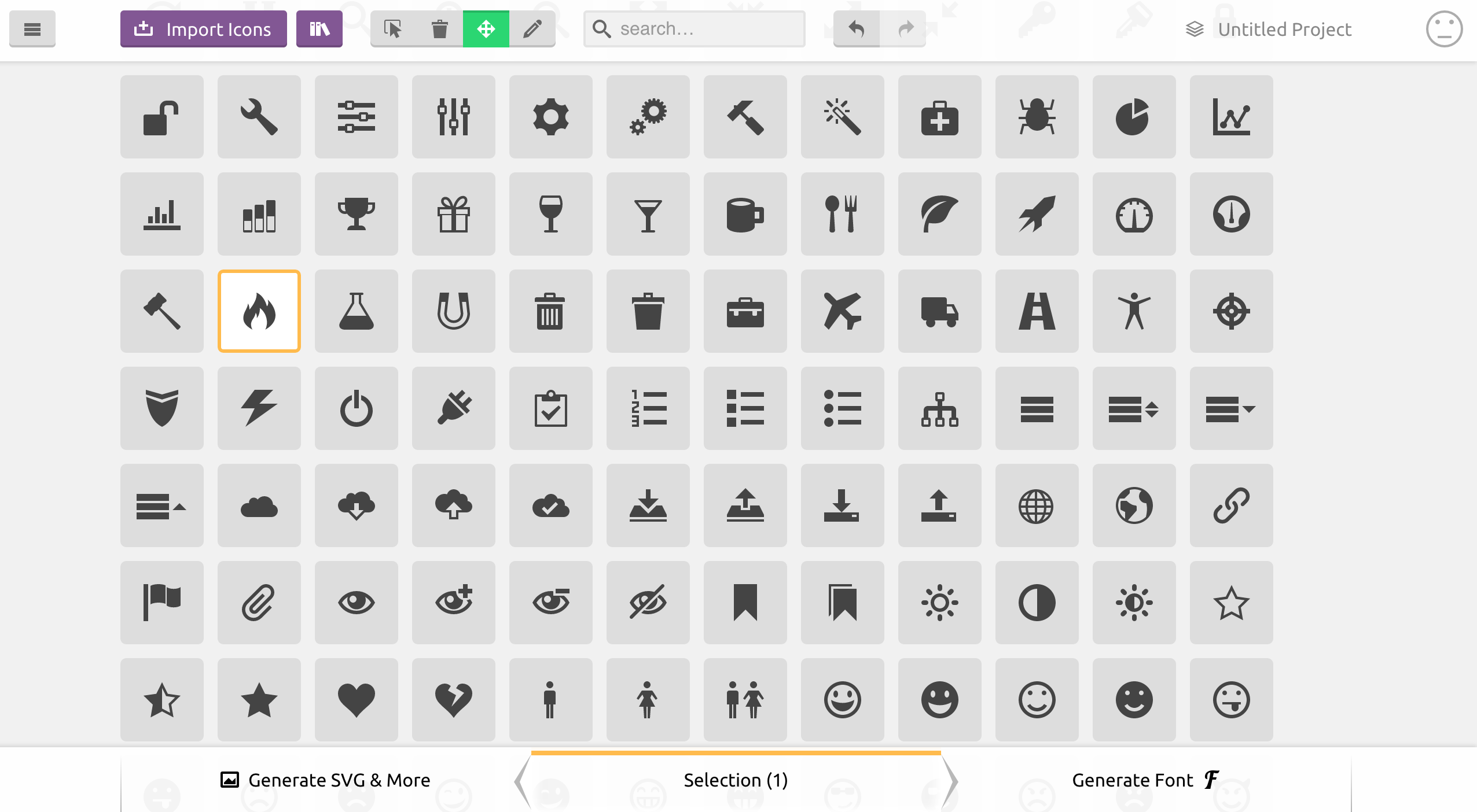
First, select the icons you need. Once you are done, click on “Generate SVG & More”. You should see listed all the icons you chose. Now you can download the bundle from Icomoon. The generated zip contains everything you need for the icons you picked (PNG files, SVG files, CSS, JavaScript, demo…). I recommend you copy the content of the SVG sub-folder (containing individual icon files), and paste it into your icon folder.
Before moving on, you will have to clean up the SVG files a bit. It is not entirely necessary per se, but I’d recommend you do that nevertheless to avoid bloating your SVG sprite with a lot of junk. Here is what the fire icon from Icomoon looks like when downloaded:
<?xml version="1.0" encoding="utf-8"?>

<!-- Generated by IcoMoon.io -->

<!DOCTYPE svg PUBLIC "-//W3C//DTD SVG 1.1//EN"

          "https://www.w3.org/Graphics/SVG/1.1/DTD/svg11.dtd">

<svg version="1.1" xmlns="https://www.w3.org/2000/svg"

     xmlns:xlink="https://www.w3.org/1999/xlink"

width="16" height="16" viewBox="0 0 16 16">

<path d="M5.016 16c-1.066-2.219-0.498-3.49 0.321-4.688 0.897-1.312 1.129-2.61

1.129-2.61s0.706 0.917 0.423 2.352c1.246-1.387 1.482-3.598 1.293-4.445 2.817 1.969

4.021 6.232 2.399 9.392 8.631-4.883 2.147-12.19 1.018-13.013 0.376 0.823 0.448

2.216-0.313 2.893-1.287-4.879-4.468-5.879-4.468-5.879 0.376 2.516-1.364 5.268-3.042

7.324-0.059-1.003-0.122-1.696-0.649-2.656-0.118 1.823-1.511 3.309-1.889 5.135-0.511

2.473 0.383 4.284 3.777 6.197z"></path>

</svg>
So much for a <path>! I recommend you remove the XML definition, the initial comment, the doctype, and the SVG wrapper (because we will inline SVG by referencing the sprite), so only the actual drawn content remains:
<path d="M5.016 16c-1.066-2.219-0.498-3.49 0.321-4.688 0.897-1.312 1.129-2.61

1.129-2.61s0.706 0.917 0.423 2.352c1.246-1.387 1.482-3.598 1.293-4.445 2.817 1.969

4.021 6.232 2.399 9.392 8.631-4.883 2.147-12.19 1.018-13.013 0.376 0.823 0.448

2.216-0.313 2.893-1.287-4.879-4.468-5.879-4.468-5.879 0.376 2.516-1.364 5.268-3.042

7.324-0.059-1.003-0.122-1.696-0.649-2.656-0.118 1.823-1.511 3.309-1.889 5.135-0.511

2.473 0.383 4.284 3.777 6.197z"></path>
Generating the Sprite
You might be asking yourself why we don’t use the sprite generated by Icomoon directly (symbol-defs.svg)? Actually, we could. You’ll see that what we are about to do is basically doing the same thing. The reasons I don’t like using the sprite are:
- Icomoon adds a few things that are not necessary (mostly attributes) and are not always relevant (e.g.
<title>filled after file name). - I don’t want to go back to Icomoon to download the sprite again every time I want to add an icon to the sprite. It’s nice to have a system inside the project.
There are several ways to generate a sprite from a folder of icon files, but most of them rely on some kind of asset pipeline like Grunt or Gulp. This is why I created spritesh, a Bash script that does Just That™.
Note: If you have a sprite generator that you like, please by all mean stick to it. spritesh is only a small helper for when you can’t/don’t want to load Gulp/Grunt and all the dependencies just for bundling icons.
You can install spritesh through npm or as a gem (both being thin wrappers around the Bash script anyway):
npm install spritesh -g
Then, run spritesh on the folder of icons. Assuming you stored the icon files in assets/images/icons and want to generate the sprite in the _includes folder, here is how it would look:
spritesh --input assets/images/icons --output _includes/sprite.svg --viewbox "0 0 16 16" --prefix icon-
Note: You might want to put this command in an npm script to avoid retyping it every time you want to regenerate the sprite.
Since we stripped out the <svg> element (and its viewBox attribute) from our source files, the viewbox argument is necessary. Here we use 0 0 16 16 because this is what Icomoon uses in the first place.
The prefix argument is not mandatory either. It just prevents any conflict with already-existing id attributes in the DOM when including the sprite. Should not be necessary, but I’d argue it’s a good practice to namespace the id attribute of the icons.
Note: If working on Windows, you will have to run spritesh in git bash or Cygwin.
You should now have a sprite looking like this:
<svg xmlns="https://www.w3.org/2000/svg" style="display:none">

<symbol id='icon-fire' viewBox='0 0 16 16'><path d="M5.016

16c-1.066-2.219-0.498-3.49 0.321-4.688 0.897-1.312 1.129-2.61

1.129-2.61s0.706 0.917 0.423 2.352c1.246-1.387 1.482-3.598

1.293-4.445 2.817 1.969 4.021 6.232 2.399 9.392 8.631-4.883

2.147-12.19 1.018-13.013 0.376 0.823 0.448 2.216-0.313

2.893-1.287-4.879-4.468-5.879-4.468-5.879 0.376 2.516-1.364

5.268-3.042 7.324-0.059-1.003-0.122-1.696-0.649-2.656-0.118

1.823-1.511 3.309-1.889 5.135-0.511 2.473 0.383

4.284 3.777 6.197z"></path></symbol>

<!-- Other <symbol>s… -->

</svg>
The only thing left to do is include the sprite in the main layout. If working on a Jekyll website for instance, it could be as simple as generating the sprite in the _includes/ folder and adding this to the layout file:
{% include sprite.svg %}
Creating an Icon Component
So far we’ve gathered icons and made a sprite. That’s nice, however, we still have to set up a convenient way to use these sprited icons. We will use a <use> tag inside an <svg> tag to reference the relevant symbol from our sprite (more on that technique in this article on CSS-Tricks), like this:
<svg viewBox="0 0 16 16" class="icon icon-fire">

  <use xlink:href="#icon-fire"></use>

</svg>
It works, but it’s not very friendly and ends up being quite annoying to deal with in the long run. Also, if we need to change the class, or the viewBox attribute, we’ll have to go over all the occurrences of this in the project. Not ideal at all.
What we want is to abstract this bit of repetitive markup in a partial. In Jekyll, it could look like this:
<svg viewBox="0 0 16 16" class="icon icon-{{ include.icon }}">

  <use xlink:href="#icon-{{ include.icon }}"></use>

</svg>
To use it, you include the partial and pass it an icon parameter:
{% include icon.html icon="fire" %}
Feel free to improve the partial to make it accept other parameters such as an extra class.
In React, it could look like this:
const Icon = (props) => (

  <svg viewBox='0 0 16 16' className={`icon icon-${props.icon}`}>

    <use xlinkHref={`#icon-${props.icon}`} />

  </svg>

);
export default Icon;
Note: the xlinkHref is only available as per React 0.14. In React 0.13, you’ll have to use dangerouslySetInnerHTML. More on that in this answer on Stack Overflow.
And then:
<Icon icon='fire' />
A Word on Accessibility
In this article from Léonie Watson, it is recommended to add a title and a description with <title> and <desc> respectively to the <symbol> definitions in the sprite, to improve accessibility.
I fully support this, however, I tend to think that title and description are heavily dependent on context. Therefore, they are better defined at use time (in our component) rather than at definition time (in the sprite) in my opinion.
For instance, if you use an icon alongside text, you don’t want a title to be read out loud, because text is already there for this. On the other hand, if you use an icon as only content for a button, you want a title and description to be read, so the user knows the purpose of the button.
Here is how I would update our component to make it possible to pass a title and a description, making it highly accessible.
{% capture id %}{% increment uniqueid %}{% endcapture %}

<svg viewBox="0 0 16 16" role="img" class="icon icon-{{ include.icon }}"

     aria-labelledby="{% if include.title %}title-{{ id }}{% endif %}{% if include.desc %} desc-{{ id }}{% endif %}">

  {% if include.title %}

  <title id="title-{{ id }}">{{ include.title }}</title>

  {% endif %}

  {% if include.desc %}

  <desc id="title-{{ id }}">{{ include.desc }}</desc>

  {% endif %}

  <use xlink:href="#icon-{{ include.icon }}"></use>

</svg>
The {% increment %} Liquid tag initialises a variable and then bumps it by one every time it is being called. In our scenario, it is called every time we include the icon partial, so for every icon.
The React version would work the same, using Lodash to get a unique id (feel free to use the implementation of your choice):
import { uniqueId } from 'lodash';
const Icon = (props) => {

  const id = uniqueId();

  return (

    <svg viewBox='0 0 16 16' role='img'

    className={`icon icon-${props.icon}`}

    aria-labelledby={

      (props.title ? `title-${id}` : '') +

      (props.desc ? ` desc-${id}` : '')

    }>

      {props.title && <title id={`title-${id}`}>{props.title}</title>}

      {props.desc && <desc id={`desc-${id}`}>{props.desc}</desc>}

      <use xlinkHref={`#icon-${props.icon}`} />

    </svg>

  );

}
export default Icon;
I will concede that it is extensively more verbose, but that’s not really a problem given that:
- The role of a component is to abstract complexity and avoid repetition.
- Accessibility is extremely important and should be a priority.
Wrapping Things Up
Hey, this wasn’t so bad now, was it? If we sum up, our system makes it easy to:
- Generate a sprite from the command line (which makes it easily pluggable in any build script) with custom options;
- Use the sprite and customise the output with a partial / component;
- Add new icons.
That sounds like a good system if you ask me! If we want to push things further, we could pipe in SVGO to optimise the SVG files. Install it via npm:
npm install svgo spritesh --save-dev
Then, make good use of npm scripts in your package.json:
{

  "scripts": {

    "sprite": "spritesh --input assets/images/icons --output _includes/sprite.svg --viewbox '0 0 16 16' --prefix icon-",

    "presprite": "svgo assets/images/icons"

  },

  "devDependencies": {

    "spritesh": "^1.0.8",

    "svgo": "^0.6.1"

  }

}
Now, everytime we run the sprite task npm will first run svgo on the icon folder (which is only useful once, but might be good to keep in case we add new icons).
There is probably room for further improvement so if you think of anything to make this SVG workflow better, please be sure to share!
Huge thanks to Sara Soueidan for her technical review on the SVG side, and to Heydon Pickering for his insightful opinion regarding accessibility.
Frequently Asked Questions about SVG Workflow for Accessible Icons
What is an SVG workflow for accessible icons?
An SVG (Scalable Vector Graphics) workflow for accessible icons refers to the process of designing, implementing, and managing vector-based icons in a way that ensures they are accessible to all users, including those with disabilities. This involves considerations such as color contrast, size, and the use of alternative text descriptions for screen readers. SVGs are preferred for this purpose due to their scalability and flexibility, allowing for high-quality display on various screen sizes and resolutions.
Why is accessibility important in icon design?
Accessibility in icon design is crucial because it ensures that all users, including those with visual impairments or other disabilities, can understand and interact with the content. Accessible icons can be read by screen readers, can be understood without color, and are clear and distinct even at small sizes. This not only improves the user experience for disabled users but also enhances usability for everyone.
How can I make my SVG icons accessible?
Making SVG icons accessible involves several steps. First, ensure that your icons are simple and clear, avoiding unnecessary complexity. Second, use high contrast colors to ensure visibility for users with color vision deficiencies. Third, provide alternative text descriptions for screen readers. Lastly, ensure that your icons scale well, maintaining clarity and legibility at various sizes.
What are the benefits of using SVGs for icons?
SVGs offer several benefits for icon design. They are scalable, meaning they maintain quality at any size, making them ideal for responsive design. They can be styled and manipulated with CSS and JavaScript, allowing for greater flexibility and interactivity. SVGs also support transparency and have smaller file sizes compared to raster images, improving load times.
How can I add alternative text to SVG icons for screen readers?
You can add alternative text to SVG icons using the <title> and
How can I ensure my SVG icons scale well?
To ensure your SVG icons scale well, avoid using absolute units like pixels in your SVG code. Instead, use relative units like percentages or viewport units. This allows the icon to scale proportionally with the size of the viewport or parent element. Also, test your icons at various sizes to ensure they maintain clarity and legibility.
Can I use CSS to style SVG icons?
Yes, you can use CSS to style SVG icons. This includes changing colors, adding borders, applying filters, and more. This allows for greater flexibility and consistency in your design, as you can match the style of your icons to your overall website design.
What is the role of JavaScript in SVG icon workflow?
JavaScript can be used in SVG icon workflow to add interactivity to your icons. This includes actions like changing the icon when hovered over or clicked, animating the icon, or dynamically changing the icon based on user input or other factors.
How can I optimize my SVG icons for performance?
To optimize your SVG icons for performance, minimize the complexity of your icons, reducing the number of paths and points. You can also use tools to minify your SVG code, removing unnecessary characters and whitespace. Additionally, consider using a sprite sheet to combine multiple icons into a single file, reducing HTTP requests.
Can I use SVG icons in all browsers?
SVG icons are widely supported in all modern browsers, including Chrome, Firefox, Safari, and Edge. However, older versions of Internet Explorer may have limited support for SVG. It’s always a good idea to test your icons in various browsers to ensure compatibility.