

Have you ever looked at a design, realizing that you liked it or didn’t like it, but you weren’t sure why? What about it did you like? What didn’t you like? Could you put your finger on it? Most likely, the reason that you liked it or didn’t like it was because of the amount of negative space it has.
Key Takeaways
- Negative space is the open or empty space around an object that defines it, providing a visual ‘breathing room’ that makes designs more appealing and easier to process.
- Effective use of negative space can create intrigue and encourage viewers to spend more time looking at a design, potentially uncovering subtle hidden messages or images.
- Negative space greatly impacts the composition of a design. Insufficient negative space can make a design appear crowded and complicated, detracting from its key elements.
- Negative space can be used creatively within typography, between lines of text (known as leading), and within logos to create memorable designs and enhance legibility.
Negative Space Defined
Negative space is the empty or open space around an object that defines it. In layman’s terms, it is the breathing room around the subject that determines how appealing it looks. The majority of people don’t like it when designs are too crowded. Giving your subject and other objects plenty of negative space gives them much more definition. Design elements don’t visually melt into a single large blob. Instead, elements are broken down into sections, making them easier to process the information in discrete chunks. This is much easier that trying to process the entire design and all of its parts at once. Lets take a look at a few examples.
Why Negative Space is So Effective
Playing with negative space and leveraging it to your advantage is an excellent way to gain a lot of attention for a design piece. When someone looks at a piece designed with well-composed negative space, the viewer can effortlessly evaluate and appreciate the design. The key factor is that they don’t have to work too hard. A healthy balance between great negative space and intrigue will entice the viewer to spend extra time looking at your design.
Designs with negative space are usually very simple, but the viewer can tell that there is more to the piece. A creative negative space design is more rewarding for the viewer; they get a feeling of inclusion because they figured out a subtle hidden message or image. People, by nature, like to feel included and informed. They enjoy feeling like they are privy to inside information, so when they see a creative use of negative space within logo or design, it sticks out in their mind. This is a highly effective way to add appeal to your designs.
Negative Space and Composition
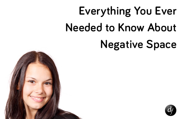
Negative space has a huge impact on composition and how your work is received visually. When a design doesn’t have enough negative space, the design, even though it may be simple, will look crowded and complicated. The example below uses an image of a woman and a title as the design, but there is very little negative space. It is difficult to focus on what is important, because the image takes up most of the visual presence. The text has to compete with the image for attention, and the whole layout is seems more complicated than it actually is.

Below is an example with better use of negative space. The woman’s photo fits the composition much better, and there is plenty of room between her portrait and the type on the right. The logo is placed in the bottom right corner, giving each element plenty of room. The type gets much more attention, and the focus is more on the message instead of the imagery. The image is meant to be a supporting element, not the main focus.
Negative Space in Type
Negative space isn’t just used for full composition; it can enhance type as well. If you know about typography, negative space between each line of text is called leading. Leading makes type much more legible. When reading two paragraphs of text, one with hardly any leading, and one without, it is easy to see why leading is so important.

As you can see in the image above, the negative space between each line (leading) makes the text much easier to read. When there isn’t enough leading between the lines of text, it is hard for your eyes to determine where the next line of text is, so you will frequently end up re-reading or skipping a line of text. This can be frustrating and even cause someone to abruptly stop reading the text, which is the last thing that any designer wants.
Negative space in type, also combined with weight, creates a visual texture on the page. This can be hard to understand from just looking at the type, but if you squint your eyes, you will see the overall relationship that negative space creates, due to the space ratio of what you see and how the letters and words are associated. When squinting your eyes, even though the type is the same size and weight, the low leading amount makes the text area on the left look darker, because it is more dense. Since the text on the right is more spread out, is doesn’t grab as much attention. Remembering this can make your headlines stand out more, which is what they are meant to do.

Figure/Ground (When Negative and Positive Space Compete)
Now this is where the fun begins. Many times, designers will create a design that uses competing positive and negative space to place hidden images. The key to this effect is usually to keep the shapes simplistic in nature. Below is a prime example of competing space. The white area looks like a vase or a statue. The black areas look like two faces staring at each other.

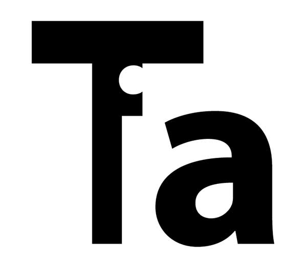
Negative space is also used in other ways too. Gestalt principles are basic laws that define how we perceive different design techniques. One of those Gestalt principles is called completion. This is where the image information may not all be present or defined with lines, but our eyes complete the shapes for us. The example below reads “Tia”, because our eyes complete the shape of the “i” on their own, without the right side of the letter being outlined.
The most common creative use of negative space is for the creation of a clever logo. The point is to use the positive space as text or one image, while the negative space forms another image. This is meant to create a mental image that can be associated with the name. From a branding perspective, this can be a powerful tool for giving a logo staying power. Staying power refers to be ability to stick in the minds of anyone who views the logo. Below are a few examples of stellar logos with creative use of negative space.

The NBC Peacock is a great example of negative space. The simple colored shapes form the feathers of the peacock. The negative space around the feathers give them more definition and symmetry, making the feathers easy to process. The negative space also forms the body and the head of the peacock. The Gestalt principle of continuation forces our eyes to complete the shapes on their own.

The Yoga Australia logo is an ingenious logo that uses positive shapes to create the person doing yoga, and the negative space within her arm and leg form the shape of Australia itself. The logo is simple, but has a lot of visual impact.

This is probably one of the most impressive negative space logos I have ever seen. The positive shapes create a golfer and shows the arc of his swing, while the negative and positive space combines to create a spartan soldiers face and helmet.
Conclusion
Negative space is a vital aspect to every design. Negative space can make the difference in the focal points of a design, the overall look of a design, its legibility, and our overall perception of the design’s presentation. You can creatively leverage negative space to encourage viewers to find hidden images within the negative space of your work, which gets more attention and retention for your design. Your viewers will be more likely to remember the design’s intended message via the use of creative imagery.
Do you know of a time where creative negative space caught your attention? Have you created a design leveraging negative space in a creative way? Did it make your client’s business more successful? Share your thoughts in the comments section below.
Frequently Asked Questions (FAQs) about Negative Space
What is the importance of negative space in design?
Negative space, also known as white space, plays a crucial role in design by providing balance and helping to highlight the main elements. It’s not just about the space around and between the objects, but also the space within them. It can help guide the viewer’s eye and make the design more digestible. By effectively using negative space, designers can create a clear visual hierarchy and improve the overall aesthetic appeal of the design.
How can I effectively use negative space in my designs?
To effectively use negative space in your designs, you need to understand its function. Negative space can be used to create a focal point, balance, and harmony. It can also be used to convey a certain mood or feeling. Start by focusing on the main elements of your design and then use negative space to highlight these elements. Remember, negative space is not just the background; it can also be the space between elements or within elements themselves.
Can negative space be colored or does it always have to be white?
Negative space doesn’t always have to be white. It can be any color, texture, pattern, or even an image. The term “negative space” simply refers to the space that is not occupied by main or positive elements. It’s the space that helps define the boundaries of positive space and brings balance to a composition.
What is the difference between positive and negative space?
Positive space refers to the main focus of a picture, while negative space refers to the background. In other words, positive space is the area in a design occupied by your subject, and negative space is the area that surrounds it. Both are important and work together to create a balanced composition.
Can negative space convey a message?
Yes, negative space can convey a message. When used creatively, negative space can form shapes or images that can communicate a certain idea or message. This technique is often used in logos, posters, and other types of visual communication.
What is the role of negative space in photography?
In photography, negative space is used to emphasize the subject of the photograph and to lead the viewer’s eye towards it. It can also create a sense of balance and harmony, and add depth and complexity to the photograph.
How does negative space contribute to minimalism in design?
Negative space is a key element in minimalist design. It helps to create a clean, uncluttered look by providing breathing room for the design elements. It allows the viewer’s eye to rest and helps to highlight the essential elements in the design.
Can negative space be used in 3D design?
Yes, negative space can be used in 3D design. It can help to define objects and shapes, create depth and perspective, and add interest and complexity to the design.
How can I improve my use of negative space?
To improve your use of negative space, start by studying successful designs that make good use of it. Practice by creating designs that use negative space in different ways, such as to create a focal point, to balance the composition, or to create a certain mood or feeling.
What are some common mistakes when using negative space?
Some common mistakes when using negative space include overcrowding the design, not using enough negative space, and not using it to create a clear focal point. It’s important to remember that negative space is not just empty space; it’s a crucial element that helps define the positive space.