
Key Takeaways
- A smooth account user experience (UX) is crucial for user retention and can be achieved by providing clear instructions about account requirements, balancing security and usability, and keeping the account management process simple.
- For a better user experience, avoid complex password requirements and restrictions on usernames, provide clear password requirements upfront, and offer the option to log in with third-party services like Facebook or Twitter.
- Keeping the account creation process simple and straightforward by asking for only necessary information, avoiding repeated fields, and providing a secure way to reset data can significantly improve the user experience.

Online accounts give users privacy, control and a personalised experience (imagine Facebook without accounts!). Account management — registration and log in — is, therefore, a necessary evil. Except when it goes wrong, no user likes or cares about account management, they just want to access the service.
You can make account management less evil by following three little rules:
- 1. Don’t make the user guess
- Almost every service on the web handles account management slightly differently. As a result, you have to be explicit about the requirements for your service. Otherwise, you’re just being cruel.
- 2. Balance security with usability
- Often, security folk will insist on an approach that compromises the user experience. This is foolish, because poor usability will lead to workarounds, and workarounds in turn lead to weakened security. Instead, aim for a design that is both secure and usable.
- 3. Keep it simple
- Account management is one of your biggest potential barriers to usage. Make the barrier practically invisible through a simple, seamless, pain-free design.
Let’s look at how these three rules can be applied to registration and log-in. We discuss registration below; log in will be covered in a second article to follow soon.
The User Registration Process
Rule #1: Don’t make the user guess
- Warn the user — ideally before they start — if they are going to have to do something to verify, before their account will be created.
- Let the user know if usernames are automatically set by the service.
- Allow — but don’t insist on — login with third party services like Facebook or Twitter.
- Spell out any requirements for username or password before this information needs to be entered [1]. In particular, let the user know whether:
- there are restrictions on length, characters, words or phrases
- spaces — and thus passphrases — are allowed
- such fields are case sensitive.
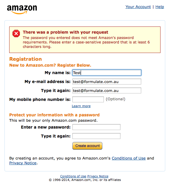
Example: What not to do.
Amazon doesn’t explain its password requirements until after form is submitted and the chosen password fails. How hard would it be to put “Case sensitive, minimum of 6 characters.” underneath the first password field?
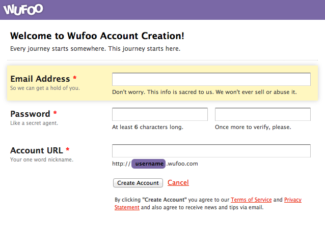
Example: A better approach.
Wufoo is up front and transparent about password requirements.
Rule #2: Balance security with usability
- Avoid setting restrictions on usernames.
- Avoid complex password requirements; this will only lead to users writing down their password and/or using the same passwords across multiple services.
- If you have a password strength meter, make sure it reflects up-to-date practice, otherwise don’t have one at all.
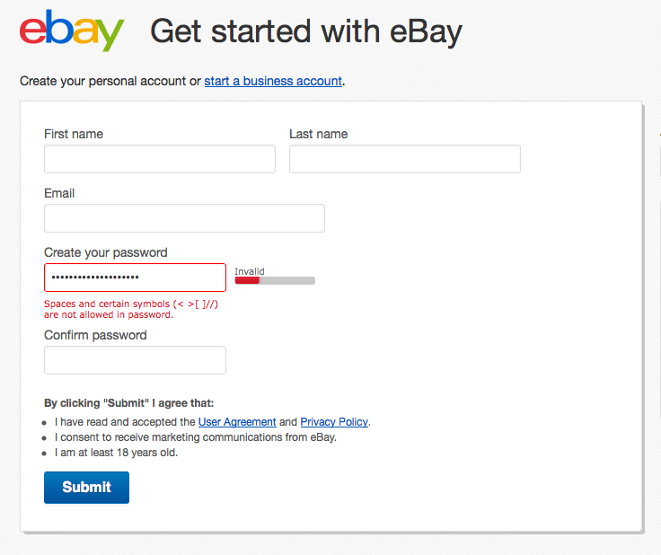
Example: What not to do.
Ebay — who recently suffered a massive data breach and responded embarrassingly poorly — don’t allow passphrases (several words separated by spaces). Yet many consider passphrases to be the most practical, secure and usable approach to passwords (see, for example, [2] and [3]).
Example: A better approach.
Envato allow passphrases. The passphrase I had entered is “This is a phrase”.

Rule #3: Keep it simple
- Avoid repeated fields (e.g. asking for password to be entered twice) and instead provide a simple (but secure) way to reset such data. (For more about repeated fields, see [4]).
- Ask for just what you need in order to create the account; you can always ask about other things later.
- Don’t ask for personal information (e.g. date of birth) unless you really need it.
- Inline validation is nice, but don’t do it before the user has had a decent amount of time to enter data.
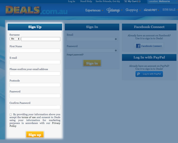
Example: What not to do.
Deals.com.au requires double entry on both email and password!
Example: A better approach.
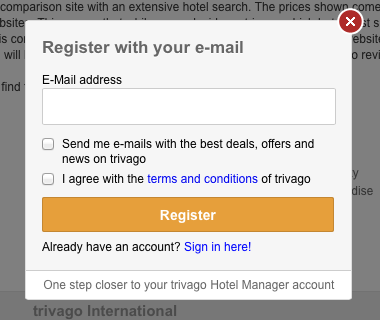
Trivago keep things very simple.
Keep an eye out for the second part of this article, on log in, to be published soon!
- Some security experts argue that you should not reveal password requirements to users, because it gives black-hat hackers clues. The problem with this argument, as I see it, is that requirements have to be revealed if the submitted password is invalid, so a black-hat hacker could expose the requirements simply by entering “p” or something equally unsatisfactory, submitting the form, and triggering the validation failure message.
Aside from that, I think it’s crazy to make the experience unusable for the mass of legitimate users, just to (mildly) frustrate a handful of black-hat hackers. Better to achieve security through other means.
- The usability of passwords
- Password strength
- Double entry of form fields
Frequently Asked Questions (FAQs) about Account User Experience (UX)
What does it mean when a password is case sensitive?
A case-sensitive password means that the password distinguishes between uppercase and lowercase letters. For example, “password” and “PASSWORD” are considered different passwords in a case-sensitive system. This feature is designed to enhance security as it increases the number of possible combinations and makes the password harder to guess.
Why is a minimum character limit required for passwords?
A minimum character limit is often required for passwords to enhance security. The longer the password, the more difficult it is for hackers to guess or crack using brute force methods. A common minimum length is six characters, but many security experts recommend using even longer passwords.
How can I create a strong password?
A strong password should be unique, long, and include a mix of uppercase and lowercase letters, numbers, and special characters. Avoid using personal information, common words, or sequences like “123456”. A password generator can be a helpful tool for creating strong, random passwords.
What is the purpose of security questions?
Security questions serve as an additional layer of security. They are typically used for account recovery purposes, in case you forget your password or need to verify your identity. It’s important to choose answers that are difficult for others to guess.
Why do some websites require me to change my password regularly?
Regularly changing your password can help to protect your account from unauthorized access. If a hacker somehow obtains your password, they will lose access once you change it. However, it’s important to create a completely new password each time, rather than making minor modifications to the old one.
What is two-factor authentication (2FA)?
Two-factor authentication is a security measure that requires two forms of verification to access an account. This typically involves something you know (like a password) and something you have (like a mobile device to receive a verification code). This adds an extra layer of security to your account.
Why do some websites log me out automatically after a period of inactivity?
This is a security feature designed to protect your account from unauthorized access. If you leave your device unattended without logging out, someone else could potentially access your account. By automatically logging you out, the website helps to reduce this risk.
What should I do if I forget my password?
Most websites have a password recovery process. This typically involves clicking on a “Forgot password” link and following the instructions to reset your password. You may need to verify your identity by answering security questions or confirming a code sent to your email or mobile device.
How can I protect my account from phishing attacks?
Be cautious of any unexpected emails or messages asking for your account details. Legitimate companies will never ask for your password. Always check the sender’s email address and the message content for signs of phishing. If in doubt, contact the company directly.
What is the difference between signing in and signing up?
“Signing in” refers to accessing an existing account with your username and password. “Signing up” refers to creating a new account. It’s important to use the correct option to avoid any confusion or access issues.

