Key Takeaways
- The piece showcases 10 unique CSS button techniques, each one enhanced by the power of jQuery, demonstrating how these tools can be used to create more dynamic and interactive web elements.
- The techniques range from creating an iPhone-style radio and checkbox switches, to a button hover fading transition, to imageless buttons à la Google, and even a cross-browser rounded button, showcasing the versatility of CSS and jQuery.
- The post also includes a comprehensive FAQ section that provides clear instructions on how to create different CSS button styles and effects, such as a hover effect, gradient effect, rounded corners, shadow effect, icon inclusion, loading effect, ripple effect, 3D effect, transition effect, and a pulse effect.
#singlestylepost img {
width: 580px;
height: 150px;
}
#singlestylepost h2 {
margin: 0;
padding: 0;
}Related posts:
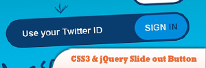
1. Awesome CSS3 & jQuery Slide out Button
The inspiration for this button comes from photoshop.com where Flash is used to create a nice slide out effect. This button does not behave exactly the same, but the effect is awesome. It does not use any images and uses the border radius property to make the rounded borders.
Source
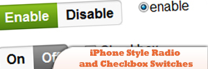
2. iPhone Style Radio and Checkbox Switches using JQuery & CSS
A great interface for an administration panel, complete with great looking forms and buttons.
Source
3. jQuery hashchange event
This plugin is, by design, very basic. If you want to add lot of extra utility around getting and setting the hash as a state, and parsing and merging fragment params, check out the jQuery BBQ plugin. It includes this plugin at its core, plus a whole lot more, and has thorough documentation and examples as well.
Source
4. Button Hover Fading Transition with jQuery
Learn how to make button hover fading transition with jQuery in this tutorial.

Source
5. Menu Buttons in 20 Lines of jQuery
The desired behavior:
> Clicking on a button opens its menu
> Clicking anywhere except inside the menu closes it
Source
6. jQuery Glowbuttons
When you mouse over the button, it glows as it comes into focus and of course when the mouse leaves the glow slowly fades away.
7. Simple “Call to Action” Button with CSS & jQuery
In this tutorial you’re going to create an effective ‘call to action’ button with CSS and some jQuery to help grab the user’s attention and entice them to click.
Source
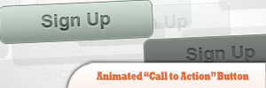
8. Animated “Call to Action” Button
In this tutorial, you’ll find a walkthrough for creating a “Call to Action” button sprite in Photoshop as well as how to use jQuery to animate it. This tutorial is broken up into three sections: Photoshop, HTML/CSS, and JavaScript.
Source
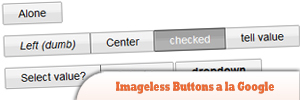
9. jQuery Imageless Buttons a la Google
This jQuery plugin is an attempt to recreate Google’s imageless buttons and prove that it doesn’t take a whole team of engineers and an endless cycle of code revision and quality control (their own words) to pull this off.
Source
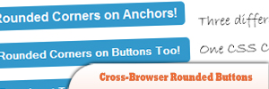
10. Cross-Browser Rounded Buttons with CSS3 and jQuery
Learn how to make a cross-browser rounded buttons with CSS3 and jQuery in this tutorial.
Source
Frequently Asked Questions (FAQs) about jQuery Enhanced CSS Buttons
How can I create a CSS button with a hover effect?
Creating a CSS button with a hover effect involves defining the button’s style and then specifying a different style for the hover state. You can use the “:hover” pseudo-class to achieve this. Here’s a simple example:.button {
background-color: #4CAF50; /* Green */
border: none;
color: white;
padding: 15px 32px;
text-align: center;
text-decoration: none;
display: inline-block;
font-size: 16px;
transition-duration: 0.4s;
cursor: pointer;}.button:hover {
background-color: #45a049;}
In this example, the button will change its background color when you hover over it.
How can I add a gradient effect to my CSS button?
CSS gradients let you display smooth transitions between two or more specified colors. You can use the “background-image” property to add a gradient effect to your button. Here’s an example:.button {
background-image: linear-gradient(to right, #ff7e5f , #feb47b);}
In this example, the button will have a linear gradient effect that transitions from #ff7e5f to #feb47b.
How can I create a CSS button with rounded corners?
You can use the “border-radius” property to create a button with rounded corners. The higher the value, the more rounded the corners will be. Here’s an example:.button {
border-radius: 12px;}
In this example, the button will have rounded corners with a radius of 12 pixels.
How can I add a shadow effect to my CSS button?
You can use the “box-shadow” property to add a shadow effect to your button. This property takes values for horizontal offset, vertical offset, blur radius, spread radius, and color. Here’s an example:.button {
box-shadow: 0 8px 16px 0 rgba(0,0,0,0.2);}
In this example, the button will have a shadow that is offset 8 pixels down and has a blur radius of 16 pixels.
How can I create a CSS button with an icon?
You can use icon libraries, such as Font Awesome, to add icons to your buttons. First, include the library in your HTML file. Then, use the appropriate class for the icon you want to use. Here’s an example:<button class="btn"><i class="fa fa-home"></i> Home</button>
In this example, the button will display a home icon and the text “Home”.
How can I create a CSS button with a loading effect?
Creating a CSS button with a loading effect involves using animations and keyframes. You can use the “@keyframes” rule to create the animation, and then apply it to your button using the “animation” property. Here’s an example:@keyframes spin {
0% { transform: rotate(0deg); }
100% { transform: rotate(360deg); }}.button {
animation: spin 2s linear infinite;}
In this example, the button will continuously spin, creating a loading effect.
How can I create a CSS button with a ripple effect?
Creating a CSS button with a ripple effect involves using the “:after” pseudo-element and animations. Here’s an example:.button:after {
content: "";
background: #90EE90;
display: block;
position: absolute;
padding-top: 300%;
padding-left: 350%;
margin-left: -20px !important;
margin-top: -120%;
opacity: 0;
transition: all 0.8s}.button:active:after {
padding: 0;
margin: 0;
opacity: 1;
transition: 0s}
In this example, the button will create a ripple effect when clicked.
How can I create a CSS button with a 3D effect?
You can use the “box-shadow” property to create a 3D effect. By using multiple shadows, you can create the illusion of depth. Here’s an example:.button {
box-shadow: 0 5px 0 darkgreen, 0 10px 5px rgba(0,0,0,0.5);}
In this example, the button will appear to have a 3D effect.
How can I create a CSS button with a transition effect?
You can use the “transition” property to add a transition effect to your button. This property allows you to specify the duration, timing function, and delay of a transition. Here’s an example:.button {
transition: background-color 0.5s ease;}
In this example, the button’s background color will transition over a period of 0.5 seconds.
How can I create a CSS button with a pulse effect?
Creating a CSS button with a pulse effect involves using animations and keyframes. Here’s an example:@keyframes pulse {
0% { transform: scale(1); }
50% { transform: scale(1.1); }
100% { transform: scale(1); }}.button {
animation: pulse 2s infinite;}
In this example, the button will continuously pulse, creating a heartbeat-like effect.
Sam Deering has 15+ years of programming and website development experience. He was a website consultant at Console, ABC News, Flight Centre, Sapient Nitro, and the QLD Government and runs a tech blog with over 1 million views per month. Currently, Sam is the Founder of Crypto News, Australia.


