Understanding Bootstrap: How it Works, and What’s New

Version 4 of Bootstrap is a major change from all its past versions. It’s a mobile-first framework and can claim to be one of the best CSS frameworks for building responsive website designs.
Since Bootstrap is a mobile-first framework, by default whatever you design or create will be mobile compatible or responsive. Isn’t that cool?
Key Takeaways
- Bootstrap 4 introduces significant updates with a mobile-first approach and enhanced responsiveness, making it a top choice for responsive web design.
- The framework is modular, allowing developers to include specific components like CSS resets or grid systems based on project needs, which simplifies customization and boosts performance.
- New additions in Bootstrap 4 include updated JavaScript libraries for interactive components and the integration of Popper.js for managing popups, enhancing the dynamic capabilities of web applications.
- The tutorial demonstrates building a “Rental Vacations” landing page, showcasing how Bootstrap 4 facilitates quick and efficient web development without extensive CSS coding.
- Important changes in Bootstrap 4 include the removal of glyphicons, replaced by external options like Font Awesome, and an emphasis on utility classes for margin and padding, offering more control over layout and spacing.
Getting Started
Bootstrap has a new website design which is itself built using the latest version of the Bootstrap framework (version 4 at the time of writing).
You can either include the precompiled version of Bootstrap using a CDN or download the archive file here.
Once you unzip the archive file, you’ll see lots of files and folders that aren’t required for our tutorial. Jump directly into the dist directory and copy all the folders to a new destination, which will be your project home.
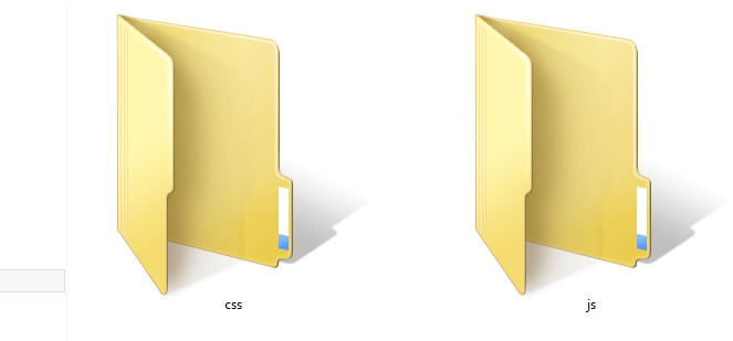
In previous versions of the framework, the download included an additional fonts folder. Now, no fonts are included, but we can easily grab some nice ones from Font Awesome, for example, or from your favorite resource for icon fonts. In our case, we have two directories, so let’s look at each of them. The css folder contains six CSS files:
bootstrap.cssbootstrap.min.cssbootstrap-grid.cssbootstrap-grid.min.cssbootstrap-reboot.cssbootstrap-reboot.min.css
As you can see, the latest version of Bootstrap is a lot more modular than previous ones. If you just need a nice CSS reset, just use bootstrap-reboot.css (and its minified version for production). Similarly, if you just want to use the grid, include bootstrap-grid.css (or bootstrap-grid.min.css for production) in your project.
For this tutorial, our main CSS file will be bootstrap.css, and we must include that in all our HTML pages. bootstrap.min.css is just the minified version of bootstrap.css. It’s needed when we’re actually deploying our application online.
Moving on to the js folder, we have the following four files:
bootstrap.bundle.jsbootstrap.bundle.min.jsbootstrap.jsbootstrap.min.js
These files contain Bootstrap’s main JavaScript libraries for things like carousels, drop-down menus, search auto suggest and many other powerful JavaScript functionalities. We’ll use the minified version when the application is ready for deployment.
Since Bootstrap 4 beta 2, the js folder has included two new folders, bootstrap-bundle.js (along with its minified version for production), and also Popper.js, a smart JavaScript library for managing poppers in web applications.
So What Exactly Are We Going to Build?
In this article, we’re going to build a static landing page using Bootstrap 4, which will be called “Rental Vacations”. Have a look at the demo page first.
See the Pen Bootstrap Landing Page Demo by SitePoint (@SitePoint) on CodePen.
Resize your browser window and you’ll see some amazing transformations in the layout of the web page. It adjusts to the size of the window. You’ll also notice that the menu bar is hiding automatically into a nice touch-compatible menu.
So we are going to build this! Excited? Yeah … me, too!
The Structure
Bootstrap understands HTML5 elements, so we need to add an appropriate doctype tag to our web page. Let’s create a new HTML page and add the following doctype tag.
<!DOCTYPE html>Now we’ll add the basic tags that are present in every HTML document:
<html>
<head>
<title>Bootstrap 101 Template</title>
<meta name="viewport" content="width=device-width, initial-scale=1.0">
<!-- Bootstrap -->
<link href="css/bootstrap.min.css" rel="stylesheet" media="screen">
</head>
<body>
<h1>Hello, world!</h1>
<script src="//code.jquery.com/jquery.js"></script>
<script src="js/bootstrap.min.js"></script>
</body>
</html>
Looking inside the <head>, we have the title element, which is easy enough to understand: it gives a title to the page.
Then we have the meta element, which is very important to understand when using Bootstrap. Since this version of Bootstrap is built to be compatible with various types of devices (mobiles, tablets, desktops, Retina displays, etc.), you need to let the browser know that it has to scale your web page appropriately on every device.
The viewport meta element does this. Here, we’ve set the initial content-width to the width of the device and scaled it one time only.
After setting the viewport meta element, we’ve imported the development version of the Bootstrap CSS file, bootstrap.css.
Let’s move on to the body section of the above HTML snippet. Just to output something, we’ve written “Hello, world” inside the h1 element. Then we’ve included the required JavaScript files from the `js` folder. Make sure these JavaScript files are included on every page. The Bootstrap documentation recommends including all the JavaScript at the end of the page.
Diving into Bootstrap
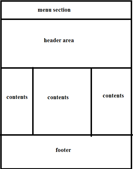
Now that we have our basic structure ready, we’ll move on to add different components to our web page. These components are by far the most important part of every website, as we see them every day. I’m going to divide the demo page into various parts as shown below.
Menu Section
Designing a menu in Bootstrap is the easiest thing that can happen in the world of web designing. It’s that easy. Let’s start building a menu for our web page.
The menu is responsive by default, and gets a new look in smaller devices. Since we have the entire CSS ready in our bootstrap.css file, we just have to add the correct markup and correct classes to each element.
Let’s start with the <nav> element:
<nav class="navbar navbar-expand-lg navbar-light bg-light">
  /* navbar code here */
</nav>
Since Bootstrap is compatible with HTML5, we’ll be using the <nav> element for our navigation menu. Let’s understand each class applied to it.
navbaris a wrapping class for navbars.navbar-expand-lgadds responsive functionality by taking charge of expanding or collapsing the navigation according to screen size. Instead of-lg, which stands for large, you can also opt for-md(medium screens),-sm(small screens), and-xl(extra large).navbar-lightis a color class for navbars with a light background.bg-lightfurther customizes the navbar’s background color. In this case, the navbar have a light color. If we replacebg-lightwithbg-dark, the navbar’s background color will be dark and the text color will be light.
Moving on, add the following snippet inside the <nav> element:
<a class="navbar-brand" href="#">Vacation Rentals</a>
<button class="navbar-toggler" type="button" data-toggle="collapse" data-target="#navbarSupportedContent" aria-controls="navbarSupportedContent" aria-expanded="false" aria-label="Toggle navigation">
  <span class="navbar-toggler-icon"></span>
</button>
The navbar-brand class is used for branding purposes. In our case, it displays the name of the website.
Next, notice the classes on the <button> element. This button is only visible on smaller screens, and it’s used to toggle the menu’s visibility on and off through data-target="#navbarSupportedContent", which is a reference to the ID value of the div element that contains the menu. Let’s add this element now, just below the previous code:
<!-- div containing the toggable navigation -->
<div class="collapse navbar-collapse" id="navbarSupportedContent">

<!-- navigation menu -->
   <ul class="navbar-nav mr-auto">
    <!-- active link corresponding to the current page -->
    <li class="nav-item active">
      <a class="nav-link" href="#">Home <span class="sr-only">(current)</span></a>
    </li>
    <li class="nav-item">
      <a class="nav-link" href="#">Trip Description</a>
    <li class="nav-item">
      <a class="nav-link disabled" href="#">About Us</a>
    </li>
    <li class="nav-item">
      <a class="nav-link disabled" href="#">Book Travels</a>
    </li>
    <li class="nav-item">
      <a class="nav-link disabled" href="#">Reservations</a>
    </li>
  </ul>
  <!-- inline form inside the navbar -->
  <form class="form-inline my-2 my-lg-0">
    <input class="form-control mr-sm-2" type="search" placeholder="Search" aria-label="Search">
    <button class="btn btn-outline-success my-2 my-sm-0" type="submit">Search</button>
  </form>
</div>
The above code is the main content of our menu. navbar-collapse is applied to make the menu touch-compatible and also to change its form for smaller devices. The contents inside are pretty easy to understand. We’ve used basic ul and li elements for listing menu items. There’s also a form that’s classed form-inline so that it displays correctly inside the navigation bar. And finally, I’ve shown the basic structure to place a drop-down menu inside the navigation.
Two important things here are:
- The use of atomic utility classes like
mr-sm-2,mr-auto, etc. These are pretty new to Bootstrap and there are plenty of them. - Attention to accessibility by the use of the
sr-onlyclass, which handles content aimed at screen readers, and attributes likearia-controlsandaria-expanded.
You can also refer to the documentation, which is highly recommended whenever you’re in any kind of confusion.
So we’re finally done with the navigation menu. Let’s move on to building the rest of the markup inside the <body> section.
Header Area
Bootstrap offers a highly usable class called jumbotron that can be used to display large headers and contents. This is mostly used in product-based websites. For that, we need to add the following markup:
<div class="row">
  <header class="col jumbotron jumbotron-fluid">
    <div class="container-fluid">
      <h1 class="display-4 text-light">
        Best Vacation Rentals
      </h1>
      <p class="lead text-light">Sed placerat fringilla quam et.</p>
      <button type="button" class="btn btn-primary btn-lg">Start Now!</button>
    </div>
  </header>
</div>
We’ve put the jumbotron inside a div with the class of row and given the jumbotron itself an extra class of col. These are classes Bootstrap uses to build its 12-column grid.
Also, notice the use of the container-fluid and jumbotron-fluid classes. These classes ensure that the container and the jumbotron take 100% width of the parent container element, or of the browser if no parent element is present.
Inside the jumbotron div element we’ve placed an h1 element, a p element and finally a fancy button.
The display-4 class is one of the latest additions to Bootstrap. It’s a display heading class that you can use when you need your headings to really stand out.
The text-light class is also a new addition to Bootstrap. It’s one of the color utility classes, letting you quickly control the color and background color of elements.
Refresh your browser and see the header area. Awesome!
The Content Area
Now, we need to divide the content area into three equal areas and place them side by side. Thanks to Bootstrap’s flexbox-based grid, this is going to be quick and easy to do.
Bootstrap provides a 12-column grid system. It divides the screen into 12 equal parts, and we need to specify which HTML element occupies which parts of the grid. So in short, any element will occupy a minimum of one grid in the grid system.
Let’s see the markup first.
<div class="row">

<!-- first column -->
  <div class="col-sm pb-4">

</div>

<!-- second column -->
  <div class="col-sm pb-4">

</div>

<!-- third column -->
  <div class="col-sm pb-4">

</div>

</div>
Firstly, there are three div elements that are contained inside a single row. So we start a new row by adding a new div with class row.
The row now contains three more div tags with the class col-sm. Before the release of Bootstrap 4, achieving this result would have required adding the col-md-4 class to each of these div elements. The number 4 in the class meant that the grid spanned four columns. So three sibling divs spanning four columns each would occupy 12 columns, which was perfectly fine.
The new Bootstrap grid uses the strength of Flexbox to make things way less complex. The col-sm class on each column div by itself ensures that the content is evenly divided among the three divs until the screen size gets to 576px, at which point columns get stacked on top of each other.
We can choose to trigger this layout change at a screen size of less than 576px by using col-xs, or at a larger screen size of 768px with col-md. It’s up to us, but just one grid class will do the job for us.
The pb-4 class is one of the new spacing utility classes that come with Bootstrap 4. It creates some padding bottom inside the element on the basis of a consistent scale of values.
Since we have each sibling div placed appropriately, it’s now time to populate them with some content. In our case, the content is unique for each one of them, with different images, but the structure is the same. Here’s the content inside the first column as an example:
<!-- first column -->
<div class="col-sm pb-4">

<!-- column content here -->
  <a href="#">
    <img class="img-fluid mx-auto d-block mt-4 mb-2 rounded-circle" src="path/to/img" alt="">
  </a>
  <h3 class="text-center mb-2">Type 1</h3>
  <p>
    Lorem Ipsum...
  </p>
  <button class="btn btn-success">Book Now @ $599></button>

</div>
The image added has class img-fluid that makes it fit to the size of the parent div irrespective of its own size. The image is responsive to the size of each sibling div. Then we have a normal h3 element and p tags. You can populate the p tag in any manner you wish. In my demo page, I’ve used the auto-generated Lorem Ipsum text. Then finally, I’ve added a button.
btn-success is used to make it green. There are other classes as well, like btn-info, btn-default, btn-warning and btn-danger. You can browse the buttons docs page for all the details.
Finally, we’ve used a few more utility classes for margins, centering, and rounding the image’s appearance into a circle.
Footer Area
The footer area follows the same principles as the content area. Here’s the markup:
<footer class="row pt-4">

<!-- first column -->
  <div class="col-sm">
    <small><p>© 2018</p></small>
  </div>

<!-- second column -->
  <div class="col-sm">
    <ul class="list-inline">
      <li class="list-inline-item">
        <a href="#">About Us</a>
      </li>
      <li class="list-inline-item">
        <a href="#">Support 24x7</a>
      </li>
      <li class="list-inline-item">
        <a href="#">Privacy Policy</a>
      </li>
    </ul>
  </div>

<!-- third column -->
  <div class="col-sm">
    <small><p class="text-right">Vacation Rentals</p></small>
  </div>

</footer>
We’ve used the HTML5 footer element and created another row at the same time. Then we’ve divided the whole area into three equal sections, the same way we did with the main content area above. Then we populated each sub division.
Some More Bootstrap Classes
Table classes: if you’re using the <table> element, you can use the .table class to make it look bit more fancy in the Bootstrap style.
Floats: you can use .float-left to float content to the left, .float-right to float content to the right, and float-none to remove floats from the element.
Clearfix class: this class is used to clear the float on any element.
Wrap-up
So this was the “get-me-started” tutorial for the latest version of Bootstrap. The main motive was to make you understand how Bootstrap works. As you might have seen, I haven’t written more than a few lines of CSS code. Bootstrap handles everything on its own with its predefined set of CSS and JS files.
One of the main disadvantage of Bootstrap is that it isn’t backwards compatible. So, if your website is built with Bootstrap 3 and you replace all the CSS and JS files with those of Bootstrap 4, the design will break. The Bootstrap creators have made huge changes to CSS class naming and have improved the responsive nature of the resulting websites.
You can also add custom CSS to your website. Create your own CSS file with any name — such as customstyles.css — and import the Bootstrap CSS into it. Then define your own style by using an appropriate element class or ID. In this demo, I would use customstyle.css to change the background of the jumbotron element.
Here’s the demo page again.
If you’ve heard about Boostrap but have been putting off learning it because it seems too complicated, then play through our Introduction to Bootstrap 4 course for a quick and fun introduction to the power of Bootstrap.
Frequently Asked Questions (FAQs) about Understanding Bootstrap
What is the significance of Bootstrap in web development?
Bootstrap is a powerful front-end framework that is essential in web development. It provides a free collection of tools for creating responsive and mobile-first websites. It includes HTML and CSS-based design templates for typography, forms, buttons, tables, navigation, modals, image carousels, and many other interface components, as well as optional JavaScript plugins. Bootstrap also gives you the ability to easily create responsive designs, meaning your websites can adapt to different screen sizes such as mobile, tablet, and desktop.
How does Bootstrap differ from other front-end frameworks?
Bootstrap stands out from other front-end frameworks due to its comprehensive features and wide usage. It is designed to be beginner-friendly, with a straightforward and intuitive setup. It also offers a large number of pre-designed components, which can significantly speed up the development process. Moreover, Bootstrap has a large and active community, which means you can find plenty of resources, tutorials, and third-party plugins to help you.
Can I customize Bootstrap to suit my specific needs?
Yes, Bootstrap is highly customizable. You can tailor the framework to suit your specific needs by overriding the default settings. This can be done through the use of custom CSS or by using the built-in SASS variables. You can also choose to include or exclude certain components and JavaScript plugins to optimize the performance of your website.
How does the grid system work in Bootstrap?
The grid system in Bootstrap is a flexible layout system that allows you to easily create complex layouts. It is based on a 12-column layout, where you can specify how many columns a particular element should span across different devices. This makes it easy to create responsive designs that adapt to different screen sizes.
What are some common use cases for Bootstrap?
Bootstrap can be used in a wide range of web development projects. It is particularly useful for creating responsive and mobile-first websites. It can also be used for prototyping, as it allows you to quickly build a functional interface with its pre-designed components. Moreover, Bootstrap is often used in conjunction with other technologies such as Angular, React, or Vue.js to build dynamic and interactive web applications.
What are the prerequisites for using Bootstrap?
To use Bootstrap, you should have a basic understanding of HTML and CSS. Knowledge of JavaScript is also beneficial, as some of the Bootstrap components require it. However, you don’t need to be an expert in these languages to start using Bootstrap. There are plenty of resources and tutorials available to help you get started.
How can I start using Bootstrap in my project?
To start using Bootstrap in your project, you can either download the Bootstrap files and include them in your project, or you can use a Content Delivery Network (CDN) to link to the Bootstrap files. Once you have included the Bootstrap files, you can start using the Bootstrap classes and components in your HTML files.
What are some of the challenges I might face when using Bootstrap?
While Bootstrap is designed to be easy to use, you might face some challenges. For example, if you want to customize the design, you might need to override the default Bootstrap styles, which can be tricky if you’re not familiar with CSS. Also, because Bootstrap includes a lot of components, it can be quite large, which might affect the performance of your website.
Is Bootstrap suitable for large-scale projects?
Yes, Bootstrap is suitable for both small and large-scale projects. It provides a solid foundation that can be easily extended and customized to suit the needs of any project. Moreover, because it is widely used, it is well-tested and reliable, making it a good choice for large-scale projects.
What are the alternatives to Bootstrap?
There are several alternatives to Bootstrap, including Foundation, Bulma, Semantic UI, and Tailwind CSS. These frameworks offer similar features to Bootstrap, but each has its own strengths and weaknesses. For example, Foundation is known for its flexibility and advanced features, while Tailwind CSS is praised for its utility-first approach and high customizability.
Web Designer with over 6 years of experience, including user experience and front end development. Currently, CEO and Co-Founder of Hashnode, a network of software developers. Has published two books: Jump Start Bootstrap and Jump Start Foundation for SitePoint Premium.