HTML5 Forms: Input Types (Part 1)


Key Takeaways
- HTML5 forms include new input types such as email, search, date, time, number, range, color, and others, which provide for more data-specific user interface elements and native data validation. These new input types are usable even in older browsers, which will default to a standard text field if they don’t understand the new input type.
- The search input type (type=”search”) provides a search field, a visual cue for users to search the site. It often comes with a built-in clear button and can be styled to match the browser or operating system’s search boxes.
- The email input type (type=”email”) is used for specifying one or more email addresses. It supports the Boolean multiple attribute for multiple comma-separated email addresses. Touchpad devices typically display a keyboard optimized for email entry when this field is in focus, and some browsers provide error messaging for invalid email inputs.
- The url input type (type=”url”) is used for specifying a web address, and like the email input type, it appears as a normal text field but offers a keyboard optimized for web address entry on touch screens. Modern browsers validate the general protocol format of a URL with this input type.
The following is an extract from our book, HTML5 & CSS3 for the Real World, 2nd Edition, written by Alexis Goldstein, Louis Lazaris, and Estelle Weyl. Copies are sold in stores worldwide, or you can buy it in ebook form here.
You’re probably already familiar with the input element’s type attribute. This is the attribute that determines what kind of form input will be presented to the user. If it is omitted—or in the case of new input types and older browsers, not understood—it still works; the input will default to type="text". This is the key that makes HTML5 forms usable today even if you’re still supporting older browsers. If you use a new input type, such as email or search, older browsers will simply present users with a standard text field.
Our sign-up form currently uses four of the ten input types you’re familiar with: checkbox, text,
password, and submit. Here’s the full list of types that were available before HTML5:
buttoncheckboxfilehiddenimagepasswordradioresetsubmittext
The HTML5 specification gave us nine more input types that provide for more data-specific UI elements and native data validation:
searchemailurlteldatetimenumberrangecolor
HTML5.1 and the WHATWG HTML Living Standard includes four additional date input types, three of which are well supported in modern browsers:
datetime-localmonthweekdatetime
(not supported in any browser)
Let’s look at each of these new types in detail, and see how we can
put them to use.
Search
The search input type (type="search") provides a search field—a one-line text input control for entering one or more search terms. The spec states:
The difference between the text state and the search state is primarily stylistic: on platforms where search fields are distinguished from regular text fields, the search state might result in an appearance consistent with the platform’s search fields rather than appearing like a regular text field.
Many browsers style search inputs in a manner consistent with the browser or the operating system’s search boxes. Currently, Chrome, Safari, Opera, and IE have added the ability to clear the input with the click of a mouse by providing an × icon once text is entered into the field, as shown in Figure 4.5. The date/time input types are also clearable in Chrome and Opera, and IE11 includes an × icon to clear most input types now, including inputs of type text.
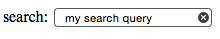
On Apple devices, the search field has rounded corners by default in Chrome, Safari, and Opera, matching the devices’ search field appearance. On touch pads with dynamic keyboards, the “go” button appears as a search icon or the word “search,” depending on the device. If you include the non-standard results attribute, Chrome and Opera will display a magnifying/looking glass icon within the form field.
While you can still use type="text" for search fields, the new search type is a visual cue as to where the user needs to go to search the site, and provides an interface to which the user is accustomed. The HTML5 Herald has no search field, but here’s an example of how you’d use it:
<form id="search" method="get">
  <label for="s">Search</label>
  <input type="search" id="s" name="s"/>
  <input type="submit" value="Search"/>
</form>
Since search, like all the new input types, appears as a regular text box in nonsupporting browsers, there’s no reason not to use it when appropriate.
Email Addresses
The email type (type="email") is, not surprisingly, used for specifying one or more email addresses. It supports the Boolean multiple attribute, allowing for multiple comma-separated (with optional space) email addresses.
Let’s change our form to use type="email" for the registrant’s email address:
<label for="email">My email address is</label>
<input type="email" id="email" name="email"/>
If you change the input type from text to email, as we’ve done here, you’ll notice no visible change in the user interface; the input still looks like a plain text field. However, there are differences behind the scenes.
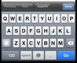
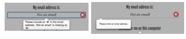
The change becomes apparent if you’re using a touchpad device. When you focus on the email field, most touchpad devices—such as the iPad or Android phone running Chromium—will all display a keyboard optimized for email entry, including the @ symbol, period, and space buttons, but no comma, as shown in Figure 4.6.
Firefox, Chrome, Opera, and Internet Explorer 10 also provide error messaging for invalid email inputs: if you try to submit a form with content unrecognizable as one or more email addresses, the browser will tell you what’s wrong. The default error messages are shown in Figure 4.7.
Note: Custom Validation Messages
Dislike the default error messages the browsers provide? Set your own with .setCustomValidity(errorMsg). setCustomValidity takes as its only parameter the error message you want to provide. If you set a custom validation message, once that value becomes valid you must set the validation message to an empty string (a falsy value) to enable form submission:
function setErrorMessages(formControl) {
  var validityState_object = formControl.validity;
  if (validityState_object.valueMissing) {
      formControl.setCustomValidity('Please set an age
↵(required)');
  } else if (validityState_object.rangeUnderflow) {
      formControl.setCustomValidity('You\'re too young');
  } else if (validityState_object.rangeOverflow) {
      formControl.setCustomValidity('You\'re too old');
  } else if (validityState_object.stepMismatch) {
      formControl.setCustomValidity('Counting half
↵birthdays?');
  } else {
      //if valid, must set falsy value or will always error
      formControl.setCustomValidity('');
  }
}
Unfortunately, while you can change the content of the message, you’re stuck with its appearance, at least for now.
URLs
The url input (type="url") is used for specifying a web address. Much like email, it will appear as a normal text field. On many touch screens, the onscreen keyboard displayed will be optimized for web address entry, with a forward slash (/) and a “.com” shortcut key.
Let’s update our registration form to use the url input type:
<label for="url">My website is located at:</label>
<input type="url" id="url" name="url"/>
Validation of URLs
All modern browsers starting with Internet Explorer 10 support the url input type, reporting the input as invalid if the value doesn’t begin with a protocol. Only the general protocol format of a URL is validated, so, for example, q://example.xyz will be considered valid, even though q:// isn’t a real protocol and .xyz isn’t a real top-level domain. If you want the value entered to conform to a more specific format, provide information in your label (or in a placeholder) to let your users know, and use the pattern attribute to ensure that it’s correct, as previously described.
Telephone Numbers
For telephone numbers, use the tel input type (type="tel"). Unlike the url and email types, the tel type doesn’t enforce a particular syntax or pattern. Letters and numbers—indeed, any characters other than new lines or carriage returns—are valid. There’s a good reason for this: all over the world, countries have valid phone numbers of various lengths and punctuation, so it would be impossible to specify a single format as standard. For example, in the USA, +1(415)555-1212 is just as well understood as 415.555.1212, but companies may also use letters in their phone number, such as (800)CALL-NOW.
You can encourage a particular format by including a placeholder with the correct syntax, or a comment after the input with an example. Additionally, you can stipulate a format by using the pattern attribute. Include a title with the pattern attribute to provide for a tooltip and to improve the UX of the native validation error message. You can also use the setCustomValidity method to provide more informative client-side validation.
In using the tel input type, dynamic touch pads will usually display the telephone keyboard, including the asterisk and pound key. You can use tel for more than just phone numbers. For example, it is likely to be the best keypad for social security number form entry.
Frequently Asked Questions (FAQs) about HTML5 Form Input Types
What are the different types of HTML5 form input types?
HTML5 introduces a variety of new input types for forms. These include ‘color’, ‘date’, ‘datetime-local’, ’email’, ‘month’, ‘number’, ‘range’, ‘search’, ‘tel’, ‘time’, ‘url’, and ‘week’. Each of these input types serves a specific purpose and can greatly enhance the user experience on your website by providing more appropriate and user-friendly input fields.
How does the ‘date’ input type work in HTML5?
The ‘date’ input type in HTML5 creates an input field that allows the user to enter a date. The date is formatted according to the locale of the user’s browser, and a date picker is often provided for user convenience. However, the support for this input type varies across different browsers.
What happens when an HTML5 form input type is viewed in an older browser?
If an HTML5 form input type is viewed in an older browser that does not support it, the browser will default to a standard ‘text’ input field. This means that the user can still enter information, but the specific features of the HTML5 input type (like a date picker for ‘date’ input type) will not be available.
How can I validate user input in HTML5 forms?
HTML5 provides several attributes for input validation, including ‘required’, ‘pattern’, and ‘min’/’max’ for numerical input types. These attributes can be used to ensure that the user input meets certain criteria before the form is submitted.
What is the ‘range’ input type in HTML5?
The ‘range’ input type in HTML5 creates a slider that allows users to select a value within a specific range. You can specify the range using the ‘min’ and ‘max’ attributes, and the default value using the ‘value’ attribute.
How does the ’email’ input type in HTML5 enhance user experience?
The ’email’ input type in HTML5 provides a convenient way for users to enter email addresses. It includes built-in validation to check if the entered text is in the format of an email address. Some browsers may also provide autocomplete functionality for this input type.
What is the purpose of the ‘search’ input type in HTML5?
The ‘search’ input type in HTML5 is designed for search fields. This input type can provide search-specific features like clearing the search box with a single click, or displaying recent searches to the user.
How can I use the ‘number’ input type in HTML5?
The ‘number’ input type in HTML5 allows users to enter a numeric input. You can specify the acceptable range of numbers using the ‘min’ and ‘max’ attributes, and the step value using the ‘step’ attribute.
What is the ‘tel’ input type in HTML5 used for?
The ‘tel’ input type in HTML5 is used for input fields that should contain a telephone number. However, it does not validate the input, so you should use JavaScript or a similar technology for validation.
How does the ‘url’ input type in HTML5 work?
The ‘url’ input type in HTML5 is used for input fields that should contain a URL. It includes built-in validation to check if the entered text is in the format of a URL. Some browsers may also provide autocomplete functionality for this input type.
Alexis Goldstein first taught herself HTML while a high school student in the mid-1990s, and went on to get her degree in Computer Science from Columbia University. She runs her own software development and training company, aut faciam LLC. Before striking out on her own, Alexis spent seven years in Technology on Wall Street, where she worked in both the cash equity and equity derivative spaces at three major firms, and learned to love daily code reviews. She is a teacher and a co-organizer of Girl Develop It, and a very proud member of the NYC Resistor hackerspace in Brooklyn, NY.
Estelle Weyl is a front-end engineer from San Francisco who has been developing standards-based accessible websites since 1999. She also writes two technical blogs with millions of visitors. Her passion is teaching web development so you'll find her speaking about CSS3, HTML5, JavaScript, and mobile web development at conferences around the United States.
Louis is a front-end developer, writer, and author who has been involved in the web dev industry since 2000. He blogs at Impressive Webs and curates Web Tools Weekly, a newsletter for front-end developers with a focus on tools.