
This article was peer reviewed by Paul O’Brien. Thanks to all of SitePoint’s peer reviewers for making SitePoint content the best it can be!
I’ve always wanted to build a 3D game. I’ve just never had the time and energy to learn the intricacies of 3D programming. Then I discovered I didn’t need to…
While tinkering one day, I got to thinking that maybe I could simulate a 3D environment using CSS transformations. I stumbled across an old article about creating 3D worlds with HTML and CSS.
I wanted to simulate a Minecraft world (or a tiny part of it at least). Minecraft is a sandbox game, in which you can break and place blocks. I wanted the same kind of functionality, but with HTML, JavaScript, and CSS.
Come along as I describe what I learned, and how it can help you to be more creative with your CSS transformations!
Note: Most of the code for this tutorial can be found on Github. I’ve tested it in the latest version of Chrome. I can’t promise it will look exactly the same in other browsers, but the core concepts are universal.
This is just half of the adventure. If you’d like to know how to persist the designs to an actual server, check out the sister post, PHP Minecraft Mod. There we explore ways to interact with a Minecraft server, to manipulate it in real time and respond to user input.
Key Takeaways
- Utilize CSS transformations to simulate a 3D environment, bypassing the need for complex 3D programming skills.
- Employ JavaScript and HTML to mimic Minecraft’s block manipulation capabilities, allowing users to create and interact with a 3D world.
- Understand and apply CSS properties like `transform-origin` and `transform` to control element positioning and orientation in three dimensions.
- Learn to build and manipulate 3D block structures using JavaScript classes and methods, enhancing the visual complexity of scenes.
- Explore dynamic interaction in the 3D space, such as adding, removing, and highlighting blocks with mouse events.
- Enhance user experience by implementing viewport controls like zoom and rotation, enabling better navigation and visibility of the 3D space.
- Leverage open-source resources and community contributions to expand and customize the functionality of the 3D Minecraft editor.
The Things We’re Already Doing
I’ve written my fair share of CSS and I’ve come to understand it quite well, for the purpose of building websites. But that understanding is predicated on the assumption that I’m going to be working in a 2D space.
Let’s consider an example:
.tools {
  position: absolute;
  left: 35px;
  top: 25px;
  width: 200px;
  height: 400px;
  z-index: 3;
}

.canvas {
  position: absolute;
  left: 0;
  top: 0;
  width: 100%;
  height: 100%;
  z-index: 2;
}
Here we have a canvas element, starting at the top left corner of the page, and stretching all the way to the bottom right. On top of that, we’re adding a tools element. It starts 25px from the left and 35px from the top of the page, and measures 200px wide by 400px high.
Depending on the order div.tools and div.canvas are added to the markup, it’s entirely possible that div.canvas could overlap div.tools. That is except for the z-index styles applied to each.
You’re probably used to thinking of elements, styled in this way, as 2D surfaces with the potential to overlap each other. But that overlapping is essentially a third dimension. left, top, and z-index may as well be renamed to x, y, and z. So long as we assume every element has a fixed depth of 1px, and z-index has an implicit px unit, we’re already thinking in 3D terms.
What some of us tend to struggle with are the concepts of rotation and translation in this third dimension…
The Theory of Transformations
CSS translations duplicate this familiar functionality, in an API that extends beyond the limitations top, left, and z-index place on us. It’s possible to replace some of our previous styles with translations:
.tools {
  position: absolute;
  background: green;
  /*
    left: 35px;
    top: 25px;
  */
  transform-origin: 0 0;
  transform: translate(35px, 25px);
  width: 200px;
  height: 400px;
  z-index: 3;
}
Instead of defining left and top offsets (with an assumed origin of 0px from the left and 0px from the top), we can declare an explicit origin. We can perform all sorts of transformations on this element, for which use 0 0 as the centre. translate(35px, 25px) moves the element 35px to the right and 25px down. We can use negative values to move the element left and/or up.
With the ability to define an origin for our transformations, we can start to do other interesting things as well. For example, we can rotate and scale elements:
transform-origin: center;
transform: scale(0.5) rotate(45deg);
Every element starts with a default transform-origin of 50% 50% 0, but a value of center sets x, y, and z to the equivalent of 50%. We can scale our element to a value between 0 and 1, and rotate it (clockwise) by degrees or radians. And we can convert between the two with:
45deg=(45 * Math.PI) / 180≅0.79rad0.79rad=(0.79 * 180) / Math.PI≅45deg
To rotate an element anti-clockwise, we just need to use a negative deg or rad value.
What’s even more interesting, about these transformations, is that we can use 3D versions of them.
Evergreen browsers have pretty good support for these styles, though they may require vendor prefixes. CodePen has a neat “autoprefix” option, but you can add libraries like PostCSS to your local code to achieve the same thing.
The First Block
Let’s begin to create our 3D world. We’ll start by making a space in which to place our blocks. Create a new file, called index.html:
<!doctype html>
<html>
  <head>
    <style>
      html, body {
        padding: 0;
        margin: 0;
        width: 100%;
        height: 100%;
      }

      .scene {
        position: absolute;
        left: 50%;
        top: 50%;
        margin: -192px 0 0 -192px;
        width: 384px;
        height: 384px;
        background: rgba(100, 100, 255, 0.2);
        transform: rotateX(60deg) rotateZ(60deg);
        transform-style: preserve-3d;
        transform-origin: 50% 50% 50%;
      }
    </style>
  </head>
  <body>
    <div class="scene"></div>
    <script src="https://code.jquery.com/jquery-3.1.0.slim.min.js"></script>
    <script src="http://ricostacruz.com/jquery.transit/jquery.transit.min.js"></script>
    <script>
      // TODO
    </script>
  </body>
</html>
Here we stretch the body to the full width and height, resetting padding to 0px. Then we create a smallish div.scene, which we’ll use to hold various blocks. We use 50% left and top, as well as a negative left and top margin (equal to half the width and height) to horizontally and vertically centre it. Then we tilt it slightly (using 3D rotation) so that we have a perspective view of where the blocks will be.
Notice how we define
transform-style:preserve-3d. This is so that child elements can also be manipulated in a 3D space.
The result should look something like this:
See the Pen Empty Scene by SitePoint (@SitePoint) on CodePen.
Now, let’s start to add a block shape to the scene. We’ll need to create a new JavaScript file, called block.js:
"use strict"

class Block {
  constructor(x, y, z) {
    this.x = x;
    this.y = y;
    this.z = z;

    this.build();
  }

  build() {
    // TODO: build the block
  }

  createFace(type, x, y, z, rx, ry, rz) {
    // TODO: return a block face
  }

  createTexture(type) {
    // TODO: get the texture
  }
}
Each block needs to be a 6-sided, 3D shape. We can break the different parts of construction into methods to (1) build the whole block, (2) build each surface, and (3) get the texture of each surface.
Each of these behaviours (or methods) are contained within an ES6 class. It’s a neat way to group data structures and the methods that operate on them together. You may be familiar with the traditional form:
function Block(x, y, z) {
  this.x = x;
  this.y = y;
  this.z = z;

  this.build();
}

var proto = Block.prototype;

proto.build = function() {
  // TODO: build the block
};

proto.createFace = function(type, x, y, z, rx, ry, rz) {
  // TODO: return a block face
}

proto.createTexture = function(type) {
  // TODO: get the texture
}
This may look a little different, but it’s much the same. In addition to shorter syntax, ES6 classes also provide shortcuts for extending prototypes and calling overridden methods. But I digress…
Let’s work from the bottom up:
createFace(type, x, y, z, rx, ry, rz) {
  return $(`<div class="side side-${type}" />`)
    .css({
      transform: `
        translateX(${x}px)
        translateY(${y}px)
        translateZ(${z}px)
        rotateX(${rx}deg)
        rotateY(${ry}deg)
        rotateZ(${rz}deg)
      `,
      background: this.createTexture(type)
    });
}

createTexture(type) {
  return `rgba(100, 100, 255, 0.2)`;
}
Each surface (or face) consists of a rotated and translated div. We can’t make elements thicker than 1px, but we can simulate depth by covering up all the holes and using multiple elements parallel to each other. We can give the block the illusion of depth, even though it is hollow.
To that end, the createFace method takes a set of coordinates: x, y, and z for the position of the face. We also provide rotations for each axis, so that we can call createFace with any configuration and it will translate and rotate the face just how we want it to.
Let’s build the basic shape:
build() {
  const size = 64;
  const x = this.x * size;
  const y = this.y * size;
  const z = this.z * size;

  const block = this.block = $(`<div class="block" />`)
    .css({
      transform: `
        translateX(${x}px)
        translateY(${y}px)
        translateZ(${z}px)
      `
    });

  $(`<div class="x-axis" />`)
    .appendTo(block)
    .css({
      transform: `
        rotateX(90deg)
        rotateY(0deg)
        rotateZ(0deg)
      `
    });

  $(`<div class="y-axis" />`)
    .appendTo(block)
    .css({
      transform: `
        rotateX(0deg)
        rotateY(90deg)
        rotateZ(0deg)
      `
    });

  $(`<div class="z-axis" />`)
    .appendTo(block);
}
We’re used to thinking in terms of single pixel positions, but a game like Minecraft works at a larger scale. Every block is bigger, and the coordinate system deals with the position of the block, not individual pixels that make it up. I want to convey the same sort of idea here…
When someone creates a new block, at 1 × 2 × 3, I want that to mean 0px × 64px × 128px. So we multiply each coordinate by the default size (in this case 64px, because that’s the size of the textures in the texture pack we’ll be using).
Then we create a container div (which we call div.block). Inside it we place another 3 divs. These will show us the axis of our block – they’re like guides in a 3D rendering program. We should also add some new CSS for our block:
.block {
  position: absolute;
  left: 0;
  top: 0;
  width: 64px;
  height: 64px;
  transform-style: preserve-3d;
  transform-origin: 50% 50% 50%;
}

.x-axis,
.y-axis,
.z-axis {
  position: absolute;
  left: 0;
  top: 0;
  width: 66px;
  height: 66px;
  transform-origin: 50% 50% 50%;
}

.x-axis {
  border: solid 2px rgba(255, 0, 0, 0.3);
}

.y-axis {
  border: solid 2px rgba(0, 255, 0, 0.3);
}

.z-axis {
  border: solid 2px rgba(0, 0, 255, 0.3);
}
This styling is similar to what we’ve seen before. We need to remember to set transform-style:preserve-3d on the .block, so that the axis are rendered in their own 3D space. We give each a different colour, and make them slightly bigger than the block they’re contained in. This is so that they’ll be visible even when the block has sides.
Let’s create a new block, and add it to the div.scene:
let first = new Block(1, 1, 1);

$(".scene").append(first.block);
The result should look something like this:
See the Pen Basic 3D Block by SitePoint (@SitePoint) on CodePen.
Now, let’s add those faces:
this
  .createFace("top", 0, 0, size / 2, 0, 0, 0)
  .appendTo(block);

this
  .createFace("side-1", 0, size / 2, 0, 270, 0, 0)
  .appendTo(block);

this
  .createFace("side-2", size / 2, 0, 0, 0, 90, 0)
  .appendTo(block);

this
  .createFace("side-3", 0, size / -2, 0, -270, 0, 0)
  .appendTo(block);

this
  .createFace("side-4", size / -2, 0, 0, 0, -90, 0)
  .appendTo(block);

this
  .createFace("bottom", 0, 0, size / -2, 0, 180, 0)
  .appendTo(block);
I found this code to be a bit of trial and error (owing to my limited experience with 3D perspective). Each element starts off in exactly the same position as the div.z-axis element. That is, in the vertical centre of the div.block and facing the top.
So, for the “top” element, I had to translate it “up” by half the size of the block, but I didn’t have to rotate it in any way. For the “bottom” element, I had to rotate it 180 degrees (along the x or y axis), and move it down by half the size of the block.
Using similar thinking, I rotated and translated each of the remaining sides. I also had to add corresponding CSS for them:
.side {
  position: absolute;
  left: 0;
  top: 0;
  width: 64px;
  height: 64px;
  backface-visibility: hidden;
  outline: 1px solid rgba(0, 0, 0, 0.3);
}
Adding backface-visibility:hidden prevents the “bottom” side of the elements from being rendered. Usually they would just appear the same (only mirrored) no matter how they were rotated. With hidden back faces, only the “top” side is rendered. Take care when turning this on: your surfaces need to be rotated the right way around or sides of the block will just disappear. That’s the reason for the 90/270/-90/-270 rotations I’ve given the sides.
See the Pen 3D Block Sides by SitePoint (@SitePoint) on CodePen.
Let’s make this block look a bit more realistic. We need to create a new file, called block.dirt.js, and override the createTexture method:
"use strict"

const DIRT_TEXTURES = {
  "top": [
    "textures/dirt-top-1.png",
    "textures/dirt-top-2.png",
    "textures/dirt-top-3.png"
  ],
  "side": [
    "textures/dirt-side-1.png",
    "textures/dirt-side-2.png",
    "textures/dirt-side-3.png",
    "textures/dirt-side-4.png",
    "textures/dirt-side-5.png"
  ]
};

class Dirt extends Block {
  createTexture(type) {
    if (type === "top" || type === "bottom") {
      const texture = DIRT_TEXTURES.top.random();

      return `url(${texture})`;
    }

    const texture = DIRT_TEXTURES.side.random();

    return `url(${texture})`;
  }
}

Block.Dirt = Dirt;
We’re going to use a popular texture pack, called Sphax PureBDCraft. It’s free to download and use (provided you’re not try to sell it on), and it comes in a variety of sizes. I’m using the
x64version.
We begin by defining a look-up table for the textures of the sides and top of the block. The texture pack doesn’t specify which textures should be used for the bottom, so we’ll just reuse the top textures.
If the side needing a texture is “top” or “bottom”, then we fetch a random texture from the “top” list. The random method doesn’t exist, until we define it:
Array.prototype.random = function() {
  return this[Math.floor(Math.random() * this.length)];
};
Similarly, if we need a texture for a side, we fetch a random one. These textures are seamless, so the randomisation works in our favour.
The result should look something like this:
See the Pen 3D Block Textures by SitePoint (@SitePoint) on CodePen.
Making a Scene
How do we make this interactive? Well, a good place to start is with a scene. We’ve already been placing blocks in the scene, so now we just have to enable dynamic placement!
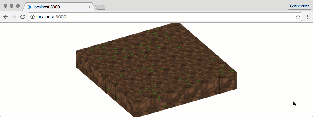
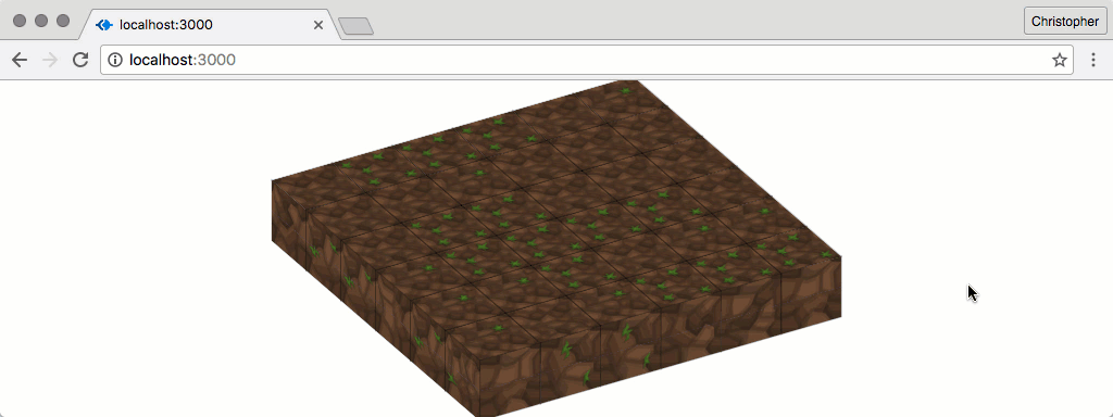
To begin with, we can render a flat surface of blocks:
const $scene = $(".scene");

for (var x = 0; x < 6; x++) {
  for (var y = 0; y < 6; y++) {
    let next = new Block.Dirt(x, y, 0);
    next.block.appendTo($scene);
  }
}
Great, that gives us a flat surface to start adding blocks to. Now, let’s highlight surfaces as we hover over them with our cursor:
.block:hover .side {
  outline: 1px solid rgba(0, 255, 0, 0.5);
}
Something strange is going on, though:
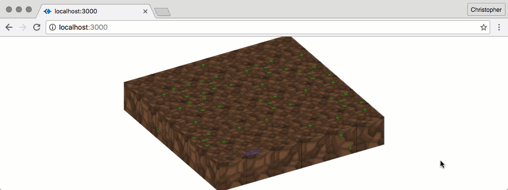
This is because the surfaces are clipping through each other randomly. There’s no nice way to fix this problem, but we can prevent it from happening by scaling the blocks slightly:
const block = this.block = $(`<div class="block" />`)
  .css({
    transform: `
      translateX(${x}px)
      translateY(${y}px)
      translateZ(${z}px)
      scale(0.99)
    `
  });
While this does make things look better, it will affect performance the more blocks there are in the scene. Tread lightly when scaling many elements at a time…
Let’s tag each surface with the block and type that belong to it:
createFace(type, x, y, z, rx, ry, rz) {
  return $(`<div class="side side-${type}" />`)
    .css({
      transform: `
        translateX(${x}px)
        translateY(${y}px)
        translateZ(${z}px)
        rotateX(${rx}deg)
        rotateY(${ry}deg)
        rotateZ(${rz}deg)
      `,
      background: this.createTexture(type)
    })
    .data("block", this)
    .data("type", type);
}
Then, as we click on a surface, we can derive a new set of coordinates and create a new block:
function createCoordinatesFrom(side, x, y, z) {
  if (side == "top") {
    z += 1;
  }

  if (side == "side-1") {
    y += 1;
  }

  if (side == "side-2") {
    x += 1;
  }

  if (side == "side-3") {
    y -= 1;
  }

  if (side == "side-4") {
    x -= 1;
  }

  if (side == "bottom") {
    z -= 1;
  }

  return [x, y, z];
}

const $body = $("body");

$body.on("click", ".side", function(e) {
  const $this = $(this);
  const previous = $this.data("block");

  const coordinates = createCoordinatesFrom(
    $this.data("type"),
    previous.x,
    previous.y,
    previous.z
  );

  const next = new Block.Dirt(...coordinates);

  next.block.appendTo($scene);
});
createCoordinatesFrom has a simple but important task. Given the type of side, and the coordinates for the block to which it belongs, createCoordinatesFrom should return a new set of coordinates. These are where the new block will be placed.
Then we’ve attached an event listener. It will be triggered for each div.side that gets clicked. As this happens, we get the block to which the side belongs, and derive a new set of coordinates for the next block. Once we have those, we create the block and append it to the scene.
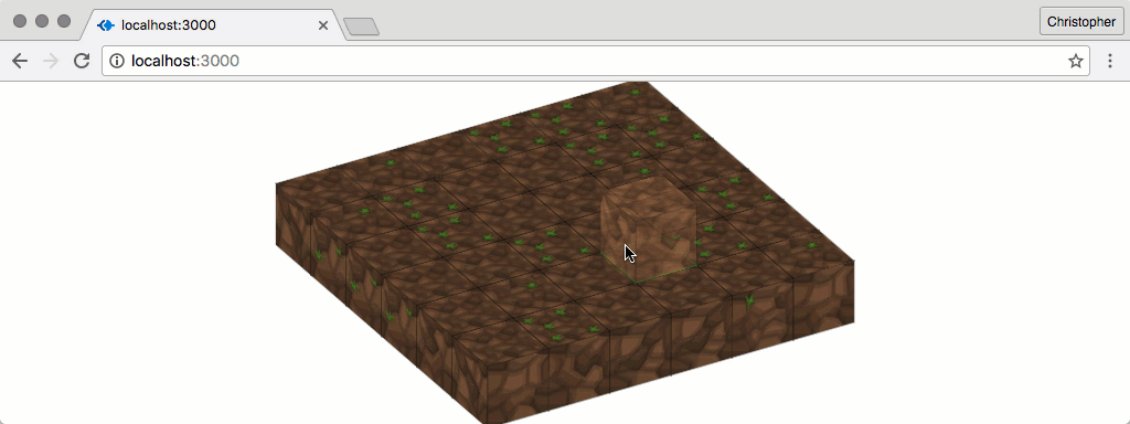
The result is wonderfully interactive:
See the Pen Pre-populated Scene by SitePoint (@SitePoint) on CodePen.
Seeing Ghosts
It would be helpful to see an outline of the block that we’re about to place, before we place it. This is sometimes referred to as “showing a ghost” of the thing we’re about to do.
The code to enable this is quite similar to that which we’ve already seen:
let ghost = null;

function removeGhost() {
  if (ghost) {
    ghost.block.remove();
    ghost = null;
  }
}

function createGhostAt(x, y, z) {
  const next = new Block.Dirt(x, y, z);

  next.block
    .addClass("ghost")
    .appendTo($scene);

  ghost = next;
}

$body.on("mouseenter", ".side", function(e) {
  removeGhost();

  const $this = jQuery(this);
  const previous = $this.data("block");

  const coordinates = createCoordinatesFrom(
    $this.data("type"),
    previous.x,
    previous.y,
    previous.z
  );

  createGhostAt(...coordinates);
});

$body.on("mouseleave", ".side", function(e) {
  removeGhost();
});
The main difference is that we maintain a single instance of the ghost block. As each new one is created, the old one is removed. This could benefit from a few additional styles:
.ghost {
  pointer-events: none;
}

.ghost .side {
  opacity: 0.6;
  pointer-events: none;
  -webkit-filter: brightness(1.5);
}
Left active, the pointer events associated with the elements of the ghost would counteract the mouseenter and mouseleave events of the side underneath. Since we don’t need to interact with the ghost elements, we can disable these pointer events.
This result is pretty neat:
See the Pen 3D Block Ghosts by SitePoint (@SitePoint) on CodePen.
Changing Perspective
The more interactivity we add, the harder it is to see what’s going on. It seems like a good time to do something about that. It’d be awesome if we could zoom and rotate the viewport, to be able to see what’s going on a little better…
Let’s start with zoom. Many interfaces (and games) allow viewport zooming by scrolling the mouse wheel. Different browsers handle mouse wheel events in different ways, so it make sense to use an abstraction library.
Once that’s installed, we can hook into the events:
let sceneTransformScale = 1;

$body.on("mousewheel", function(event) {
  if (event.originalEvent.deltaY > 0) {
    sceneTransformScale -= 0.05;
  } else {
    sceneTransformScale += 0.05;
  }

  $scene.css({
    "transform": `
      scaleX(${sceneTransformScale})
      scaleY(${sceneTransformScale})
      scaleZ(${sceneTransformScale})
    `
  });
});
Now we can control the scale of the entire scene, just by scrolling the mouse wheel. Unfortunately, the moment we do, the rotations are overridden. We need to take the rotation into account, as we allow dragging the viewport with the mouse to adjust it:
let sceneTransformX = 60;
let sceneTransformY = 0;
let sceneTransformZ = 60;
let sceneTransformScale = 1;

const changeViewport = function() {
  $scene.css({
    "transform": `
      rotateX(${sceneTransformX}deg)
      rotateY(${sceneTransformY}deg)
      rotateZ(${sceneTransformZ}deg)
      scaleX(${sceneTransformScale})
      scaleY(${sceneTransformScale})
      scaleZ(${sceneTransformScale})
    `
  });
};
This function won’t only account for the scale factor of the scene, but also the x, y, and z rotations factors. We also need to change our zooming event listener:
$body.on("mousewheel", function(event) {
  if (event.originalEvent.deltaY > 0) {
    sceneTransformScale -= 0.05;
  } else {
    sceneTransformScale += 0.05;
  }

  changeViewport();
});
Now, we can start to rotate the scene. We need:
- An event listener for when the drag action starts
- An event listener for when the mouse moves (while dragging)
- An event listener for when the drag action stops
Something like these should do the trick:
Number.prototype.toInt = String.prototype.toInt = function() {
  return parseInt(this, 10);
};

let lastMouseX = null;
let lastMouseY = null;

$body.on("mousedown", function(e) {
  lastMouseX = e.clientX / 10;
  lastMouseY = e.clientY / 10;
});

$body.on("mousemove", function(e) {
  if (!lastMouseX) {
    return;
  }

  let nextMouseX = e.clientX / 10;
  let nextMouseY = e.clientY / 10;

  if (nextMouseX !== lastMouseX) {
    deltaX = nextMouseX.toInt() - lastMouseX.toInt();
    degrees = sceneTransformZ - deltaX;

    if (degrees > 360) {
        degrees -= 360;
    }

    if (degrees < 0) {
        degrees += 360;
    }

    sceneTransformZ = degrees;
    lastMouseX = nextMouseX;

    changeViewport();
  }

  if (nextMouseY !== lastMouseY) {
    deltaY = nextMouseY.toInt() - lastMouseY.toInt();
    degrees = sceneTransformX - deltaY;

    if (degrees > 360) {
        degrees -= 360;
    }

    if (degrees < 0) {
        degrees += 360;
    }

    sceneTransformX = degrees;
    lastMouseY = nextMouseY;

    changeViewport();
  }
});

$body.on("mouseup", function(e) {
  lastMouseX = null;
  lastMouseY = null;
});
On mousedown we capture the initial mouse x and y coordinates. As the mouse moves (if the button is still being pressed) we adjust the sceneTransformZ and sceneTransformX by a scaled amount. There’s no harm in letting the values go over 360 degrees or below 0 degrees, but these would look terrible if we wanted to render them onscreen.
Computation inside a
mousemoveevent listener can be computationally expensive due to how much this even listener may be triggered. There are potentially millions of pixels on the screen, and this listener could be triggered as the mouse moves to each one. That is why we exit early if the mouse button isn’t being held down.
When the mouse button is released, we unset the lastMouseX and lastMouseY, so that the mousemove listener stops computing things. We could just clear lastMouseX, but clearing both feels cleaner to me.
Unfortunately, the mousedown event can interfere with the click event on block sides. We can get around this by preventing event bubbling:
$scene.on("mousedown", function(e) {
  e.stopPropagation();
});
Give it a whirl…
See the Pen Zoom And Rotation by SitePoint (@SitePoint) on CodePen.
Removing Blocks
Let’s round out the experiment by adding the ability to remove blocks. We need to do a couple of subtle but important things:
- Change hover border colour from green to red
- Disable the block ghosts
It’ll be easier to do these with CSS, as long as we have a body class to indicate whether we’re in addition (normal) mode or subtraction mode:
$body.on("keydown", function(e) {
  if (e.altKey || e.controlKey || e.metaKey) {
    $body.addClass("subtraction");
  }
});

$body.on("keyup", function(e) {
  $body.removeClass("subtraction");
});
When a modifier key is pressed (alt, control, or command), this code will make sure body has a subtraction class. This makes it easier to target various elements using this class:
.subtraction .block:hover .side {
  outline: 1px solid rgba(255, 0, 0, 0.5);
}

.subtraction .ghost {
  display: none;
}
We’re checking for a number of modifier keys, since different operating systems intercept different modifiers. For example, altKey and metaKey work on macOS, whereas controlKey works on Ubuntu.
If we click on a block, when we’re in subtraction mode, we should remove it:
$body.on("click", ".side", function(e) {
  const $this = $(this);
  const previous = $this.data("block");

  if ($body.hasClass("subtraction")) {
    previous.block.remove();
    previous = null;
  } else {
    const coordinates = createCoordinatesFrom(
      $this.data("type"),
      previous.x,
      previous.y,
      previous.z
    );

    const next = new Block.Dirt(...coordinates);
    next.block.appendTo($scene);
  }
});
This is the same .side click event listener we had before, but instead of just adding new blocks when a side is clicked, we first check if we’re in subtraction mode. If we are, the block we just clicked is removed from the scene.
The Final Demo
The final demo is wondrous to play with:
See the Pen Removing Blocks by SitePoint (@SitePoint) on CodePen.
There’s a long way to go before we support as many blocks and interactions as Minecraft, but this is a good start. What’s more, we managed to achieve this without needing to study advanced 3D techniques. It’s an unconventional (and creative) use of CSS transformations!
If you’re keen to do more with this code, head over to the other half of this adventure. You don’t have to be a PHP expert to interact with Minecraft servers. And just imagine the awesome things you can do with that knowledge…
And don’t forget: this is just half of the adventure. If you’d like to know how to persist the designs to an actual server, check out the sister post, PHP Minecraft Mod. There we explore ways to interact with a Minecraft server, to manipulate it in real time and respond to user input.
Frequently Asked Questions (FAQs) about JavaScript 3D Minecraft Editor
How does the JavaScript 3D Minecraft Editor work?
The JavaScript 3D Minecraft Editor is a web-based tool that allows you to create and edit 3D Minecraft-like worlds. It uses JavaScript, a popular programming language, to generate and manipulate 3D objects in a virtual environment. The editor uses a combination of JavaScript libraries, such as Three.js for 3D rendering and Cannon.js for physics, to create a realistic and interactive 3D world. You can add, remove, and modify blocks in the world, change the lighting and textures, and even add physics to the blocks.
Can I use the JavaScript 3D Minecraft Editor on any browser?
Yes, the JavaScript 3D Minecraft Editor is designed to be compatible with all modern web browsers that support WebGL, a JavaScript API for rendering 3D graphics. This includes browsers like Google Chrome, Mozilla Firefox, Safari, and Microsoft Edge. However, performance may vary depending on the browser’s JavaScript engine and the capabilities of your device’s hardware.
How can I add custom blocks or textures in the JavaScript 3D Minecraft Editor?
The JavaScript 3D Minecraft Editor currently does not support adding custom blocks or textures directly through the editor interface. However, you can modify the source code to add your own blocks or textures. The blocks are defined in the Blocks.js file, and the textures are loaded from image files in the textures folder. You would need to have some knowledge of JavaScript and Three.js to do this.
Is the JavaScript 3D Minecraft Editor open source?
Yes, the JavaScript 3D Minecraft Editor is an open-source project. This means that the source code is freely available for anyone to view, modify, and distribute. You can find the source code on the project’s GitHub page. If you’re interested in contributing to the project, you can submit pull requests with your changes.
Can I use the JavaScript 3D Minecraft Editor for commercial purposes?
As an open-source project, the JavaScript 3D Minecraft Editor is free to use for both personal and commercial purposes. However, it’s important to note that the project is licensed under the MIT License, which requires that the original copyright notice and license text be included in any copies or substantial portions of the software.
How can I save my work in the JavaScript 3D Minecraft Editor?
The JavaScript 3D Minecraft Editor does not currently support saving your work directly from the editor. However, you can export your world as a JSON file, which can then be imported back into the editor at a later time. To do this, use the ‘Export’ button in the editor, and then save the resulting JSON file to your device.
Can I add physics to the blocks in the JavaScript 3D Minecraft Editor?
Yes, the JavaScript 3D Minecraft Editor supports adding physics to the blocks. This is done using the Cannon.js library, which is a lightweight and easy-to-use JavaScript library for 3D physics. You can enable physics for a block by setting its ‘physics’ property to true in the Blocks.js file.
Can I share my creations from the JavaScript 3D Minecraft Editor with others?
Yes, you can share your creations from the JavaScript 3D Minecraft Editor with others. You can do this by exporting your world as a JSON file, and then sending this file to others. They can then import this file into their own instance of the editor to view and modify your world.
How can I contribute to the JavaScript 3D Minecraft Editor project?
If you’re interested in contributing to the JavaScript 3D Minecraft Editor project, you can do so by submitting pull requests on the project’s GitHub page. You can also report issues or suggest new features through the GitHub issue tracker. Before contributing, it’s recommended to read the project’s contribution guidelines.
Can I run the JavaScript 3D Minecraft Editor offline?
Yes, you can run the JavaScript 3D Minecraft Editor offline. To do this, you would need to download the source code from the project’s GitHub page and then open the index.html file in your web browser. Note that you would still need a web browser that supports WebGL to run the editor.