Looking for a little inspiration? Searching out the ultimate effect? Or simply want to sharpen your skills and hone your capabilities? Whatever the case, you’ve come to the right place!
These quick tutorials have been prepared by SitePoint’s own Community Members, and we’re always adding new content. Don’t forget, if you’d like to contribute your own tutorial, email us now.
Latest Additions!
A Grunge Experiment
By Andrew Harwood
Andrew experiments with the grunge technique to create compelling, atmospheric imagery, and explains his technique in this step-by-step how-to.
Organic Vortex Effect
By Andrew Harwood
Use Photoshop to create a cool vortex effect with organic shapes — it makes a great background or wallpaper, and can be used as the basis for other effects. Andrew shows how it’s done.
Using Vectors in Photoshop – Tracing
By Andrew Harwood
Take your favourite stock photo and turn it into a traced, “vectorish” image with Andrew’s easy guide. Give your next design a cool, modern feel with this cool effect.
Other Recent Additions
Back To School – The Elements of Design
By Nick Mullen
All designers need a good grip on the basics. Nick explains colour, line, mass, movement, space, texture, and more!
Black and White to Colour
By Nick Mullen
If you’ve ever wanted to change a plain old B&W image to colour, or ‘touch up’ a photo with tinting highlights, this tutorial has the asnwers. Five easy steps to an advanced technique — learn it today!
Cool Headers
By Gavin Benda
Need to design a cool page header? Gavin uses trippy effects to add depth and interest to any header.
Ion Fire Cloudbursts
By Brian Poirier
A very cool effect that’s easy to produce, and which you can alter to your own requirements. Brian’s easy step-by-step guide gives you all the tips and tricks you’ll need to master this effect.
A 3D Flag
By Daniel Piechnick
Learn how to create a realistic 3D effect over a flag, ribbon or banner graphic with this cool tutorial.
Airbrushing Landscapes
By Daniel Piechnick
You don’t have to be Monet to create a compelling landscape image. Daniel shows us how it’s done with the airbrush tool.
Grungy Tech Effect
By Adam Polselli
Adam combines grunge and techy looks to create an intriguing effect that’s great for collages and backgrounds.
Push Buttons in Photoshop
By Doug Cloud
They look good, they add tangibility to your site, and they’re easy to build! Doug shows how to create your own slick push buttons in Photoshop.

Back to School: The Elements of Design.
The Elements of design truly affect everything we see — and how we see it.
Comprised of:
- Colour
- Line
- Mass
- Movement
- Space
- Texture and
- Value
the elements of design have been used by traditional artists as the basis for some of the most well respected and most admired artworks ever created. They’re also common through out nature, as well as human design — be it a logo, Website, brochure …or anything else you can think of.
Colour
Colour is something you can’t escape, and as it’s something we all focus on day in, day out, it’s fairly important that you understand at least this basic element.
Colour has 3 basic characteristics:
- Hue – distinguishes one colour from another
- Tone – affects the quality of brightness, lightness or darkness of colour
- Chroma – affects the quality of saturation, or the intensity of the colour
Colours can affect what we think and feel: our moods. The reaction we have to a design — anger, warmth, power, purity — can all be bought into an image through the use of colour.
Black: The colour of authority and power.
White: Innocence and purity.
Red: Red is the most stimulating colour on the colour wheel. It can stimulate faster heart rate, influence rage and or anger, and can also stimulate appetite.
Blue: Blue invokes peace, tranquility and loyalty, but can also be cold and depressing.
Green: A difficult colour to master, yet it is one of the most relaxing (hence green rooms at TV stations). Dark green is masculine and conservative, and implies wealth.
Purple: is the colour of royalty, and gives the impression of luxury, wealth and sophistication.
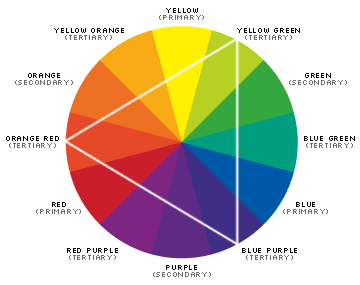
The colour wheel was invented through the basic theory of bending the spectral range of light into a circle containing seven different colours.
Since the invention of the colour wheel, artists have agreed (no mean feat!) that it represents the easiest way to choose complimentary colours. Within the colour wheel there are three classes of colour:
Primary: These are believed to be the fundamental three colours. They cannot be created by combining any other colours on the wheel, and they form the basis for all other colours.
Secondary: Secondary colours are made with the following formula:
Primary+Primary=Secondary, for example:
Red + Blue = Violet
Purple, Red + Yellow = Orange
Blue + Yellow = Green
Secondary colours lie between the primary colours.
Tertiary: Tertiary colours are created with this formula: Primary+Secondary=Tertiary
Using Triads to Select Colour Schemes
Triads are colour schemes that are connected within the colour wheel by a triangle. Using the RGB hex value, you can easily create complementary colour schemes by shifting the values around in groups of two, like this: RRGGBB, BBRRGG, GGBBRR
Line
Lines are basically a combination of points packed in together to form a single object — the line. Lines can be straight, curved or irregularly shaped.
The most common use of line is to control the flow, direction and speed of the viewer’s eye. Vertical lines will stop the person’s eye, and give a sensation of mass and volume. They can also convey power and strength.
Horizontal lines influence rest and relaxation, while diagonal lines are dynamic and active. Line has several variables that we as designers can use to cause different effects, including:
- size
- shape
- position
- direction
- number
- interval
- density.
Mass
Any 2-dimensional object is called a shape, and any 3-dimensional object that has height, width, and depth is called a form. But don’t be fooled! A design element that appears on-screen to have the 3 dimensions is only an illusion of form — you have to be able to physically move an object around for it to truly be a form.
Most often mass is used for composition and to create patterns, though it can also be used to create an illusion of movement and rhythm through repetition. And by creating a smaller object next to a larger object, you can create the illusion of depth and perspective.
Movement
Movement is the element of design that defines direction and motion. When you want to lead a person to a specific area of a Website, artwork or design, you can use movement within the object to guide them there. Many designers overlook this element by using movement to lead the viewer’s eye off the screen (as is quite frequently seen in Flash design). But if you want a person to focus on specific content, or a particular element, this isn’t the way to go about it!
If you decide to use movement within your design (animation, and motion blur are 2 examples) then it is important not to use too much — subtlety is the key here. A page full of movement becomes disorienting to the viewer as they try to follow the animation. Even flashing text, for example, has motion, so be very critical when you review pages that contain any moving elements at all.
Space
Space is any area between and around objects — the space around any object is called negative space. Used together, space and negative space can also give an illusion of depth.
Negative space is just as important as space — it will often give direction by leading the eye into positive space. So finding the balance between the use of negative space and positive space is what will make an image look “right”.
Space can also be suggested by the use of tone, colour and the linear perspective of overlapping planes.
Texture
There are two types of texture: tactile texture (which is texture that you can physically touch), and visual texture.
I’m going to ignore texture as an element of art (sculpture, architecture and the like), and focus on visual texture as it has more relevance to us as Web designers. So when I say “texture”, I’m referring to visual texture — not tactile texture.
Visual texture relates to any 2-dimensional image, be it print, painting or on screen. It’s texture that you can see, but not touch. It has the ability to look rough or smooth, wet or dry, hard or soft, shiny or matte, slick or sticky, slippery, abrasive, coarse or porous — just to name a few!
Texture is used to enhance the realism of an image, which explains why most 3-d game designers focus a lot more on texture now than they did years ago, and why games seem more realistic. Texture has the advantage that it can trigger in our minds an association between what we see, and the resulting feeling generated by that image. We can then recall those same feelings when we see that texture again.
Texture also adds contrast and depth, along with direction and interest. Look at any object close up that has a rough texture, then put it down and move away from it. The texture will be less obvious, and less likely to arouse your sense of touch.
This same approach should be taken when using visual texture. If you want an image to appear to be close to the viewer, add more texture to it, and if you want the image to appear to be further away, reduce the texture.
Value
Value deals with colour — more specifically, the lightness or darkness of colour. Like texture, value can be used to bring objects closer, or make them seem more distant — add a higher value contrast to bring them closer, and a duller contrast to push them further away.
Value can also be used to give focus to certain areas and to make others seem less important.
Nick Mullen has been researching affiliate programs for the last 6 months and is currently developing a resource for merchants and affiliates who want to maximise their affiliate space.

Black and White to Colour
Spruce up a standard black and white photo with a little color. Here’s how it’s done!
Step 1 – Create a Layer and Mask
In the layout pallet, drag “Layer 1” over the “create a new layer” button
![]()
This will replicate “layer 1” — rename this layer “Girl Outline”. Now you will need to add a mask
![]()
to this layer. If you have any colors selected in your color pallet, you’ll notice that they are now black and white.
When using masks, black can’t be seen through. This means that we can use black as an eraser, but we can also use white to un-erase a selection at any time.
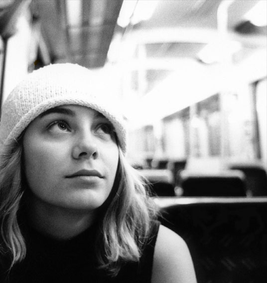
The outline around the girl was created using the paintbrush at various brush sizes. If you’re more comfortable using the pen tool, that will yield the same results.
Step 2 – Skin Tones
Now we have the main outline that we’ll work with. Here are two methods by which you can accomplish the color on top — I’ll explain each of them on different layers.
The first thing to do is replicate the “girl outline” layer again, and re-name this layer “Skin”. Go to image> adjust> hue/saturation> and select colorize.
Use the settings: Hue: 36 Saturation: 41 Lightness: 0 to get a nice peachy skin color. Notice in the Layer pallet below how the entire image has been colourised, yet in the full size image we can still see the grey background that’s being masked.
Step Three – Hair
Now that the skin looks good, we need to fix the hair. Replicate the layer called “Skin” and rename it “Hair”. For this step, we need to remove the face.
So click on the layer mask thumbnail for the hair layer, and fill the area of the face and arm with black. You’ll be left with the beanie and the hair. Again go to image> adjust> hue/saturation> and select colorize.
Use the settings: Hue: 40 Saturation: 25 Lightness: 0 and cange the opacity to 80%.
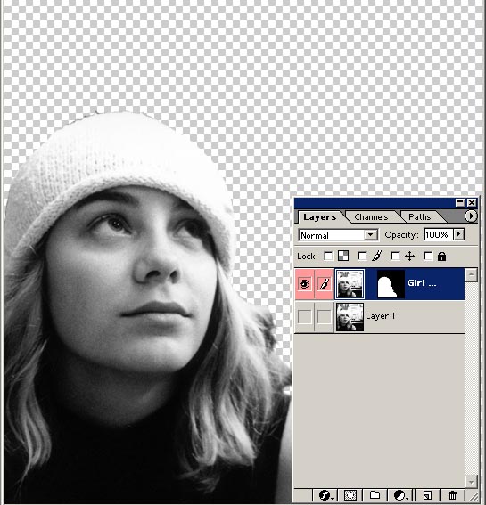
Step 4 – Face
Next is to throw a little color on the face. Create a new layer, call it “Face”, and select the paintbrush.
Now, using the color #CE0606, paint the lips. Then select white and paint the eyes.

Now, drop the opacity to 40% and change the layer blending to color. Click on “add mask”, and just tidy the lips and eyes up a little. Why use a mask for this step? Good question — it’s really only a matter of preference. I personally try to use masks as much as I can so that I can change things later, and so I don’t have to be as worried about precision on the actual layer.
I repeated this process for the cheeks using a light shade of pink (#FFC9C9) just under the eyes, lowered the opacity to 34%, and changed the layer blending to color. That’s it!
Step 5 – Background
Select the “Girl Outline” layer and duplicate it. Rename this layer “Background” and move it to the top of the layer pallet.
Select the mask for this layer, and go to image> adjust> invert (CTRL+I). Due to the fact that the background in this image is so out of focus, I’ll simply colourise the layer — anything more and we might end up killing the image.
Select the “Background” layer thumbnail and go to image> adjust> hue/saturation> Then select colorize — in this example I used Hue: 151 Saturation: 13 Lightness: 0. That’s it! The effect is complete! Here’s what you should have:
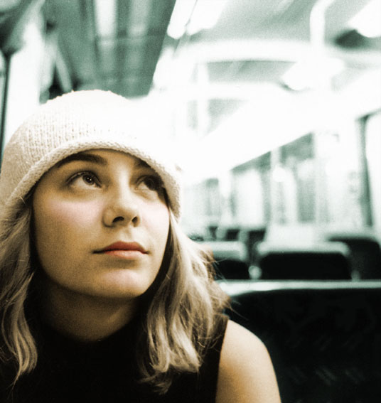
Nick Mullen has been researching affiliate programs for the last 6 months and is currently developing a resource for merchants and affiliates who want to maximise their affiliate space.

Cool Headers
Difficulty: Intermediate
Pre-requisites: Knowledge of the ‘layers palette’ and how to use the ‘move’ tool.
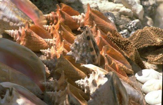
What I find best to start off with is a detailed photo of some sort, but make sure it holds a lot of interest. I’ve decided to use this one of shells:
Step 1: The First Layer
Open up the shell image in Photoshop and right click the background layer. Select ‘duplicate’ (call it “RadialBlur” and hit ok). A new layer should appear.
Now change the layer’s mode to ‘multiply’ and decrease the opacity to around 75%.

Once you’ve done this, use the ‘move tool’ to move the layer around a little, until it looks good.
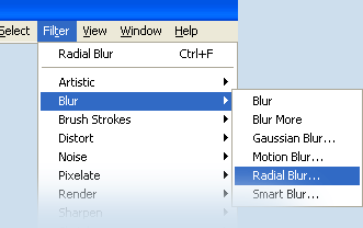
Apply a radial blur (filter >> blur >> radial blur) of about 20 in ‘best’ mode. It should look something like this:
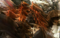
Step 2: The Second Layer
Now, create another duplicate layer (name it “RadialBlur2” like we did above). Right click the top layer (the blurred one you just created), and duplicate it.
Change the layer’s mode to color burn. You can move this image around a little to add effect.
Now, select you original layer and then select filter >> motion blur, entering 40 degrees for the angle, and 25 for the amount. It should look like this:
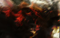
Step 3: Creating Highlights
Duplicate the background layer again (call it “highlights”), and drag this new layer to the top of the list. Then, change the layer mode to ‘luminosity’ and the opacity to around 40%. You’ll get something like this:
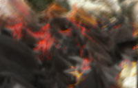
Step 4: Adjusting the Color
Just about finished — but it looks a bit strange with all those colors! Click the half white / half black circle at the bottom of the layers palette:
![]()
and select hue/saturation. Once the popup box appears, check the ‘colorize’ box and enter these settings:
- Hue: 220
- Saturation: 100
- Lightness: +8
It should look pretty cool now, with lots of blue fades and highlights showing, a little like this:
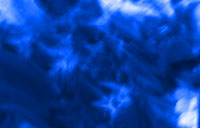
To wrap up, cut out a nice ‘header sized’ piece. Apply a bit of text, maybe some grids and you should have a fine looking image! Here’s what I ended up with:

Gavin is a Sitepoint Mentor and owns Platinum Website Design whilst studying I.T. at university.

Ion Fire Cloudbursts in Photoshop
Ever want a neat effect like any of these?
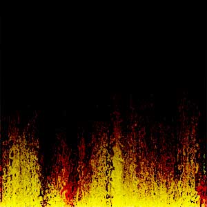
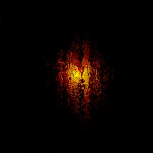
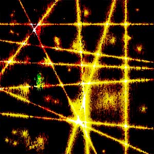
Would you believe they’re all made the same way, except for one simple step at the end?
Well, this tutorial will show how you can make these types of effects (which I call “Ion Fire Cloubursts”) in just a few easy steps, requiring no third party add-on filters. And the effect is easily customizable!
I’ll assume that you know the basics of Adobe Photoshop (adding layers, using gradients, etc), and anyone with a basic working knowledge of Photoshop should be able to easily reproduce and expand on this method.
Step 1: A New Image
First off, make a new image, and add a new layer (for a total of two layers). Rename Layer 1 “Effects”, and name Layer 2 “Clouds”. Then, make the Cloud layer the active layer (it’s where you’ll do most of the initial work).
Note that the image can be of any size, but should be RGB with a transparent background. In this example I used PS 6 and made my image 500×500, 72 DPI. The images in this article were reduced to a 300×300 size for easy display, although some resolution and appearance of the effect is lost this way.
Step 2: Choose your Colors
Select two colors. Colors that are not similar are the best (i.e. don’t pick two blues). These two colors will end up being the main colors of your effect (although some extras do get added in the process). I’ll use the colors FFCC00 (a gold-like yellow) as the foreground color, and 330000 (a maroon) as the background for this example.
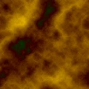
Next, use the Clouds filter (Render>Clouds). Then use the Difference Clouds twice (Render>Difference Clouds).
You should get an image that looks something like this:
Step 3: Applying Texture
Now run the Craquelure filter (Texture>Craquelure) with the settings in the following ranges:
- Spacing: 70-100
- Depth: 2-3
- Brightness: 8-10
This adds some roughness and irregularity to the clouds.
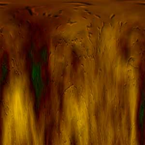
Next, run the Polar Coordinates filter (Distort>Polar Coordinates). Choose “Polar to Rectangle” as the method.
Note, that using Polar Coordinates is not strictly necessary. However, if you want to make the ‘flame’-like effects appear on some of the images, which looks much better, Polar Coordinates will help you achieve that effect.
Ok, now you should have an image that looks something like this:
Step 4: Grain and Ripple
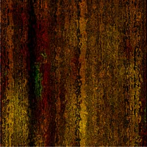
The Grain filter is next (Texture>Grain). Use the settings 90, 20, vertical. You can adjust these settings a little and experiment for slight variations, but don’t stray to far from the settings given here.
Follow with the Ocean Ripple filter (Distort>Ocean Ripple), with the settings of 9, 9. These too can be changed, but I find these settings work best. This filter can be run twice if you like for more distortion — how much you should use will depend largely upon the size of your work, and the colors involved.
In the example below, I only used it once. Note that the actual image in Photoshop is much brighter than this reduced version.
Step 5: Set your Layers
Now set the layer to Color Burn (on your Layer’s Palette). You can try some of the other settings as an experiment (Color Dodge, etc). I also use an Opacity of 100%, but can also be changed as needed.
Now select the Effects Layer and hit D on your keyboard to access the default colors (Black & White), and choose the Gradient tool.
Step 6: Gradient
Now here comes the fun part, where you can make whatever type of effect you want!
Use the gradient tool on the Effects layer. The type of gradient you choose, as well as the direction and the location of the gradient’s placement, really matters. Depending on the type and placement, etc of your gradient, the following versions of the effect can be made:
This flame effect is made using the Linear Gradient from top to bottom:

This cloud or nebula effect is made by switching the colors around (with white as the foreground), and using the Radial Gradient:

A line of fire, or burning bar, is made by keeping white as the foreground colour, and using the Reflected Gradient:
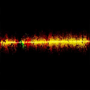
A Web effect can be made by playing around with the gradients. For this example, I used Foreground to Transparent gradients on a black-filled background:

The variations are endless, and combining different gradients together will allow you to make numerous versions and types of effects. Here are some other effects I created using the steps above, but with a little experimentation:

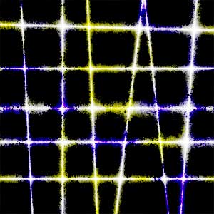
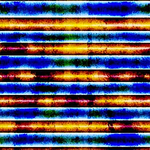
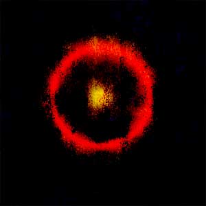
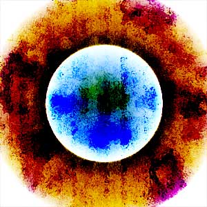
The Number 1 Rule of Photoshop, and especially so in this tutorial, is to experiment and have fun! Enjoy!
Brian is a licensed professional private investigator and part-time Web designer in Houston, Texas. But to our Community members, he’s better known as Steelsun. He can be contacted through his Website at Steel-Sun.com

A 3D Flag
It’s easy to make a coloured block of text, or a simple diagram (e.g. a flag), but how can you make it look like it’s actually real? It’s not difficult once you know how – just follow these steps:
Take your object (in this case, the Australian flag), and make some space around it, using the “Canvas Size” option.

Now make a new image, the same size as your first image. Select the “Gradient” tool, and edit the gradient. Put in lots of markers, as I’ve done in the image (this will make your gradient produce black and white bars).
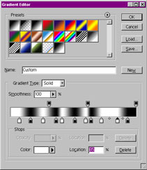
Hold down Shift, and apply the gradient across your new image.
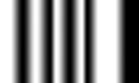
Go to Filter > Blur >, Gaussian Blur, and blur your image a little. This image is now your “Displacement Map” — save it (I generally use the name “dispmap.psd”).
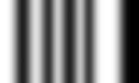
Now go back to your original image, and go to Filter > Distort > Displace, and enter 0% in “Horizontal Scale” and 5% in “Vertical Scale”. Using greater percentages will make the waves bigger — experiment until you’re happy with the result. When it asks for a file, select your displacement map. This will distort your image depending on how dark the displacement map is at that point.

Next, grab your displacement map image and drag it onto your new image. Use the arrow keys to nudge the displacement map until it covers the whole image.
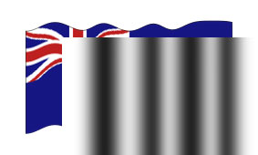
Select the displacement map layer, make it into an “Overlay” layer, and reduce its opacity (around 75% is good). Voila! You now have a funky flag!
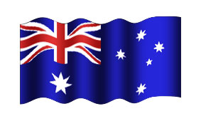
Compare this image to the first one, and you’ll really notice the difference! This technique can also be used to make realistic curtain, ribbon, and banner graphics. Have fun!
Daniel runs Pegasus Web Design Resources and works as a professional Web designer in South Australia.

Airbrushing Landscapes
Not being much of an artist myself, I was surprised to realise how easy it is to make realistic miniature landscapes using the airbrush.
To start with, make a new layer, and use the selection tool to select a small circle, about 150 pixels in diameter. I’ve drawn the circle here, but you don’t need to do that — you just have to have to have a circular selection.
Now, select the airbrush, and set it to size 27 (or thereabouts).
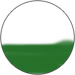
Step 1. Roughly airbrush the lower part of the circle. Don’t remove the light sections, as they add a bit of colour variation, and that accidental bump at the right can stay — it could be useful as a hill.
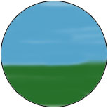
Step 2. Get a light blue colour, and repeat the process to create the sky.
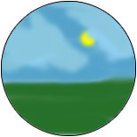
Step 3. Select the brightest yellow colour, then apply it to one spot for a few seconds to make a sun.

Step 4. To draw clouds, select the sky’s colour (use the eyedropper, or Alt+Click). Then go to the colour picker and select a colour that’s slightly lighter than the sky. Use this colour in a kind of circular scribble to create the cloud. To make the clouds more realistic, select another, similar colour, and colour over most of the clouds (if you take a closer look, you’ll notice the right cloud contains two colours).
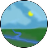
Step 5. To make a river, use a darker blue colour. Zoom in and use a smaller brush for the stream that tapers off to the horizon. As with the clouds, go over the river with a similar colour.
Step 6. Just for fun, I thought I might put in a pyramid to finish off. You’ll need to zoom in and use a small brush to do this one. When you’re finished, remember to use Stroke, to put a black outline around the circle.
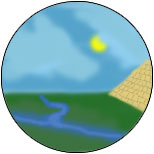
That’s it! I’ve used this technique to illustrate a couple of sites, and in the header for a couple of my sample sites. Happy airbrushing!
Daniel runs Pegasus Web Design Resources and works as a professional Web designer in South Australia.
Grungy Tech Effect
Create a cool texture that’s kind of grungy, kind of techy, and works really well for collages and backgrounds.
Software Required: Adobe Photoshop 7.0
Step 1 – the New Document
Create a new document, 300×500, with a white background. Set your colors to the default by hitting the “D” key on your keyboard. You want black as your foreground and white as your background.
Next, go to FILTER > RENDER > CLOUDS.
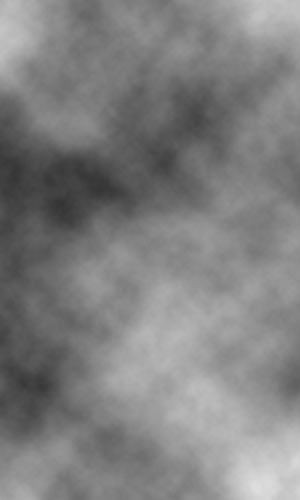
Step 2 – Motion Blur
Go to FILTER > BLUR > MOTION BLUR, and use these settings:
Angle: 0
Distance: 55 pixels
Click OK. You should now have something that looks like this:
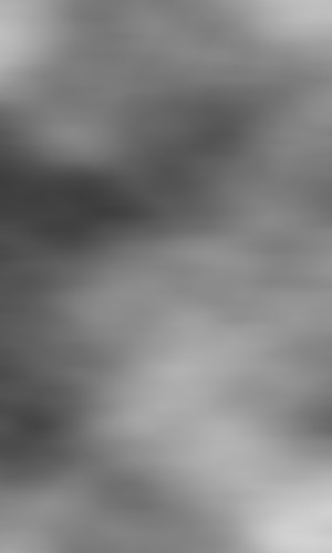
Step 3 – Liquify
Next go to FILTER > LIQUIFY. Select the “Shift Pixels Tool” from the left hand toolbar and keep the default settings, Brush size: 64 and Brush pressure: 50. Now, using quick, sweeping strokes, begin at the top of your image and sweep back and forth across it with slightly overlapping strokes. It should take about 8-10 overlapping strokes to cover the whole image. If you mess up, don’t panic! Simply click the “REVERT” button on the right side of the window.
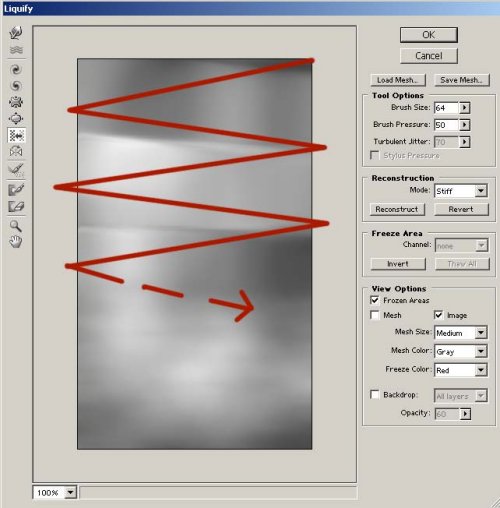
If you’ve completed this step correctly, you should get something similar to the image below. Don’t try to be exact — this is an experimental step you can have fun with!

Step 4 – Contrast
Now we need a little more contrast. Go to IMAGE > ADJUSTMENTS > BRIGHTNESS/CONTRAST and use the following settings:
Brightness: 15
Contrast: 55
Click OK, and you should have something like this:
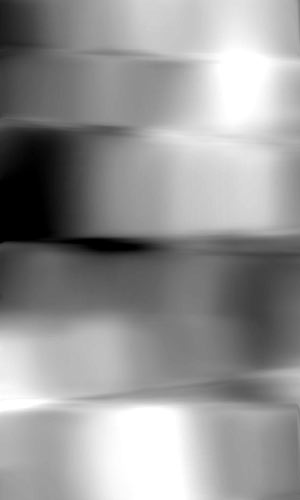
Step 5 – A Little Colour
Now let’s add a little color. We don’t want to use too much, because we’re trying to keep a sort of metallic, steely look, but we need enough color to add some interest. Go to IMAGE > ADJUSTMENTS > HUE/SATURATION (Ctrl + U) and select the “Colorize” checkbox. I used the following settings to give it the look of cold steel, but feel free to experiment.
Hue: 218
Saturation: 13
Lightness: 0
Click OK.
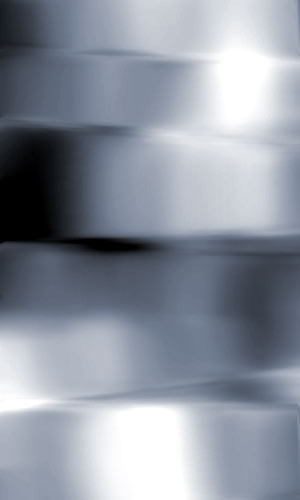
Step 6 – Accentuate Highlights
This step is optional — I used it to accentuate the highlights and shadows. Simply go to IMAGE > ADJUSTMENTS > REPLACE COLOR. With the eyedropper tool, go to your image and select a pure black. Then, in the “Replace Color” window, change the “Lightness” to -40. Leave Hue and Saturation alone, and click OK.
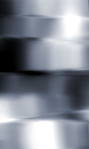
Step 7 – Water Paper
Go to FILTER > SKETCH > WATER PAPER. Keep the default settings and click OK. There you have it! A cool, simple, and fun texture that you can use almost anywhere. Be sure to experiment with your own settings — I guarantee you’ll find something even better along the way. Now, if you’d like to use this as a corner background image on a Webpage, continue to the next step:
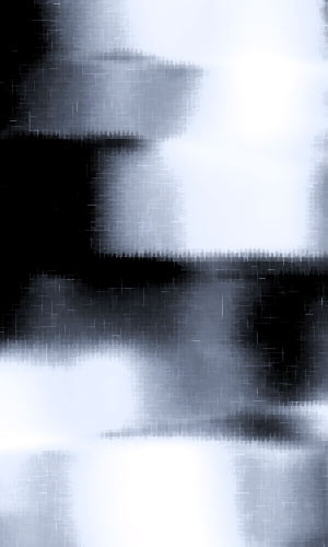
Step 8 – Prepare for Web
If you’d like to use the image you just created as a corner background on a Web page, simply select the Eraser Tool, grab a big 200 px feathered brush, and erase the area around the bottom and left or right side of the image. You should get a nice graphic that you can place in the corner of a Webpage. Enjoy experimenting!

When Adam isn’t occupied with school work, he is busy with being an Advisor at the SitePoint Community Forums, adding to his design portfolio, and managing Get the Look and the rest of the Adam Polselli Network.

Push Buttons In Photoshop
Push buttons are a good, tactile addition to your Website. Not only can they enhance a clean, professional design, they can also add an element of tangibility, which can be important in the online environment.
This tutorial will show you how to make buttons that appear to “push down” when a visitor places their mouse pointer over them. While the steps below may seem excessive for making this kind of effect, it is important to note that this process creates a more crisp, clean, legible button image than those you will find proliferating the Web. Try it!
Step 1. Shape and Colour
Open Photoshop and create a new document that’s 117px by 65px, resolution 72, in RGB mode, with a white background. Use the Zoom Tool (keystroke Z) and zoom in on your image by 400%. This will make working on the button easier.
Create a new layer and name it “Back”, then take the Marquee Tool and draw a rectangular selection in the middle of the canvas. Make this selection 80 pixels long and 20 pixels wide (to see the size of your selection make sure the Info Palette is visible; if it isn’t, go to Window > Info).
Choose the color you want the “Back” to be. In this tutorial I used a light sky blue (#0099CC). Make this your Foreground color and then hit Alt+Delete to fill the rectangle with the color. Finally, deselect (Ctrl+D).

Step 2. Button Up
Create a new layer, and name it “Button Up”. Take your Pencil Tool from the tool bar and make sure the tip size is set to one pixel. Make your Foreground color black.
With your Pencil, draw a rectangle similar to the one on the left using the Back layer as a guide — right along the top, and three pixels from the bottom.

Last of all, click the “eye” icon to turn off your Back layer, which will make it easier to do the next steps.
Step 3. Apply Gradient
Select your Magic Wand from the toolbar. In the Properties bar for the Wand tool make sure the Tolerance is set to 30, Contiguous is checked, and that Anti-aliased is off. Now select the inside of your rectangle.

Now click on your Gradient Tool in the tool bar, and make sure that Foreground to Background is selected in the Properties bar. Set your Foreground color to #51CEF8, and your Background color to #0E6D8D.

Draw your Gradient Tool from the bottom to the top, then deselect.
Step 4. Finish Button Up
Now take the Pencil again and use the same light blue color (#51CEF8) we used in Step 3 to draw a strip down the left side of your rectangle.

Next, use the dark blue color (#0E6D8D) from Step 3 to draw a strip along the bottom and up the right side of your rectangle.

Grab your “Button Up” layer and drag it down to the “Create a new layer” icon at the bottom of the Layers palette. Put this layer below the “Button Up” layer and name it “Button Down”.
Turn the “Button Down” layer off for now by clicking the little “eye” icon next to it.
Step 5. Shadow
Create a new layer and place it below both your button layers. Name this one “Shadow”.
Turn your “Back” layer on again by clicking the “eye” icon next to it. Use the Pencil to draw a “shadow” similar to mine using the dark blue color (#0E6D8D) from Step 3.
I turned off the “Button Up” layer so you can see the exact shape of the shadow I drew.

Here’s how the shadow looks with the “Button Up” layer on.

Step 6. Finish Off
Now turn the “Button Up” layer off and turn the “Button Down” layer on. Select your Move Tool from the toolbar and press the “down” arrow key on your keyboard twice. Now turn this layer off and turn the “Button Up” layer back on.

Ok, that’s it for making the buttons. Now let’s create some text and then save the buttons for use on your Web page.
Step 7. Create Text
For the text, I used the Verdana font, size 10, in white with no anti-aliasing (when working with a font of this size I never use anti-aliasing). I also added a drop shadow to make the words stand out from the button a little more. You can add any words you like at this stage; perhaps use the names of the pages to which the buttons are going to link to (I’ll use the word “About”, as the button will like to my “About” page).

Your layers palette should resemble the one shown here. Notice I have the “Button Down” and “Background” layers turned off.
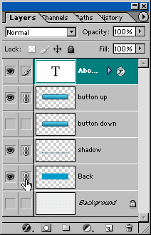
Now click on the small squares next to each of the visible layers to link them. Click on the small arrow in the upper right hand corner of the Layers palette and choose Merge Linked.
Tip: If you select a layer before you link it, the resulting merged layer will have that layer’s name. For instance, on the left I’ve highlighted “About”, and when all the linked layers are merged, the resulting layer is automatically named “About”.
Step 8. Copying the File
Once you’ve merged the layers press the following keys in the order shown here:
- Ctrl+A to select all
- Ctrl+C to copy
- Ctrl+N to create new document
- Ctrl+V to paste
At the third step you can name your new document (for instance, as the file contains the About button in the “up” state, you might name it about_up).
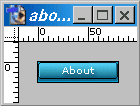
Now highlight your buttons file (clicking on the title bar will highlight it) and press Ctrl+Alt+Z (to Undo) until you get back to where you were in the Layer palette example in Step 7.
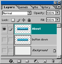
Step 9. Button Down
Now we need to make the “down” state of our button.
Turn off the “Button Up” layer and turn on the “Button Down” layer. The first thing you’ll need to do is move the word “About” so that when someone clicks the button on your Web page it will appear that both the button and the word “push” down.

Highlight the type layer that has the word About in it, select your Move Tool, and hit your down arrow key two times.
Now link the layers as you did in Step 7, and follow the directions in Step 8 to merge, copy, and paste into a new document. Name this new document about_down (or choose a name of your own).
Make sure you go back to your original button file and use Ctrl+Alt+Z to undo your changes back to the state in which your layers are not merged.
You should now have two separate documents — one containing the about_up button,
![]()
and one containing the about_down button.
![]()
You will need to repeat these steps for each button you want to create. Remember to name each button accordingly. You can use different colors than the ones we used here — just make sure your Back layer is always the same color as the background you’ll be placing the buttons on.
Doug has been a commercial graphic designer for 23 years, and had his own comic strip for a while. He’s been doing Web and graphic design work for the last 5 years.

A Grunge Experiment
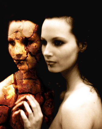
This effect builds on the basic grunge technique, and focuses on Photoshop’s Blending Modes and the Eraser Tool. Let’s get started!
Step 1 — Image Selection
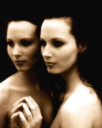
To start your own grunge manipulation, I recommend that you select a picture that already has a dark feel about it. Here’s the one I chose:
Step 2 – Find Suitable Textures
One of the absolute necessities in creating successful grunge effects is texture. Take time to make sure the textures you choose will work well with the image and the effect you’re creating.
Also, keep this in mind: the higher the quality of texture, the better the results.
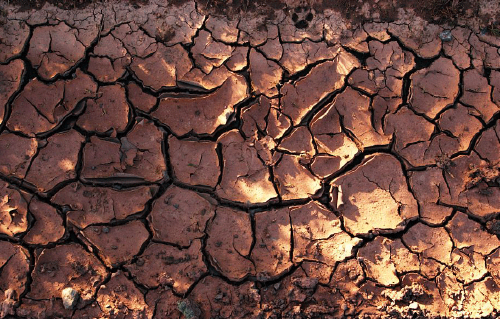
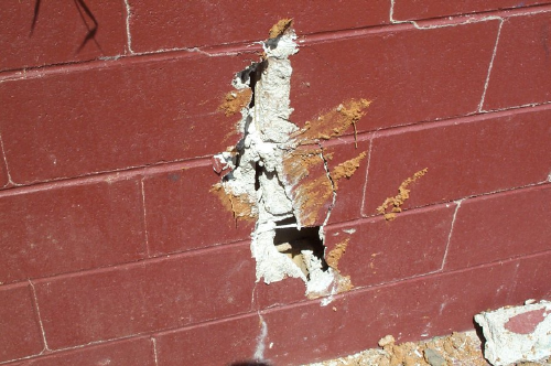
For this example, I used imagery of cracks in the earth and walls.
Step 3
Concentrate more heavily on the face than the rest of the body for this step. Take the second texture image, resize it, and position it around the middle of the face.
Using a large soft brush with the Eraser Tool (at around 100 pixels), get rid of the main areas of brick that surround the crack. For the more intricate areas, zoom in with a magnification of about 400% and use a smaller soft brush (about 8 pixels).
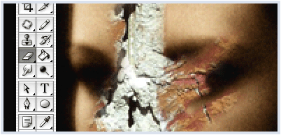
Once you’re satisfied with your work, change the Textures layer Blending Mode to Multiply.
Step 4 – The Second Texture
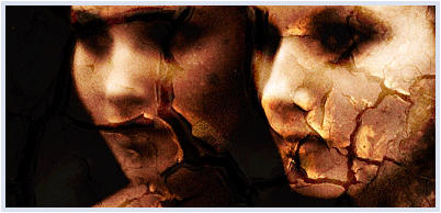
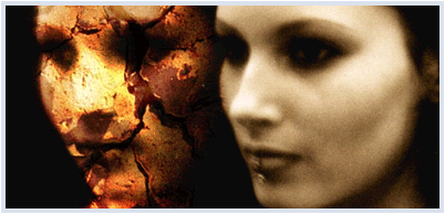
Now import the other texture into the workspace, again resize it to your liking, and then apply the Overlay blending option. It should look something like this:
Just like before, use the eraser tool to get rid of unwanted texture, zooming in and using smaller brush sizes as needed. I warn you, this may be quite time consuming if you’re not used to working in this way.
Once you’re done, duplicate the layer to enhance the texture.
Step 6 – Add Text
For a finishing touch, you might like to add some text with a script-style font, and play around with the blending options to see which complements the curves of the text best.
This tutorial only covers a few aspects of the grunge style. If you want to go further than this, try sites like www.dubtastic.com for a more in depth look.
Andrew is a Web graphics and branding specialist based in the UK. He’s also a mentor in the SitePoint Forums who loves Queen. Visit his online portfolio at frozentoast.com.

Organic Vortex Effect
This effect focuses on the use of filters and image adjustments in PhotoShop. It creates a fantastic, organic-looking vortex that can make a great background, wallpaper, or the basis for other effects.
Step 1 – Organic Shapes
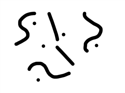
Start with a new document that has a white background, and is around 640 x 480 pixels in size. On the background layer, with a brush of around 17 pixels, draw some lines like those shown below.
Step 2 – A Radial Blur
Select Filter > Blur > Radial Blur and use it with the following specifications:
- Amount 100%
- Type – Zoom
- Quality – Best.
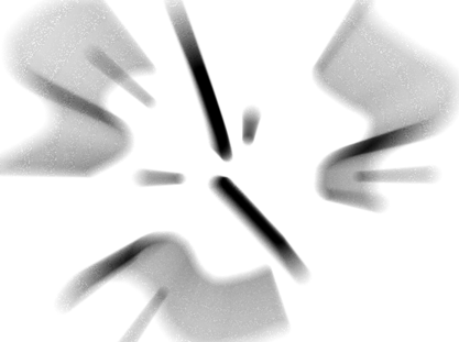
Step 3 – Repeat!
Now, apply Filter > Stlize > Find Edges, then repeat Step 2. You’ll see something like this:
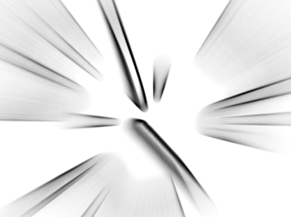
Step 4 – X Marks the Spot
Now, select Image > Adjustments > Invert and draw a white star or an “X” in the middle of the image like so:
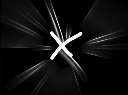
Step 5- Balance that Colour
Now, repeat Step 2, then Step 3, and finally Step 2 again. When you’ve finished all that, go to Image > Adjustments > Color Balance and play around with the tool until you find a colour you like. This is what I decided to use:
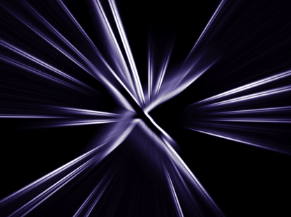
Step 6 – The Swirl
Now apply Filter > Distort > Twirl and set it to about 90 degrees.
It’s done!
This technique can be used for anything from walls to headers for websites. Try experimenting with each stage, and your final outcome, to see different variations on this effect you can create. Here’s an example:
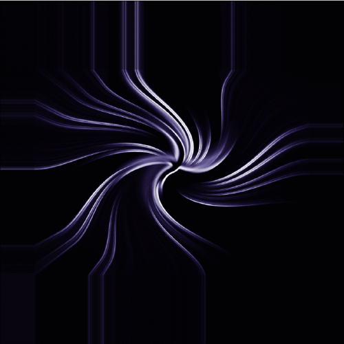
To create variation, I incorporated some pixel stretching — another great technique that I expanded upon here
Andrew is a Web graphics and branding specialist based in the UK. He’s also a mentor in the SitePoint Forums who loves Queen. Visit his online portfolio at frozentoast.com.

Using Vectors in Photoshop — Tracing
This tutorial introduces the PenTool and uses paths to create a power-packed modern tracing effect.
Step 1- Choose your Image
First, we need to grab an image from either google or a stock image CD. You can use basically any image you like. To begin with, however, it’s probably best to pick something such as a face or an animal’s head so that the experiment doesn’t get too complicated.
Here’s the image I chose:
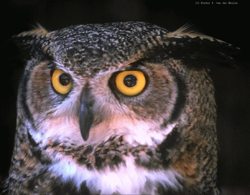
Of course, if the image you’ve chosen is large, scale it down to more workable proportions.
Step 2 – Choose your Palette
Move the picture into the centre of your canvas and zoom in about 200%-300% — whatever you’re happy to work with.
Now, pick out the darkest colour in the image and select it for your palette using the Eyedropper tool.
Step 3 – Trace the Shape
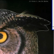
Next, make a new layer and use the Pen Tool to trace carefully around the outside of the shape. It doesn’t matter if you use a lot of lines (or mouse clicks) to trace the shape — this will give variation to the finished work.
Your tracing should look something like this:
Step 4 – A Colour Change
Now that you have your outline, select the Paths tab, right click the Work Path and select Make Selection:
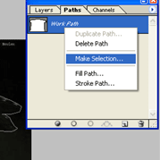
With your shape designated a Selection, fill it with the colour you picked out with the Eyedropper Tool in Step 2.
Step 5 – Colouring In
You’ve coloured the main shape — now, apply the technique from Step 4 to all the main shapes in your image. If you’re using an image of a face or head, the best way to proceed often is to start with the eyes and work outwards: from eyes to nose, to mouth, to the ears and so on.
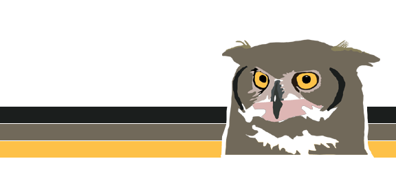
You should eventually finish with something quite ‘vectorish’. Experiment a little with your presentation. I placed a background behind my image, which finished up as:
Enjoy!
Andrew is a Web graphics and branding specialist based in the UK. He’s also a mentor in the SitePoint Forums who loves Queen. Visit his online portfolio at frozentoast.com.
Visit the SitePoint Forums today.

