

When the discussion comes to Compass, people have different opinions. Some of them highlight the reasons for excluding Compass from their workflow (e.g. Hugo), while others emphasize the benefits of using its features.
In this article, I’ll cover eight Compass features you can use to build robust stylesheets. To better explain them, I created a Compass project. The assets of it can be found in this github repository.
It’s time now to start!
Key Takeaways
- Compass provides a ‘sticky footer’ feature that ensures the footer stays at the bottom of the page, even when there isn’t enough content to fill the viewport. This requires three elements: the main wrapper of the page, an empty div at the bottom of the main element, and the footer itself.
- Compass simplifies the process of applying different styles to links depending on their state with the ‘link-colors’ mixin, which generates the necessary code. The first parameter, specifying the default link color, is the only mandatory one.
- Compass offers a ‘vertical rhythm’ feature that helps maintain consistency in layouts, improving readability. This involves specifying base font-size and line-height properties, establishing a baseline, and using mixins to adjust font sizes and add whitespace between elements.
- Compass also includes a ‘contrasted’ mixin for creating contrast between the foreground and background colors of an element. The mixin takes parameters for the background color, and optionally for the dark and light contrasted text colors.
Sticky Footer
A common web design issue I come across can be shown below:
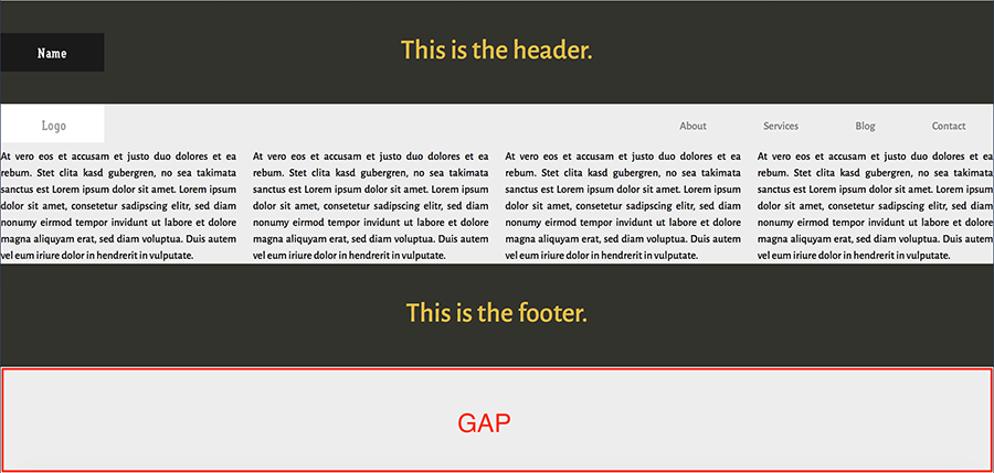
As you can see, there’s a big gap between the footer and the bottom of the page. That happens, of course, because there isn’t enough content in our page to fill the viewport. Thankfully, however, Compass helps us fix this problem.
Before diving into the solution, let’s have a look at the HTML structure for the page:
<header>

    <!-- content -->

</header>

<nav>

    <!-- content -->

</nav>

<main id="root">

    <section>

        <!-- content -->

    </section>

    <div id="root_footer"></div>

</main>

<footer id="footer">

    <!-- content -->

</footer>
In order to create the sticky footer, Compass requires three elements. The main wrapper of our page (in this case the main element), an empty div at the bottom of this element, and the footer. The last step is to include the sticky-footer mixin in our Sass code. In addition, we have to pass as parameter the desired height for the footer. For example:
@include sticky-footer(150px);
Optionally, we can use custom selectors to target the required elements. In such a case, we have also to pass as parameters those selectors:
@include sticky-footer(150px, "myroot", "myroot_folder", "myfooter");
Link Colors
We often want to apply different styles to links depending on their state. For instance, here you can see the styles for our links:
nav ul a {

    color: black;

}
nav ul a:hover {

    color: tomato;

}
nav ul a:active {

    color: lightblue;

}
nav ul a:visited {

    color: gray;

}
nav ul a:focus {

    color: green;

}
Thanks to Compass, we can generate the code above by using the following mixin:
@include link-colors(black, tomato, lightblue, gray, green);
All the parameters are optional except the first one, which specifies the default link color. Therefore, if we’re only targeting specific states, the previous mixin can be modified as follows:
@include link-colors(black, $active: lightblue);
Vertical Rhythm
Vertical rhythm can help keep layouts consistent, which in turn will have a positive impact on readability.
Let’s see how Compass facilitates the process of setting up vertical rhythm.
First, we have to specify the base font-size and line-height properties of our page. By default, Compass does this for us by defining the following variables:
$base-font-size: 16px;

$base-line-height: 24px;
Then, to establish the rhythm we place the establish-baseline mixin in our code:
@include establish-baseline;
Here’s the output:
html {

    font-size: 100%;

    line-height: 1.5em;

}
After including this mixin in the project, the demo page would look something like this:
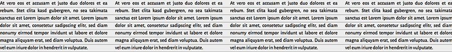
To maintain the rhythm, we have to calculate the line-height of the elements that have a different font size compared to the default. This can be achieved with the adjust-font-size-to mixin.
Imagine, for example, that we want the paragraphs to have a bigger font size. To do this, we can write something like the following:
p {

    @include adjust-font-size-to(18px);

}
This will output:
p {

    font-size: 1.125em;

    line-height: 1.33333em;

}
Finally, Compass provides different mixins for adding whitespace between the elements. For small screens, our paragraphs receive the following mixins:
p {

    @include leader;

    @include trailer;

}
The result:
p {

    margin-top: 1.5em;

    margin-bottom: 1.5em;

}
Text Replacement
Replacing text with an image/icon is a well-known web design technique. This could be used, for instance, when we want to display a logo.
Let’s have a look at an example.
The screenshot below shows the nav element of the demo page:
Here’s the corresponding HTML:
<nav>

    <h3 id="logo">Logo</h3>

    <ul>

        <!-- content -->

    </ul>

</nav>
The goal is to show an image instead of the h3 element. To achieve this with Compass, we can use the replace-text-with-dimensions mixin:
h3 {

    @include replace-text-with-dimensions('logo.gif');

}
The CSS:
h3 {

    text-indent: -119988px;

    background-image: url('../images/logo.gif?1425726050');

    background-repeat: no-repeat;

    background-position: 50% 50%;

    width: 150px;

    height: 56px;

}
Below are the possible parameters of this mixin:
| Parameter | Description | Default Value | Optional |
|---|---|---|---|
| img | The relative path to the image, or a url literal. | – | No |
| x | The x position of the background image. | 50% | Yes |
| y | The y position of the background image. | 50% | Yes |
| inline | Convert the image to a data URI? | false | Yes |
Let’s now modify our example by setting the inline variable to true. If we look at the compiled CSS, we’ll notice something like this (truncated for brevity):
h3 {

    background-image: url('data:image/gif;base64,R0lGODdhlgA4AOMAAP...');

}
In this way, we embedded the image in the CSS and avoided one extra HTTP request. However, we have to decide if this option works for us by taking into consideration some factors, like the number of images and their size.
Notice also the timestamp parameter that Compass appends to the image. This is important because it ensures that we’ll always have the updated image.
URL helpers
The following screenshot shows the image we want to insert in the header element:
To do this in CSS, we can write the following rule:
header {

    background-image: url('../images/name.gif');

}
But, what happens if we have a lot of different images and for some reason we modify their path? Unfortunately, that needs a lot of extra work. In addition to images, this problem can happen for the webfonts and stylesheets.
Again, thanks to Compass, we shouldn’t care about those cases. By setting the relative environment variable to true, Compass can read the path of the images, fonts, and stylesheets. Therefore, we can apply styles like the following:
header {

    background-image: image-url('name.gif');

}
And the result is similar to what we’re expecting:
header {

    background-image: url('../images/name.gif?1425753571');

}
Keep in mind that this variable is useful during the development process. For production, we have to use other variables (e.g. http_images_path) that Compass offers.
Furthermore, there’s also the option to use the inline-image mixin which, in the same way as discussed in the previous section, will convert the image into a base64 encoded image:
header {

    background-image: image-url(inline-image('name.gif'));

}
Selector Helpers
Compass provides a helper function for styling our headings. To take advantage of it, we have to use the interpolation syntax. Here’s an example:
#{headings(2,3)} {

    text-align: center;

    font-weight: 500;

}
The generated CSS:
h2, h3 {

    text-align: center;

    font-weight: 500;

}
Of course, the example above is pretty basic and thus, there’s no need to use this function. However, supposing we’re interested in specifying styles for all the available headings, we can modify its syntax as follows:
#{headings()} {...}
or:
#{headings(all)} {...}
The relevant CSS:
h1, h2, h3, h4, h5, h6 {...}
Note that either headings or the headers keyword can be used as function name.
Color Helpers
Compass also gives us a variety of color functions for creating interesting color palettes. What’s interesting is the fact that most of them can receive either a positive or a negative value:
For example, let’s combine the adjust-lightness and background mixins to produce a linear gradient for our header:
Here’s the code:
$gradient-color: #7E8AA2;
header,

footer {

    @include background (linear-gradient($gradient-color, adjust-lightness($gradient-color, 50%), adjust-lightness($gradient-color, -10%)));

}
And the result:

Color Contrast
Compass offers the contrasted mixin for creating contrast between the foreground and background colors of an element. The possible parameters of this mixin are shown below:
| Parameter | Description | Default Value |
|---|---|---|
| background-color | The background color of the element. | – |
| dark | The dark contrasted text color of the element. | black |
| light | The light contrasted text color of the element. | white |
Let’s try this handy feature in our project:
header,

footer {

    @include contrasted(#33332D);

}
The compiled CSS:
header,

footer {

    background-color: #33332D;

    color: #fff;

}
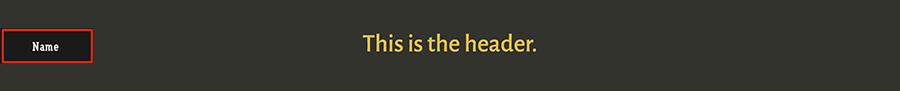
And here’s how the header looks like:

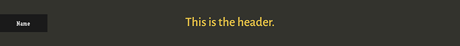
But, what if we pass a lighter color? For example:
header,

footer {

    @include contrasted(#ccc);

}
In such a case, as you can see the text color of the element becomes black:

Moreover, we can overwrite the default text colors:
header,

footer {

    @include contrasted(#33332D, shade(#FFD34E, 10%), shade(#BD4932, 10%));

}
The final result:
Conclusion
In this article, I presented to you eight helpful Compass features. Of course, the power of Compass isn’t only limited to those ones presented here. For instance, you might want to have a look at the sprites generator and math functions. Hopefully, you enjoyed the article and if you’re a Compass user you might take advantage of some of them in your next design!
To conclude, Compass is a really good choice if you want to include many of its features in your projects. Otherwise, it might be worth keeping an eye on a simpler and more lightweight library like Bourbon or something like autoprefixer to simply handle vendor prefixes.
Frequently Asked Questions about Compass Features for Web Development
What is Compass and why is it useful in web development?
Compass is a CSS authoring framework that uses the Sass preprocessor. It provides a host of utilities that make writing CSS more efficient and maintainable. Compass simplifies complex CSS tasks, such as creating gradients or handling vendor prefixes. It also provides a robust and flexible framework for creating responsive designs, making it a valuable tool for modern web development.
How does Compass compare to other CSS frameworks?
Compass stands out from other CSS frameworks due to its extensive library of reusable patterns, mixins, and functions. It also integrates seamlessly with Sass, allowing developers to leverage the power of both tools. While other frameworks may offer similar features, Compass’s focus on maintainability and efficiency sets it apart.
Can I use Compass with other web development tools?
Yes, Compass is designed to work seamlessly with a variety of web development tools. It integrates well with task runners like Grunt and Gulp, and can be used alongside other CSS frameworks or libraries. This flexibility makes Compass a versatile tool in a developer’s toolkit.
How does Compass improve the efficiency of writing CSS?
Compass improves efficiency by providing a library of reusable code snippets, known as mixins. These mixins can be used to quickly implement complex CSS features, such as gradients or vendor prefixes. This reduces the amount of code a developer needs to write and makes the code easier to maintain.
What are some of the advanced features of Compass?
Some of the advanced features of Compass include its sprite generator, which automates the process of creating CSS sprites, and its layout helpers, which simplify the process of creating complex layouts. Compass also provides a robust typography toolkit, making it easier to create beautiful, readable text.
How does Compass support responsive design?
Compass provides a set of mixins and functions specifically designed to support responsive design. These tools make it easy to create flexible layouts that adapt to different screen sizes and resolutions. This makes Compass an invaluable tool for creating modern, mobile-friendly websites.
Is Compass suitable for large-scale web development projects?
Yes, Compass is well-suited to large-scale web development projects. Its focus on maintainability and efficiency makes it a good choice for projects with large codebases or multiple developers. Additionally, Compass’s modular architecture allows for a high degree of customization, making it adaptable to a wide range of project requirements.
How does Compass handle browser compatibility?
Compass handles browser compatibility through its use of mixins. These mixins automatically generate the necessary vendor prefixes for different CSS features, ensuring that they work correctly across different browsers. This eliminates the need for developers to manually handle browser compatibility, saving time and reducing the risk of errors.
Can I customize Compass to suit my specific needs?
Yes, Compass is highly customizable. It provides a modular architecture that allows developers to include only the features they need, reducing bloat and improving performance. Additionally, Compass’s extensive library of mixins and functions can be extended or modified to suit a developer’s specific needs.
How can I get started with Compass?
Getting started with Compass is straightforward. First, you’ll need to install Ruby and the Compass gem. Once these are installed, you can create a new Compass project using the command line. From there, you can start writing your CSS using Compass’s powerful features and utilities.