

 There’s a lot more to typography that just picking a font. It is the ability to choose an arrangement of type that is legible and attractive. There are four fundamentals that can help you maximize the readability and improve the look of your website:
- Contrast
- Hierarchy
- Space
- Size
Here, we’ll look at contrast.
When we talk about contrast in typography, it can mean several things:
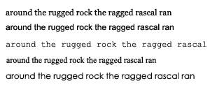
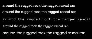
- The contrast between large and small type.
- The contrast between different typefaces, for example a script font used for a heading and a sans-serif font used for body copy.
- The contrast between the font colour and the background it appears on.
In a nutshell, contrast is an important factor in how easy it is to read text. You want to avoid making your web visitors squint, or feel the need to put on sunglasses when they visit your site and you can do that by choosing suitable foreground and background colors.
Let’s look at a very simple example of good contrast. Black text on a white background. It’s very easy to read.
Reversing that out, with white text on black background.
Again, easy to read. However, things would be a little dull on the web if EVERYONE used black and white. Dark colored text with an off-white background color, or vice versa, still provides excellent contrast while bringing a bit of color harmony to your site. Here are some examples of contrast between text color and background color that work well.
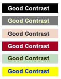
Obviously this is only a small list, but the key point to remember is you want to avoid making it difficult for readers. Always ensure that there is sufficient contrast between text and its background.
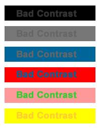
The above are examples of contrast from the wrong side of the tracks — they’re bad! As you can see, some of these color schemes actually hurt your eyes and should definitely be avoided if you want to keep your readers. The top three are also nearly impossible to read.
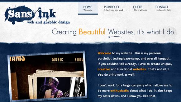
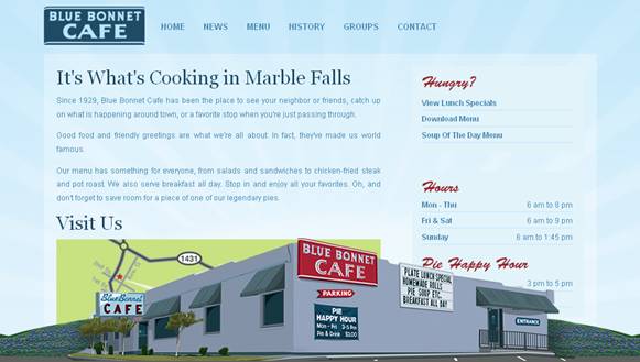
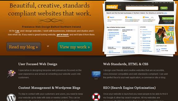
Let’s take a look at some working examples of good contrast. I’ve picked out 5 sites that have a color scheme which uses good contrast, none of which are black and white.
ArtDesign

Sans Ink
Mr Vector

Blue Bonnet Cafe
Lee Munroe
Have you come across any nice or unusual color contrasts on a website that you’d like to share?
Frequently Asked Questions on Using Contrasting Fonts for Maximum Impact
What are the benefits of using contrasting fonts in design?
Contrasting fonts can significantly enhance the visual appeal of a design. They can help to create a hierarchy of information, making it easier for viewers to understand the message. Contrasting fonts can also add depth and interest to a design, preventing it from appearing flat or monotonous. They can help to guide the viewer’s eye through the design, highlighting key points and making the content more engaging.
How can I choose the right contrasting fonts for my design?
Choosing the right contrasting fonts involves considering several factors. Firstly, consider the mood or tone you want to convey. Different fonts can evoke different feelings, so choose fonts that align with your message. Secondly, consider readability. Ensure that your chosen fonts are easy to read at various sizes and on different devices. Lastly, consider the balance. The fonts should complement each other without overpowering one another.
Can I use more than two contrasting fonts in a design?
While it’s possible to use more than two contrasting fonts in a design, it’s generally recommended to stick to two or three at most. Using too many different fonts can make a design look cluttered and confusing. If you do choose to use more than two fonts, ensure they all work well together and maintain a sense of harmony in the design.
What are some examples of effective font pairings?
Some examples of effective font pairings include pairing a serif font with a sans-serif font, or pairing a script font with a simple, clean font. These combinations can create a pleasing contrast and make your design more visually interesting. However, the best font pairing will depend on the specific needs and style of your design.
How can I test the effectiveness of my font pairing?
You can test the effectiveness of your font pairing by creating a mock-up of your design and asking for feedback. Consider the readability, the balance, and the overall aesthetic appeal of the design. You can also use online tools and resources to help you evaluate your font pairing.
What are high contrast fonts and when should I use them?
High contrast fonts are typefaces that have a significant difference in stroke thickness. They can add a dramatic and sophisticated touch to your design. High contrast fonts are often used in headings, logos, or any other design elements that need to stand out.
Can contrasting fonts be used in all types of design?
Contrasting fonts can be used in a wide range of designs, from websites and logos to posters and brochures. However, the specific fonts and the way they are used may vary depending on the type of design and the intended audience.
Are there any rules for using contrasting fonts?
While there are no hard and fast rules for using contrasting fonts, there are some general guidelines to follow. For instance, it’s important to maintain a balance between the fonts and to ensure they complement each other. It’s also crucial to consider readability and to choose fonts that align with the mood or tone of your design.
How can I learn more about font pairing and typography?
There are many resources available online for learning about font pairing and typography. Websites like Google Fonts, ManyPixels, and MyFonts offer a wealth of information and tools to help you understand and experiment with different font combinations.
What are some common mistakes to avoid when using contrasting fonts?
Some common mistakes to avoid when using contrasting fonts include using too many different fonts, choosing fonts that clash or compete with each other, and neglecting to consider readability. It’s also important to avoid using fonts that don’t align with the mood or tone of your design.