

Key Takeaways
- Mobile design patterns are crucial for user experience in applications, and this piece focuses on the patterns of invitations and feedback. Invitations should be intuitive and clear, guiding users to desired functionality. Popular invitation patterns include dialog boxes, tips, tours, and video demos.
- Feedback is equally important in mobile design. Users should be kept informed about their actions, changes of state or conditions, errors or exceptions through clear and unambiguous language. Three important feedback examples include error messages, confirmation and system status.
- The article emphasizes the importance of considering the user’s needs and expectations when implementing mobile design patterns. The design should be responsive and adaptable to different screen sizes, and thoroughly tested on multiple devices to ensure consistency and usability.
Introduction
In the first article of this mini-series dedicated to Mobile Design Patterns, I gave a brief overview of what they are and the importance of their implementation in any well designed mobile application.
Besides, I tried to show, through the study of one of the best known and most downloaded applications available in the marketplace, Pinterest, some of the patterns that should be considered in order to make your users’ experience pleasant and easy.
In it, I’ve outlined some useful tips and tricks for better organization of forms, galleries and search functions.
In this new article we’ll look at user invitations and underline the importance of suggestions and feedback for users who interact with a mobile application.
Example of Mobile Design Patterns: Invitations
How many times have you downloaded a smartphone application and, at the very first, not understood what to do to proceed? It’s happened to me quite often and, failing to exploit the potential of the application (however valid and useful it may have seemed to me), the only thing to do was to uninstall it and choose another app with more or less the same features but able to be approached more intuitively.
Intuitiveness: this is one of the key concepts behind the design and development of a mobile application.
On those occasions when you have personally been faced with an unintuitive interface and not known what to do, what would you have needed to avoid closing and deleting the application? A simple and clear suggestion that would lead you to the intended functionality. An invitation. So, from your experience as users then and as developers now, don’t you think that this little trick will be useful to hold on to your users and make sure that they do not uninstall your application after the first start?
At this point, let’s start seeing how we can improve our users’ experience with invitations.
Patterns for invitations are several and should be selected thinking about the contents of the application, your taste and, most important, the possible preferences of the targeted users. Among the most widely used patterns we find dialog boxes, tips, tours, and video demos, but there are other equally effective patterns that can influence an intuitive response, such as transparency, persistent invitations and others.
The most common and widely used are the “dialog box” pattern and the “tips” pattern, which give first instructions and are removed when the interaction starts. I have no chance in this article to dwell on examples of all patterns for invitations, so I decided to analyze the ones I think are more interesting than these two just described.
Tours
Tours are used to highlight the main features of an application, with particular attention to the users’ perspective. Also in this case, Pinterest app offers us a valid example of this pattern.
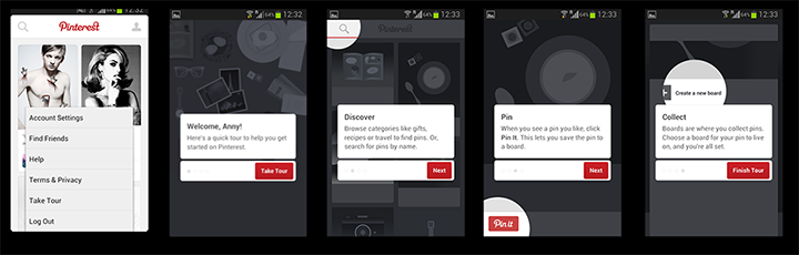
As you can see from the image above, you can access the tour through a menu item and, once done, it allows us to understand, in three short and simple steps, what to do with the application and which buttons to use to interact with it. The Pinterest tour is characterized by concise copy, vivid graphics and easy navigation.
Persistent invitations
Persistent invitations remain visible on the screen. This is the case of the message inserted in the “Saved Searches” section of the Ebay app where there’s always a message which suggests to users what to do, that is “Tap the clock icon to receive daily notifications when an object matches the saved search” (in the screenshot, it’s in Italian, sorry!)
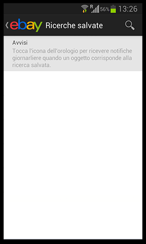
Even for this type of invitation, the message has to be short, clear, preferably of a different color and size text and with some visual cues.
This is exactly what is done in the home screen of one of the most popular and downloaded games of recent times: Fruit Ninja.
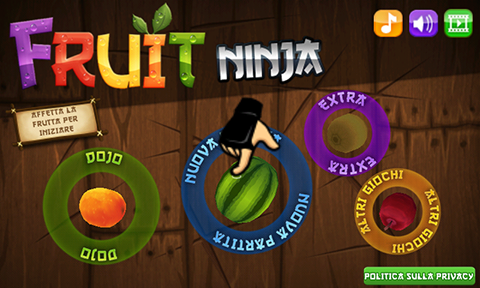
At the top left, under the logo, you find the invitation “Slice the fruit to start” which is persistent and won’t disappear after the first start of the game; moreover, a few seconds after you launch the app, the image of a little hand which suggests you to “slice” the game icons to go on appears and dispels all doubts.
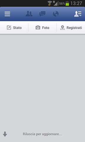
Discoverable invitations
This is the most common pattern used for prompting a data refresh; in fact, this kind of invitation is discovered when a common gesture such as swiping or flicking is performed.
Think about Facebook, Twitter or Google+ home screen: we’re now all accustomed to pulling down to refresh the page and load news on our profiles but how did we get used to it? Simply by doing it, with no clear message.
Transparent invitations
This is a pattern typically seen on home screens and it deals with a seethrough layer positioned over the screen provid content to rapidly and visually explain how to move in the app and which is removed when the screen is touched and the interaction begins.
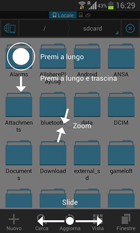
This is the case of the ES File Explorer app in which the instructions “Press”, “Press and drag”, “Zoom” and “Slide” with their associated icons, disappear when the user taps on the screen.
Examples of Mobile Design Pattern: Feedbacks
According to Larry Constantine and Lucy Lockwood “Feedback Principle” (included in their list of “Principles of user interface design“)
The design should keep users informed of actions or interpretations, changes of state or condition, and errors or exceptions that are relevant and of interest to the user through clear, concise, and unambiguous language familiar to users.
What does it mean? It means that users have to know and see the results of their interactions with the mobile app they’re using. Regards to this field, there are three important examples you should consider: error messages, confirmation and system status.
Error messages
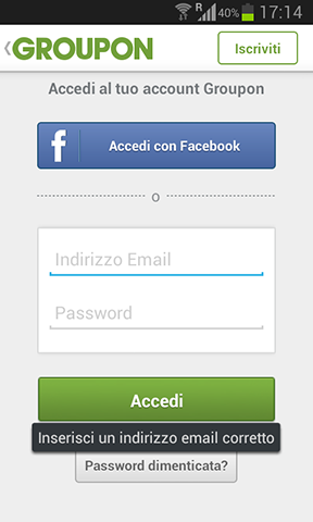
This messages should be always clear and indicating the problem (possibly also suggesting a solution). One example is Groupon error message which appears if the user has not inserted a valid email address or password (in this case the request is for a valid email address).
The tip is to make the error as visible as possible with colorful in-screen messages instead of modal dialogs.
Confirmation messages
One important thing to remember is that confirmation messages shouldn’t ever obstruct the flow of the page, so be sure to provide a confirmation message when an action is taken but don’t break the users’ flow.
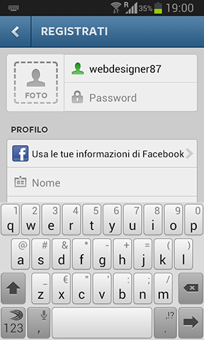
The registration form of Instagram provides us with an excellent example of this pattern. When a user chooses a name, if the name was available the corresponding icon would become green while if it was not, the color would be red. This is a great system to make the confirmation process faster and more intuitive, using conventions that have been consolidated over time.
System status
For system status notifications, you can use messages, progress bars, animated indicator or a combination of different elements. Don’t forget to include a cancel button to stop long operations: users will really appreciate it.
Conclusions
In this article you’ve seen, through some examples of more or less known applications available in the marketplace, which are the most common mobile patterns used to give suggestions, make invitations and provide feedbacks. In the next, and last one, you’ll discover the most common anti-patterns and understand why and when to avoid them.
Frequently Asked Questions about Mobile Design Patterns
What are some examples of mobile design patterns?
Mobile design patterns are reusable solutions to common problems that occur in mobile application design. Some examples include navigation menus, search bars, forms, lists, and grids. These patterns are used to create a consistent and intuitive user experience across different mobile applications.
How do mobile design patterns improve user experience?
Mobile design patterns provide a familiar and predictable experience for users. By using common design elements, users can quickly understand how to navigate and interact with an application. This reduces the learning curve and increases user satisfaction and engagement.
What are some best practices for implementing mobile design patterns?
When implementing mobile design patterns, it’s important to consider the user’s needs and expectations. This includes using familiar design elements, ensuring that the design is responsive and adaptable to different screen sizes, and testing the design on multiple devices to ensure consistency and usability.
How can I choose the right mobile design pattern for my application?
Choosing the right mobile design pattern depends on the specific needs of your application and its users. Consider the tasks that users will be performing, the information they will be accessing, and the overall flow of the application. It’s also important to consider the limitations of mobile devices, such as screen size and input methods.
Can I combine different mobile design patterns in my application?
Yes, it’s common to combine different mobile design patterns to create a unique and effective user experience. However, it’s important to ensure that the combination of patterns is cohesive and doesn’t confuse or frustrate users.
What are some common mistakes to avoid when using mobile design patterns?
Some common mistakes include overcomplicating the design, not considering the user’s needs, and not testing the design on different devices. It’s also important to avoid using too many different patterns, as this can confuse users and make the application difficult to navigate.
How can I test the effectiveness of my mobile design patterns?
You can test the effectiveness of your mobile design patterns through user testing. This involves observing users as they interact with your application, gathering feedback, and making adjustments based on their experiences and suggestions.
Are there any resources for learning more about mobile design patterns?
There are many resources available for learning more about mobile design patterns. This includes online tutorials, books, and articles. You can also learn from studying successful mobile applications and analyzing their design patterns.
How often should I update my mobile design patterns?
The frequency of updates depends on the needs of your users and the evolution of mobile technology. It’s important to regularly review and update your design patterns to ensure they remain effective and relevant.
Can I create my own mobile design patterns?
While it’s common to use established design patterns, you can also create your own. This allows you to tailor the design to the specific needs of your application and its users. However, it’s important to ensure that your patterns are intuitive and easy to understand.