The Splat Is Gone: Nickelodeon’s Logo Gets An Update
Nickelodeon has updated its well-recognized “splat” logo to a new text based insignia. It’s still orange and the characters have a round balloon-like friendliness to them, but the splat is gone. 
Old Logo

New logo
The new logo is set in a rounded typeface with the letter i , looking like a little person, being the focal point.
The new identity will be taking over in the Autumn when all of the Nickelodeon channels and the web site will display the logo. The company itself has been around for about thirty years and the splat logo was introduced five years later in 1984.

Original Logo
Cyma Zarghami, president of all things Nick, has stated that the main reason for changing the logo, is to connect Nickelodeon, Nick at Nite, Nicktoons, Nick Jr. (which a friend described to me today as Toddler Heroin) and TeenNick, all of which will use the new logo. 
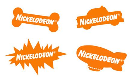
Some of the variety of Nick logos
She said;
We wanted to clean it up and allow Nick to be the stamp on all of these channels, that ultimately meant jettisoning the familiar Nickelodeon “splat.”
In asking ourselves if everything could live under the splat, we decided that the splat was dated. (via Variety Magazine)
The original splat logo was design by Scott Nash and Tom Corey for Fred Siebert at Fred/Alan and was renowned for its multiple variations. 
I can’t pretend I grew up with Nickelodeon (it wasn’t on Irish TV, but is now available here on cable), but I certainly know the logo well and have a bit of fondness for it. It’s fun and bright and a little bit mischievous. Something I think the new logo is missing. The splat must surely be one of the most recognizable logos out there, friend to both children, and time-poor parents, appearing in the top corner of the box. I like the simplicity of the new logo but it seems sad that it’s replacing a bit of a classic. 
What do you think of the new design? Like it, loathe it, indifferent?
Frequently Asked Questions (FAQs) about Nickelodeon’s Logo Update
What was the reason behind Nickelodeon’s logo change?
Nickelodeon decided to change its logo as part of a rebranding strategy. The new logo is a reflection of the network’s evolution and its commitment to constantly innovate and adapt to the changing preferences of its audience. The change was also aimed at creating a more modern and streamlined look that would resonate with today’s digital-savvy kids.
How has the audience reacted to the new Nickelodeon logo?
The reaction to the new Nickelodeon logo has been mixed. While some fans appreciate the modern and sleek design, others miss the old ‘splat’ logo that had become synonymous with the network. However, Nickelodeon believes that the new logo will eventually win over its audience as it better represents the network’s current direction and offerings.
What does the new Nickelodeon logo represent?
The new Nickelodeon logo represents the network’s commitment to innovation and evolution. It’s a more streamlined and modern design that reflects the digital age we live in. The logo is also designed to be more versatile and adaptable across various platforms, from TV screens to mobile devices.
How does the new logo compare to the old ‘splat’ logo?
The new logo is a significant departure from the old ‘splat’ logo. While the ‘splat’ logo was playful and quirky, the new logo has a more modern and sleek design. The new logo also uses a different color scheme, opting for a more vibrant and energetic palette that appeals to the younger audience.
Has the logo change affected Nickelodeon’s brand recognition?
While the logo change has sparked some debate among fans, it has not significantly affected Nickelodeon’s brand recognition. The network’s commitment to delivering quality content remains its primary brand identifier. The new logo is just a visual representation of the network’s evolution and its commitment to adapt to the changing times.
Why did Nickelodeon decide to retire the old ‘splat’ logo?
Nickelodeon decided to retire the old ‘splat’ logo as part of its rebranding strategy. The network felt that the ‘splat’ logo, while iconic, did not fully represent its current direction and offerings. The new logo is designed to better reflect the network’s commitment to innovation and evolution.
How often does Nickelodeon change its logo?
Nickelodeon does not change its logo frequently. The recent change is the first major logo update in over a decade. This reflects the network’s commitment to consistency and brand recognition, while also demonstrating its willingness to evolve and adapt when necessary.
What was the process behind creating the new Nickelodeon logo?
The process behind creating the new Nickelodeon logo involved extensive research and design iterations. The network worked closely with a design team to create a logo that would reflect its current direction and resonate with its audience. The process also involved testing the logo across various platforms to ensure its versatility and adaptability.
Will the new logo be used across all Nickelodeon platforms?
Yes, the new logo will be used across all Nickelodeon platforms. This includes the network’s TV channels, websites, mobile apps, and social media pages. The aim is to create a consistent and unified brand identity across all platforms.
What is the significance of the color scheme in the new Nickelodeon logo?
The color scheme in the new Nickelodeon logo is designed to be vibrant and energetic, reflecting the network’s youthful and dynamic audience. The colors also help to create a sense of excitement and fun, which is central to Nickelodeon’s brand identity.
Jennifer Farley is a designer, illustrator and design instructor based in Ireland. She writes about design and illustration on her blog at Laughing Lion Design.
