

This sponsored article was created by our content partner, BAW Media. Thank you for supporting the partners who make SitePoint possible.
In your role as a professional web developer, you’re up for just about any website-building challenge. But, building a creative website portfolio for your own services isn’t something you’re accustomed to.
As much as you love web development, you’ve probably never thought of it as being a particularly sexy or creative profession.
The truth is, it’s not all that difficult to put an eye-grabbing portfolio together rather easily when you’re armed with the right tools, and you have a selection of inspiring and relevant concepts to choose from.
Here are 8 powerful ideas, together with 32 examples, to inspire you and enable you to promote your services on your own stunning portfolio website.
Key Takeaways
- Make your portfolio website stand out by clearly stating what you do, keeping the design simple and clean, and creatively showcasing your skills and experience. Use elements that reflect your personality and professional approach.
- Draw inspiration from various sources such as artists, professional websites, and even product websites. Consider turning your portfolio into a game or presenting yourself as a product for a unique twist.
- If time is a constraint, consider using pre-built websites as a quick and effective way to create a stunning online portfolio. These are designed with easy navigation and interactive elements to increase user engagement.
- Regularly update your portfolio website to showcase your most recent work and skills. For new web developers, personal projects, school projects, or contributions to open-source projects can be included in the portfolio.
8 Ideas that Will Make Your Web Dev Portfolio Website Stand Out
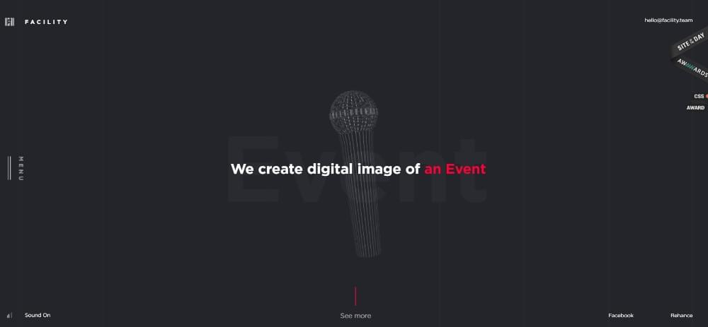
1. Owning What You Do and Sharing It with Others
Many if not most portfolio websites have something in common. Because of their designs, it takes visitors a few seconds to figure out what the author actually does.
And, the longer it takes a visitor to figure it out what you do, and who you’re doing it for, the more likely it becomes that he or she will leave before even getting a glimpse of your portfolio.
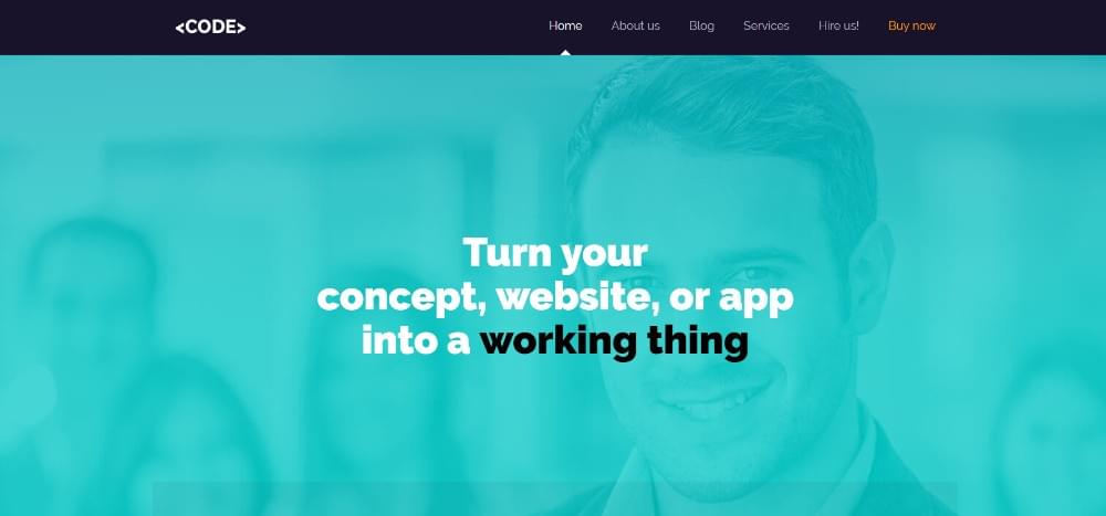
You want to let people know exactly what you do the instant they land on your home page, and here are a few ways to make that happen.
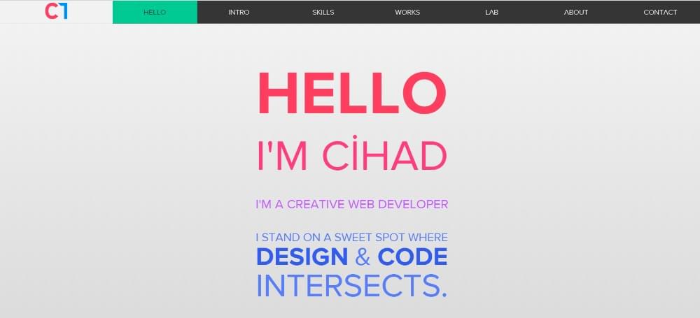
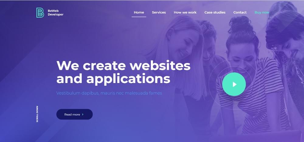
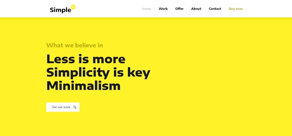
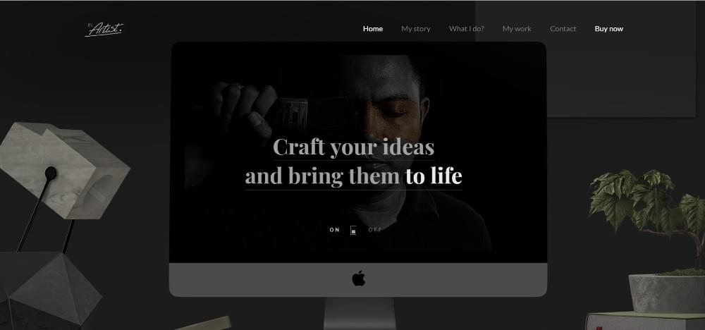
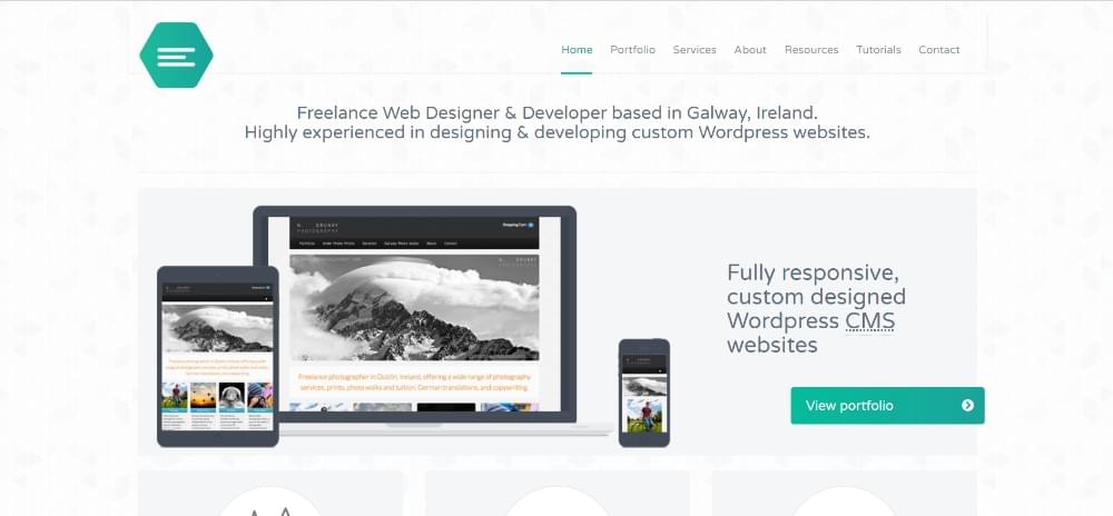
This pre-built website’s crystal clear headline message instantly draws the reader in.
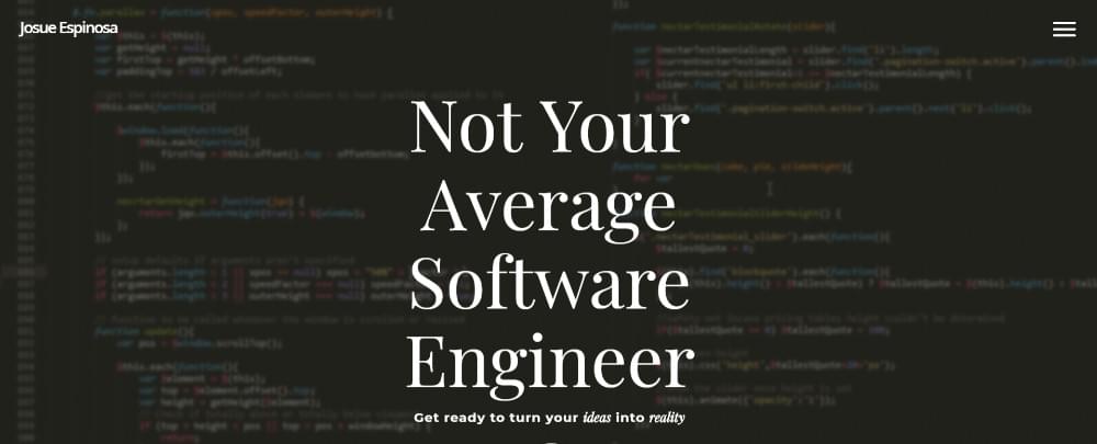
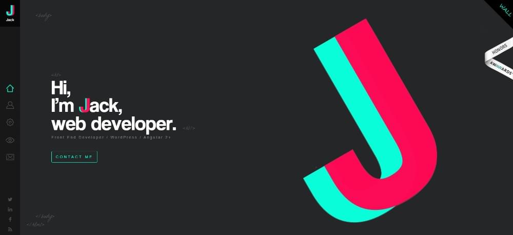
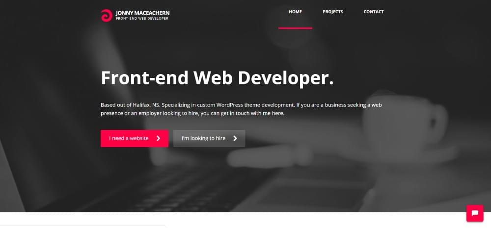
This guy tells you straight out what he does. He even used a screenful of code for his hero shot.
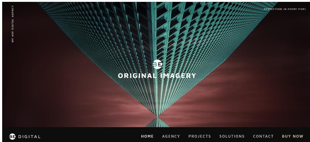
2. Simplicity Is the Ultimate Sophistication
Most website visitors don’t like clutter, and certainly won’t be willing to wade through it to find what you’re offering. Since you take pride in your ability to write clean code, a clean portfolio design should appeal to you as well.
It will certainly appeal to your visitors.
A clean design will attest to your skills and work ethic, and if you feel it’s necessary, you can always use color and texture in a way that will make your personality stand out.
For example:
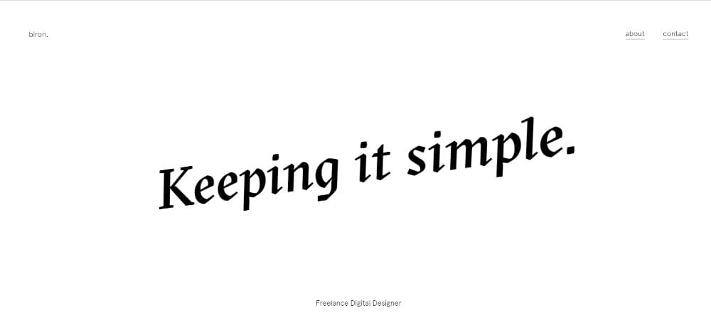
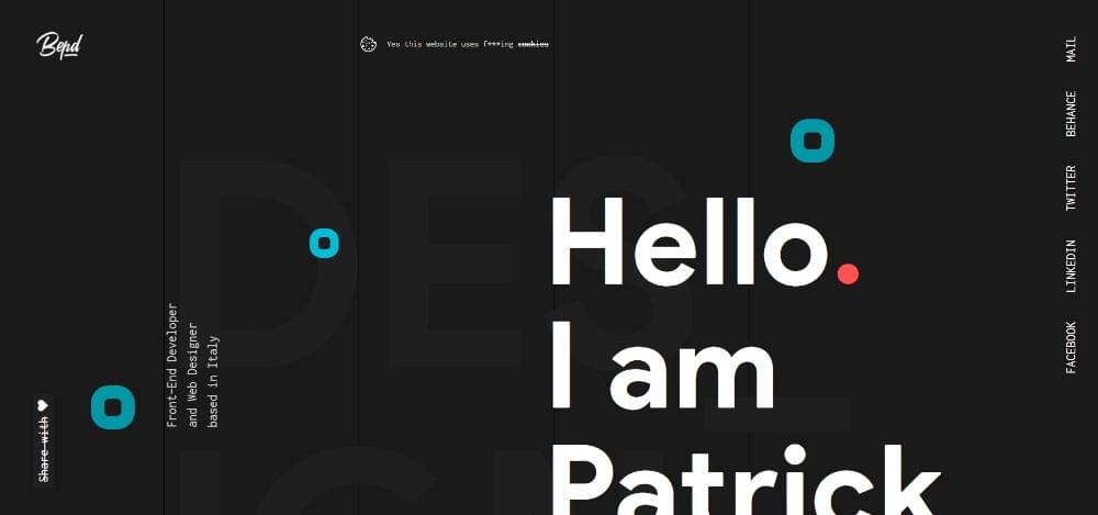
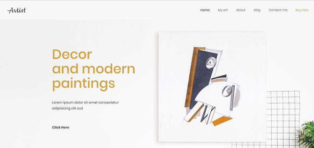
This freelance digital designer made a brand out of simplicity. Just how cool is that?
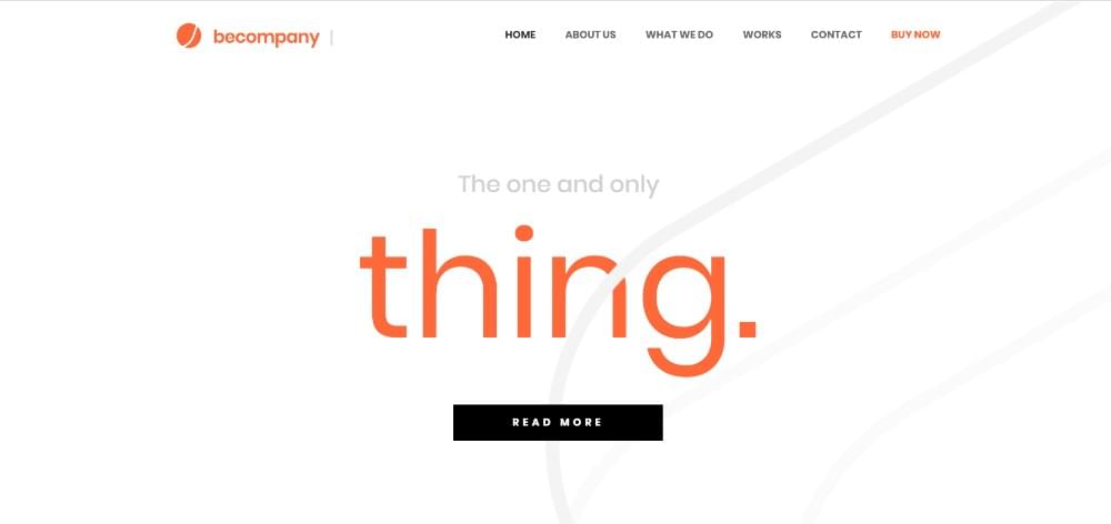
A perfect example of how design simplicity can produce a clean website home page that’s impossible to ignore
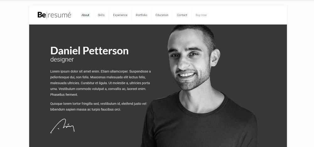
3. Turning a Resumé from Blah to Wow
Resumés are so passé. Don’t you agree?
Not when you let your art or products speak for themselves, which is what portfolio websites can do; and spectacularly so if done right.
You can still keep the classic structure of a resumé since that is what a reader would lbe expecting.
Just apply a little creativity to make your skills and experience stand out. Add a few catchy visuals and/or interactive elements and watch the resumé you’re building suddenly go from Blah or Meh, to Wow.
Now, the readers will want to know more about you, what you do, and what you can offer them.
Here’s a few examples of resumés that are so outstanding they’re worth a second, or third, assessment.
This theme’s subtle animated elements will make the finished website pleasingly interactive.

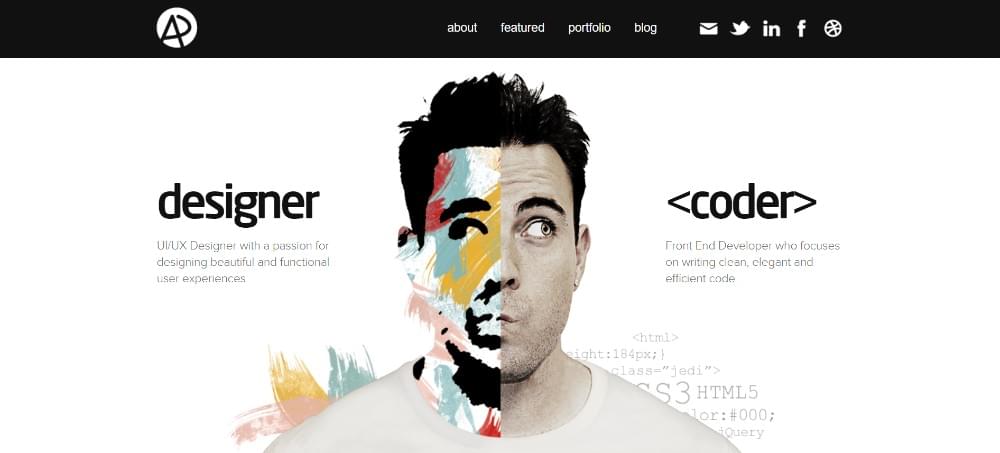
A quick study on how to take your resumé and turn it into a work of art that’s full of personality.
4. Professional with a Creative Twist
You’re a no-nonsense type when it comes to doing your job, as are most professionals; and you want to be seen that way to be able to land bigger jobs and attract better clients.
It never hurts to “borrow” a bit from the ways top professionals in other industries present themselves online. We’re not talking “copycat” here.
It’s simply a matter of getting an idea or two from lawyers, coaches, consultants, and other professionals on how to make your website look professional, yet not “stuck up”.
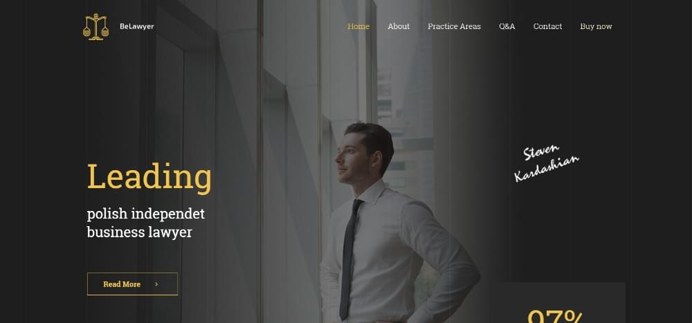
This theme targets independent lawyers, but it can easily be customized to create a sleek portfolio website.
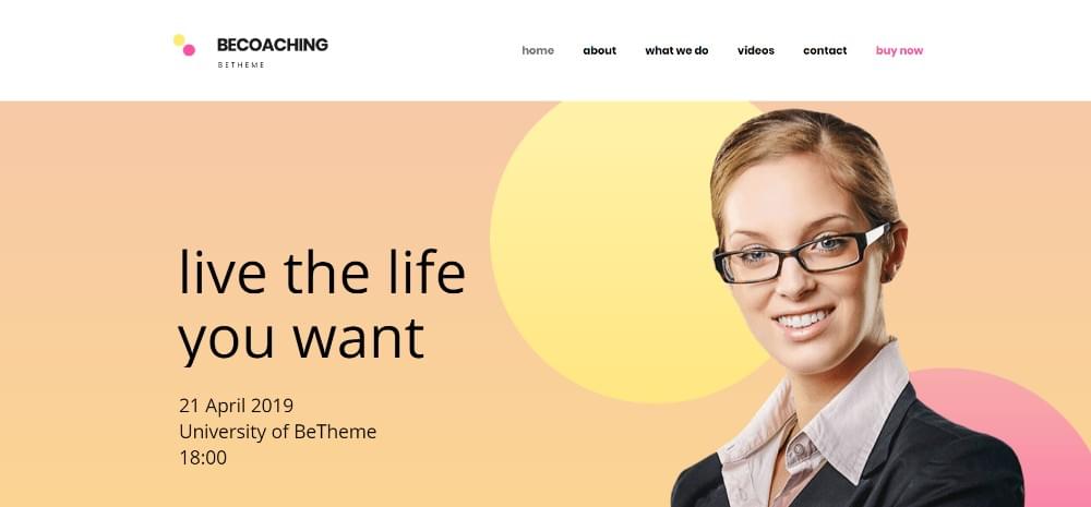
If a personality-infused portfolio website is your goal, you might check out how coaches attract their clients.
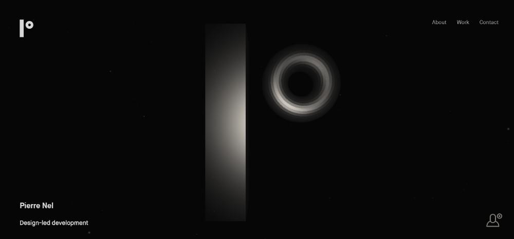
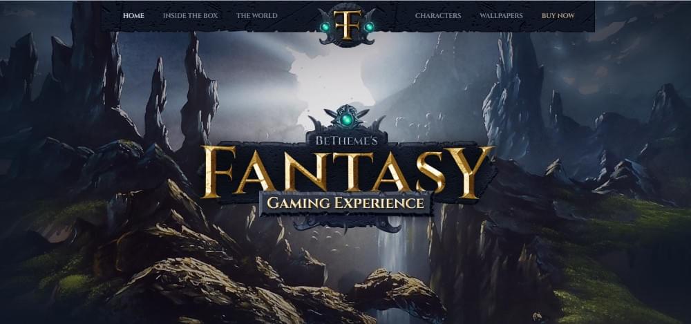
5. Leaning on the artistic side
Artists have the most drool-worthy websites. You really wouldn’t expect it to be any other way. Face it; you’d have problems trying to compete with them.
Fortunately, you don’t have to. There are already plenty of web developers out there who’ve successfully created some awesome portfolio websites for themselves, and even for others.
Like Adham Dannaway, who used this artistic approach to present his web dev and design services.
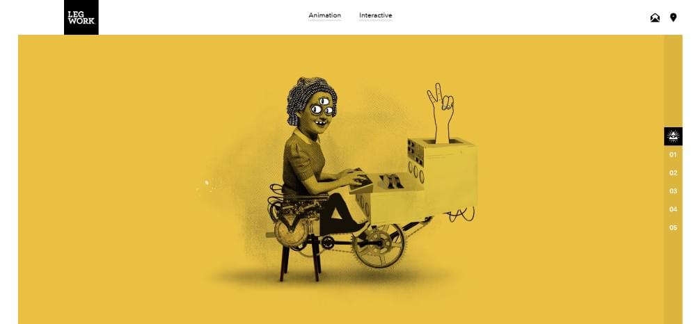
Or Legwork Studio. This animation studio combined illustration with animation and packaged it up to create a recognizable visual brand.
You can also get inspiration from themes like these two that artists are currently using to create their website portfolios:
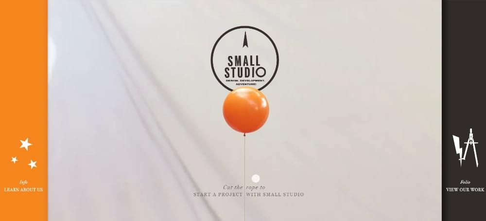
6. Grabbing attention with gamification
Want to know the type of website portfolio that offers the greatest chance of making you famous?
Try turning your online portfolio into a game.
We’ve already gone from Blah to Wow. Why not aim for something even better?
When you turn your portfolio into a game, it’s hard for anyone to pass it by. Almost everyone likes to participate in an entertaining online adventure, and it’s much more enjoyable than going down lists of skills and accomplishments.
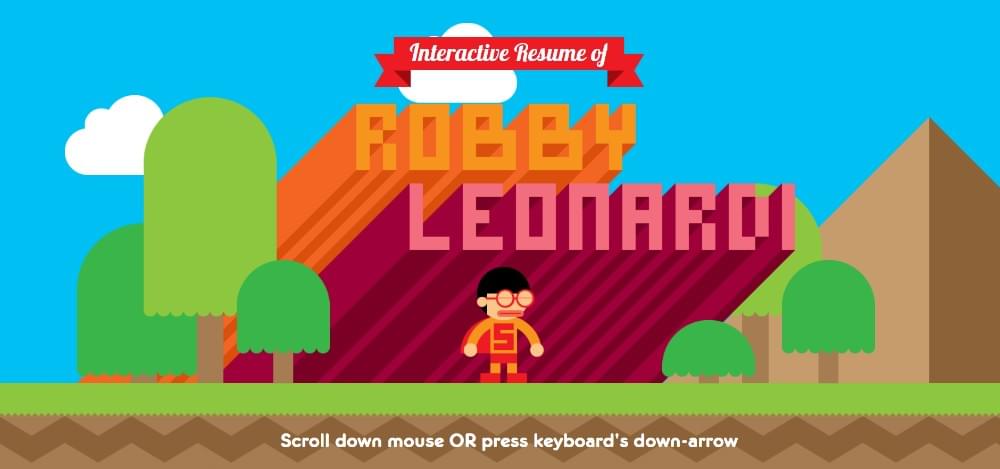
This designer-programmer-animator is well-known for his award-winning, mind-blowing portfolio game. Yes, it did win him awards; and lots of high-fives.
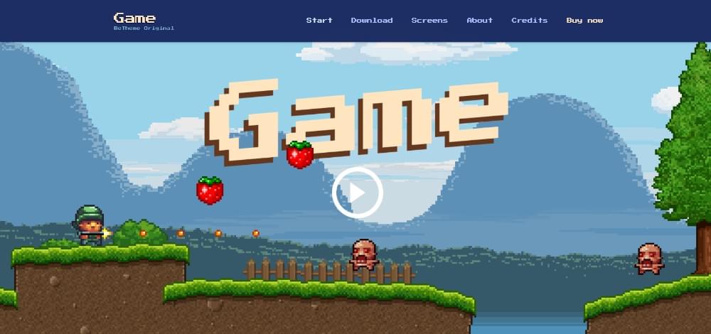
You can take this game presentation theme, and easily turn it into an interactive portfolio.
7. “Stealing” the Best from Company Websites
When you’re running a company, you’re tasked with finding a way to sell multiple products of services on the same website.
It’s often the same for you as a web developer.
You have multiple skills and services, and you want to show them off in the most attractive way possible. You also need to find a way to present your offers in a crystal-clear fashion, so clients can easily find precisely what they’re looking for.
If you have multiple skills and services to offer, you should find these examples a source of inspiration:
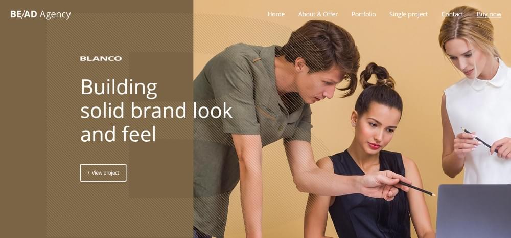
This ad agency theme works great for hybrid services.
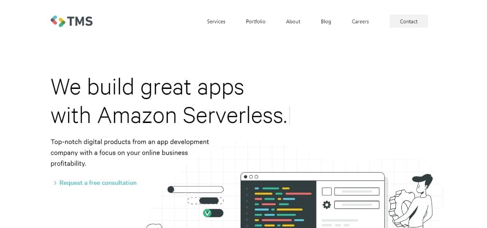
These folks found a simple and powerful way to present all the technologies they use.
8. Presenting yourself like a product
Think of how high-converting websites sell tech products.
They adhere to a common architecture designed to attract people and convince them to buy or sign up for a free trial. Use that same architecture to build your website portfolio, and you can expect to attract more potential clients and convince them to hire you.
At the same time, you can demonstrate what you could build for them if they choose to work with you.
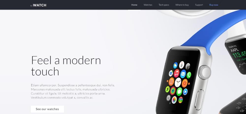
This classic website structure for selling IoT products is designed to attract and convert.
A web developer used a structure similar to this for her online portfolio.
Get Started
With a few creative concepts to get you started, you no longer have a reason or any excuses to keep putting off building your own portfolio website.
If you’re worried that you don’t really have the time to juggle client’s work with working on your online portfolio, there’s a shortcut you can take.
Unless or until you have enough time on your hands to build it from scratch, a pre-built website can provide a fast and effective way to create a dazzling online portfolio to show off your work.
A good resource is Be Theme, with its huge library of 70+ one-pagers (and 400+ pre-built websites of all kinds).
Each is designed with easy navigation in mind, and each incorporates interactive elements designed to increase user engagement on the page. All that you need to do it to add your creative vision, which will be more than enough to take your portfolio from “meh” to “stunning”.
Frequently Asked Questions on Building a Stunning Portfolio Website as a Web Developer
What are some unique features I can add to my portfolio website to make it stand out?
To make your portfolio website stand out, consider adding unique features such as an interactive resume, a blog section where you share your thoughts on web development trends, or a case study section where you detail the process and results of your past projects. You can also include client testimonials to build trust with potential clients. Additionally, consider integrating social media feeds, especially LinkedIn and GitHub, to showcase your online presence and community involvement.
How can I optimize my portfolio website for mobile devices?
Mobile optimization is crucial as a significant number of users access websites on their mobile devices. To optimize your portfolio website for mobile, ensure your website is responsive, meaning it adjusts to fit any screen size. Also, keep your design simple and clean, as too many elements can make your site look cluttered on a small screen. Lastly, make sure your site loads quickly on mobile devices, as slow loading times can frustrate users and make them leave your site.
How can I showcase my skills and expertise on my portfolio website?
Showcasing your skills and expertise on your portfolio website can be done in several ways. You can include a skills section where you list your technical skills, such as programming languages, frameworks, and tools you are proficient in. You can also showcase your expertise through your portfolio projects. For each project, provide a brief description, the technologies used, and the challenges you overcame. If possible, include a link to the live project or screenshots if the project is not publicly accessible.
How can I improve the SEO of my portfolio website?
Improving the SEO of your portfolio website involves several steps. First, ensure your website has a clear, easy-to-navigate structure. Second, use relevant keywords in your content, but avoid keyword stuffing. Third, optimize your images by using descriptive file names and alt tags. Fourth, include meta descriptions for your pages. Lastly, consider starting a blog where you write about web development topics, as this can help attract traffic to your site and establish you as an expert in your field.
How can I make my portfolio website more engaging for visitors?
To make your portfolio website more engaging, consider adding interactive elements such as animations or hover effects. You can also include a video introduction where you talk about yourself and your work. Additionally, make sure your content is well-written and easy to read. Break up large blocks of text with headings, bullet points, and images to make your content more digestible. Lastly, include clear calls to action to guide your visitors on what to do next, whether it’s contacting you, viewing your work, or reading your blog.
How often should I update my portfolio website?
It’s recommended to update your portfolio website regularly, ideally every few months. This allows you to showcase your most recent work and skills. Regular updates also show potential clients or employers that you are active and continuously improving your skills. However, the frequency of updates may depend on how often you complete new projects or learn new skills.
What should I include in my portfolio if I’m a new web developer with no client projects yet?
If you’re a new web developer with no client projects yet, you can include personal projects, school projects, or contributions to open-source projects in your portfolio. You can also create mock projects where you build websites or applications for imaginary clients. This not only showcases your technical skills but also your creativity and problem-solving abilities.
How can I use my portfolio website to attract my ideal clients?
To attract your ideal clients, make sure your portfolio website clearly communicates who you are, what you do, and who you do it for. Highlight the types of projects you enjoy working on and the industries you specialize in. Also, showcase your unique selling proposition – what sets you apart from other web developers. This could be your unique design style, your expertise in a specific technology, or your approach to problem-solving.
Should I include prices for my services on my portfolio website?
Whether to include prices for your services on your portfolio website depends on your personal preference and business model. Some web developers prefer to discuss pricing after a potential client has contacted them, while others find that listing prices upfront helps filter out clients who cannot afford their rates. If you choose to list your prices, make sure to clearly communicate what each package includes.
How can I protect my work on my portfolio website?
To protect your work on your portfolio website, you can add a copyright notice at the bottom of your site. You can also use watermarks on your images, although this can detract from the design. If you’re concerned about people using your code, remember that anyone who views the source code of a website can see the HTML, CSS, and JavaScript. However, they won’t be able to see your server-side code, such as PHP or Node.js, unless you specifically share it.

