

Remember 2015? The Apple Watch, the new iPhone 6S, falling in love with Jurassic Park again. It seems like only yesterday.
2015 left its unique style on everything, including web design, which continues adapting this year to mobile browsing overtaking desktop. Based on my own discussions with the design team at UXPin, let’s explore the top ten trends and how to continue reaping their benefits going forward into 2016.
Key Takeaways
- Minimalism was a significant trend in web design in 2015, with an emphasis on simplicity and faster loading times, particularly for mobile browsing.
- Long scrolling became more popular, providing more creative freedom, improved storytelling, stronger interactions, and simplified navigation, particularly for sites with heavy mobile traffic.
- Flat design evolved, allowing for more details and flourishes, while maintaining its simplicity and easy comprehension.
- The use of powerful animations became more prevalent, attracting attention and showing relations between elements on a page.
- Card layouts, which allow sites and apps to display a wealth of content in a clean, organized manner, were particularly suitable for responsive design and mobile devices.
1. Minimalism
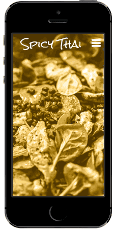
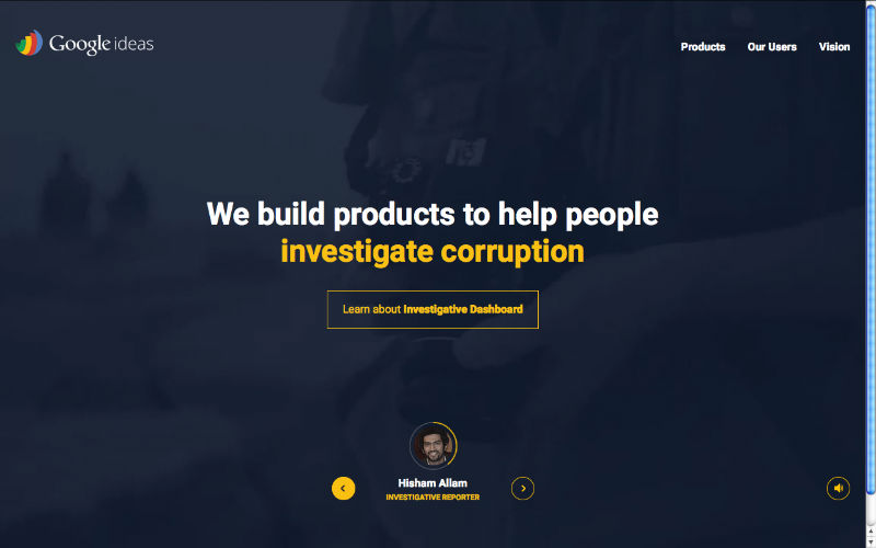
Minimalist sites embody one of the central ideals of web design in 2015: simplicity. Stripping away all but the essential elements does more than give your site an air of elegance – it also reduces loading times, a nice advantage for mobile browsing. Plus fewer elements means easier responsive design.
As explained in the free guide Web Design Trends 2015 & 2016, the minimalist aesthetic also worked together with advancement in visual capabilities, which encourages other trends like HD backgrounds.
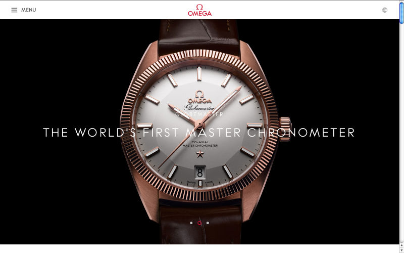
In the example above, OMEGA includes only what’s necessary: language settings, expandable menu, and the logo for returning to the home page. This draws attention almost exclusively to the hero image of the luxury product because there’s not many other UI elements to compete with.
Tips
- Save space with slideouts or pulldown menus.
- Applying different degrees of symmetry keeps the site from looking dull, especially asymmetry.
Free Resources
- Gallery of Minimal One-Page Websites – A site dedicated to featuring the best one-page websites.
- Best Minimalist WordPress Themes – A nice launchpad for minimalist templates, though not all are free.
- Design Trends: Elegance of Minimalism – A free guide teaching useful web minimalism techniques based on 28 examples of the year’s best designs.
2. Long Scrolling
Smaller screens means longer scrolls.
With the “below the fold” myth proven wrong, today designers and users alike are recognizing the value of long scrolling: more creative freedom, improved storytelling, stronger interactions, and simplified navigation (if the site is small enough).
Long scrolling works best for sites with heavy mobile traffic or frequently updating content, and is less effective for sites with heavy media like videos, which drag on loading times.
Tips
- Sticky navigation menus or jump-to-section options protect against disorienting users, which is a common concern with scrolling.
- Draw out the playful aspects of long scrolling with effects such as parallax and scrolling-triggered animations.
- Avoid the negative SEO effects by following the advice in this Moz article and this Quicksprout article.
Free Resources
- One Page Love – A gallery of the best single-page websites, updated regularly.
- “Apple Resurrects the Scroll Wheel” – A TechCrunch article analyzing how the Apple Watch may breath new life into scrolling websites.
- How to Create a Parallax Website – A two-part tutorial that teaches the fundamentals, including coding, for parallax design.
3. The New Flat Design
Today’s flat design has evolved from its roots as an alternative to skeuomorphism. The new, more nuanced iteration of flat design – Ryan Allen calls it “Flat Design 2.0” – offers more opportunity for details and flourishes:
- Lighting glares and highlights
- Gradient and/or drop shadows
- Greater values for detailing
Like minimalism, flat’s simplicity remains its strength. The almost cartoonish graphics, legibility-first typography, and playful colors keep the style geared for easy comprehension.
Tips
- Ghost buttons can be used outside of flat design. Their transparency keeps focus on background image, making them a popular addition to hero images.
- Flat’s simple graphics make loading a breeze. This works perfectly for responsive design.
Free Resources
- Design Trends: Evolution of Flat Design – A free guide teaching flat techniques based on 18 examples of the year’s best designs.
- 25 Flat Device Mockups: Templates for creating flat design mockups on a variety of devices.
- 50 Flat Icon Sets: Digital Synopsis’s roundup of 50 flat icon sets that are free to use or peruse.
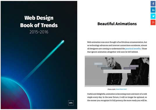
4. Powerful Animations
Because motion attracts attention, animation can influence the visual hierarchy of what gets seen first. Moreover, animation also show relations: imagine an animation of a window shrinking and flying into the menu – this animation confirms the action’s success, and also shows the user where on the menu they can view the window later.
The fly-in menu, as prototyped below in UXPin with the no-code animations editor, demonstrates this principle perfectly.
At the very least, animation gives life to dull actions. A hover animation shows a link is clickable more than a simple color change.
Tips
- Web and app animations can still make use of Disney’s classic 12 rules of animation.
- Long scrolling formats rely heavily on animation to create the appearance of smooth scrolling. On top of that, animations triggered by scrolling create a more immersive and entertaining site.
- Loading screen animations give users an estimation on time and entertain them while waiting.
- Subtle animations in the background, as long as they’re not excessive or distracting, can add a little energy to an otherwise stale visual.
Free Resources
- CSS3 Animation Cheat Sheet – This useful collection of ready-made, plug-and-play animations lets you apply premade CSS classes to any element you wish.
- Web Animation – A frequently updated guide to synchronization and timing for animation in web pages and APIs.
- Interaction Design & Animations – Free 80-page guide teaching interaction design techniques based on 47 examples of the year’s best designs.
5. Lively Colors
In the past designers were limited to 216 web-safe colors, but now there are millions, an advancement timed nicely with the rise of HD screens.
As explained in Web Design Trends 2015 & 2016, this year saw a rise in bright, lively colors to coincide with the tone of flat design, but these “happy” colors fit well with other trends as well.
The attention-grabbing colors reduce the likelihood of a site appearing dull – minimalism’s natural weakness. When used actively with typography, colors can draw attention to certain words or phrases. Moreover, colors serve a valuable function for suggesting usability: think of cards that change color when hovered over, an obvious indicator of interactivity.
Tips
- Each color elicits a different emotion, so choose the right ones to match your product’s personality.
- Understand how color theory applies to design before choosing your scheme.
Free Resources
- ColourLovers – A global community showcasing their own clever palettes and discussing color theory across all mediums.
- Tint UI – A color picker for copying hexadecimal codes. Allows for browsing by platform (Material Design, iOS, etc.), brands (Twitter, Firefox, etc.), or current trends.
- Design Trends: Vibrancy of Color – Free guide teaching color techniques based on 22 examples of the year’s best designs.
6. HD Backgrounds
With more and more people owning high definition devices, it was just a matter of time before this trend caught on.
HD is any resolution greater than 200 ppi (dpi), while standard definition is 72 ppi. This makes images designed with standard definition in mind appear blocky or blurry on HD devices, but HD images appear fine in SD. That means users with SD displays won’t notice the difference – but those with HD certainly will.
Tips
- Device backgrounds don’t usually conform to the 1:1.5 aspect ratio of cameras, so take an active role in cropping. Otherwise, you won’t control what’s cut and what’s seen.
- Scalar vector graphics (SVG) translate images using lines and points; raster formats (.jpg, .png, .gif) work pixel-for-pixel. Use SVGs for new graphics, and save raster formats for real-life images and video because they have a fixed number of pixels from the start – that’s why it’s important to capture the media in HD from the beginning.
Free Resources
- Improving Image Quality on the Retina Display – Tuts+’s tips on tackling HD displays, including the usage of CSS media queries.
- Browser Shots – An online tool for testing your site’s screen resolutions and browser capabilities.
- 20 HD Blurred Background Sets – A collection of free blurry HD backgrounds.
7. Expressive Photography
Thanks in part to the increase in HD screens, web design continues using higher quality (and at times more artistic) photography.
This is most obvious with the prevalence of hero images – single photos that fill the entire background. Hero images draw users in more quickly, making them perfect for landing and login pages.
Tips
- Combine custom and stock photography in such a way that the stock photos also look custom – for example, consistent themes and subjects.
- For free stock photos, try Unsplash, Pixabay, and Pexels.
- Influence how an image is perceived with color overlays. For example, a yellow overlay on an otherwise drab photo will make it more upbeat.
- Product photos in natural environments increase sales more than traditional product images by creating context about how it feels to actually own the product.
Free Resources
- “10 Pitfalls to Avoid When Using Stock Photography” – An article from Design Shack warning against ten common mistakes with stock photography.
- TinEye Reverse Image Search – A great tool for stock photography that reveals all of a photo’s locations on the Internet.
- “The Ultimate Guide to Beautiful DIY Photography – A beginner’s guide to taking your own web photography.
8. Dynamic Typography
With font rendering no longer a concern and the availability of new, free fonts, typography has begun playing more of a role in web design.
Dynamic typography doesn’t always mean wild or elaborate fonts – in fact, the most common is simple typography, fitting in with trends like flat design and minimalism. The trend of dynamic typography refers to any text that draws attention to itself, whether simple or elaborate. This includes the typeface that’s extremely large or extremely small.
Tips
- Most of the time, two fonts per site is enough. For variety, experiment with more typefaces, but stick within the same typeface family.
- Remember the primary goal of typography is legibility and readability. It doesn’t matter how impressive your typeface is if it’s not understood.
- Dynamic typography can turn text into eye candy, and it’s common to see pages with beautiful text as the central “image.”
Free Resources
- Design Trends: Dramatic Typography – Free guide teaching typography techniques based on 21 examples of the year’s best designs.
- Awwwards Typography in Web Design Gallery – Awwward-winning sites selected for their typography – updated regularly.
- “41 Best Free Web Fonts of 2015” – Instead of browsing through thousands of options, Elegant Theme’s list hand-picks the best from this year.
9. Fuller Interactions
The advancements of HTML5, CSS, Javascript, and jQuery now allow fuller interactions, which actually boost business. This trend developed from the increase in:
- -Elements that can be clicked (or swiped)
- -Push notifications
- -Usage of personalization tools (like geolocation)
- -Control over revealing content
- -Scroll-based navigation
- -Transitions and loop functions
The year also saw more micro-interactions, i.e., a ding sound when you send an email, or an animation to draw attention to a new notification.
Tips
- Signifiers bypass explaining how things work and make interaction easier. Think about how a hamburger icon labeled “MENU” communicates a pullout menu or how a play button communicates a clickable video.
- To better understand how users interact and what they expect, try role-playing between user and interface, where one person actually speaks for the future site.
Free Resources
- Interaction Design Best Practices Volume 1 – Free 109-page guide teaching timeless IxD techniques based on 33 case studies.
- 2016 IxD Awards – Interaction Awards’ best picks for IxD, a good resource for inspiration and new ideas.
- Making and Breaking UX Best Practices – UX Booth’s guidelines on the roots of UX design and the ideas behind the practices.
10. Card Layouts
Rounding out the top ten is another trend attuned to mobile devices.
The card layout allows sites and apps to display a wealth of content in a clean, organized manner, making them great for browsing, especially when linking to external sites. And because rows and columns can be automatically rearranged to fit different screen sizes, this layout is perfect for responsive design.
Tips
- The entire card should be clickable, as opposed to only the image or textual links. Fitts’s law states that this makes interacting easier.
- The negative space between cards, called “gutters,” should be clearly defined. Don’t make users guess the boundaries.
Free Resources
- How to Build a Card Interface with Sketch App 3 – A tutorial on how to make simple cards using Sketch (an up-and-coming design app).
- 10 Material Design Cards for Web in CSS and HTML – A resource for designing cards for Google’s Material Design.
- Design Techniques: Cards & Minimalism – Free guide teaching card UI & minimalist techniques based on 43 case studies.
Takeaway
It’s more important that you apply the trends based upon the needs of your users than the desire to be trendy. Not all of these trends will work for each site, so always work your way backward from the user.
If you’d like to learn more, the free 185-page guide Web Design Trends 2015 & 2016 elaborates on these 10 techniques, with more best practices and handpicked links to 100 free resources.
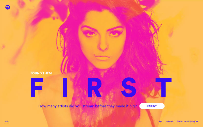
Read about how to apply these trends, then see them practiced in over 160 examples from household sites like Google, Apple, Dropbox, Spotify, BMW, Versace, Reebok, Adidas, and more.
Frequently Asked Questions (FAQs) about Web Design Trends of 2015
What were the most influential web design trends in 2015?
In 2015, several web design trends stood out. These included the use of large, high-quality images and videos as backgrounds, the rise of flat design, and the increased use of micro-interactions. Mobile-first design also became more prevalent, as more users accessed the internet via their smartphones. Additionally, the use of scrolling instead of clicking, the popularity of card design, and the focus on storytelling through design were also significant trends.
How did mobile-first design impact web design in 2015?
Mobile-first design had a significant impact on web design in 2015. With the increasing number of users accessing the internet via their smartphones, designers had to prioritize mobile interfaces. This led to the rise of responsive design, where websites automatically adjust to fit the screen size of the device being used. It also led to simpler, more streamlined designs that are easier to navigate on a small screen.
What is flat design and why did it become popular in 2015?
Flat design is a minimalist design approach that emphasizes usability. It features clean, open space, crisp edges, bright colors, and two-dimensional illustrations. Flat design became popular in 2015 because it is simple, easy to understand, and focuses on content, making it ideal for mobile interfaces.
How did the use of large images and videos as backgrounds influence web design in 2015?
The use of large images and videos as backgrounds became a popular trend in 2015. This trend helped to create visually stunning websites that immediately grab the user’s attention. It also allowed designers to convey a lot of information quickly and effectively, making websites more engaging and interactive.
What is card design and why was it a trend in 2015?
Card design is a design technique where information is presented in ‘cards’ – rectangular or square blocks. Each card typically contains a unique piece of content. This design trend became popular in 2015 because it is highly flexible and works well on a variety of screen sizes. It also makes it easy for users to digest information in bite-sized chunks.
How did the focus on storytelling through design manifest in 2015?
In 2015, there was a shift towards using web design to tell a story. This was achieved through the use of large images, videos, and parallax scrolling effects to create a narrative as the user navigates through the site. This trend helped to create more engaging and emotionally resonant websites.
What are micro-interactions and why were they a trend in 2015?
Micro-interactions are small, subtle animations or design elements that guide the user or provide feedback. They became a trend in 2015 because they enhance the user experience by making websites more intuitive and engaging.
How did the trend of scrolling instead of clicking influence web design in 2015?
The trend of scrolling instead of clicking influenced web design in 2015 by encouraging designers to create longer, more comprehensive pages. This trend was driven by the rise of mobile browsing, where scrolling is often easier and more intuitive than clicking.
How did the web design trends of 2015 influence the design of e-commerce websites?
The web design trends of 2015 had a significant impact on e-commerce websites. The use of large images and videos helped to showcase products more effectively, while the rise of mobile-first design led to more streamlined and user-friendly shopping experiences. Additionally, the use of card design made it easier for users to browse and select products.
How have the web design trends of 2015 influenced current web design practices?
The web design trends of 2015 continue to influence current web design practices. The focus on mobile-first design, for example, has become a standard practice in web design. Similarly, the use of large images and videos, flat design, and micro-interactions continue to be popular. These trends have helped to shape a more user-centric approach to web design.

