Using Texture Tastefully in Web Designs

Texture is not just a passing trend in web design. It’s an essential tool for adding depth and dimension to an otherwise flat page. The best designers know that a website’s texture can draw the viewer’s attention and emphasize important words or images. The right texture and color have the power to transform a web design into an aesthetically appealing, effective website. There are limitless options for adding versatile textures to a site, and proper use of texture can accomplish several design goals:
- Grab Attention: A designer can use texture to focus the eye on headings, titles, icons, footers, call-to-action buttons, artwork, fonts, or logos. Many designers will opt for a textured logo over a clear background, or a clean logo against a textured background for dramatic effect. Typically, the textured part of a website is what tends to appeal to visitors first. It’s easier to process information when visitors know where to look.
- Add Contrast: Texture can provide much-needed contrast for sidebars, information boxes, or other distinct sections of content. In other words, the website architecture is vastly improved with the addition of various thoughtfully-inserted textures. With a little texture, a designer can add more information to the page without it seeming disorganized or overwhelming.
- Provide a Unique Atmosphere: Atmosphere is something most designers take very seriously. The best websites invite visitors into their portals and captivate them for long periods of time. The branding takes center-stage, and there is no doubt as to where the company stands in its policies, products, services, and principles. Everything is clearly spelled out in the design aesthetic – the mood, the images, the colors, and the textures.
- Create Realism: Some designers like their pages to appear like nature – be it ice, water droplets, wood, plants, fur, or some other texture. This realism evokes emotions in the viewer and can be impressive to behold if done properly.
But, at the same time, you certainly can have “too much of a good thing” if you overuse textures in your web designs. Poor use of texture can create a disjointed, chaotic environment that overshadows the main points of the site, or – worse yet – a cliché design that lacks any real creativity or imagination. In recent years, amateur designers have been quick to jump on the texture bandwagon, creating template after template of textured layouts that scour every other WordPress blog and band website. As a result, some designers characterize textured web designs as “grungy” or “unprofessional.”
Texture Tips to Consider
- Legibility is most important. If any part of the website becomes more difficult to read once texture is incorporated, it must be removed. If visitors can’t find the information they want within several seconds, they’re gone – no matter how pretty the site may look.
- Texture should be used minimally and purposefully. Just as a person should not leave the house wearing polka-dots, stripes and plaid at the same time, a designer should not try to stitch multiple textures together that make the content more difficult to enjoy.
- Web developers should pay close attention to loading time in their designs. It is possible to include texture without sacrificing speed and efficiency. Creating a small, seamless tiled image is far better than loading a giant texture file.
Below are twenty-three examples of impressive texture-based designs.
RetroPress

Daily Payne

Corvus Art

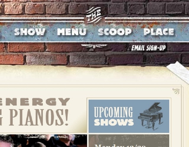
Blue Moon Dueling Piano Bar
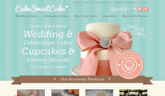
Cake Sweet Cake
The Foggy Goggle

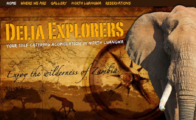
Delia Explorers
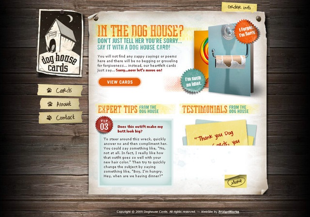
Dog House Cards
Rocket Club

Ryan Scherf

Forever Heavy

Wandering Goat Coffee Company

Lifetree Creative

Foreign Policy Design

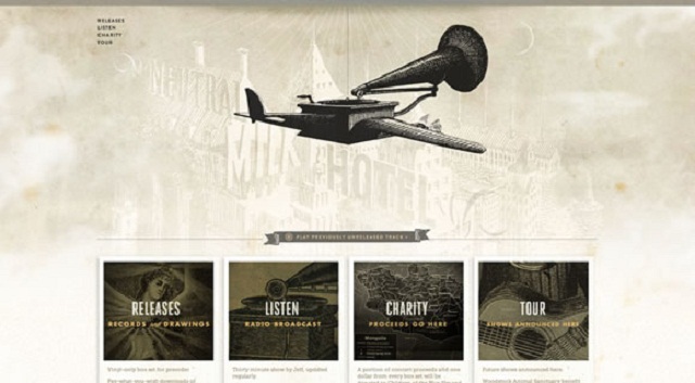
Neutral Milk Hotel
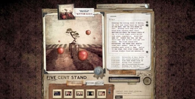
Five Cent Stand
The Third Floor

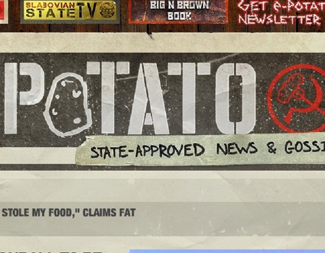
Slabovia.tv
The Cowboy Star

Sienna Online

Marcus James Wine

Allen Solly

Aussie BBQ

When executed tastefully, textured designs showcase the skills of designers with discerning eyes for detail and sophisticated sensibilities.
Do you have any texture-based designs (or texture tips) to share? Do you think textures are a fleeting fad in web design?
Frequently Asked Questions on Textured Web Designs
What are the benefits of using textured web designs?
Textured web designs can significantly enhance the visual appeal of a website. They add depth and dimension, making the design more engaging and interactive. Textures can also help to differentiate various elements on a page, guiding the user’s eye and improving navigation. Moreover, textures can evoke certain emotions or associations, helping to reinforce a brand’s identity and message.
How can I effectively use textures in my web design?
The key to effectively using textures is subtlety. Overdoing it can make your design look cluttered and confusing. Start by deciding where you want to draw attention and use textures to highlight these areas. Also, ensure that your textures align with your overall design theme and brand identity. Experiment with different types of textures – from smooth and sleek to rough and gritty – to see what works best for your design.
Can textures affect the loading time of my website?
Yes, textures can affect the loading time of your website. High-resolution textures can increase the size of your web pages, leading to slower loading times. To avoid this, you can use CSS3 to create textures, or optimize your texture images for web use. Also, consider using a content delivery network (CDN) to speed up the delivery of your textures and other website assets.
What are some common mistakes to avoid when using textures in web design?
Some common mistakes include using textures that clash with the overall design theme, overusing textures, and not optimizing texture images for web use. Also, avoid using textures that make text hard to read. Always prioritize usability and user experience when incorporating textures into your design.
How can I create my own textures for web design?
You can create your own textures using graphic design software like Adobe Photoshop or Illustrator. You can also use a camera or scanner to capture real-world textures. Once you’ve created or captured your texture, you can edit and optimize it for web use using your graphic design software.
Are there any resources for free textures that I can use in my web design?
Yes, there are many online resources where you can find free textures. Websites like Subtle Patterns, Texture King, and Lost and Taken offer a wide variety of free textures that you can use in your web designs. Always check the licensing terms before using a texture to ensure that you’re not infringing on any copyrights.
Can I use textures in responsive web design?
Yes, you can use textures in responsive web design. However, you need to ensure that your textures scale properly on different screen sizes. You can do this by using CSS3 to create scalable textures, or by using vector textures that can be scaled without losing quality.
How can I use textures to improve the user experience on my website?
Textures can be used to guide the user’s eye and improve navigation. For example, you can use a subtle texture to differentiate the navigation bar from the rest of the page. Textures can also be used to highlight important elements or information, making them stand out and catch the user’s attention.
Can textures have an impact on the overall branding of my website?
Absolutely. Textures can evoke certain emotions or associations, helping to reinforce your brand’s identity and message. For example, a sleek and smooth texture might convey a modern and high-tech brand, while a rough and gritty texture might convey a rugged and outdoorsy brand.
How can I experiment with textures in my web design without affecting my live website?
You can use a staging or development environment to experiment with textures and other design elements without affecting your live website. This allows you to test different textures, see how they affect your website’s performance and user experience, and make any necessary adjustments before implementing them on your live website.
By Rachel Alexander, founder of digital agency Alexanders Internet Marketing.