
Key Takeaways
- The CMYK (cyan, magenta, yellow, and black) color wheel is often proposed as a universal color model, replacing the traditional red, yellow, and blue wheel, as it can illustrate both additive (using light) and subtractive (on paper) color. However, it can fail when mixing opaque pigments.
- Despite the move towards digital and the use of the CMYK model, many digital artists still use the traditional red, yellow, and blue color wheel. This is because color schemes and concepts of traditional color theory are based on this model, and the relationships between colors are determined by their relative positions on the color wheel.
- There are flaws in both color wheel models, and no color wheel can fully describe the complexities of how we perceive color from light. The author argues that color combinations created using the red, yellow, and blue color wheel are more aesthetically pleasing, and thus continues to use it as the basis for color selections in design.
Following straight on from the last article in this series on color, Color Theory 101, we’re now going to take a better look at the RGB and CMYK color wheels.
I’m constantly amazed by the lack of respect that exists for the red, yellow, and blue primary color wheel. I’ve heard people call it invalid, archaic, and a kindergarten tool. It’s true that the red, yellow, and blue color wheel is not a scientifically accurate model of the perception of light. Many people want to eliminate the red, yellow, and blue color wheel from art curricula, and establish the CMYK (cyan, magenta, yellow, and black) color wheel, shown in Figure 1, “The CMYK color wheel”, as the universal color model. Note that the secondary colors in the CMYK color wheel are red, green, and blue, meaning that we could use the CMYK to illustrate both additive (using light) and subtractive (on paper) color.
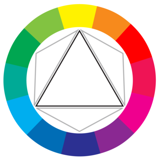
Fig. 1, “The CMYK color wheel”
To illustrate the reasoning behind the push to move to CMYK, I’ve used gouache paints, which are basically watercolors that come in a tube. When mixed with water, they are fairly translucent and produce the colors you would expect to see on the modern CMYK color wheel, as Figure 2, “Playing with CMY gouache paints” shows. Magenta and yellow mix to produce nice shades of orangey reds, while cyan and yellow mix to produce green and minty tones. This is how CMYK printing works. The inks are translucent and the overlap between them (along with the use of black—don’t forget good ol’ K) gives us most of the colors we can see on an additive, light-emitting monitor or TV. As the famous TV painting instructor Bob Ross might have said, “That’s a happy little color model.”
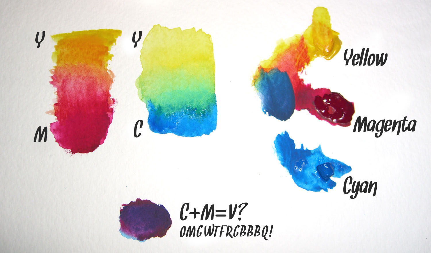
Fig. 2, “Playing with CMY gouache paints” — click for a hi-resolution scan.
Wait! What’s that purple splodge? Yes, equal amounts of cyan and magenta form a violet or purple, instead of the pure blue suggested by the CMYK color wheel. Numerous anomalies like this crop up when we mix opaque pigments. Basically, if your paint is so thick that you’re unable to see the white paper or canvas on which you’re painting, the concepts of a CMYK color wheel start to fail. In this regard, the traditional red, yellow, and blue color wheel developed by Goethe, Itten, and others over the last four centuries or so is a much better model.
But we’re using pixels, not paint! The reason many digital artists still keep a red, yellow, and blue color wheel handy is because the color schemes and concepts of traditional color theory are based on that model. As we’ll see shortly, the relationships between colors are largely determined by their relative positions on the color wheel. But those positions differ depending on the wheel; for instance, on the traditional color wheel, red and green are opposite, whereas on the CMYK wheel, cyan is opposite red. We can’t simply shift the red and blue around the color wheel and call it a day. Because of this, the color schemes that I’ll be discussing in the next few articles are based on the red, yellow, and blue color model.
There are flaws to be found in both color wheel models, and complementary colors are a prime example. But what’s really going to bake your noodle is when I tell you that there is no color wheel that can fully describe the complexities of the way in which we perceive color from light. Even though I design mostly for the Web—a medium that’s displayed in RGB—I still use red, yellow, and blue as the basis for my color selections. I believe that color combinations created using the red, yellow, and blue color wheel are more aesthetically pleasing, and that good design is about aesthetics. Therefore, I’m going to present color theory as I learned it in my sophomore design fundamentals class in college: from the traditional red, yellow, and blue color wheel.
The Principles of Beautiful Web Design
This article is from Jason Beaird’s The Principles of Beautiful Web Design book (second edition is out now!). Be sure to lookout for further articles from the book here on Design Festival.
Frequently Asked Questions about RGB and CMYK
What is the main difference between RGB and CMYK color models?
The primary difference between RGB (Red, Green, Blue) and CMYK (Cyan, Magenta, Yellow, Key/Black) lies in their usage. RGB is an additive color model used for digital displays, including computer monitors and television screens. It combines red, green, and blue light at various levels to create a broad spectrum of colors. On the other hand, CMYK is a subtractive color model used in color printing. It combines cyan, magenta, yellow, and black in various amounts to absorb light rather than emit it, thereby creating the desired color.
Why does my printed work look different from the screen?
This discrepancy often occurs due to the difference between the RGB and CMYK color models. Screens display colors in RGB, which has a wider color gamut or range than CMYK. When you print an RGB image, the printer converts it to CMYK, which may result in color shifts because some RGB colors are out of the CMYK color gamut.
How can I convert RGB to CMYK accurately?
Most graphic design software, such as Adobe Photoshop or Illustrator, allows you to convert RGB to CMYK. However, remember that the conversion may cause some colors to change because the RGB color gamut is wider than the CMYK’s. It’s advisable to manually adjust the colors after conversion to ensure they match your original intention as closely as possible.
What is color gamut, and why is it important?
Color gamut refers to the complete subset of colors that can be accurately represented in a given circumstance, such as within a color space or by a certain device. Understanding color gamut is crucial because it affects how accurately colors can be reproduced. For instance, RGB has a wider color gamut than CMYK, meaning it can represent more colors.
When should I use RGB, and when should I use CMYK?
Use RGB for anything that involves digital screens, such as websites, apps, and video games. On the other hand, use CMYK for anything that involves printing, such as brochures, business cards, and book covers.
What does ‘subtractive’ and ‘additive’ color mean?
Subtractive and additive refer to how colors are formed. In an additive color model like RGB, colors are created by adding light. The more light you add, the brighter and lighter the color becomes. In a subtractive color model like CMYK, colors are created by subtracting light. The more color you add, the darker it becomes.
Why is black represented as ‘K’ in CMYK?
The ‘K’ in CMYK stands for ‘Key.’ In printing, ‘key’ refers to the key plate that impresses the artistic detail or image onto the paper. This plate is usually filled with black ink because black provides the highest contrast and detail in the image.
Can I use both RGB and CMYK in one project?
Yes, you can use both RGB and CMYK in one project, but it’s not recommended. Mixing color models can lead to inconsistent colors, especially when the project is printed. It’s best to decide on one color model at the start of the project and stick to it.
What is color calibration, and why is it important?
Color calibration is the process of adjusting the colors on your screen to ensure they match the standard. It’s important because it ensures that the colors you see on your screen accurately represent the final printed product. Without proper color calibration, your printed work may look different from what you see on your screen.
How can I ensure color consistency across different devices?
Ensuring color consistency across different devices can be challenging due to variations in how devices display colors. One way to achieve this is by using color profiles, which are sets of instructions that tell your device how to display colors. You can also use a color calibration tool to adjust your screen’s colors to match a standard.