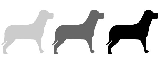
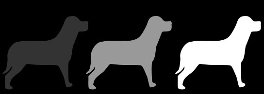
So far in this series we’ve looked at Balance, Proximity and Contrast as principles of design. You’ve seen how applying these concepts can help you organize your information and make it eye catching. Today we’re looking at Value. Value and color as design principles are related to each other but not every design will have color, but every design will have value. So what is value?
Value, also sometimes referred to as tone, is the relative lightness and darkness of an object. It has nothing to do with the price of the design! As soon as you place an object on your blank canvas (whether for print or web) that element has value. In the image below, the value of each of the silhouetted dogs gives a different impression about the dog. Does the dog on the left have blonde hair? Is he in fog?

Value is relative
Every element in your design has a value from 1% black to 100% black. You’re not always going to be working with a white or grey background though. If you’re working on a black background the value will be 1% white to 100% white. This suggests another quality of value. Value is relative.

As you can see in the example above, the value of each dog is relative to the other dogs and also to the background they’re placed on. The greater the difference in value between the object and it’s background, the greater the Contrast. Value is a very powerful tool when creating the look and feel of a design.
Value and color
Although color is incredibly important in design (and we’ll be looking at color next week), the best designs do not rely solely on color to make an impact. A successful design should work well in black and white to begin with, and this is where value comes into play. Let’s take the example of a couple of logos. I’ve taken two logos from Logopond and desaturated them. The first logo looks good in color but the effect partially disappears in black and white and the logo looks weak.

This second logo, while maybe not looking quite as vibrant in grayscale as in color still holds up well.

You could argue that perhaps the first logo was designed to only be used on a website, and if that’s the case, fine. But you should always think (and experiment with) how your design might look in just one color. Does the design fall apart if it appears in a newspaper or a fax?
Value can be used for emphasis. The poster for Jungle Fever shows two hands clasped together with the value of light and dark skinned fingers providing contrast. I’ve mentioned in the previous design principle posts, that these principles rarely work in isolation. This poster also uses balance and repetition to create and eye-catching design.

The Howard Wing website is simple and elegant and uses values very effectively. The large dark-valued photographic backgrounds used throughout the site work well with the light text.

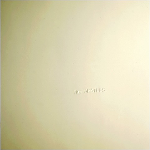
As we’ve seen in the examples so far, value is most often used to create contrast. However, if you want to create a completely different mood, use values to create a lack of contrast. The White Album by The Beatles uses white embossed text on a white background. You can’t really get more subtle than that. The value comes from the hint of shadow cast by the embossed letters.

Image Credit: Beatles Bible
So to sum up, things to think about when using value in your designs.
1. Value occurs in every design. Just by placing an element on a page, value is created. Have you chosen the values or is it an accident?
2. If you want to achieve contrast, are the values of each element different enough?
3. Are the values you’re choosing eye-catching? Do they help move the viewer’s eye through the design.
4. Have you created the right mood with the values you’ve picked. Should the design be subtle or in your face?
Next week I’ll finish this series by looking at color. I hope you can join me.
Frequently Asked Questions about Design Value
What is the concept of value in design?
Value in design refers to the relative lightness or darkness of a color. It is an essential element in the creation of visual art as it sets the mood, creates spatial depth, and highlights the importance of certain elements in a design. Value can be used to bring attention to a particular area within a design, create a certain mood, or to create a sense of depth and space.
How does value contribute to the overall design?
Value plays a crucial role in the overall design. It helps in creating a visual contrast, which is essential for distinguishing between different elements in a design. It also helps in creating a sense of depth and dimension, making the design more realistic and appealing. Moreover, value can be used to guide the viewer’s eye to the most important parts of the design.
How can I effectively use value in my design?
To effectively use value in your design, you need to understand the concept of contrast. Contrast is created by the difference in values. You can use high contrast to draw attention to certain elements in your design, and low contrast to create a sense of harmony and balance. Also, using a range of values can help create a sense of depth and three-dimensionality in your design.
What is the difference between value and color?
While color refers to the hue or the name of a color, value refers to the lightness or darkness of that color. In other words, value is a measure of the amount of light a color reflects. Both color and value are important elements of design, but they serve different purposes. While color can set the mood and create emotional responses, value is used to create contrast and depth.
How does value relate to the principle of emphasis in design?
Value is closely related to the principle of emphasis in design. By using different values, a designer can draw attention to certain elements in a design, making them stand out. This is often used to highlight the most important parts of a design, or to create a focal point.
How can I improve my understanding of value in design?
Improving your understanding of value in design involves practice and study. Experiment with different values in your designs and observe the effects. Also, study the work of other designers and artists to see how they use value. There are also many resources available online, including tutorials and articles, that can help you deepen your understanding of this important design principle.
Can value be used in both monochromatic and colored designs?
Yes, value can be used in both monochromatic and colored designs. In monochromatic designs, value is used to create different shades and tints of a single color, creating depth and contrast. In colored designs, value can be used to create contrast between different colors, making certain elements stand out.
What is the role of value in creating a sense of depth?
Value plays a crucial role in creating a sense of depth in a design. By using a range of values, from light to dark, a designer can create the illusion of three-dimensionality. This is often used in realistic art, but can also be used in more abstract designs to create a sense of space and depth.
How does value contribute to the mood of a design?
Value can greatly contribute to the mood of a design. Light values can create a sense of joy, openness, and positivity, while dark values can create a sense of seriousness, mystery, or sadness. By carefully choosing and applying values, a designer can evoke specific emotional responses from the viewer.
Can value be used to create a sense of movement in a design?
Yes, value can be used to create a sense of movement in a design. By gradually changing the value from one part of the design to another, a designer can create the illusion of movement and flow. This can be used to guide the viewer’s eye through the design, or to create dynamic and engaging compositions.
Jennifer Farley is a designer, illustrator and design instructor based in Ireland. She writes about design and illustration on her blog at Laughing Lion Design.

Published in
·Design·Design & UX·HTML & CSS·Photoshop·Prototypes & Mockups·Review·Sketch·Software·Technology·UI Design·UX·Web·March 11, 2019


