So far in this series, we’ve already looked at how you can improve your design work by applying the principles of Balance and Proximity. Today we’re continuing with the concept of Contrast.
Contrast occurs when two elements on a page are different. For example, it could be different colors between the text and the background color. It could be a heading set in a big, bold, grungy font combined with a sans-serif font (read more about contrast and conflict in typography) for the body text. It could be a difference between a large graphic and a small graphic or it could be a rough texture combined with a smooth texture. Our eyes like contrast.
The important thing about contrast is that the elements should be completely different. Not just a little bit different.
1. Contrast is attractive to the eye
One of the main reasons to use contrast in your designs, whether for print or web, is to grab attention.
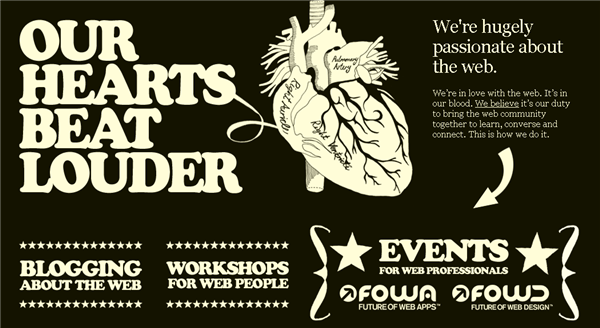
The Carsonified site uses contrast to make an impact. The site has large bold text and images, as well as a reversed out, high contrast color scheme.
This magazine cover for Proximity uses an interesting contrasty image of tiny white boats floating on a deep blue-green sea.
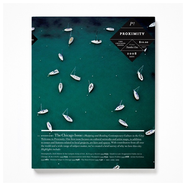
Image Credit: Graphic Exchange
2. Contrast aids organization of information
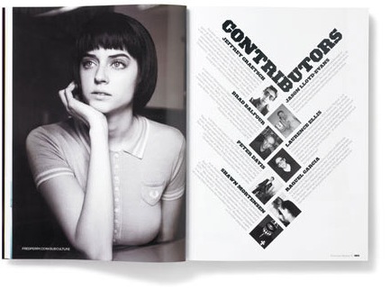
Not only is a page more attractive when contrast is used, but the purpose and organization of the document are much clearer. In the magazine spread below, Studio8 have used Contrast, Balance and Proximity laws to produce an unusual, eye-catching page with the contributors bios. Heavy black type provides a good contrast to the lighter body text.
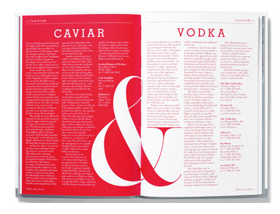
This spread, also by Studio8 is divided into two halves with reversed out type on the left. Each page provides information about two separate but related products. A huge ampersand joins the pages together.
3. Contrast creates a focus
The famous adverts for the iPod expertly used contrast to focus the viewers attention on the music player. The ads featured a silhouetted character on a brightly colored background. The iPod and earphones appear in white and stand out clearly against the silhouettes and colored backgrounds.

The design for this specially commissioned wine bottle relies on the contrast of the white text and doodles against the dark red color of the wine. It works very effectively as a unique Christmas gift.
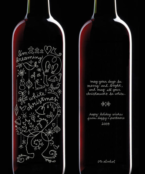
Image Credit: The Dieline
Things to think about when adding contrast to your designs
1. How are you creating contrast? Is it through texture, typography, color, or shape?
2. If you want to achieve contrast through typography, which fonts are you using? Are they very different, or just a little bit different? Be bold with your font choices but remember to make sure the text is legible.
3. Is contrast strengthening your design idea?
If you enjoyed reading this post, you’ll love Learnable; the place to learn fresh skills and techniques from the masters. Members get instant access to all of SitePoint’s ebooks and interactive online courses, like Foundations of Photoshop. Comments on this article are closed. Have a question about Photoshop? Why not ask it on our forums?Frequently Asked Questions on Principles of Design: Contrast
What is the role of contrast in design?
Contrast is a fundamental principle in design that helps to distinguish between different elements and create visual interest. It can be achieved through variations in color, size, shape, and other attributes. By creating contrast, designers can guide the viewer’s attention, highlight important elements, and enhance the overall aesthetic appeal of a design. It’s a powerful tool that can make designs more engaging and effective.
How can I effectively use contrast in my designs?
To use contrast effectively, you need to understand its purpose in your design. Are you trying to highlight a specific element, guide the viewer’s attention, or simply create visual interest? Once you know this, you can experiment with different attributes like color, size, shape, and texture to create contrast. Remember, contrast is not just about making things different, but making them different in a way that serves your design’s purpose.
Can contrast be used in color design?
Absolutely! Contrast in color design is not only possible but also highly effective. You can create contrast by using colors that are opposite each other on the color wheel, or by using different shades, tints, or tones of the same color. This can help to highlight specific elements, create a certain mood, or guide the viewer’s attention.
What are some common mistakes when using contrast in design?
Some common mistakes include overusing contrast, which can make a design look chaotic and confusing; not using enough contrast, which can make a design look flat and boring; and using contrast without a clear purpose, which can make a design look inconsistent and disjointed. To avoid these mistakes, always have a clear purpose for your contrast and use it in moderation.
How does contrast relate to other design principles?
Contrast is closely related to other design principles like balance, emphasis, and unity. For example, you can use contrast to create a focal point (emphasis), balance out different elements, or create a sense of unity by contrasting similar elements. Understanding how these principles interact can help you create more effective designs.
Can contrast be used in typography?
Yes, contrast can be a powerful tool in typography. By varying the size, weight, style, or color of your type, you can create contrast that guides the reader’s attention, creates hierarchy, and adds visual interest. Just remember to keep readability in mind when using contrast in typography.
How can I learn more about using contrast in design?
There are many resources available for learning about contrast in design. You can read books on design principles, take online courses, or even experiment with contrast in your own designs. The key is to practice and experiment, as this will help you develop an intuitive understanding of how contrast works.
What is the psychological impact of contrast in design?
Contrast can have a significant psychological impact in design. It can guide the viewer’s attention, evoke certain emotions, and even influence perceptions and behaviors. For example, high contrast designs can create a sense of excitement and energy, while low contrast designs can create a sense of calm and tranquility.
Can contrast be used in web design?
Definitely! Contrast is a crucial principle in web design. It can be used to guide the user’s attention, highlight important information, and enhance the overall user experience. For example, you can use contrast to make your call-to-action buttons stand out, or to differentiate between different sections of your website.
How can I evaluate the effectiveness of contrast in my designs?
Evaluating the effectiveness of contrast in your designs can be subjective, but there are a few strategies you can use. You can ask for feedback from others, conduct user testing, or even just step back and look at your design from a distance. If the contrast is serving its purpose – whether that’s guiding attention, highlighting information, or creating visual interest – then it’s likely effective.
Jennifer Farley is a designer, illustrator and design instructor based in Ireland. She writes about design and illustration on her blog at Laughing Lion Design.

