
With today’s snazzy and competitive “Web 2.0” and social media world, universal design is many times forgotten. It’s bewildering as to why since there are many social, technical, financial, and legal reasons which support universal design practices. Let’s discuss some of the more prevalent issues in websites today, and how they relate to the main universal design principles.
Key Takeaways
- Universal web design is often overlooked despite its social, technical, financial, and legal benefits. Common mistakes include difficult-to-read text, unclear text links, excessive visual noise, lack of keyboard access, and missing alternative text for images.
- Text readability is crucial for universal design. Small-sized text and low color contrast can make web typography difficult to read. Using relative sizing in CSS rather than fixed sizes can help ensure the user is able to resize the text as needed.
- Keyboard access is essential for universal design. Many websites fail to provide this, creating barriers for users. Good practices include providing a :focus state in CSS if the :hover pseudo class is used, and ensuring that if a mouse event is designed, equal access for the keyboard is provided.
- Providing alternative text for images is another key aspect of universal design. If an image provides relevant content, it must be accompanied with alternative text to ensure accessibility for all users, including those with visual impairments or slow internet connections.
The Principles
First, let’s review the seven universal design principles including some web-related examples. Keep in mind that these principles are applied, of course, to many industries outside of computer and web, such as civil engineering (buildings, walkways), entertainment (movie theaters, theme parks), and transportation (buses, trains).
- Equitable use: useful and marketable to people with diverse abilities.
Example: A local government’s website is designed so that it is accessible to those who are using assistive technology such as a screen reader. - Flexibility in use: accommodates a wide range of individual preferences and abilities.
Example: Design of an airline website maintains visual aesthetics in various computer display sizes. - Simple and intuitive: easy to understand, regardless of the user’s experience, knowledge, language skills, or current concentration level.
Example: Primary controls of a web application are labeled with both text and symbols. - Perceptible information: communicates necessary information effectively to the user, regardless of ambient conditions or the user’s sensory abilities.
Example: An instructional video with captions provides the option to read the dialogue in addition to listening. - Tolerance for error: minimizes hazards and the adverse consequences of accidental or unintended actions.
Example: A technical error when submitting a form provides a clear explanation and options for how to continue. - Low physical effort: can be used efficiently and comfortably, and with a minimum of fatigue.
Example: Website design has sufficient color contrast and text size which minimizes eye strain. - Size and space for approach and use: Appropriate size and space is provided for approach, reach, manipulation, and use regardless of the user’s body size, posture, or mobility.
Example: A website is designed so that a physically impaired user who cannot use a mouse can still access all the content with a keyboard (or onscreen keyboard!).
Now that we are familiar with the principles, let’s examine several related web design issues.
Difficult to Read
The first popular mistake in Universal Design is textual content which, because of its design, is difficult for many to read. This relates to Principles 1, equitable use; and 6, low physical effort, specifically, eye strain. Note that cognitive reading difficulty is a separate issue not within the scope of this article. Good readability makes a website more usable and aesthetically pleasing. By the way, check out the Readability.com web application for super easy reading.
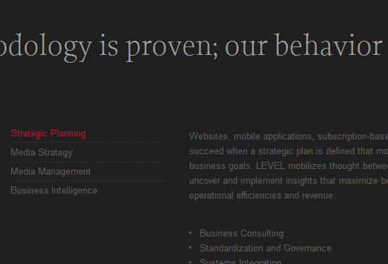
So what are the issues? Small-sized text and low color contrast are two key problems which make web typography difficult to read. In the example below, the main textual content is gray over a black background which fails Difference in Brightness and Difference in Colour tests. The text size is set to 12 pixels which is fairly small for many users, including myself. When removing the text size from the CSS, the browser displays the default size which is slightly larger, and much more readable! So instead of setting the default text to 12px or .75em, try a little higher like 16px or .95em.
Another best practice relating to text is to use relative sizing in the CSS (ems or percentages) rather than fixed sizes (pixels or points) to help ensure the user is able to resize the text in the browser as needed and have the layout scale with the text. Other good guidelines including provide user-friendly headings and ample line-spacing.
Difficult to Determine Text Links
By default, hyperlinked text is rendered with an underline. This is a long-standing convention in web browsing. Removing this convention not only breaks user expectations, but may make the link inaccessible to those with color-blindness or low vision. Many times compounding this problem is when links are defined with a dark color among black text. Similarly to the issue above, this relates to Principles 1 and 6.
My optometrist tells me that beginning around age 40, men’s eyesight begins to lose its ability to distinguish between colors. And boy is she right! Many websites have dark blue links with no underline, and I sure have to strain my eyes to determine the text links. The example below is from a news story. Can you see the text link? It’s quite difficult for me.

News websites seem to be notorious for using blue links with removed underlines, even from the distinguished UK site The Telegraph. To solve, simply remove the barrier by returning the underline. The Nomensa blog is a good example. Optionally, use bold text, or another visual denotation for a text link such as a colored background.
Visual Noise
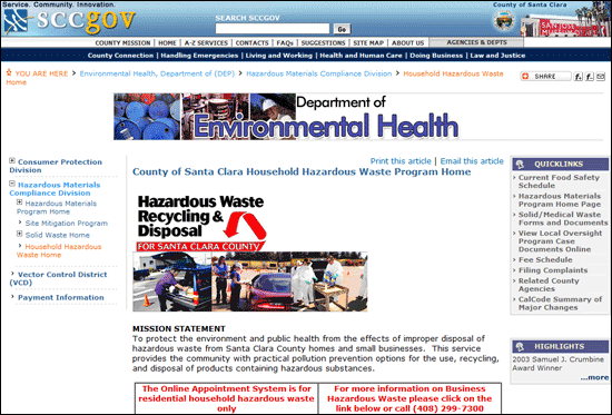
Scattered layouts and content overload is not only visually unappealing, but not very usable nor accessible. This directly relates to Principle 3, simple and intuitive. In a Californian local government web page, shown below, there are numerous navigation areas, two large subsection banner images, and just an unorganized, scattered appearance. As a result, the main content doesn’t begin until the “fold” of the page, which is obviously not ideal. Also, there is no focal point, no visual hierarchy, causing a user to be even more likely to frantically search the page for what the user needs.
By contrast, check out the Australian Government and USA.gov websites; much more spacious and organized which creates a more usable experience.
More examples which create “visual noise” are:
- Navigation: Too many sections of navigation on a page (as in example above) and too many levels of navigation can be confusing as well as a design nightmare.
- Redundant tooltips: Title attributes on text links which have the same content as the link itself creates a tooltip that is obtrusive and unneeded.
- Meaningless images: only use an image in content when it has value; it should convey meaning important to the textual content.
No Keyboard Access
Keyboard access, the ability to navigate a screen and interact with focusable objects using the keyboard alone, is essential. Unfortunately, many websites don’t provide this. More accurately stated, many websites create barriers to keyboard users since HTML is inherently keyboard-accessible. If you design for a mouse event, be sure to provide equal access for the keyboard. This creates device-independence; that’s a good thing! This issue relates to Principles 1, equitable use; and 2, flexibility in use.
When coding a website, there are several good practices to consider. In CSS, if the :hover pseudo class is used, ensure that a :focus state is also provided. Also, one should never remove the outline on the anchor element, i.e. a { outline: 0 } (be wary: most CSS reset stylesheets remove anchor outlines — be sure to add them back in in your own CSS later!). If it is absolutely necessary, then some kind of visual effect must replace it.
In JavaScript, do not use the double-click handler (onDblClick) because keyboards cannot execute this behavior. If the onMouseOver and onMouseOut JavaScript handlers are used, the onFocus and onBlur events must also be implemented to allow for keyboard access.

Missing Alternative Text for Images
If an image provides relevant content it must be accompanied with alternative text. When the image cannot be seen—as would be the case with blind users, low-band users, and broken image links—then the “content” of the image still needs to be accessed. This issue, like above, relates to Principles 1 and 2. The most popular method to provide alternative text is enter the text in the image element’s alt attribute.
Many images such as graphical charts, comics, and infographics on the web do not provide a “long description” in the alt text and therefore block many users of its content. The Web Axe blog corrects some examples of this in its series “Fixing Alt”. For more about long descriptions, check out my two-part article Longdesc & Other Long Image Description Solutions.
Here are some guidelines for alternative text:
- If text is embedded in the image, add it to the alt attribute.
- If an image is decorative only, it should contain an empty
altattribute. (e.g.<img src="decoration.png" alt=""/>). - For some images, such as charts and artwork, longer descriptions are needed.
- If an image with a link contains content, then the alternative text should describe the function of the link, not the image itself.
The Takeaway
The seven universal design principles are an excellent resource when designing a website, as well as other products. People use a computer differently, and access the web differently. By keeping this mind, a web designer will be more successful in creating websites that are attractive, user-friendly and accessible to all.
Further Reading
- Universal Design for Web Applications (O’Reilly Media) by Wendy Chisholm, Matt May.
- Universal Usability, online book by Sarah Horton.
- Universal Design of Instruction, University of Washington DO-IT program.
- Principles of Universal Design, College of Design, North Carolina State University.
- The Universal Design File: Designing for People of All Ages and Abilities (Journal) by Molly Story, James Mueller, Ron Mace.
Frequently Asked Questions on Universal Web Design
What is Universal Web Design and why is it important?
Universal Web Design (UWD) is a design approach that aims to create websites and web content that can be accessed and used by as many people as possible, regardless of their abilities or the devices they use. It is important because it ensures that everyone, including people with disabilities, can access and use web content effectively. It also improves the overall user experience, making websites more user-friendly and easier to navigate.
How does Universal Web Design differ from traditional web design?
Traditional web design often focuses on aesthetics and functionality for a general audience. On the other hand, Universal Web Design takes into account the diverse needs of all users, including those with disabilities. It emphasizes accessibility, usability, and inclusivity, ensuring that web content is accessible and usable by everyone, regardless of their abilities or the devices they use.
What are some common mistakes in Universal Web Design?
Some common mistakes in Universal Web Design include not considering the needs of all users, not making web content accessible to people with disabilities, not testing the website on different devices and browsers, and not following web accessibility guidelines and standards. These mistakes can lead to a poor user experience and limit the accessibility and usability of the website.
How can I make my website more accessible and user-friendly?
There are several ways to make your website more accessible and user-friendly. These include using clear and simple language, providing alternative text for images, ensuring that the website is navigable with a keyboard, using a logical and consistent layout, and providing captions for videos. It’s also important to test your website on different devices and browsers to ensure that it works well for all users.
What is a web browser and how does it affect Universal Web Design?
A web browser is a software application that people use to access the internet and view web pages. It affects Universal Web Design because different browsers may interpret and display web content differently. Therefore, it’s important to test your website on different browsers to ensure that it works well and looks good on all of them.
What are some examples of Universal Web Design?
Examples of Universal Web Design include websites that are easy to navigate with a keyboard, websites that use clear and simple language, websites that provide alternative text for images, and websites that provide captions for videos. These features make the website more accessible and usable for all users, including those with disabilities.
How does Universal Web Design benefit businesses?
Universal Web Design benefits businesses by improving the user experience, increasing customer satisfaction, and expanding the potential customer base. By making their websites more accessible and user-friendly, businesses can reach a wider audience, including people with disabilities. This can lead to increased traffic, higher conversion rates, and improved customer loyalty.
What are some resources for learning more about Universal Web Design?
There are many resources available for learning more about Universal Web Design. These include online tutorials, webinars, books, and courses. Some reputable organizations that provide resources on Universal Web Design include the World Wide Web Consortium (W3C), the Web Accessibility Initiative (WAI), and the National Center on Disability and Access to Education (NCDAE).
How can I implement Universal Web Design in my existing website?
Implementing Universal Web Design in an existing website involves making changes to improve accessibility and usability. This may include adding alternative text for images, making the website navigable with a keyboard, using a logical and consistent layout, and providing captions for videos. It’s also important to test the website on different devices and browsers to ensure that the changes have improved the user experience.
What is the future of Universal Web Design?
The future of Universal Web Design is likely to involve more emphasis on accessibility and inclusivity, as more businesses recognize the importance of making their websites accessible to all users. Advances in technology, such as artificial intelligence and machine learning, may also play a role in making websites more accessible and user-friendly. Additionally, there may be more regulations and standards to ensure that websites are accessible and usable by everyone.