Dial-a-Style #4: Nailing the Pop Art Look

Key Takeaways
- Pop art, originating in Great Britain in the mid 1950s, was a commentary on contemporary consumer culture and a departure from the deep, philosophical meanings of previous art movements. Instead, it focused on bold, simple shapes and bright colors.
- The movement was popularized in the United States in the late 1950s, becoming the new avant-garde standard until the late 1960s. American Pop Art often incorporated irony and parody, while British Pop Art focused on specific subjects and references.
- Key figures in the pop art movement included Andy Warhol, known for his use of commercial and industrial techniques, and Roy Lichtenstein, who created parodies and commentary within hand-painted comic strips.
- To achieve the pop art look, artists should be free with their color palette, focusing on primary colors, and aim for “instant meaning” in their work. The goal is to make the ordinary extraordinary, transforming everyday objects and consumer goods into works of art.
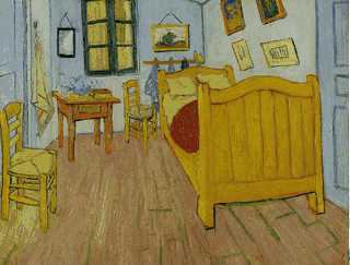
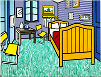
Roy Lichtenstein’s ‘Bedroom in Arles’ in 1992.
Pop art: the word probably conjures up images of soup cans and colorful Marilyn Monroes for you.
A commentary on both the contemporary consumer and the culture, pop art delved into a world without looking for deep and philosophical meanings. It was a complete departure, and an active backlash against the art movements before it.
Like most artistic movements, pop art has its specific techniques and subject matters. The focus settled on culture and mass consumerism and art techniques that were typically embodied within classic fine art were transformed or abandoned altogether with pop art.
Bright vivid colors often accompanied bold, simplistic shapes and soft lines for a distinct and recognizable shape.
The Beginning
Despite its association with New York, pop art had its true conception in Great Britain during the mid 1950s.
The movement emerged shortly after World War II, but it was Lawrence Alloway, a British curator who actually coined the term ‘pop art’ in 1955.
Pop art actually didn’t make its presence known in America until the late 1950s, where it went on to become the new, avant-garde standard until the late 1960s.
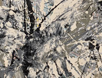
Pollock’s Number 28, 1950
Like most art movements, pop art was a direct response to the prevailing movement of the time – Abstract Expressionism.
After World War II, ‘high art’ quickly came to be defined by abstract expressionists like Jackson Pollock, who were obsessed with energy, movement, color and texture. At the same time — unlike almost all artists before — they generally shied away from clearly recognisable figures or subjects.
“Why bother painting things?” they said.
While this was a revelation with art critics, the general public often rolled their eyes at this ‘spatter art’.
Pop art not only returned recognisable subject matter to center stage — it plucked some of the most mundane advertising, celebrities snaps and comics from consumer culture, and dared to hang it on the gallery walls.
Pop artists loved painting things.
British and American Pop Art
While both Great Britain and North America engaged in the art pop movement, they used completely different styles, mediums and subject matter.
American Pop Art on a whole incorporated irony and parody for a more kitschy and aggressive feel. They translated the culture they lived in within their work and employed more commercial techniques like silk screen printing.
British Pop Art took a different approach by using references and focusing on specific subjects. As they did not have first-hand experience with American culture, they in turn channeled their view of American pop culture into their imagery with a British touch.
Key Players of Pop Art
Andy Warhol
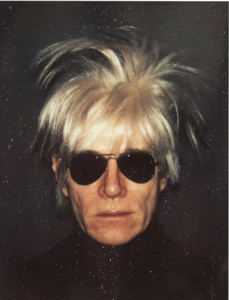
Andy Warhol (1928-1987) an American artist is almost certainly the most famous and recognizable artist of the pop art movement.
Before joining the revolutionary movement he was a successful commercial artist in New York where he focused his time in magazine illustration and advertising. It was around 1949 where he began to experiment with popular consumer items like shoe advertisements.
Warhol’s style consisted of highly decorative and whimsical elements that were often coupled with a touch of comic which gave his work a more personal tone compared to other fine art.
One of the first artists who adopted traditional commercial and industrial techniques within his work, Warhol implemented silkscreen printing to create his paintings.
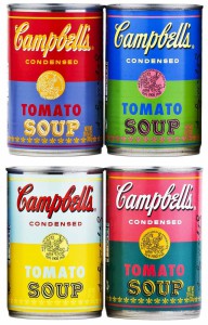
It wasn’t until the 1960s that Warhol began producing some of his most iconic works with paintings of popular American products like Campbell soup cans, Coca-Cola bottles and the dollar bills. His celebrity centered work featuring the likes of Marilyn Monroe, Elizabeth Taylor and Marlon Brando also came about.
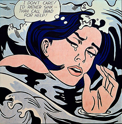
Roy Lichtenstein

Roy Fox Lichtenstein (1923-97) was another American pop artist who served to be one of the great pioneers of the art pop movement with the likes of Warhol, Rosenquist and Johns. His works, like Warhol’s, were iconic and instantly recognized.
Originally an abstract artist, it wasn’t until Lichtenstein met Allan Kaprow while taking up a teaching job at Rutgers University. It was there that Lichtenstein began his journey into the movement of pop art as he began to create free-hand paintings with comic strip frames.
Within his work Lichtenstein created parody and commentary within these hand painted comic strips as not only was he inspired by comics but popular culture as well.
Lichtenstein, like Warhol, adopted commercial techniques like silkscreen printing to create his work. He, however, added a more mechanical reproduction and is most known for his work showcasing the Ben-Day Dots printing process.
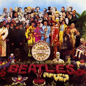
Sir Peter Blake

Sir Peter Thomas Blake (1932) is an English artist of the pop movement and one of the more readily known British pop artists. Most famously known for the artwork he created for the Beatles’ “Sgt. Pepper’s Lonely Heart Club Band” album cover, Blake has created other notable works as well.
Considered by some as the “Godfather of Pop Art” and one of the founding pioneers within British Pop Art, it was his feature in Ken Russell’s pop art film “Pop Goes the Easel” where Blake gained vast attention. However, it wasn’t until notorious London art dealer Robert Fraser began to showcase his work that Blake truly made connection with those imbedded deep into pop culture.
Nailing the Look
Rule #1: Crank the Color
If there is one thing every designer can take away from pop art it is to be free with your color palette. Color was such a powerful tool during the art movement that you would be hard pressed to find an artist who stuck with muted tones. From this we learn that it is okay to push and test your color boundaries.
Since colors were often vivid it was no surprise that the predominant colors seen in pop art works were the primary colors, red, blue and yellow. These colors were not used to reflect the artist’s emotional state but the state of pop culture.
Color is not the only factor when going for the pop art style. Bold, thick black lines often seen in Lichtenstein’s work renders that comic book style. The use of contrasting elements is also a technique utilized.
Rule #2 Instant Meaning
As pop art dealt with pop art, it was essential that the subject matter was instantly understood. Unlike the art movements before, the need for deep philosophical meaning wasn’t prevalent.
To depart from the fine art and traditional agenda artists incorporated commercial processing, acrylic paints instead of oils and other materials not associated with fine art painting. This was done in order to achieve the goal of “instant meaning”.
Furthering their ideal, pop artists also began to borrow from already high-profiled and easily recognizable consumer goods. From here they developed their color schemes and imagery which helped create an immediate connection with the viewing public.
This is what made pop art so accessible.
Rule #3 Make the Ordinary Extraordinary
Pop art was all about the simple and basic of items as well as form. Artists like Warhol transformed objects like cans and bottles into something that made you stop while artists like Lichtenstein put their own spin on already created art.
Artists intentionally took these objects, especially if they were consumer goods, and scaled them to ridiculously large proportions.
Just like with the Dada art movement it was determined that art could be anything and made out of anything. Pop artists expanded on this idea and therefore were not afraid to introduce items not typically seen as aesthetically pleasing into their work. No matter the object or material, it would be used if considered right for the piece of art.
Who’s Nailing the Pop Art Look?
Mega Cultural
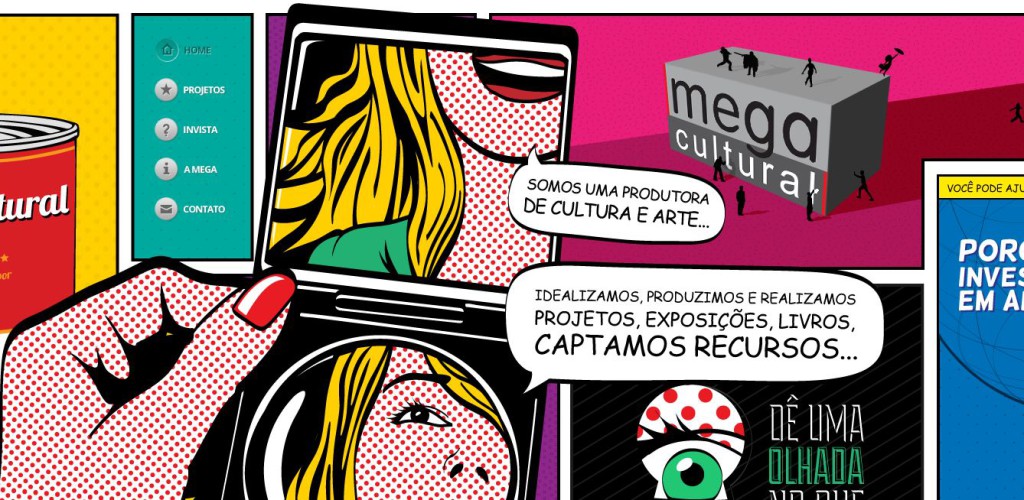
There are many different ways to employ the pop art look to your website as Dona Baronesa Design Studio shows.
Clearly research was put in with how accurate it nails this looks that takes on the comic book layout, word bubbles and all.
Katy Perry Color Pop Lashes

Pop art was all about pop culture and consumerism so it makes perfect sense to see the design aesthetic on package designs.
Katy Perry may be the perfect pop art princess, and her Katy Perry Color Pop Lashes looks like something Lichtenstein would design — complete with requisite bold colors and ben day dots.
Will Fernandes
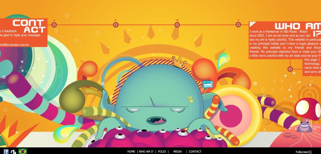
It isn’t always necessary to nail every aspect of a movement in order for something to be considered it.
Will Fernandes uses a bevy of techniques for his website but it is the bright vivid colors that truly makes the site “pop” enough to be considered pop art inspired.
Kevin Bourgeois

Web and packaging design aren’t the only areas that are being given the art pop treatment. The artwork by New York artist Kevin Bourgeois takes the trend of using faces in pop art and turns it into what could be seen as socio-political pop art.
Frequently Asked Questions about Pop Art Style
What is the significance of bright colors in pop art?
Bright colors are a defining characteristic of pop art. They are used to grab attention and make a bold statement. The use of bright colors in pop art is a reflection of the consumer culture that the movement was reacting to. These colors were often seen in advertising and mass-produced goods, and by using them, pop artists were both critiquing and celebrating this aspect of modern life.
How can I incorporate pop art style into my own artwork?
Incorporating pop art style into your own artwork involves embracing bold, vibrant colors, and often includes using commercial images or everyday objects. Pop art is all about making a statement and challenging traditional notions of what art should be. You can start by experimenting with different color palettes and incorporating images from popular culture.
What are some common themes in pop art?
Pop art often deals with themes of consumerism, popular culture, and mass media. It’s a reaction to traditional art forms and often uses images from advertising, comic books, and everyday objects. The goal is to challenge the status quo and make art more accessible to the general public.
How did pop art influence modern design?
Pop art has had a significant influence on modern design. Its bold, vibrant colors and use of everyday images have been embraced by graphic designers and advertisers. It’s also influenced fashion, interior design, and even architecture. The pop art movement helped to blur the lines between high art and popular culture, and its influence can still be seen today.
What materials are commonly used in pop art?
Pop artists often use a variety of materials in their work, including acrylic paint, collage, and screen printing. They also frequently incorporate images from popular culture, such as advertisements, comic books, and everyday objects. The goal is to create art that is accessible and relatable to the general public.
How can I learn more about pop art?
There are many resources available for learning more about pop art. You can start by visiting art museums or galleries that feature pop art, or by reading books on the subject. There are also many online resources, including articles, blogs, and video tutorials.
Who are some famous pop artists?
Some of the most famous pop artists include Andy Warhol, Roy Lichtenstein, and Jasper Johns. These artists are known for their bold, vibrant artwork and their critique of consumer culture.
How can I create a pop art color palette?
Creating a pop art color palette involves choosing bold, vibrant colors. You can start by looking at the work of famous pop artists for inspiration. You can also use online tools to help you create a color palette.
What is the history of pop art?
Pop art emerged in the mid-20th century as a reaction to traditional art forms. It was a movement that embraced popular culture and consumerism, and it sought to make art more accessible to the general public. The movement began in Britain and soon spread to the United States and other parts of the world.
How has pop art evolved over time?
While the core principles of pop art have remained the same, the movement has evolved over time. Today, pop artists continue to use bold colors and everyday images, but they also incorporate new technologies and mediums. The influence of pop art can be seen in many areas of modern design, including graphic design, advertising, and fashion.
Gabrielle is a creative type who specializes in graphic design, animation and photography.