When one country’s economic downturn affects the rest of the globe immensely, it’s apparent we all live in an intertwined system. The Internet and the personal computer have played a big role in bringing us all together, but still a large portion of people are being left out due to the high cost of a PC. The mobile phone is changing this, allowing citizens everywhere to access the Internet, turning the planet into a truly global village where everyone can communicate with each other.
Whether it’s teenagers in South London, families in Buenos Aires, or businessmen in Kampala, computer users across the globe can now obtain information via the Internet on their mobile phones. This might even be more exciting than the One Laptop per Child project. Now, more than ever, knowledge can be accessible to all. This is good news, but what are the ramifications of expanding mobile web access for web site developers?
The Road to Standardization
As you’d expect, there are still some hurdles that need to be overcome in order to truly become a global online community through the mobile web. The small screen size and lack of JavaScript support means that most web sites created for a computer work inadequately when viewed on a phone; a full-sized web site requires the user to scroll up/down and left/right to view the whole content. Also, most internet operators’ networks are closed, meaning … and each operator has its own rules. And internet costs can vary widely, depending on the operator, the country, and roaming charges.
Subtle differences between manufacturer’s mobile phones and how browsers interpret web pages can add up; some even strip out device information – making it impossible to serve your site correctly to their customers. Promoting your mobile site to a large number of people is difficult, and the screen size and resolution you have to work with is tiny. Of course, looking at the negatives might make it seem there are too many obstacles to bother with, especially for a designer, but the medium’s potential is great. It’s like the Wild West out there, complete with all its opportunities. Can you remember the Internet of 1995? Compare that to the Web today. There’s been a giant leap in usability, uses, and ubiquity. Without global participation, the progress we see today would not have been made.
There are organizations working towards a larger scale road map for standardization in the mobile industry. The mobile section of W3C is developing the best practices for mobile-ready web sites. The Mobile Marketing Association is tackling marketing issues, thinking about the profitability angle, which is essential for the medium to survive and expand.
A greater understanding of what the Internet via your mobile device really means has to – and will – happen. What will it mean to you as a web designer or marketing professional? What about the average mobile phone user? What does the average user want from this medium? How can we make it better?
The only way to answer these questions is to take part in the evolution yourself. Regardless of who you are or what you do for a living, the Web on the go is for people like you.
Even Your Parents Could Do It
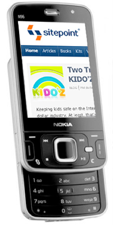
Become familiar with the medium by creating your own mobile-ready standards-compliant web site. It’s surprisingly easy. There are several companies out there that offer excellent site builder wizards. They’ll host your new mobile web site for free, often in exchange for an ad on your page, or give you the option of hosting yourself or using your own domain name.
Swift gives you a quite powerful interface to make your own mobile-ready web site. Other site builders are available – I’ll look at these later on – but I’ll use Swift to demonstrate how you can create a mobile-friendly site. Before going any further I’ll give you the full disclaimer: I used to work over at Proteus (now known as 2ergo), the company behind Swift. I was involved with other projects, but I always kept an eye on Swift’s development because I like how it puts the power in people’s hands. I liken the situation to how it would have been if Macromedia gave Dreamweaver away for free back in 1997; 2ergo are giving away a tool that allows anyone to create a standards-compliant web site, specially formatted for every browser or device it might possibly be viewed on. That’s a big deal.
Try It, I Dare You!
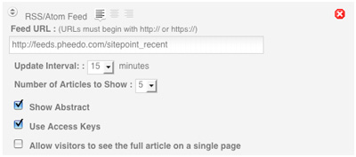
A very powerful aspect of Swift is that it allows you to pull in an RSS feed for content. This means that if you have a blog, you can create a mobile-ready version in a few simple steps. Or, you could create a site that consists of your favorite blog, news sites, or any other content available via RSS. Nifty!
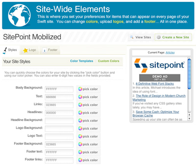
Swift also enables you to add color – using a template or your own custom colors – upload your logo, and put in a site-wide footer.
Once you’ve personalized your site with Swift’s features, your blog’s ready for anyone with a web-enabled mobile phone. Now all you need to do is make your mobile site known to the masses. Go to the goodies section to share with friends, send an SMS or email, or create a widget to integrate into your own web site (this lets your regular visitors send themselves a link to their phone).

Once you start receiving visitors, you can track them with the built-in reporting tools.
There are several other products out there that do similar things to Swift.
So, try it out to see what works for you. Remember that web site content for mobile devices will differ in some way from what you’re used to. But think about the vast audience you may be able to reach. Will commuters across the globe enjoy your ramblings about emerging tech? Can they see the pictures? Does their mobile operator have a reasonably priced data plan for the Web to be really useful?
These are all questions that need to be addressed, and the only people who can answer them are us. Be vocal about your experiences as you can influence the technology, price structures – indeed, the future of the mobile Web. The Internet had to evolve according to users’ needs to reach Web 2.0 status. Here’s your chance to be part of the next big development.
 Halla Kolbeinsdotir
After a decade abroad in the USA and England, Iceland native, Halla Kolbeinsdóttir returned home in January 2008 to live. She now works at Nova ehf, Iceland’s 3G carrier, where she tries to keep the carrier portal and web site interesting and usable. Before returning to Iceland, Halla spent her time on the East Coast of the United States. Here she launched mobile-related web sites like THQ Wireless and various mobile storefronts for Disney/Touchstone movies.