

The web is predominantly rectangular. On the other hand, print media tends to be more varied in shape. Among the many reasons for this difference is a lack of appropriate tools to achieve what we have in print media.
This tutorial will introduce you to clip-path, a property which allows you to prevent a portion of an element from being displayed. The region that is visible is governed by the values you provide. We will begin with the basics, then cover the syntax and later on move to more advanced concepts.
Key Takeaways
- The CSS clip-path property allows developers to hide or display portions of an element, providing more design flexibility than the deprecated clip property which only supported rectangular clipping.
- The clip-path property accepts basic shapes, geometry boxes or a URL referencing an internal or external SVG
element, allowing developers to create complex shapes and animations. - Animation can be added to the clip-path property, but the number of vertices in the final and initial shapes must be the same to ensure a smooth transition.
- While the clip-path property is not supported by all browsers, most modern ones including Chrome, Safari, and Opera do support it with the appropriate prefix. Firefox supports the property partially.
The Basics
Clipping is when we trim a piece from something. In our case, it is an operation which allows us to completely or partially hide elements on a web page. Two other concepts that relate to clipping which we will use in this article are clipping path and clipping region.
Clipping path is the path we use to clip an element, it marks out our clipping region. It can be a basic shape or a complex polygonal path. The clipping region then includes all the area enclosed within the clipping path.
Anything outside the clipping region is clipped by the browsers. This not only includes backgrounds and other such content but also borders, text-shadows and so on. Moreover, browsers won’t capture any events like hover or click outside an element’s clipping region.
Even though our specific element is now non-rectangular, the content around the elements flows exactly the way it would have if the element had its original shape. To make the surrounding elements flow according to the shape of the clipped element, you will have to use the shape-outside property. This has been covered in detail in this SitePoint tutorial.
Also, keep in mind that you do not want to confuse this property with the deprecated clip property which was very restrictive and only supported rectangular clipping.
Syntax and Usage
The correct syntax for using this property is:
clip-path: <clip-source> | [ <basic-shape> || <geometry-box> ] | none
The syntax values above include:
clip-sourcewill be a URL referencing an internal or external SVG<clipPath>element.basic-shapeaccepts the basic shape function defined in the CSS Shapes specification.geometry-boxis optional. When you provide it along with thebasic-shapefunction, it acts like a reference box for the clipping done bybasic-shape. Ifgeometry-boxis specified by itself, then it uses the shape of specified box, including any corner shaping (provided by theborder-radiusproperty) as the clipping path. We will explore this further soon.
Now, consider the following CSS code which uses the basic shape function:
img {
  clip-path: polygon(50% 0%, 100% 50%, 50% 100%, 0% 50%);
}
It will clip all the images in the shape of a rhombus. But why are the images being clipped in shape of a rhombus and not a trapezium or parallelogram? It all depends on the value of your vertices. The following diagram illustrates the conventions to be used when you are creating your own polygon shapes for clipping:
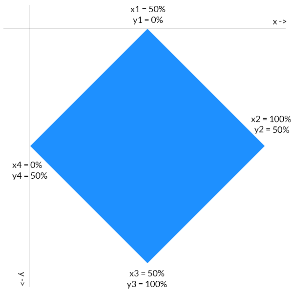
The first coordinate of each point determines its location on the x-axis. Similarly, the second point specifies its location on the y-axis. The points are all plotted in a clockwise direction. Consider the rightmost point of our rhombus. It is located half way down the y-axis, so its y coordinate is 50%. It is also located at the extreme right position on the x-axis, so its x coordinate is 100%. Values of all other points can be deduced similarly.
Clipping Elements With geometry-box Values
When you are clipping a HTML element the geometry-box (or reference box) can be any one of the following — margin-box, border-box, padding-box or content-box. The geometry-box value should be used in following manner:
.clip-me {

  clip-path: polygon(10% 20%, 20% 30%, 50% 80%) margin-box;

  margin: 10%;

}
In the case above, the margin-box of our element will be used as a reference to determine the exact location of clipping points. The point (10%, 10%) is the top-left corner of our margin-box and thus our clip-path would be positioned in relation to that point.
In case of SVG elements, it can be fill-box, stroke-box and view-box. The value view-box will use the nearest SVG viewport as a reference box if no view-box is specified.
Uses of clip-path
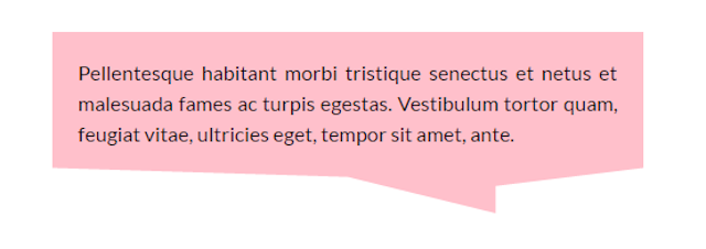
This property has a lot of interesting uses. Firstly, it can improve our text content. Take a look at the image below. The background behind the headline and the second paragraph was created using clip-path property:
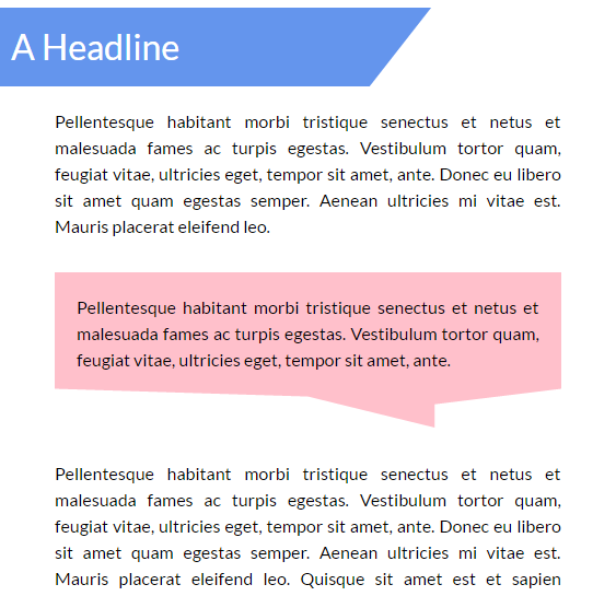
You can easily create the first background using gradients and other such techniques. However, it would be a lot harder to create the second one without the help of clip-path. Note that the line at the bottom of that message-like background is not perfectly horizontal, it is a bit oblique. To achieve this result with clip-path you need only a single line of CSS:
.p-msg {
  clip-path: polygon(0% 0%, 100% 0%, 100% 75%, 75% 85%, 75% 100%, 50% 80%, 0% 75%);
}
The background has seven vertices and it is reflected in our polygon’s clip-path. How did I come up with those co-ordinates you ask? I’ll leave that to the reader to figure out — doing so will help you have a better understanding of the concepts. Play around with the CodePen below to get the hang of it:
See the Pen Text with clip-path by SitePoint (@SitePoint) on CodePen.
You can also clip images into different shapes with this property and arrange them together in cool ways with the help of a little CSS. The image thumbnails in your galleries no longer need to be rectangular and the user avatars can have any shape that you wish. In this tutorial, we will arrange images in the shape of a rhombus. Since all images have the same basic rhomboid shape they will use the same clip-path value. Here is the CSS for rightmost image:
.right {
  clip-path: polygon(50% 0%, 100% 50%, 50% 100%, 0% 50%);
  position: relative;
  top: -352px;
  left: 256px;
}
Here is an example of clip-path images in action:
See the Pen Images with clip-path by SitePoint (@SitePoint) on CodePen.
There is a lot more that you can do with clip-path — you can create buttons with fancy shapes or add nice hover effects to your navigation menu. You are limited only by your own creativity!
Adding Animation
This property is also able to be animated. The only thing that you have to keep in mind is that the number of vertices in the final and initial shape must be the same. This makes sense because otherwise the browser won’t know where to add that extra vertex (or where to remove it from). Here is some CSS to animate a trapezium:
@keyframes polygons {
  25% {
    clip-path: polygon(20% 0%, 100% 38%, 70% 90%, 0% 100%);
  }
  50% {
    clip-path: polygon(0 46%, 100% 15%, 55% 74%, 0 100%);
  }
  70% {
    clip-path: polygon(100% 38%, 100% 38%, 66% 100%, 0 53%);
  }
}
In the final phase of the animation, the trapezium changes into a triangle. As I mentioned earlier, we can’t change the number of vertices and expect the animation to be smooth. Changing the number of vertices will make the transition abrupt. To resolve this issue, I have set the first two vertices in the last polygon in such a way that they coincide. This way our quadrilateral transforms nicely into a triangle.
See the Pen A clip-path animation by SitePoint (@SitePoint) on CodePen.
Browser Support
This property is not supported by IE and Edge. Firefox only supports clip-path partially (it only supports the url() syntax). However, from version 47 onward, Firefox supports this property with the layout.css.clip-path-shapes.enabled flag enabled.
Chrome, Safari and Opera require the prefix -webkit- in order to work properly. Unfortunately, even they don’t support shapes in external SVGs. You can read more about browser support on Can I Use.
Conclusion
This tutorial covered the basics of clip-path to help you get started. While it did not take much time to learn how to use this property, using it creatively will take a little practice. By the time browser support is decent enough, you will be ready to create stunning effects with clip-path.
I would also like to mention two tools — clippy by Bennett Feely and clip path generator by CSS Plant — to make it easier for you to create complex polygonal paths.
Have you created something awesome with clip-path? Please provide a link to it in the comments.
Frequently Asked Questions (FAQs) about CSS Clip-Path Property
What is the CSS Clip-Path Property and How Does it Work?
The CSS clip-path property is a powerful tool that allows you to clip (i.e., cut away) parts of an element. It works by defining a specific region of an element to display, while the rest remains hidden. This property can take basic shapes like circle, ellipse, polygon, or inset as values, or even an SVG path. The clip-path property is particularly useful in creating complex shapes and animations in CSS.
How Can I Use the Polygon Function in CSS Clip-Path?
The polygon function in CSS clip-path allows you to create complex shapes by specifying the coordinates for each point of the polygon. The coordinates are defined in pairs (x, y), where x represents the horizontal axis and y represents the vertical axis. For example, clip-path: polygon(50% 0%, 100% 50%, 50% 100%, 0% 50%) would create a diamond shape.
Can I Use CSS Clip-Path Property for Responsive Design?
Yes, the CSS clip-path property can be used in responsive design. By using percentages instead of fixed values for the shape parameters, the clip-path will scale with the size of the element. This ensures that the clipping will adapt to different screen sizes and orientations.
Is it Possible to Animate the CSS Clip-Path Property?
Absolutely! CSS animations can be applied to the clip-path property. This can be done using keyframes and the animation property. The keyframes are used to define the stages of the animation, and the animation property is used to apply these stages over a duration of time.
What Browsers Support the CSS Clip-Path Property?
The CSS clip-path property is supported by most modern browsers, including Chrome, Firefox, Safari, and Opera. However, it’s not supported by Internet Explorer. For the most up-to-date information on browser support, you can check websites like Can I Use.
How Can I Use the Circle Function in CSS Clip-Path?
The circle function in CSS clip-path allows you to create a circular clipping region. The syntax is circle(radius at position), where radius is the size of the circle and position is the center point. For example, clip-path: circle(50% at 50% 50%) would create a circle in the middle of the element.
Can I Use an SVG as a Clip-Path in CSS?
Yes, you can use an SVG as a clip-path in CSS. This is done by referencing the SVG in the clip-path property using the url() function. The SVG must be defined in the HTML and have an id that can be referenced.
What is the Difference Between Clip and Clip-Path in CSS?
The clip property in CSS is a predecessor to the clip-path property and has less functionality. The clip property only allows for rectangular clipping and is less flexible than the clip-path property, which allows for a variety of shapes and even custom paths.
How Can I Use the Inset Function in CSS Clip-Path?
The inset function in CSS clip-path allows you to create a rectangular clipping region with optional rounded corners. The syntax is inset(top right bottom left round border-radius), where top, right, bottom, and left define the size of the rectangle and border-radius defines the roundness of the corners.
Can I Use Multiple Shapes in a Single CSS Clip-Path?
Yes, you can use multiple shapes in a single CSS clip-path by using the path() function. This function allows you to define a custom path using SVG path syntax, which can include multiple shapes. However, this is more complex and requires knowledge of SVG path commands.