
Key Takeaways
- A new accessible accordion widget has been developed, named a11yAccordion, which allows for better accessibility for keyboard-only users and those using screen readers, improving the user experience for individuals with disabilities.
- The a11yAccordion widget, open-sourced and available on GitHub, allows keyboard-only users to tab through the widget with ease and enables screen readers to read out all the content within the widget, including dynamically changing titles based on search results.
- The a11yAccordion widget comes with a JavaScript API for programmatic manipulation, and while it has made significant strides in improving accessibility, there are still areas for improvement and development, with contributions from developers and designers actively encouraged.
At the dawn of the millennium, a blind gentleman successfully sued the Sydney Organizing Committee of the Olympic Games as they had failed to make the official website of the Olympic Games adequately accessible to blind users. Over the years, many such cases have come to light, and numerous acts have been passed in various countries which make it mandatory for you to make your website adequately accessible.
Many JavaScript libraries today provide a variety of widgets like sliders and menu bars, but developers often choose to ignore accessibility. One such example is the jQuery Accordion widget. The accordion is a useful widget which solves the problem of presenting content in an area with space constraints.
The Problem
Using jQuery 1.9.1, jQuery UI 1.10.4, and Chrome 32, it is not possible to tab through the accordion headers. However, once the accordion is active, you can use the up and down arrow keys to navigate through the headers and press the Enter Key to uncollapse one (which in itself is not intuitive). Secondly, there is no way for a screen reader (NVDA in this case) to read what is within the just uncollapsed area.
During the Google Summer of Code 2013, I was working on the ATutor project of the Inclusive Design Institute. ATutor is an open source learning content management system, which complies completely with the accessibility specifications. We had a significant problem – the data in the courses page. It typically listed all courses and their corresponding information, which made it difficult for someone using assistive technologies (AT) to navigate easily. A solution was an accordion, but one which met the high accessibility standards set by ATutor.
The a11yAccordion
My mentor for the project, Alexey Novak, had developed something similar for AContent, a content authoring system used to create web based learning content. A standalone version was then developed and open sourced so that it could be used in the ATutor project, as well as in any other project.
There were two prime objectives for the project – keyboard only users must be able to tab through the widget with relative ease, and screen readers must be able to read out all the content within the widget.
In the current version, you can tab through the whole widget using just your keyboard, and the screen reader reads through the content as well. If you use the search bar, the title is changed dynamically, which makes a screen reader read it out to update you about the number of results of your search.
Quick Start
The project is hosted on GitHub and you can download the source code. There is also a demo you can view before downloading. Note that you would need to include the CSS (dist/css/a11yAccordion.css) and JavaScript (dist/js/a11yAccordion-0.2.2.min.js) files. Alternatively, you can compile it using grunt.
The markup for an example accordion is shown below.
<ul class="a11yAccordion" id="Accordion1">

  <li class="a11yAccordionItem">

    <div class="a11yAccordionItemHeader">

      <strong>Random Months</strong>

    </div>

    <div class="a11yAccordionHideArea">

      <ul>

        <li>January</li>

        <li>June</li>

        <li>February</li>

        <li>November</li>

      </ul>

    </div>

  </li>

  <li class="a11yAccordionItem">

    <div class="a11yAccordionItemHeader">

      <strong>Dummy Text</strong>

    </div>

    <div class="a11yAccordionHideArea">

      Lorem ipsum dolor sit amet, consectetur adipisicing elit, sed do eiusmod tempor incididunt ut labore et dolore magna aliqua. Ut enim ad minim veniam, quis nostrud exercitation ullamco laboris nisi ut aliquip ex ea commodo consequat.

    </div>

  </li>

  <li class="a11yAccordionItem">

    <div class="a11yAccordionItemHeader">

      <strong>Header with image</strong>

    </div>

    <div class="a11yAccordionHideArea">

      <img src="https://www.google.co.in/images/srpr/logo11w.png" alt="Google Logo">

    </div>

  </li>

</ul>
The JavaScript code needed to manipulate the previously defined accordion is shown below.
var myAccordion = a11yAccordion({

  parentSelector: '#Accordion1'

});
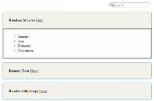
The resulting accordion is shown in the following figure.
Using the Widget
The latest version of the a11yAccordion can be found on GitHub. Clone the repository or download it as a zip file to get started. As the widget is built on jQuery 1.10 0, you would need to include jQuery before initiating the widget.
As you’ve already seen, an options object is passed to the accordion’s JavaScript constructor. a11yAccordion supports the following options.
parentSelector– The selector for the parent container which has accordion markup. This defaults toundefined.accordionItemSelector– The selector for rows which contain headers and hidden areas. This defaults to.a11yAccordionItem.headerSelector– The selector for a header within the row. This defaults to.a11yAccordionItemHeader.hiddenAreaSelector– The selector for hidden areas within the accordion row. Defaults to.a11yAccordionHideArea.visibleAreaClass– The class which is added to every row which will be uncollapsed/visible to the user. Defaults to.visibleA11yAccordionItem.colorScheme– The color scheme for the accordion. Defaults to.light.speed– The speed of animation in milliseconds. Defaults to 300.hiddenLinkDescription– A description for every Show/Hide link that is provided for users who use assistive technology.showSearch– A Boolean option which will tell the accordion to render search options.showOne– A Boolean value that defines if the accordion can uncollapse only one row to the user at a time.overallSearch– A Boolean option which will tell search to look not only in headers but within collapsed areas as well.
The API
The a11yAccordion also comes with a JavaScript API, which allows for programmatic manipulation. The API functions are described below.
collapseRow(rowIndex)– This function hides the hidden area under the row with correspondingrowIndex.uncollapseRow(rowIndex)– This function shows the hidden area under the row with correspondingrowIndex.toggleRow(rowIndex)– This function toggles the state of the row between collapsed and uncollapsed.getRowEl(rowIndex)– This function returns the jQuery row element with the correspondingrowIndex.showOne– This is a Boolean value with shows the user only one uncollapsed row at a time.
The Future
Although we have come quite a long way from a simple accordion, there are a lot of things left to do. The issues page tracks our immediate plans. To name one, we plan to add a function that helps in disabling rows programmatically.
Contributing to the Project
This project has a lot of potential, but it needs the help of developers and designers. Fork and clone the GitHub repository to contribute. Developers need to install Grunt and run npm install to set up the system locally. Designers can also directly add themes to the LESS file.
Frequently Asked Questions (FAQs) about Accessible Accordion Widget
How does an accessible accordion widget improve the user experience?
An accessible accordion widget significantly enhances the user experience, especially for users with disabilities. It provides a structured, easy-to-navigate layout that allows users to access content in a more manageable way. The accordion widget breaks down information into smaller, digestible sections that can be expanded or collapsed at the user’s discretion. This not only makes the content more readable but also allows for easier navigation, particularly for users who rely on assistive technologies like screen readers.
What is the role of ARIA in creating an accessible accordion widget?
ARIA (Accessible Rich Internet Applications) plays a crucial role in creating an accessible accordion widget. It provides additional semantics to help assistive technologies like screen readers understand the content better. For instance, ARIA roles, states, and properties can be used to indicate which sections of the accordion are expandable, which are currently expanded, and which are collapsed. This makes the accordion widget more accessible and user-friendly.
How can I make my accordion widget keyboard accessible?
Keyboard accessibility is a vital aspect of web accessibility. To make your accordion widget keyboard accessible, you need to ensure that all functionalities of the widget can be accessed using the keyboard alone. This includes navigating between different sections, as well as expanding and collapsing them. You can achieve this by using appropriate ARIA roles and properties, and by implementing keyboard event handlers in your code.
What are some common mistakes to avoid when creating an accessible accordion widget?
Some common mistakes to avoid include not providing keyboard accessibility, not using appropriate ARIA roles and properties, and not testing the widget with actual users and assistive technologies. Additionally, it’s important to ensure that the content within the accordion is still accessible and readable when the accordion is collapsed.
How can I test the accessibility of my accordion widget?
There are several ways to test the accessibility of your accordion widget. You can use automated accessibility testing tools, manual testing methods, and user testing. Automated tools can help identify some accessibility issues, but they can’t catch everything. Manual testing, including using the keyboard to navigate and using a screen reader, can help identify issues that automated tools might miss. User testing, particularly with users who rely on assistive technologies, is also a valuable way to identify potential accessibility issues.
How does an accessible accordion widget benefit SEO?
An accessible accordion widget can significantly benefit SEO. Search engines like Google favor websites that provide a good user experience, and accessibility is a big part of that. Additionally, the structured layout of an accordion widget can make your content more understandable and easier to index for search engines.
Can I use CSS to style my accessible accordion widget?
Yes, you can use CSS to style your accessible accordion widget. However, it’s important to ensure that your styling does not interfere with the widget’s accessibility features. For instance, you should avoid using colors that do not provide sufficient contrast, as this can make the content hard to read for users with visual impairments.
What is the difference between an accordion and a tabbed interface?
Both accordions and tabbed interfaces are used to organize content into separate sections, but they function differently. In an accordion, only one section can be open at a time, and opening a new section will close the previously open one. In a tabbed interface, multiple sections can be open at the same time, and users can switch between them without closing any.
How can I make my accordion widget responsive?
To make your accordion widget responsive, you can use CSS media queries to adjust the layout and styling based on the screen size. You should also ensure that the widget functions properly on different devices, including mobile devices and tablets.
Can I use JavaScript to enhance the functionality of my accordion widget?
Yes, you can use JavaScript to enhance the functionality of your accordion widget. For instance, you can use JavaScript to control the behavior of the accordion, such as automatically collapsing sections when a new one is opened. However, it’s important to ensure that any enhancements do not interfere with the widget’s accessibility features.