

The modern web design world is an innovative one. Table-based lists with offset pagination are rapidly falling out of favor, whereas Masonry layouts with infinite scrolling are becoming the new norm. This article provides an in-depth look at the Masonry layout and its usage.
Key Takeaways
- Masonry layout, also known as Pinterest Style Layout, is a grid layout based on columns without fixed height rows, making optimal use of space inside a webpage by reducing unnecessary gaps.
- The Masonry layout is commonly used for image galleries, blog posts, and portfolios. It is especially useful when the items displayed on the grid have varied dimensions.
- Generating Masonry layouts can involve advanced calculations, and it is often more efficient to use a plugin. Popular plugins include Masonry, Wookmark, Isotope, Nested, and Freetile.js.
- Features of Masonry layout plugins can include dynamic column sizes, sorting and filtering, animation, dynamic elements, and layout options. It’s important to consider these features when choosing a plugin for your specific needs.
Defining Masonry Layout
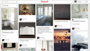
The term Masonry layout probably owes its name to the popular jQuery Masonry plugin that is used to generate this type of layout. Masonry layout is also referred to as the Pinterest Style Layout, as www.pinterest.com was the first major website to use this layout style.
Masonry is a grid layout based on columns. Unlike other grid layouts, it doesn’t have fixed height rows. Basically, Masonry layout optimizes the use of space inside the web page by reducing any unnecessary gaps. Without this type of layout, certain restrictions are required to maintain the structure of layout.
Developers and designers are accustomed to seeing web pages laid out with CSS floats. But this common type of layout doesn’t take the size of the elements into consideration. Instead, it adds elements one after another, first in the horizontal direction, then vertically. The following image shows a typical web page that uses floats for layout:
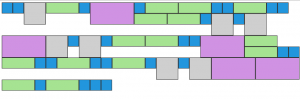
As you can see, having boxes with dynamic dimensions makes it difficult to design a layout without unnecessary gaps. This type of layout makes it harder for users as well, because the page height increases due to the additional spaces. It requires unnecessary scrolling to navigate to the bottom of the page. In such scenarios, we have to use a fixed-size box in each row.
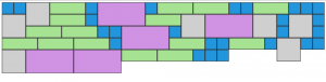
Using a Masonry layout is the ultimate solution to this problem, as it reduces the spaces and tries to fit the maximum number of boxes into the rows and columns. Consider the following screenshot to see how the previous design looks in a Masonry layout. Notice that the height of the page is reduced and the layout is easier on the eye.
Masonry Layout Around the Web
Let’s look at some of the different uses of Masonry-style layouts across the Web:


Practical Uses of Masonry Layout
Masonry layout can equip a site with better functionality, as well as enhance a site’s design. The following are practical examples of Masonry layout usage:
- Image Galleries – The most popular use of Masonry layouts is for galleries. Image galleries are built using different types of images with varying dimensions. It can be challenging to create a set of images with the same dimensions, without losing their quality. Because of this, Masonry layouts are a great choice for creating galleries using images with varied dimensions.
- Blog Posts – Generally, a blog’s home page lists the latest blog posts, along with a short summary. As long as we use one column to list posts, there won’t be any problems. However, with multiple columns, it is not possible to list the posts with varying length summaries. To keep the consistency of the layout, it is necessary to restrict the summary length. With a Masonry layout, we can list the latest posts in multiple columns without having to truncate the post summaries.
- Portfolios – Masonry layouts are useful for displaying portfolio items. It can be used to present projects, designs, images, or anything that is relevant to your profile.
Choosing a Masonry Layout – Considerations
So far, we have discussed a few practical use cases of Masonry layouts, but there are countless other ways to utilize this layout style. If you are thinking about using a Masonry layout on your website, consider the following points before making your decision:
- Generally, you will need to use a grid-based layout.
- Items displayed on the grid should have varied dimensions.
- In order to experience the real effects of a Masonry layout there should be a considerable number of items.
Generating Masonry Layouts
Generating Masonry layouts involves some advanced calculations, so it is wise to use a plugin, rather than building it from scratch. There are many popular plugins for generating Masonry layouts, with a wide range of features. The following is a list of the top Masonry layout plugins:
Features of Masonry Layout Plugins
The plugins listed in the previous section contain unique features in addition to the common feature set. It is difficult to understand the difference between each plugin just by looking at a Masonry layout generated by each one. All of the layouts will appear quite similar. It is important to consider the available features before choosing a plugin. Generally, most plugins provide an API and documentation for identifying their features.
I suggest looking at the available features of each plugin before making your choice. I have compiled the following list of common features from the plugins listed in the previous section. These are some of the main features, but each plugin also has its own unique ones. It’s up to you to choose the best plugin based on your application requirements.
- Column sizes – Masonry layouts can have fixed-size columns or dynamic columns. Fixed-size columns are the norm. It is better to choose a plugin that allows dynamic columns, as it enhances the flexibility.
- Sorting and Filtering – Plugins like Isotope allow you to sort and filter the elements without losing the structure of the layout. It is a good feature to have when you need dynamic Masonry layouts.
- Animation – Unlike normal layouts, Masonry layouts change completely with the addition or removal of elements. Because of this, it is better to have animation effects for adjusting elements – this creates an awesome user experience.
- Dynamic Elements – Generally, we create the layout on page load using the available elements. But some sites might require the ability to add or remove elements without refreshing. In such cases, the plugin should have the ability to auto adjust the layout to provide the optimal structure.
- Layout Options – The plugin should allow you to set column width, gutter size, alignment, etc.
Creating a Masonry Layout via Plugin
Masonry by www.desandro.com is the most popular plugin from the previous list. The following is a step-by-step guide to quickly building a simple Masonry layout:
- Step 1 – Download the masonry.pkgd.min.js file and include it at the end of the page as shown in the following code:
<html>

  <head>

    <title>Masonry Layout with Masonry Plugin</title>

  </head>

  <body>

    <script src='masonry.pkgd.min.js'></script>

  </body>

</html>
- Step 2 – Create a list of elements with variable widths and heights. Each element should have a common class. Consider the following code:
<html>

  <head>

    <title>Masonry Layout with Masonry Plugin</title>

    <style>

      * {

        -webkit-box-sizing: border-box;

        -moz-box-sizing: border-box;

        box-sizing: border-box;

      }
      .item {

        width:  50px;

        height: 50px;

        float: left;

        background: #2296DD;

        border: 2px solid #333;

      }
      .item.thumbnail {

        width:  100px;

        height: 100px;

        background: #cfcfcf

      }
      .item.medium {

        width:  150px;

        height: 50px;

        background: #A6E392

      }
      .item.large {

        width:  200px;

        height: 100px;

        background: #D092E3

      }

    </style>

  </head>

  <body>

    <div id='masonry'>

      <div class="item"></div>

      <div class="item"></div>

      <div class="item thumbnail"></div>

      <div class="item medium"></div>

      <div class="item"></div>

      <div class="item large"></div>

      <div class="item"></div>

      <div class="item medium"></div>

    </div>
    <script src='masonry.pkgd.min.js'></script>

  </body>

</html>
As you can see, we have a common class called item for identifying elements in the grid layout. Then, we have three additional classes for changing the dimensions of elements. Finally, we include all of the elements inside a container called masonry.
- Step 3 – Initializing the Masonry plugin is the final task in the process. We use this to restructure the elements and construct the layout. Consider the following initialization code:
<script>

  var container = document.querySelector('#masonry');

  var masonry = new Masonry(container, {

    columnWidth: 50,

    itemSelector: '.item'

  });

</script>
We can initialize the Masonry plugin by providing the container, item selector, and column width. We get the most optimal layout by defining element widths as multiples of the column width.
Conclusion
As you can see, it is simple to build a Masonry layout using plugins. Try experimenting with other plugins and their various settings to see the variations of Masonry layouts. After experimenting, answer some of the questions below. Feel free to share your experience among our audience.
- What is the best Masonry layout plugin you have found, and why?
- Do you have any practical use cases of Masonry layout?
- What are the features you like to see in a Masonry plugin?
You can see a Masonry layout in action using this article’s demo link. You can also download the code here.
Looking forward to hearing from you.
Frequently Asked Questions (FAQs) about Masonry Layout
What is the difference between Masonry Layout and CSS Grid Layout?
Masonry Layout and CSS Grid Layout are both popular techniques used in web design to create visually appealing and responsive layouts. The main difference between the two lies in how they arrange elements. Masonry Layout places elements in optimal positions based on available vertical space, similar to a mason fitting stones in a wall. It minimizes gaps between elements of varying height, creating a ‘Pinterest-like’ layout. On the other hand, CSS Grid Layout is a two-dimensional system, meaning it can handle both columns and rows. It allows designers to create complex layouts that were previously difficult to achieve with CSS alone.
How can I create a Masonry Layout using CSS?
Creating a Masonry Layout using CSS involves using the column-count and column-gap properties. The column-count property specifies the number of columns in the layout, while the column-gap property determines the space between these columns. Here’s a simple example:.container {
column-count: 3;
column-gap: 1em;}.item {
background-color: #eee;
display: inline-block;
margin: 0 0 1em;
width: 100%;}
In this example, the .container class has three columns with a gap of 1em between them. Each .item will fill up the columns from top to bottom.
Can I use Masonry with Bootstrap?
Yes, you can use Masonry with Bootstrap. Bootstrap is a popular framework that provides pre-designed styles and components, while Masonry is a grid layout library. They can work together to create responsive, grid-based layouts. You can use Masonry’s JavaScript library to create a Masonry grid within a Bootstrap container or row.
How can I add images to a Masonry Layout?
Adding images to a Masonry Layout is straightforward. You simply include the image within the grid item. Here’s an example:<div class="grid">
<div class="grid-item"><img src="image1.jpg"></div>
<div class="grid-item"><img src="image2.jpg"></div>
<div class="grid-item"><img src="image3.jpg"></div></div>
In this example, each grid-item contains an image. The images will be arranged in a Masonry Layout.
How can I make a Masonry Layout responsive?
Making a Masonry Layout responsive involves using media queries to adjust the column-count property based on the viewport size. For example, you might want a single column on small screens, two columns on medium screens, and three columns on large screens. Here’s how you can do it:.grid {
column-count: 1;
column-gap: 1em;}@media (min-width: 500px) {
.grid {
column-count: 2;
}}@media (min-width: 900px) {
.grid {
column-count: 3;
}}
In this example, the grid starts with one column. When the viewport width is at least 500px, it switches to two columns. When the viewport width is at least 900px, it switches to three columns.
How can I add animations to a Masonry Layout?
You can add animations to a Masonry Layout using CSS transitions or JavaScript libraries like jQuery. For example, you might want to animate the grid items when they’re added or removed. Here’s how you can do it with CSS transitions:.grid-item {
transition: all 0.5s ease;}.grid-item:hover {
transform: scale(1.1);}
In this example, the grid items will scale up when hovered over, creating a zoom effect.
Can I use Masonry Layout with WordPress?
Yes, you can use Masonry Layout with WordPress. Many WordPress themes include Masonry Layout options, and there are also plugins available that add Masonry functionality. You can use these options or plugins to create Masonry-style blog post grids, photo galleries, and more.
How can I add a filter to a Masonry Layout?
Adding a filter to a Masonry Layout involves using JavaScript to hide or show grid items based on their class. You can create buttons or links that trigger the filter when clicked. Here’s a simple example using jQuery:$('.filter-button').on('click', function() {
var filterValue = $(this).attr('data-filter');
$('.grid').isotope({ filter: filterValue });});
In this example, clicking a .filter-button will filter the .grid items based on the data-filter attribute of the button.
How can I add a load more button to a Masonry Layout?
Adding a load more button to a Masonry Layout involves using AJAX to fetch more grid items and append them to the grid. You can use jQuery’s .ajax() method to send a request to the server, and Masonry’s .append() method to add the new items to the grid.
How can I add a Masonry Layout to a React app?
Adding a Masonry Layout to a React app involves using a Masonry component. There are several third-party libraries available that provide such components, including react-masonry-component and react-masonry-css. You can install these libraries via npm, import the Masonry component into your app, and use it to create a Masonry grid.